Back in the Spring, I put together this little print for the Legion Paper Scavenger Hunt at the National Stationery Show (you can read all about that here), and never had the heart to put away the M form. That sparked the challenging idea to create an entire ornamental alphabet that could potentially be turned into stationery and more.
 So I started in random order to develop other letterforms. Most measure about 21 picas high (about 3.5") with varying widths based on individual letters. I sketched rough layouts for each letter, with some being considerably easier than other. The L is unique in that I specifically used many of our ornaments originally designed for the Lanston Type Company.
 Once I got into the flow, the letters practically designed themselves.
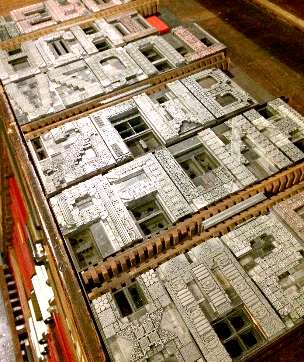
 And then suddenly there were 26 letters, comfortably living on 3 galleys.
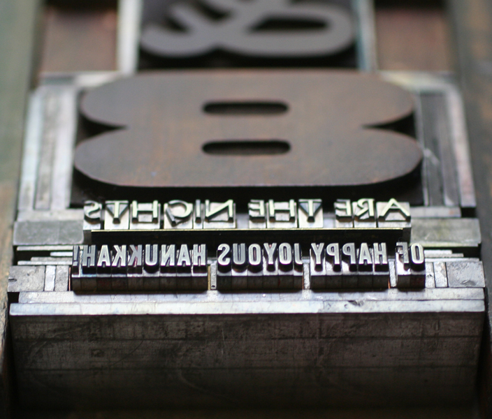
 I wanted to include an ampersand because they are perennially popular and it would serve my ideas for the end result of the project. But this form proved to be quite difficult; it looked as miserable as this image while I walked away from it for a bit to revisit ampersand designs that might better inform the outcome.
 After a break, this is what came together. Getting all of the angles was pretty killer but the final form was solid. It even includes a tiny 'and' catchword.
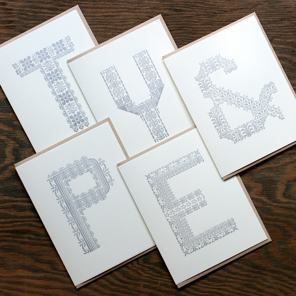
 Occasionally taking a break from the typesetting, I started printing the actual folded note cards. These didn't necessarily go in order, but the first three did. They are all printed in silver on Stonehenge cotton paper, and include 100% recycled kraft envelopes.
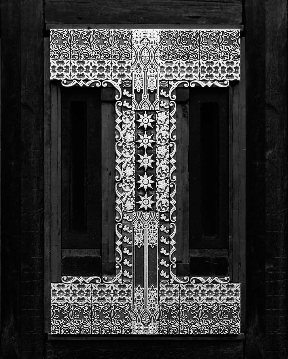
 And here the M, slightly updated, makes another appearance.
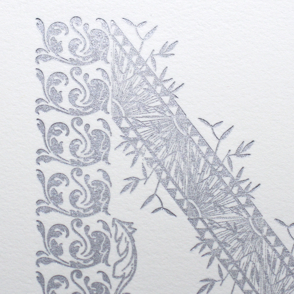
 A few of the details...such lovely ornaments.
 The stationery is sold in sets of 6 by the letter, so you can pick your favorite. Great for gifts, too! And of course there's the ampersand if you just can decide.
 It struck me that the forms themselves were really beautiful and that they could perhaps be used for another purpose. So after printing each run, I left a little silver ink on them and grabbed the camera. I digitally cleaned up the images to adjust the contrast to best show the ornaments and then flipped the images so they could be read by all.
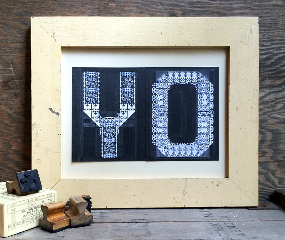
 Then I had these printed digitally as postcards on thick, recycled card stock.

 And they're fun to play with! Sold individually, it's easy to mix and match and spell whatever you like. Or, of course, send them as postcards.
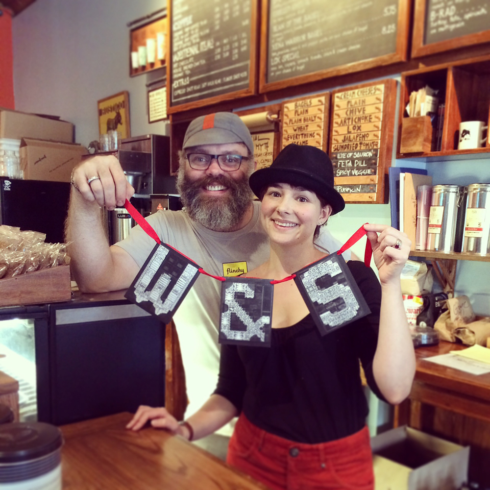
 We also had some fun punching holes in them to make banners. Here are the adorable and lovely Will and Sido from Ravenswood's own Beans and Bagels.
 Beautiful box sets all ready to go. These are available on our etsy site now.
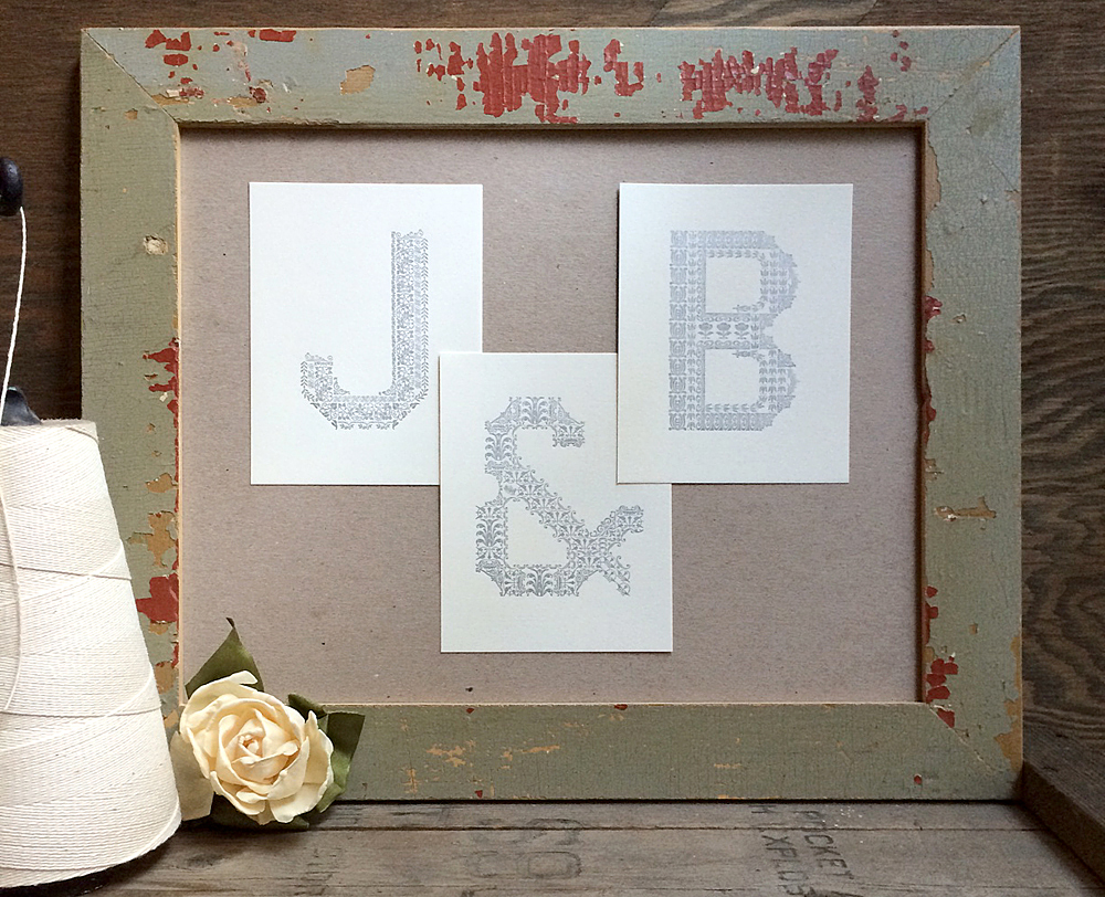
 And if you're interested, we can sell letters individually so you can use the actual printed cards as a display. Given that Mr. Starshaped and I will be celebrating our tenth anniversary this week, I put together this grouping for him. See the importance of that ampersand?