It's been a while since the last post, but the studio has been caught up in attending the National Stationery Show for the first time, which was a stellar success. On top of our normal work load of custom projects, I designed our 10x10' booth, painted it, printed countless new products (more on those soon), created our first ever print catalog and brought to life numerous promotional pieces in advance of the show. As we expand our reach outside of custom work, NSS is a great opportunity to get work in front of wholesale buyers. The first piece we created specifically for the show was a contribution to the annual Legion Paper scavenger hunt. A number of small shops participate, and this year the theme was alphabet flash cards. Luckily, I got letter M, which was perfect for this theme:
 Legion supplied the paper, and I chose Stonehenge Fawn, which is a soft, American made cotton paper. The card is printed in two colors and of course uses all metal type, including the fabulous two-color Alphablox.
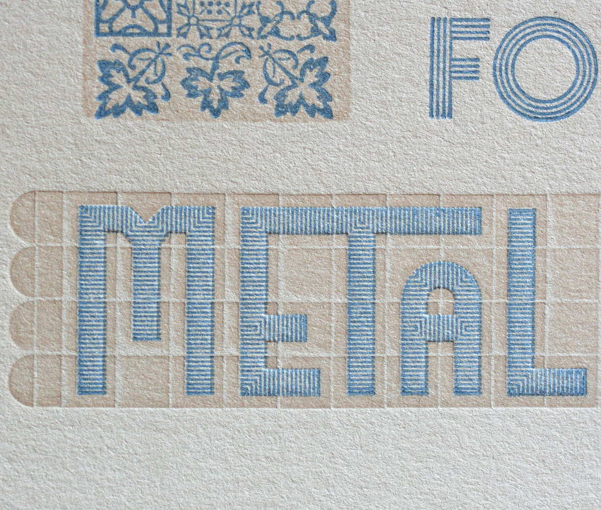 The card was, I'm happy to say, popular, and will be the basis for a series of letter cards in the near future. The form is really wonderful; we can create modular letterforms out of very ornate pieces.
 The type for the colophon on the back of the card:
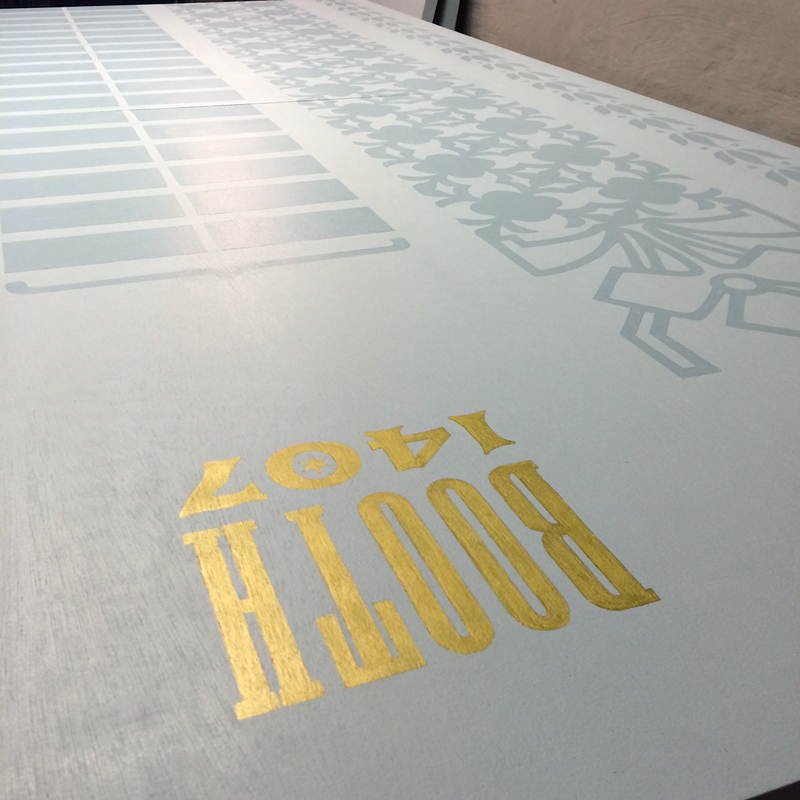
 While we printed by day, we painted by night. Mr. Starshaped graciously built all of our hard booth walls, as well as the crate in which they shipped to NY. Some truly talented friends came over in the evening over the course of a week to help lay down the highly detailed ornamental cityscape that was the theme. It was entirely painted by hand, including the booth number. I didn't want to let our sign painter friends down by using vinyl!

 I also printed up new cards, note pads and stationery to have on hand, also matching our booth and studio. This was a great excuse to work with the Virkotype initial set that's been screaming to be used. Three colors!
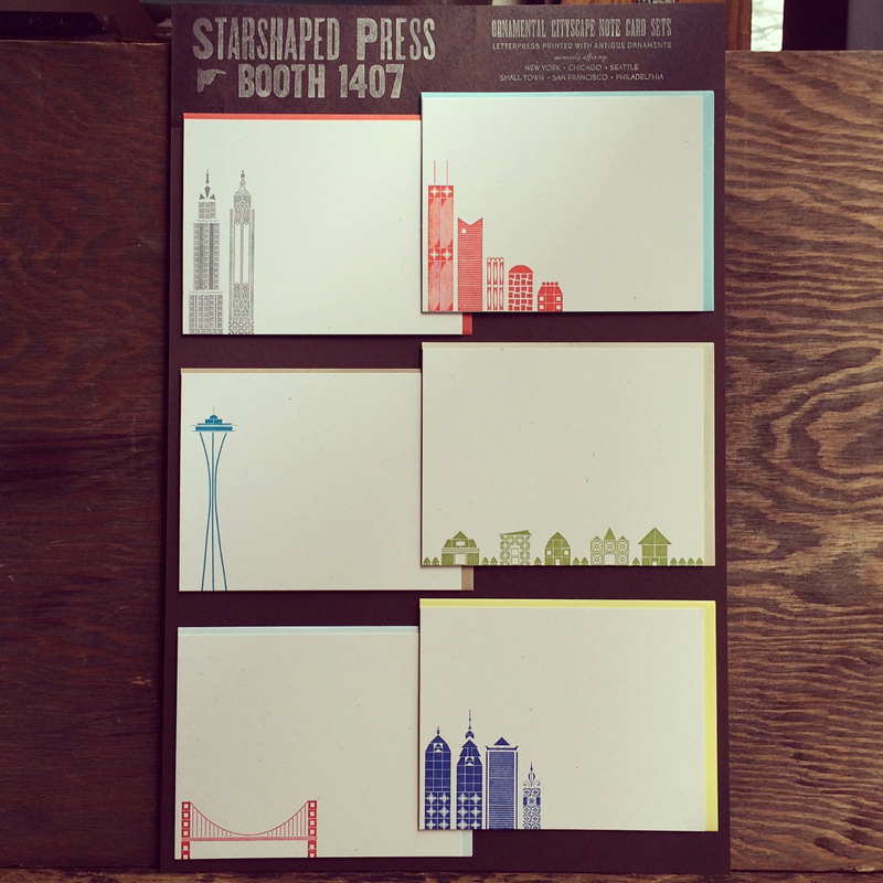
 While busily printing away, I was pleased to find that our cityscape note card sets were accepted as a finalist for Best New Product at the show, which required putting together this board. We now offer 5 other options besides Chicago, including New York, Seattle, Philly, San Francisco and a Small Town version if city living isn't your thing.
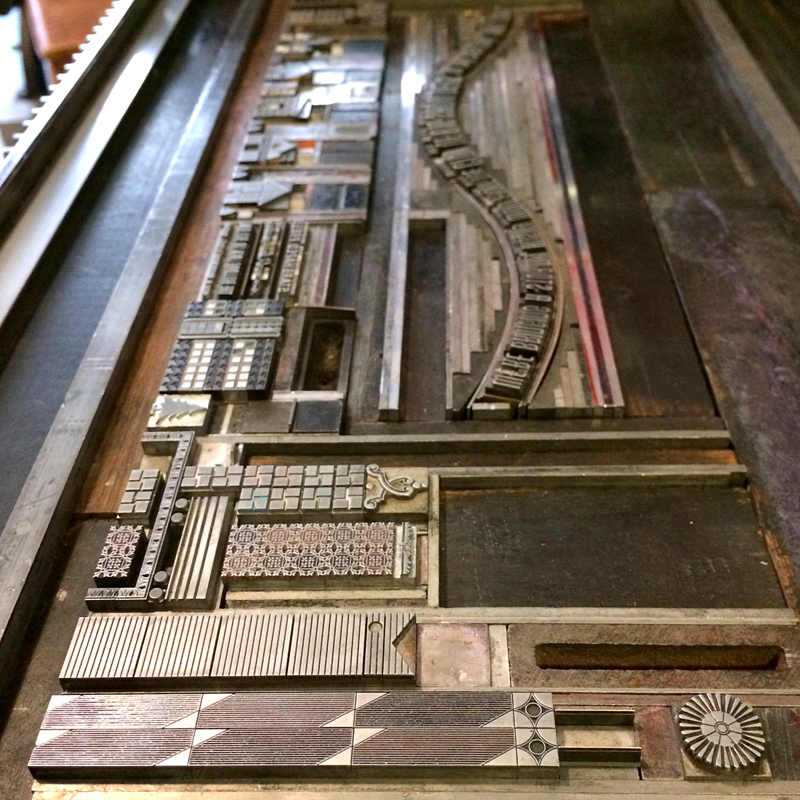
 The swan song of printing for the show was the pre-show mailer. This went out to a selection of stores that I wanted to meet in New York as well as other printers I was anxious to meet face to face. It was printed in an edition of about 100, and included an outer wrapper and accordion fold insert featuring many of the popular sections of our cityscape collection. And how about that sexy typographic curve?
 I pulled in bits of Carl Sandburg's 'Chicago' poem because he sums it up so well. Even the envelopes have little 6-pointed Chicago stars.


 At last! The Bulldog Lock Co. Building we have enjoyed residing in for the last ten years made an appearance on this piece.


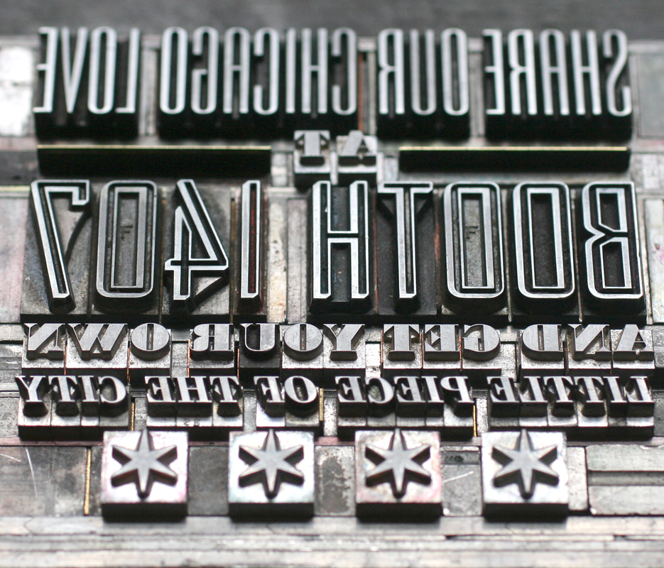
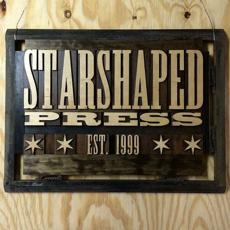
 One of the final touches for the booth was piecing together the sign. I'm particularly excited about this, as I had commissioned the laser cut right-reading type from Moore Wood Type last summer and it now has a proper place in a large 14x20" chase with real furniture and quoins. I wanted it to be as close to the real deal as possible, given that all of our work is created with metal and wood type.
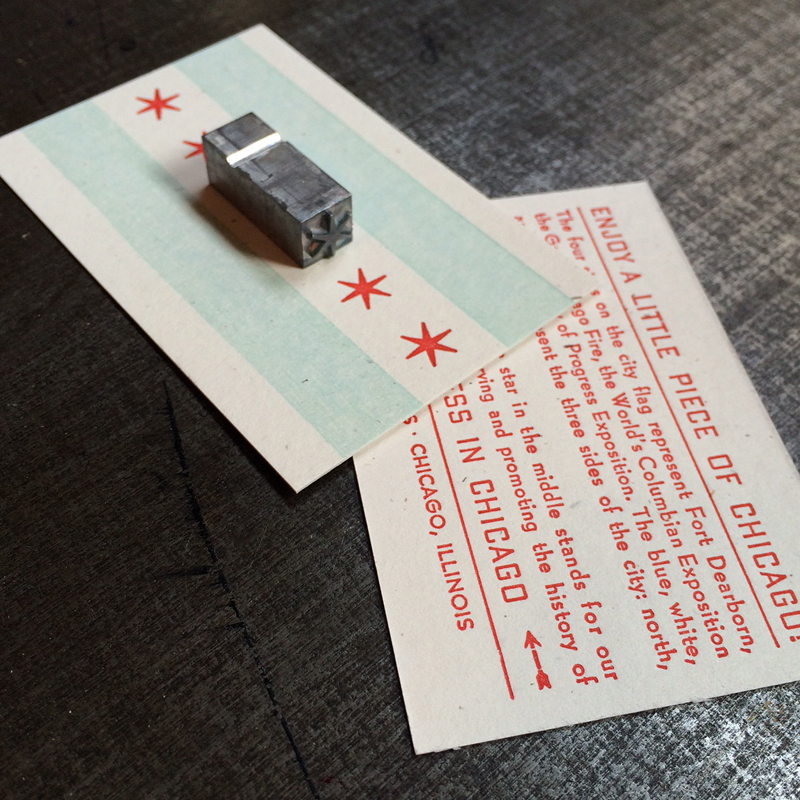
 To round out our 'bringing a piece of Chicago' to New York theme, the give away piece in our booth was a small card printed to resemble the Chicago flag, with a little history of it on the back side. Glued to each is a real piece of type, acquired from Skyline Type Foundry. This proved to be a very popular item at the show!
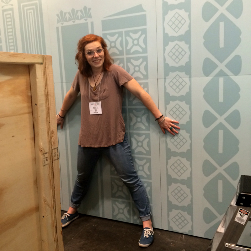
 After breathing a sigh of relief that our crate made it safely, Lindsey of Gingerly Press, my assistant for the week, and I went about squishing it into our space. Here she is holding onto the walls while our neighbors behind us banged on their booth while setting up lights. It was the only really scary moment of our set up!
 Once we were done, though, I couldn't have been happier with the look. You can see the detail of the hand painted ornaments and the sign really popped. I built the table out of a type case, a sheet of plexiglass and two legs from Ikea. All of the prints and cards fit neatly within the building structures, which made it easy to get them all in place.


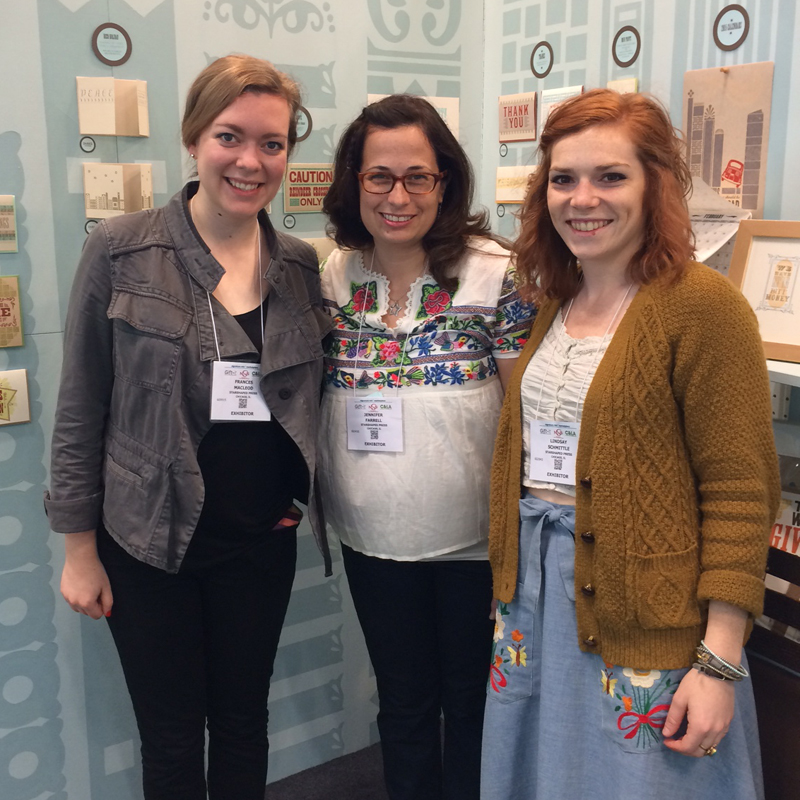
 One of the days, we had the pleasure of having Frances come and help us out, alongside her mom (not pictured here). It's so wonderful to have supportive and talented friends lend a hand!
 Given that set up went well, we had a day to walk around New York, which always means a trip to Bowne & Co. down in the South Street Seaport area. It's a worthwhile trip for disciples of metal type and 19th century processes. Lucky for us, Bowne swung into the show on the last day, and we received this beautiful little hand cut card!

 The biggest pleasure of being at the show was sharing it with old friends and finding new ones. Amber of A. Favorite Design has been a friend and neighbor for many years and was extremely helpful in show prep. She and Tom take the cake for cutest couple!
 It was also a pleasure to (finally) meet Kathryn of Blackbird Letterpress, who makes beautiful, quirky cards, including one of her dog. You can see his large cut out in this picture.
 I am also a huge admirer of Katharine Watson, who keeps it old school in a different way, creating all of her beautiful pieces with hand carved linoleum blocks.
 And of course the shop I have always admired, Hammerpress. Their style and attention to detail in typography is a real standout at the show, not to mention inspiration.
 There was definitely fun, albeit the expensive variety, to be had while there. We attended Paper Party one night with our longtime friend and neighbor Emily of Orange Beautiful, and new friends from Cincinnati, Steam Whistle Letterpress.
 And then it was time to pack up and go. Our booth was reduced to a pile of flats ready to be packed away until early next Spring when we bring them out for repainting and repurposing. I've already got ideas for next years adventure! Overall, the experience made the trip worthwhile, not to mention the number of orders we received, especially from new stores, as well as feedback on a number of our projects.
 But it's always good to be back in the studio, designing and printing the day away.