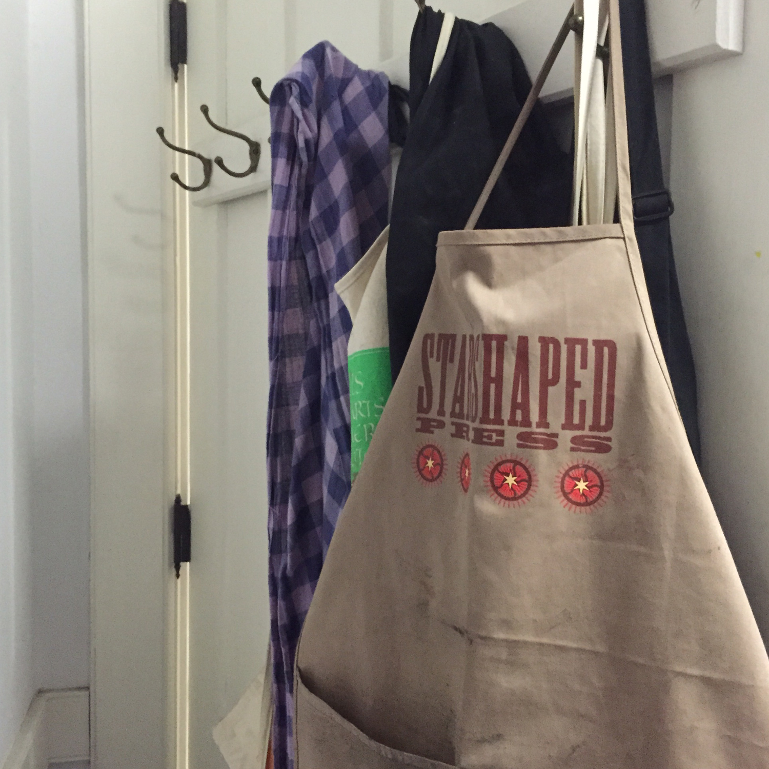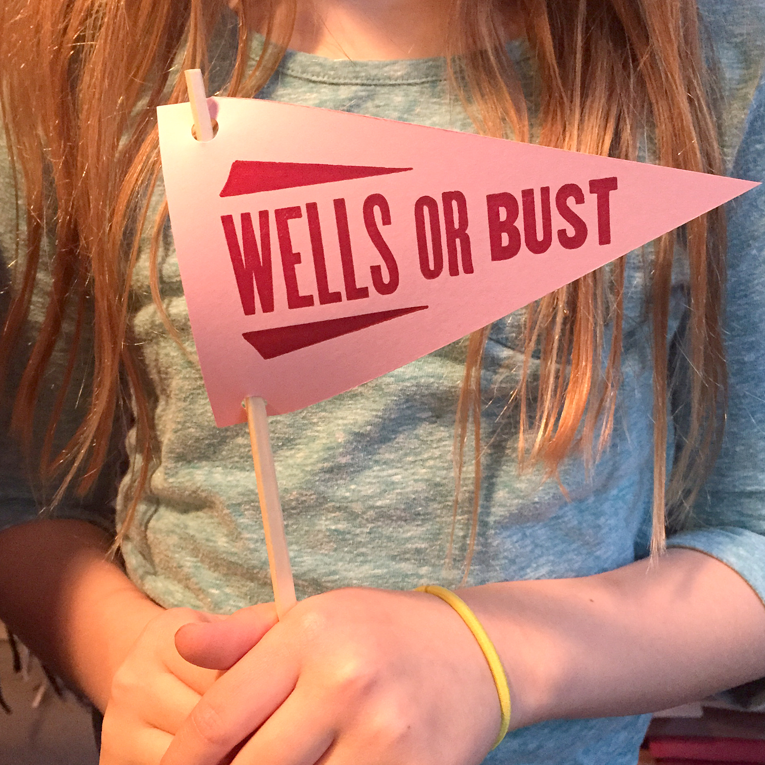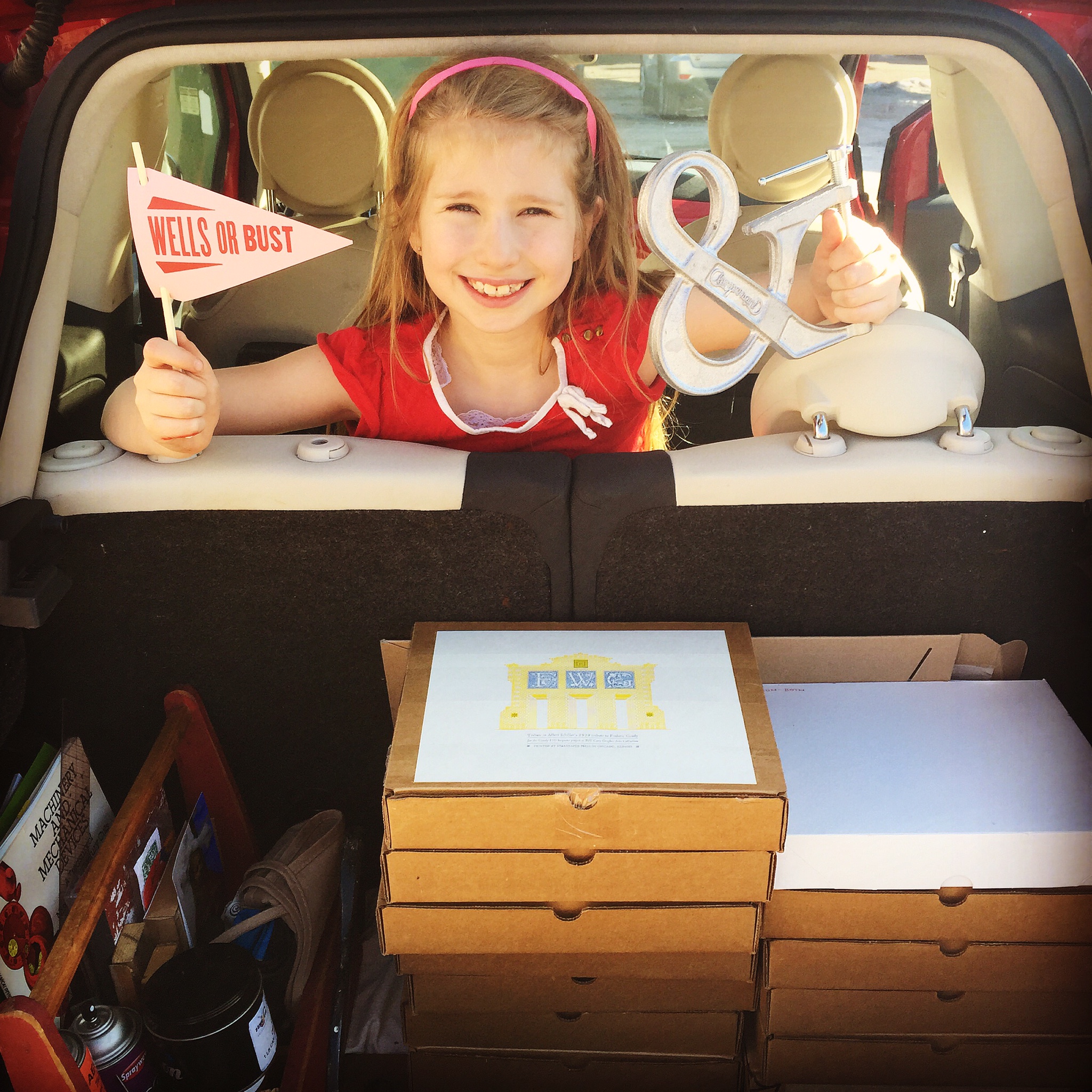
Nothing beats the long haul of March in Chicago like a working vacation in another print shop. Okay, maybe that's just me, but it was a real treat to spend time in Central New York for a residency at the Wells College Book Arts Center, with stops at some of our favorite places along the way. We packed the car with tools and remaining copies of An Alphabet of Sorts, our contribution to the Goudy 150 keepsake project, prints to share and one kid destined for Grandma's house. The one stop Jo and I made together was at Virgin Wood Type to collect our newest typeface as well as other ornaments I can't wait to ink up. A visit to Virgin is like waking up Christmas morning, where even the type gets the fancy wrap treatment.

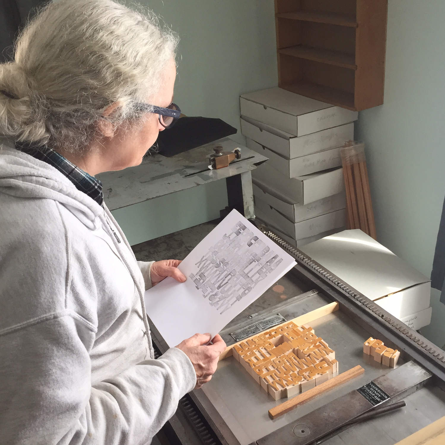
Here's Geri proofing up our Gothic Bold thanks to the ease of carbon paper.
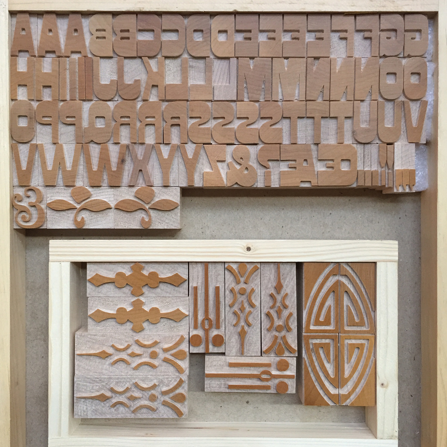
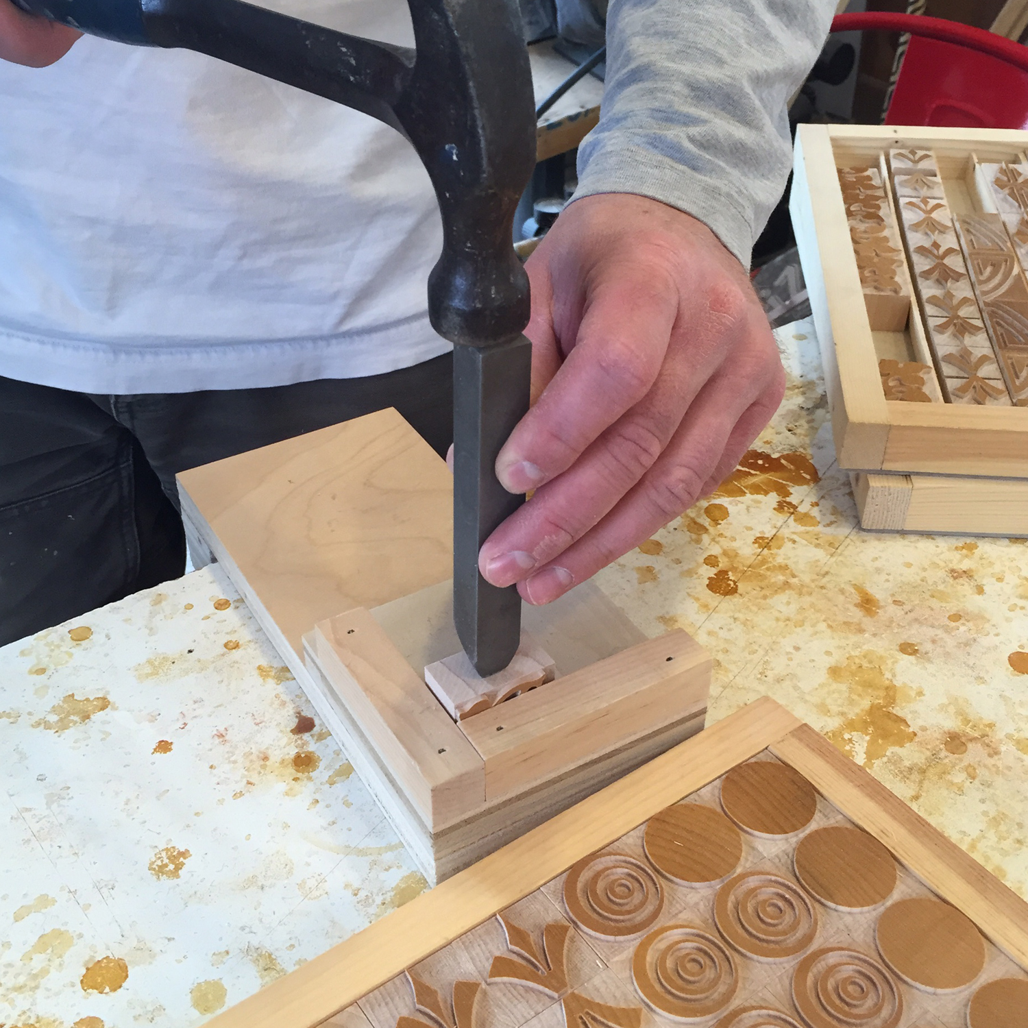
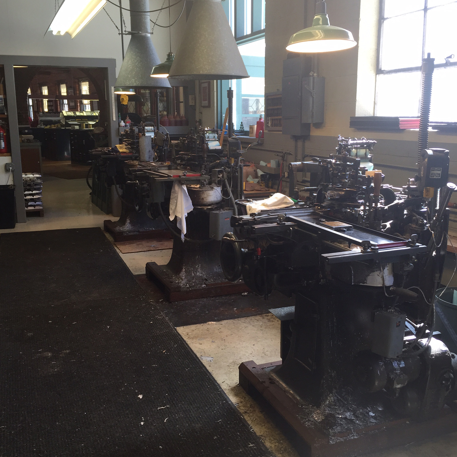
For a small shop it's terribly impressive what takes place here. The team was very busy, cutting nonstop to stock up for an upcoming trip to SGC.

Even the hell box is a popular spot for slightly less-than characters with a ton o' potential.

No set is complete without stamping!

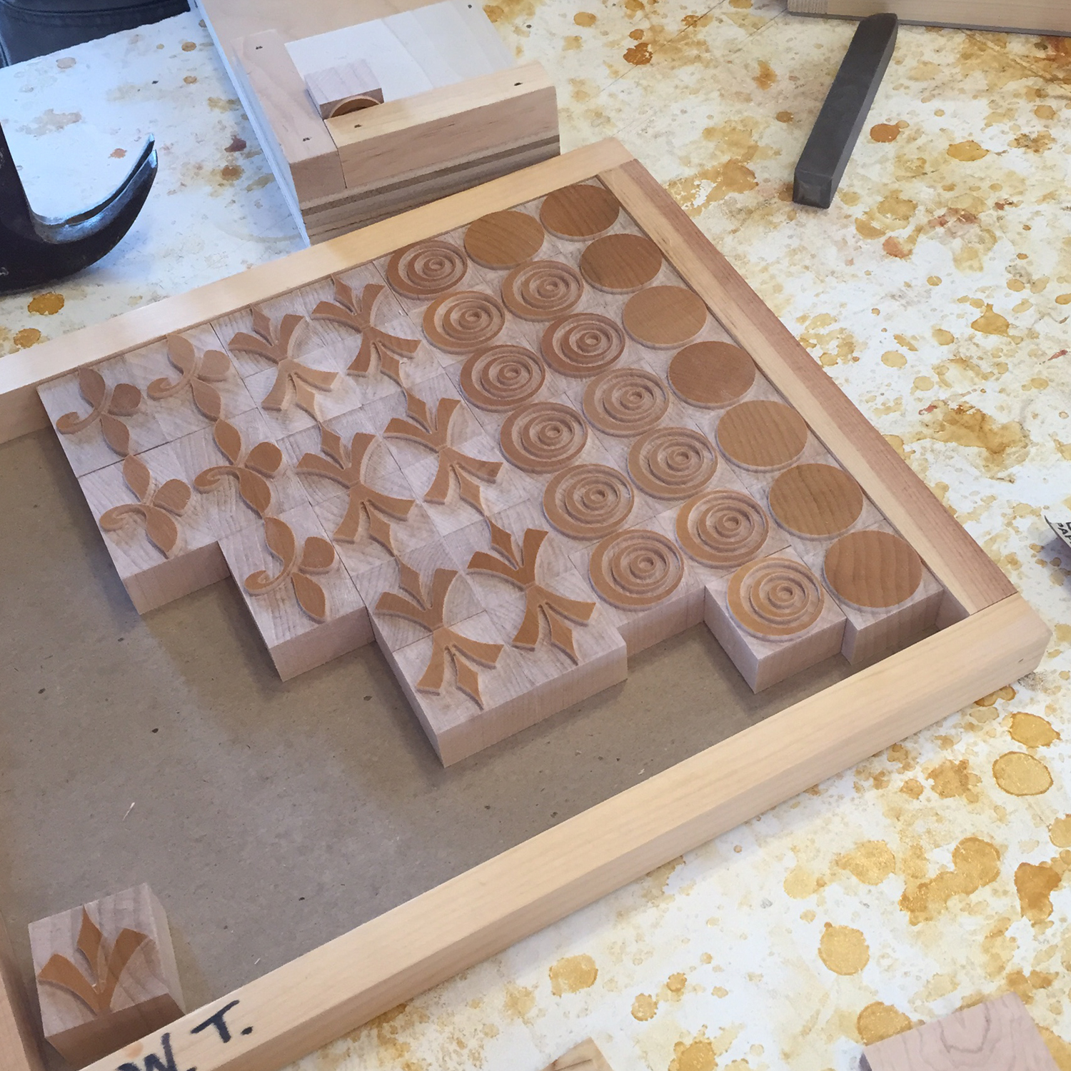
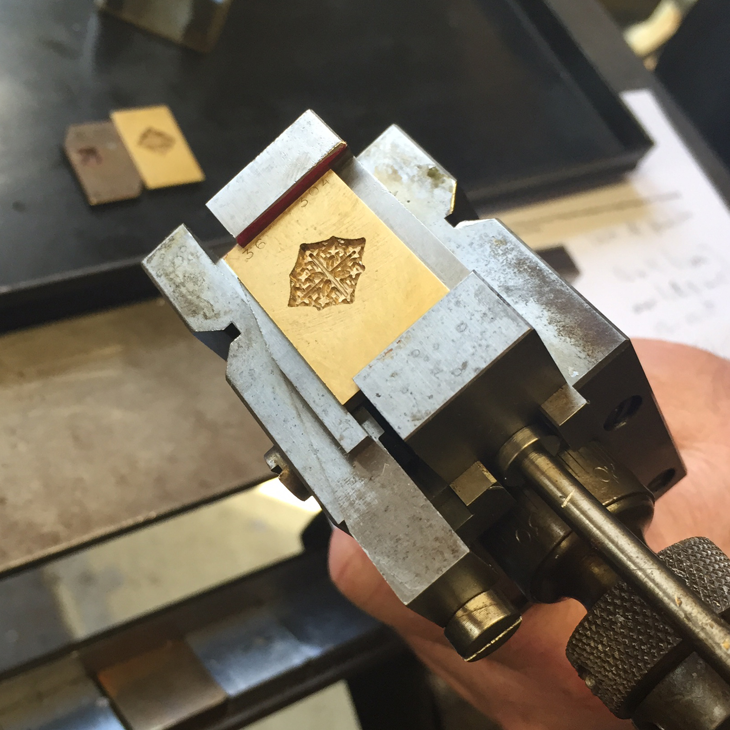
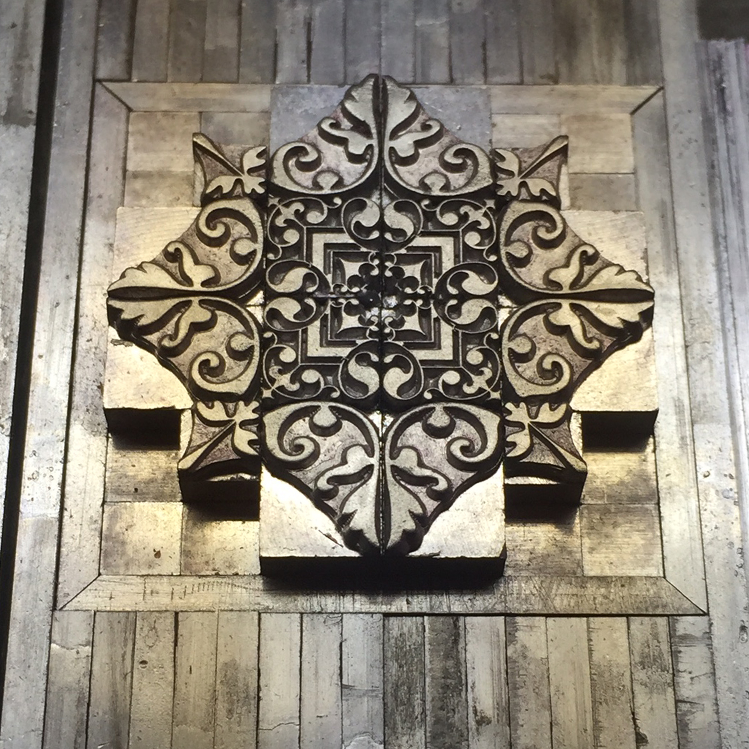
Right after we left the pantograph was set to work again, cutting a preliminary set of an exciting new modular typeface. See the patterns below. Can't WAIT for this one.

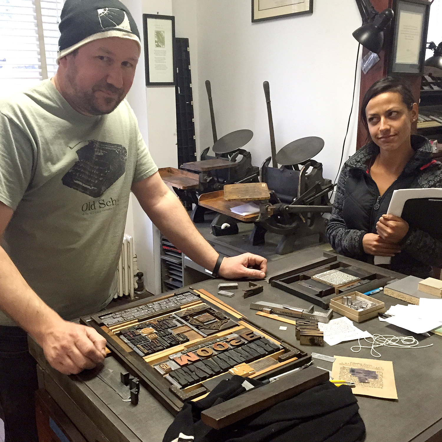
Two of my favorite people, Matt and Geri.
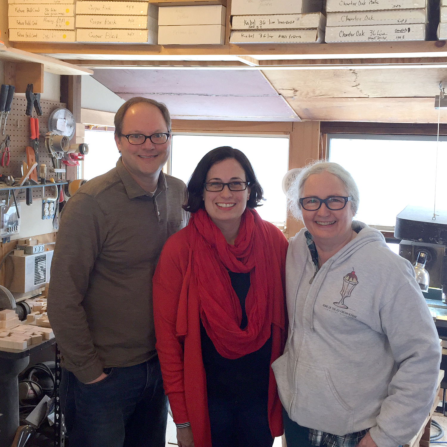
We brought a clampersand as a gift for Matt, which Jo promptly tested on his thumb. It works!

The next day I headed out on my own, stopping for a few hours at the Cary Graphic Arts Collection to both visit and print and put together a little more research on Albert Schiller. Amelia made these great posters!

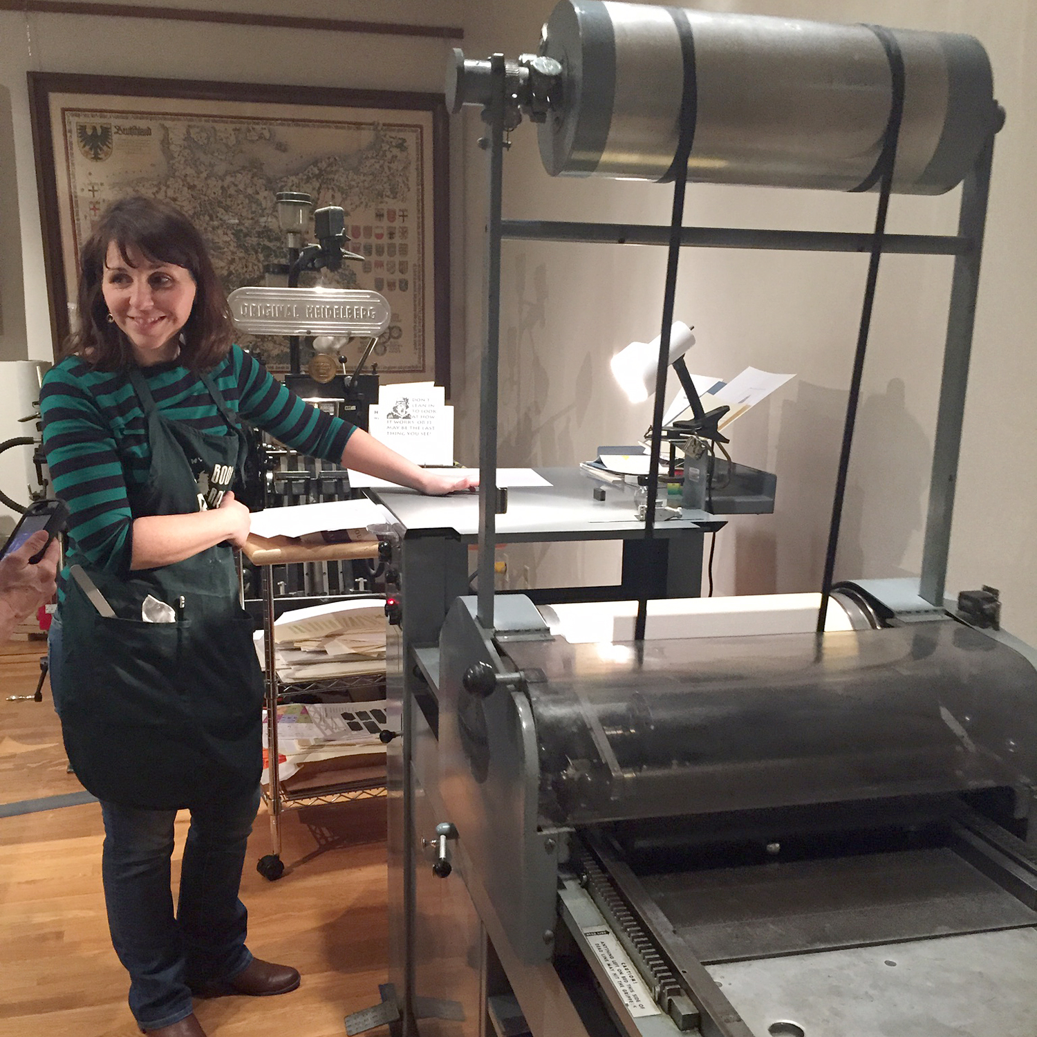
And here she is, having just set up my Goudy keepsake form to print. Many folks came through to pull a print for themselves, and I couldn't resist putting one of the prints on Goudy's press for a photo with the man himself.


I also found a copy of Schiller's original tribute that served as a model. Here it is next to my reincarnation.

I've narrowed down the images I captured of Schiller's work to just the ones I sought as inspiration for what I planned to do once at Wells College, starting with the incomparable Ampersand Machine.


The Cary Collection is a trove of treasures and it was an honor to get a little behind-the-scenes glimpse into the life of a curator.


After fully saturating myself with inspiration, it was time to head to Wells for the real work of my trip. I love this poster printed at their Book Arts Center, soon to be my home. It's a little glimpse at the kind of typographical dessert that was waiting for me.
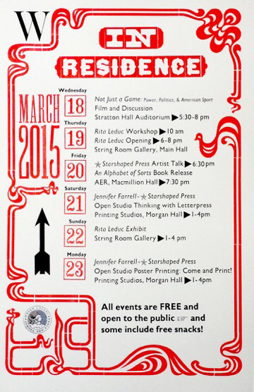
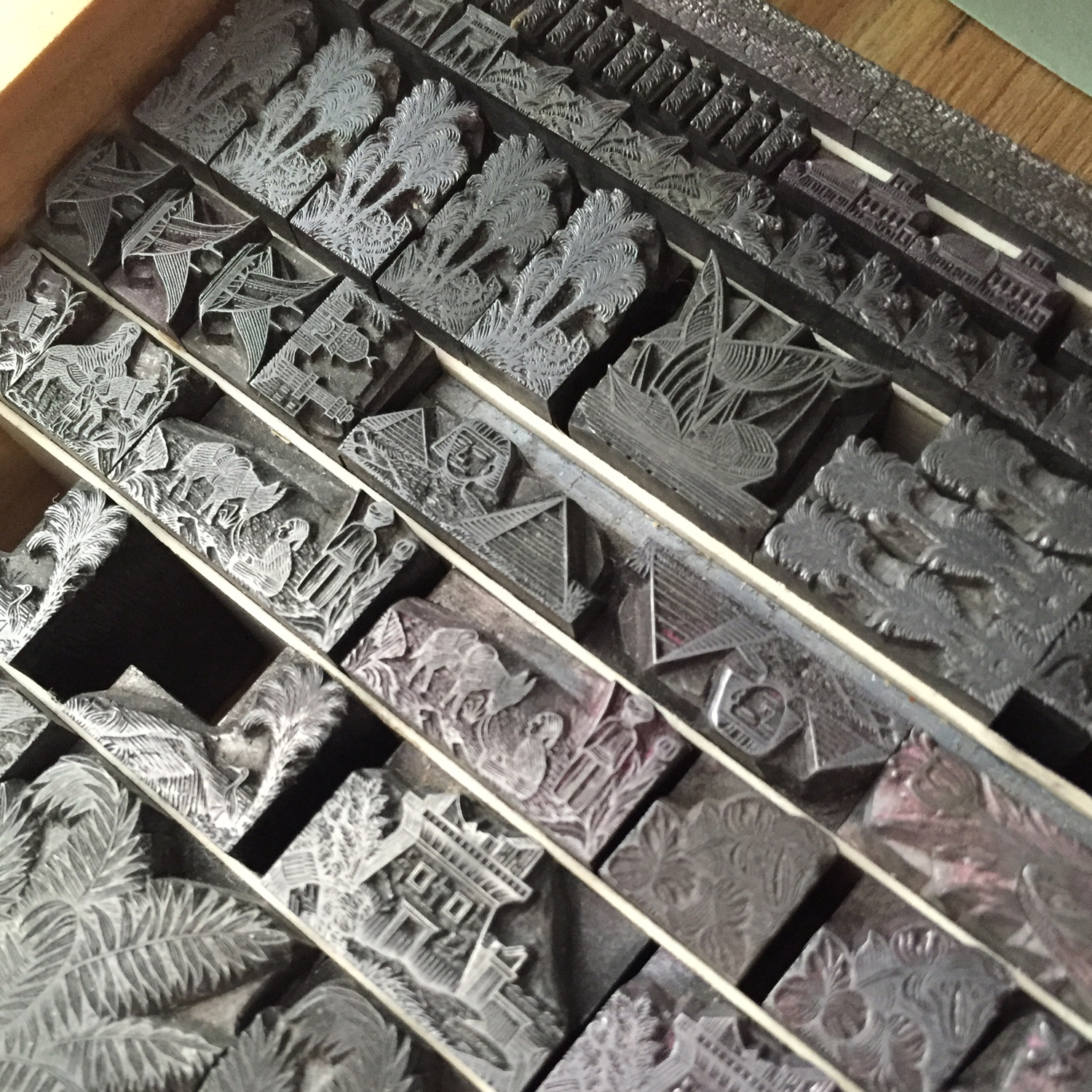
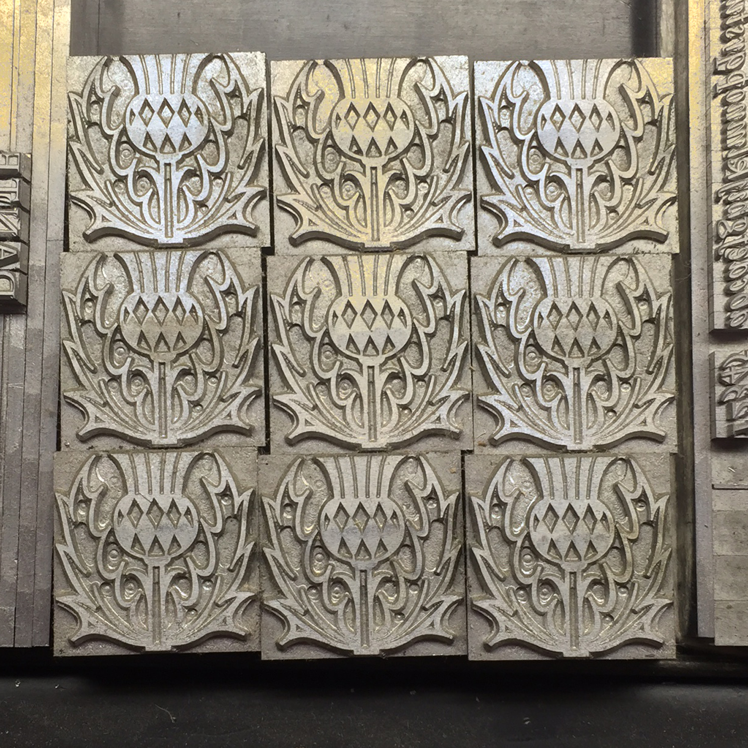
And here's another. This is a fraction of the unbelievable type available to work with and I wanted to use it all. It was a delight to discover much of this was originally from the Chicago Type Foundry (read: OLD).

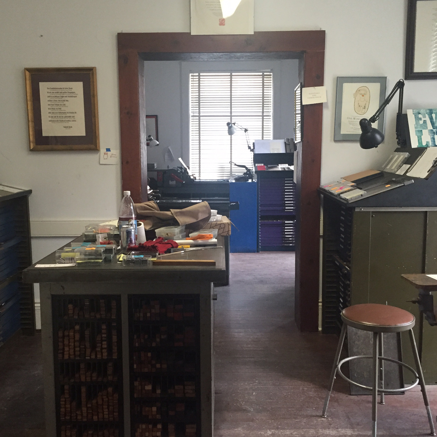
The shop is so beautiful and well organized, as you can see. There's a ton of natural light in this charming old building with it's large doors and windows and worn hardwood floors.


The only big messes in the place were the ones I made over the course of the week. A little food, a little caffeine, a ton of boxed ornaments.

And if one incredible studio isn't enough, there's a second faculty print room as well. Spoiled for choice!

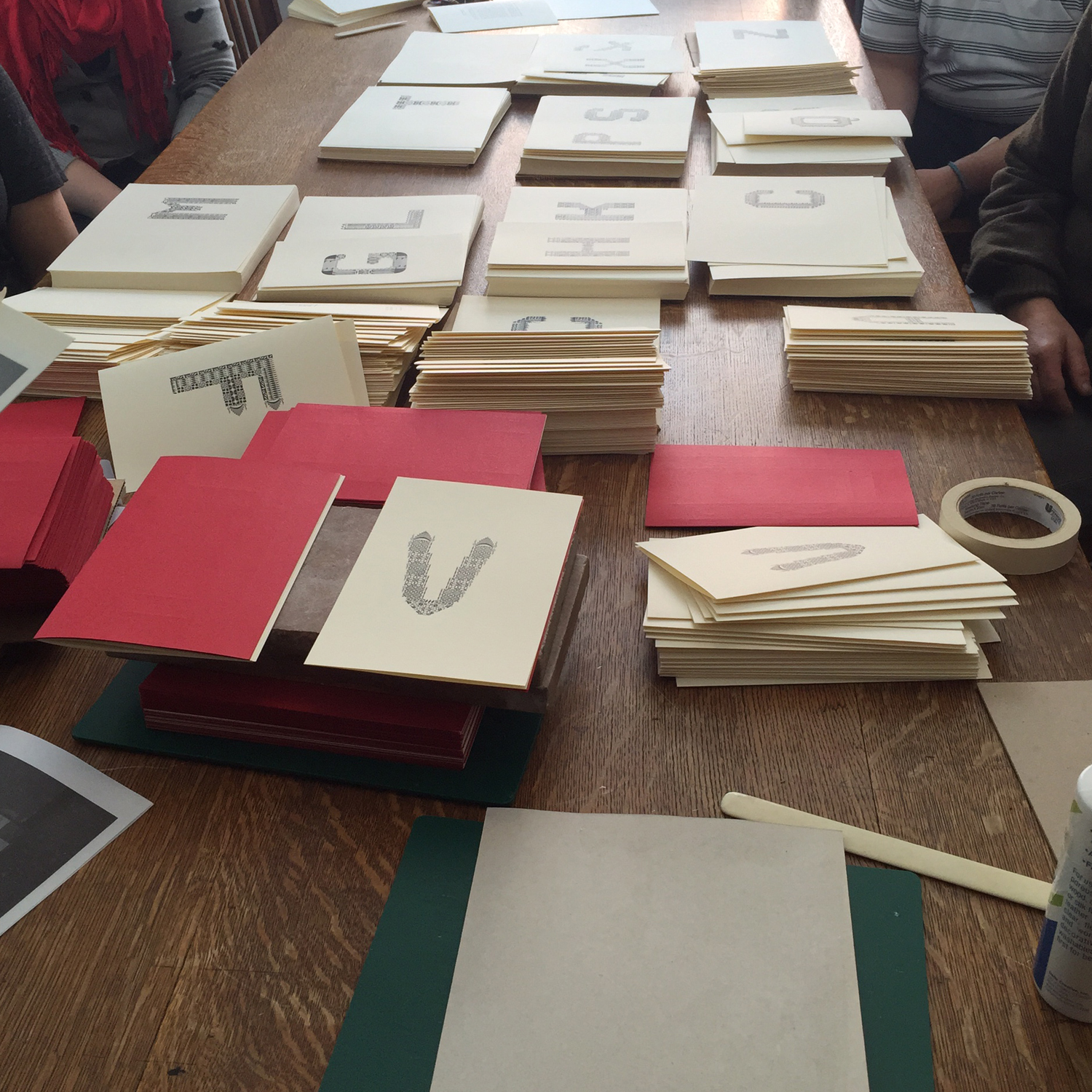
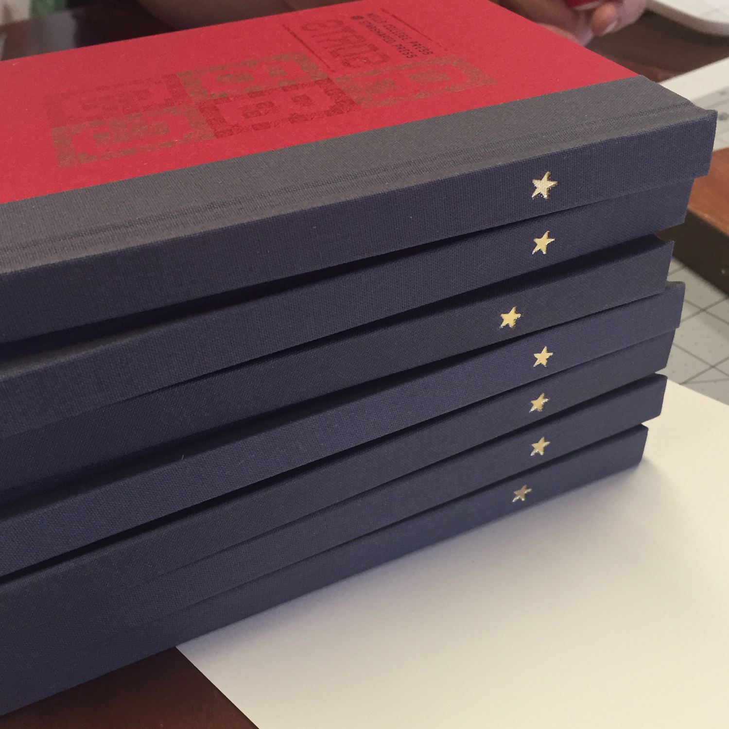
One order of business was to tackle the binding of An Alphabet of Sorts and you can see the beginning of the collating with students here.


Seeing them pile up was pretty exciting, as was the addition of little gold stars foil stamped on the spine.


Friday evening I gave a warts-and-all lecture about the 15 year history of Starshaped and shared details about collaborating with Wells on the book. What a great way to launch my 'baby' into the world. Shout out to Jookie Jill for taking this right-on shot.

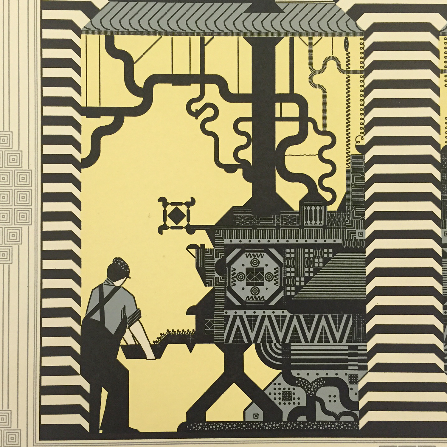
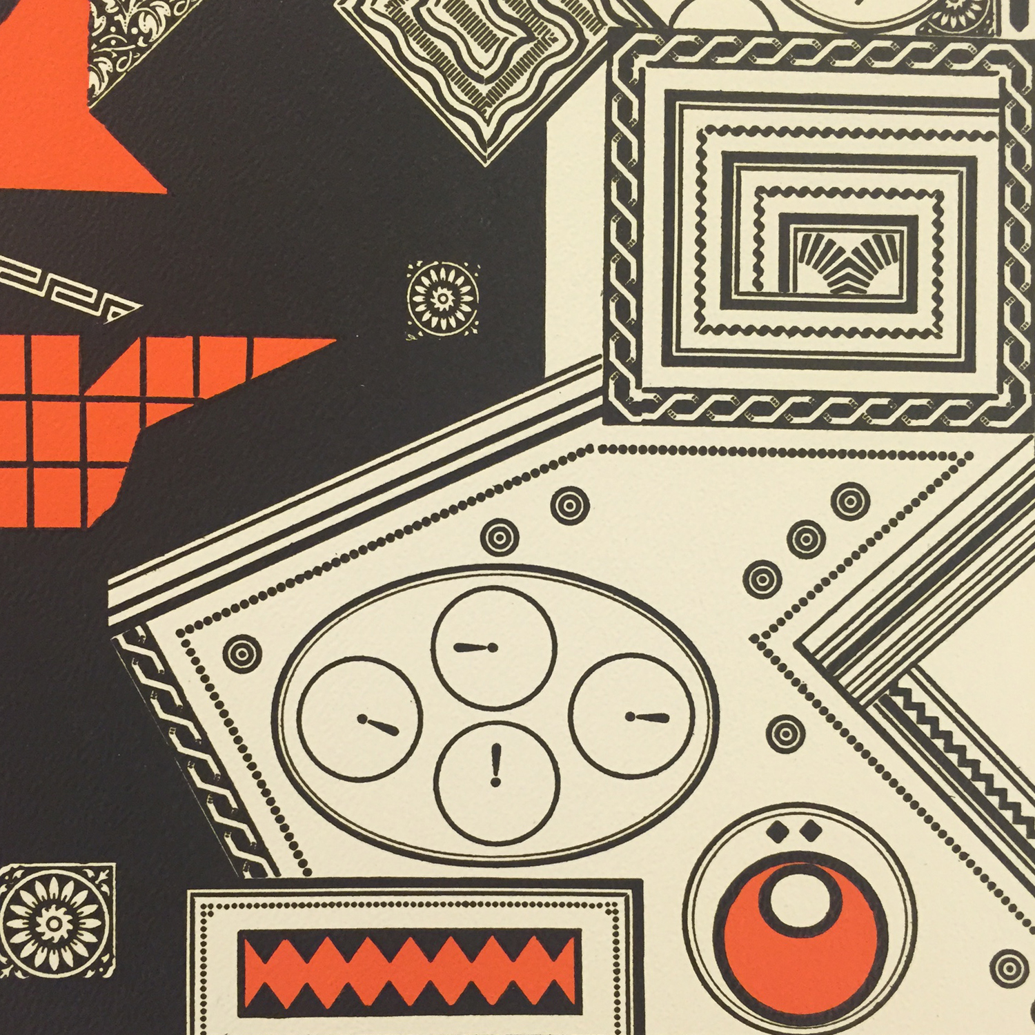
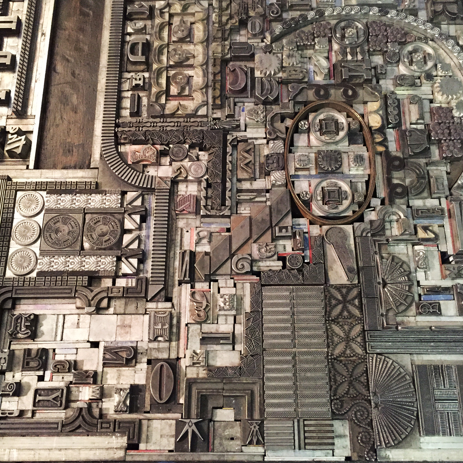
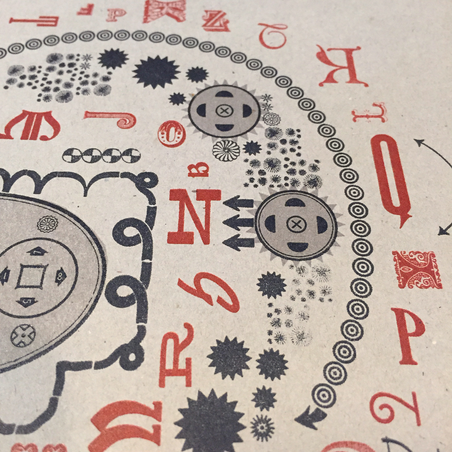
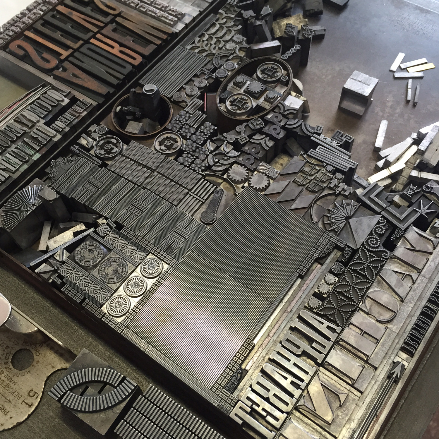
Not able to remove the images of Schiller's Ampersand Machine from my brain over the last 6 months, I knew I wanted to create a response print that would take advantage of the type collection at Wells, including the different types of ornaments there. Hence my Alphabet Machine plan was hatched. I have a soft spot for big, fat type and was tickled to find this Bodoni in the basement of the Book Arts Center. We just don't have enough of this at Starshaped.

Slowly my machine started to take shape, with made up gears, smokestacks and repositories for type.
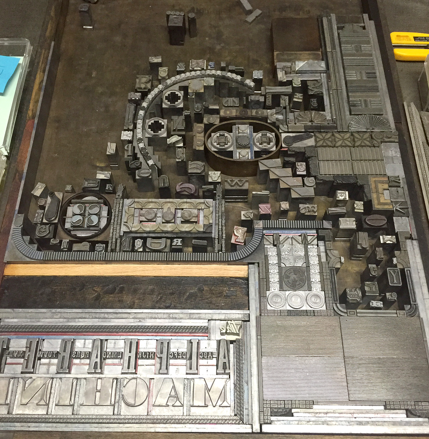

LOVE these mortised circles into which I shoved tiny 6 point number arrows.

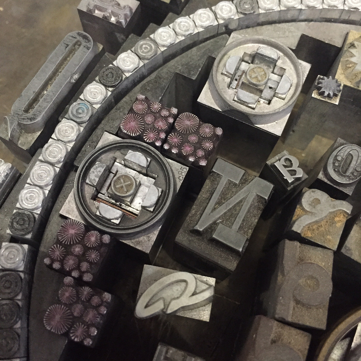
It got a little tough to keep my bearings with this one, as you can well imagine. Limiting my choices to ornaments that were not organic while fitting my brainstormed buzz words (pipes, valves, shoots, squares, linear, conveyor... you get the idea) was the only way to keep my head screwed on straight in this 'crack house of ornament'.
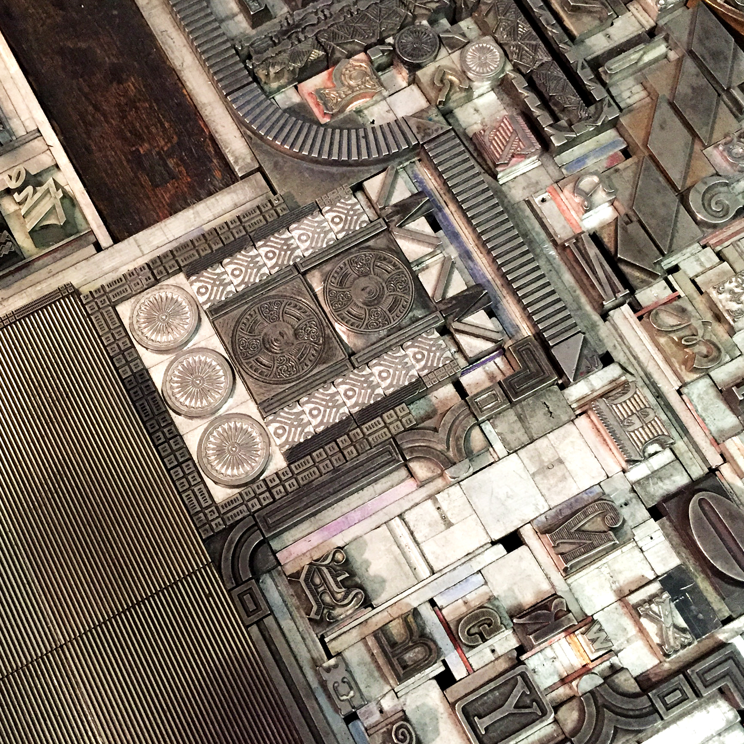

By late Saturday evening, the entire form was set and on press, ready for a proof.

My first move was to pull a carbon paper proof. Not perfect, but enough to get an idea of what the overall print will look like.

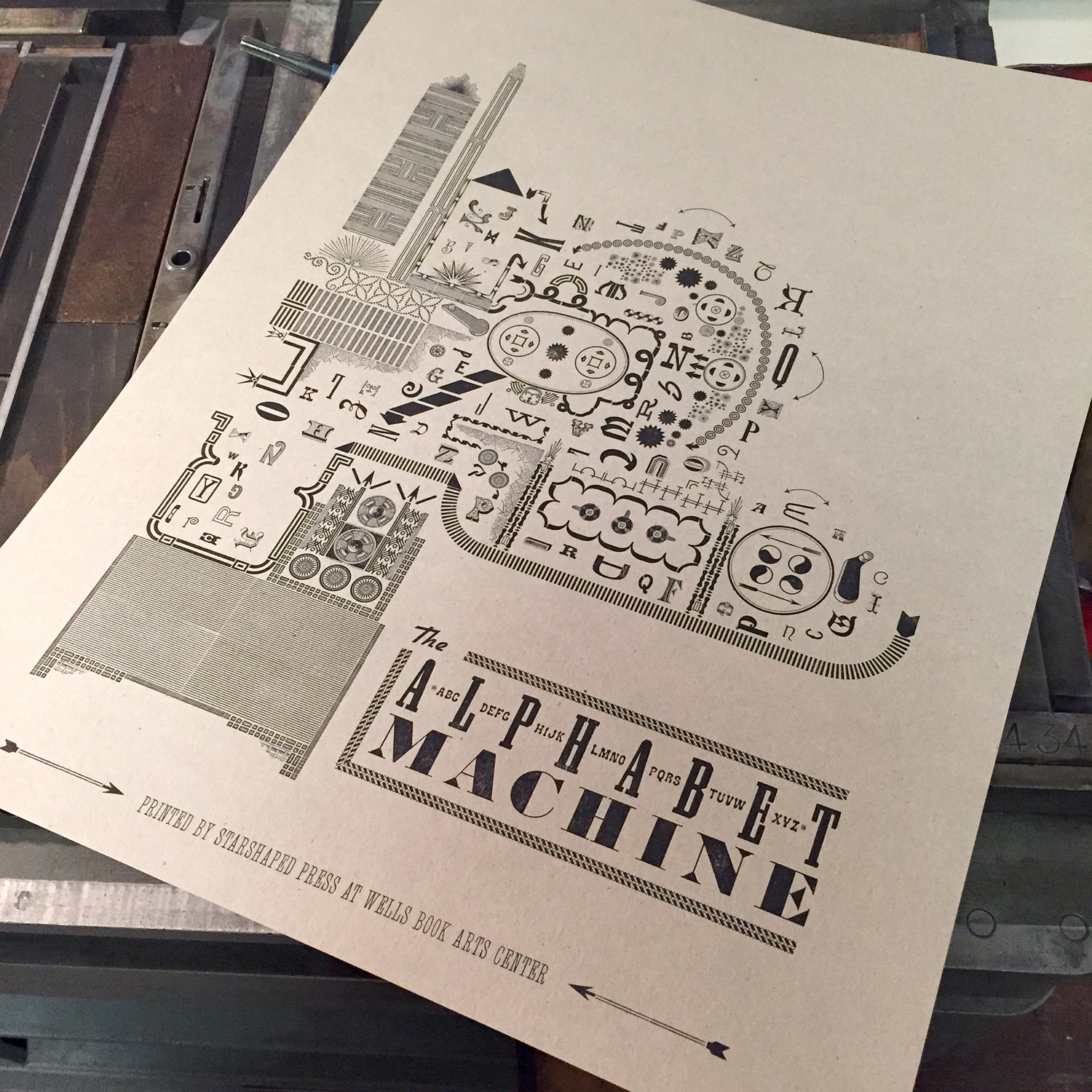
The first full proof was pretty great. Regardless of number of colors, I always print the entire form together to make sure everything makes sense before pulling out the separations. The paper is a gloriously rough and recycled gray and I used the same dark gray ink for the machine as in An Alphabet of Sorts.
Then I pulled out all of the type which would be printed in red. This was very mentally helpful as I could then see just the machine itself.

I marked spacing for where all of the letters were so that I'd know how to reinsert them after the first color was done.

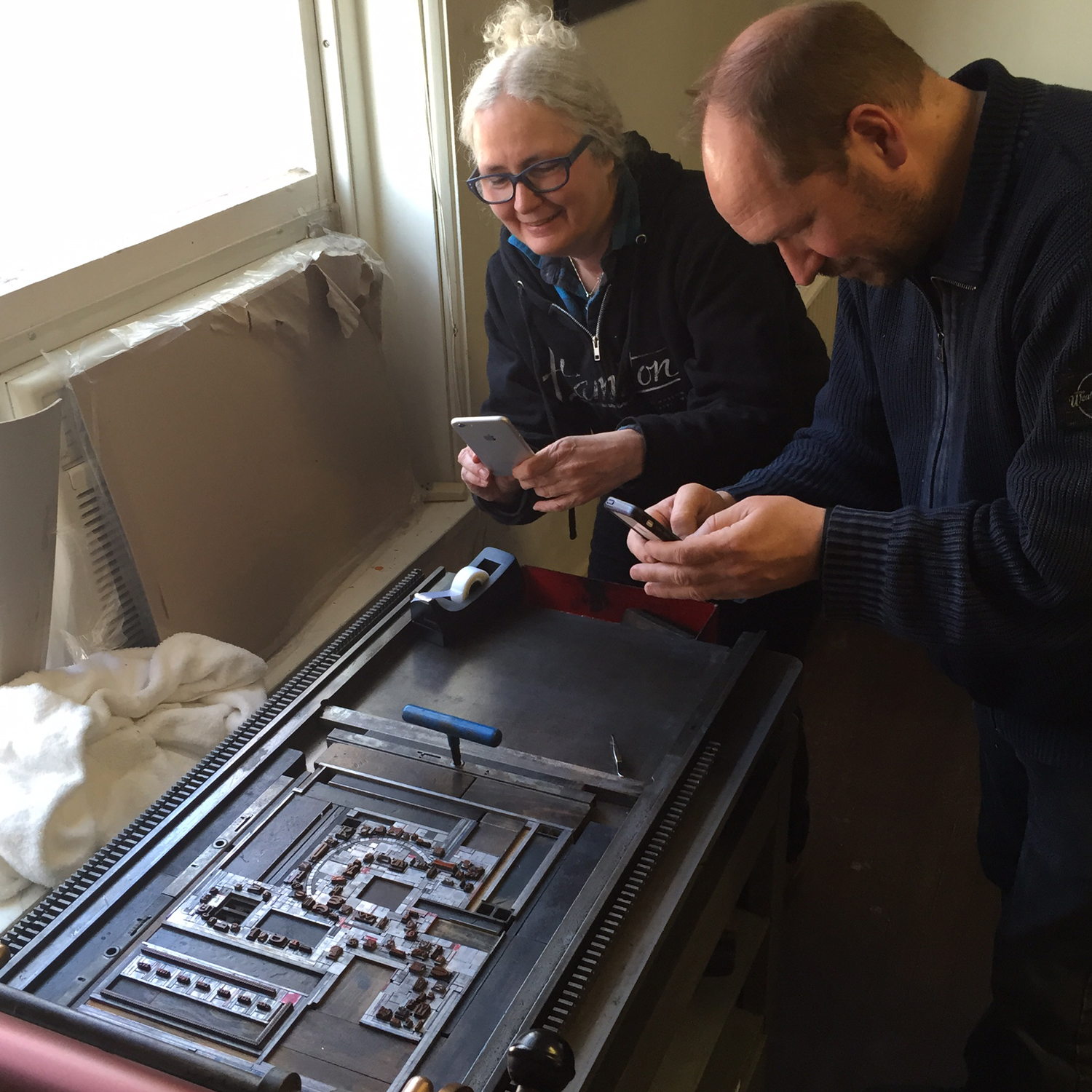
Here's just the second color made up of letters only. Apparently this is pretty interesting as I caught both Virgin Wood Type Geri and Rich, director of the Book Arts Center, taking shots of it.

Here's the sequence for printing, starting with the proof, removal of the second color and then the full version. And of course another excuse to show this wonderfully fat type.
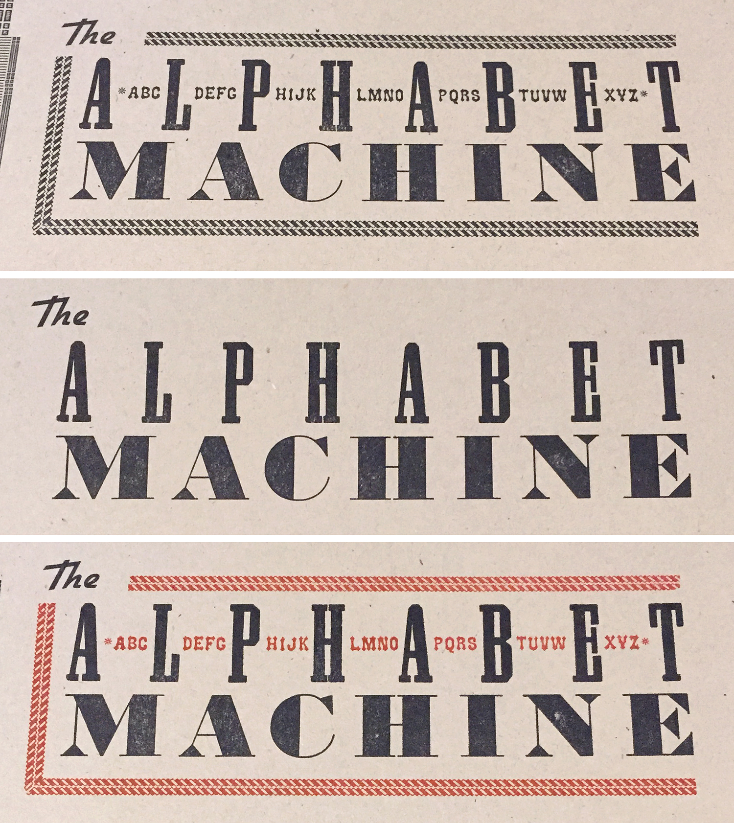
I decided to add a third run to the print in the form of a very light gray. This was to solidify a few areas as well as add a bit of dimension to the machine.


The final print is very satisfying. It is now available for purchase here.

Late nights? I saw a few. But what a great way to spend them.

Throughout the week we hosted a few open studio times as well as helped students with their own printing. It's wonderful to see how much the equipment is being used and I loved working with a new group of printers.

We also played hooky one day and visited the Bixler Letterfoundry which was almost too much to bear. Their large shop is split between meticulously maintained casting and printing areas and I spied on both.
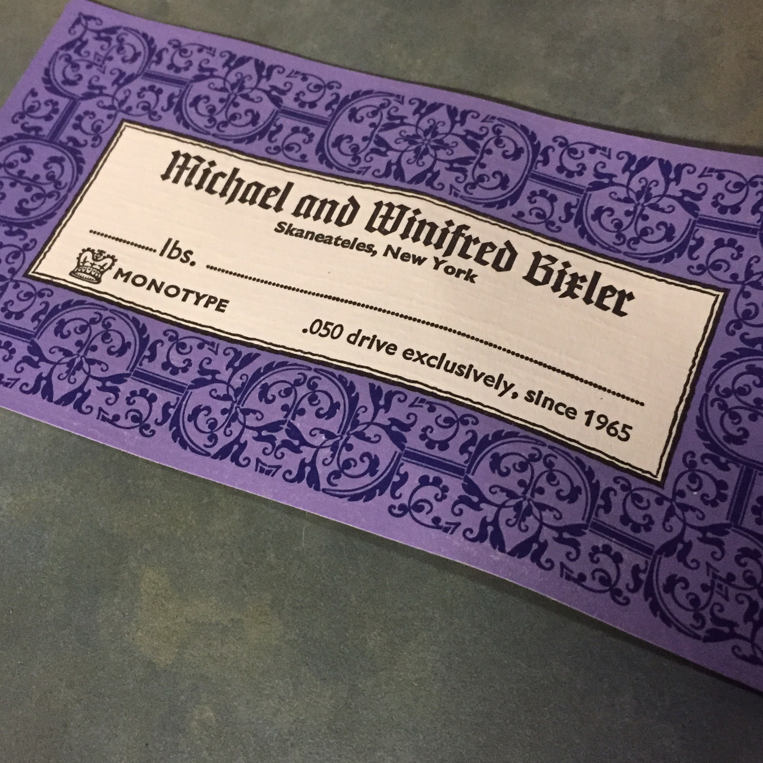

They had two new matrices made for 36 point ornaments so we set those up to cast.
Here's one of the first!


I received a set of both of the new casts, shown here with a new-to-me set received from honorary Starshaped lady, Jessie of Punky Press.


There was beautiful, ornamental inspiration all over the place.

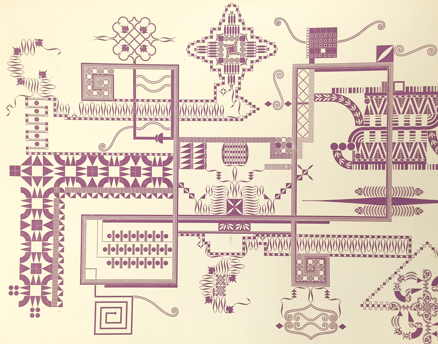
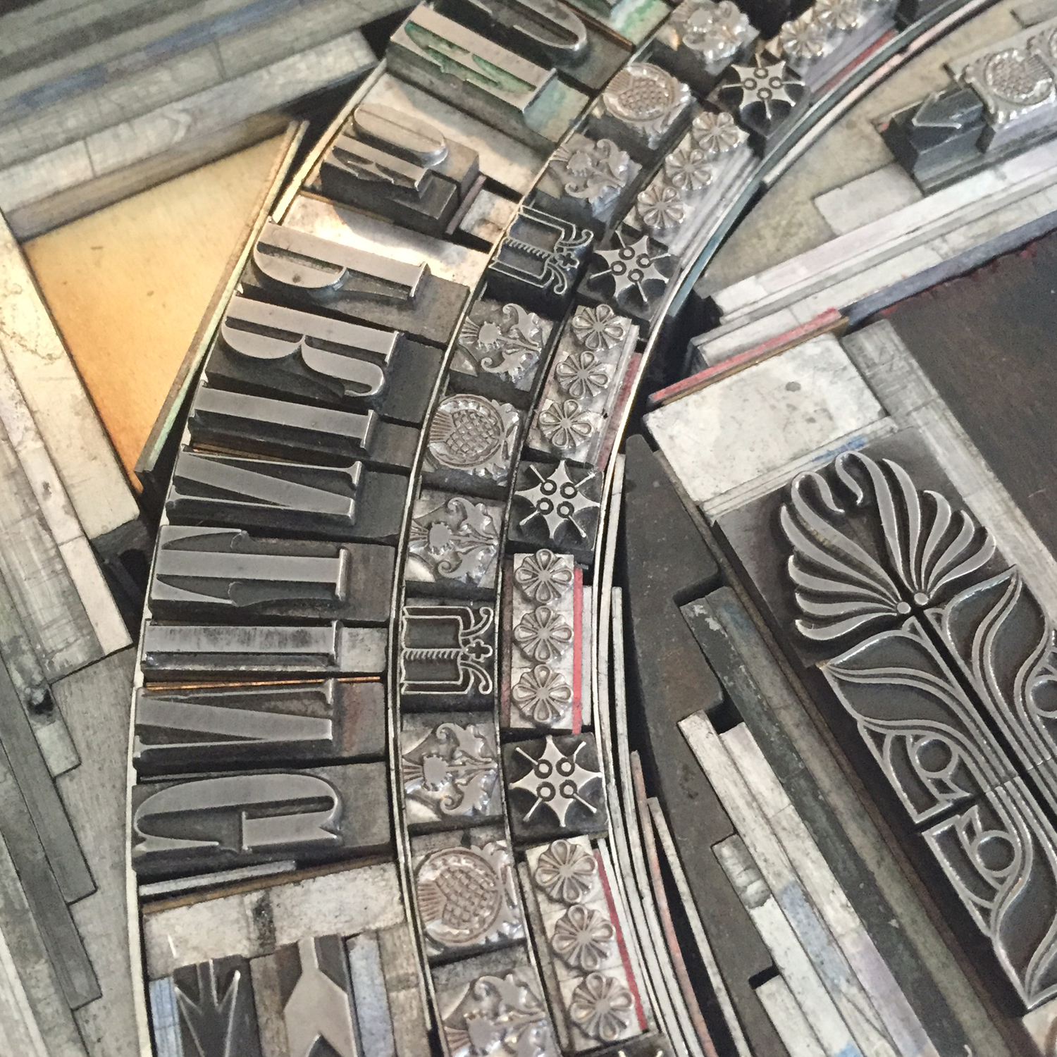
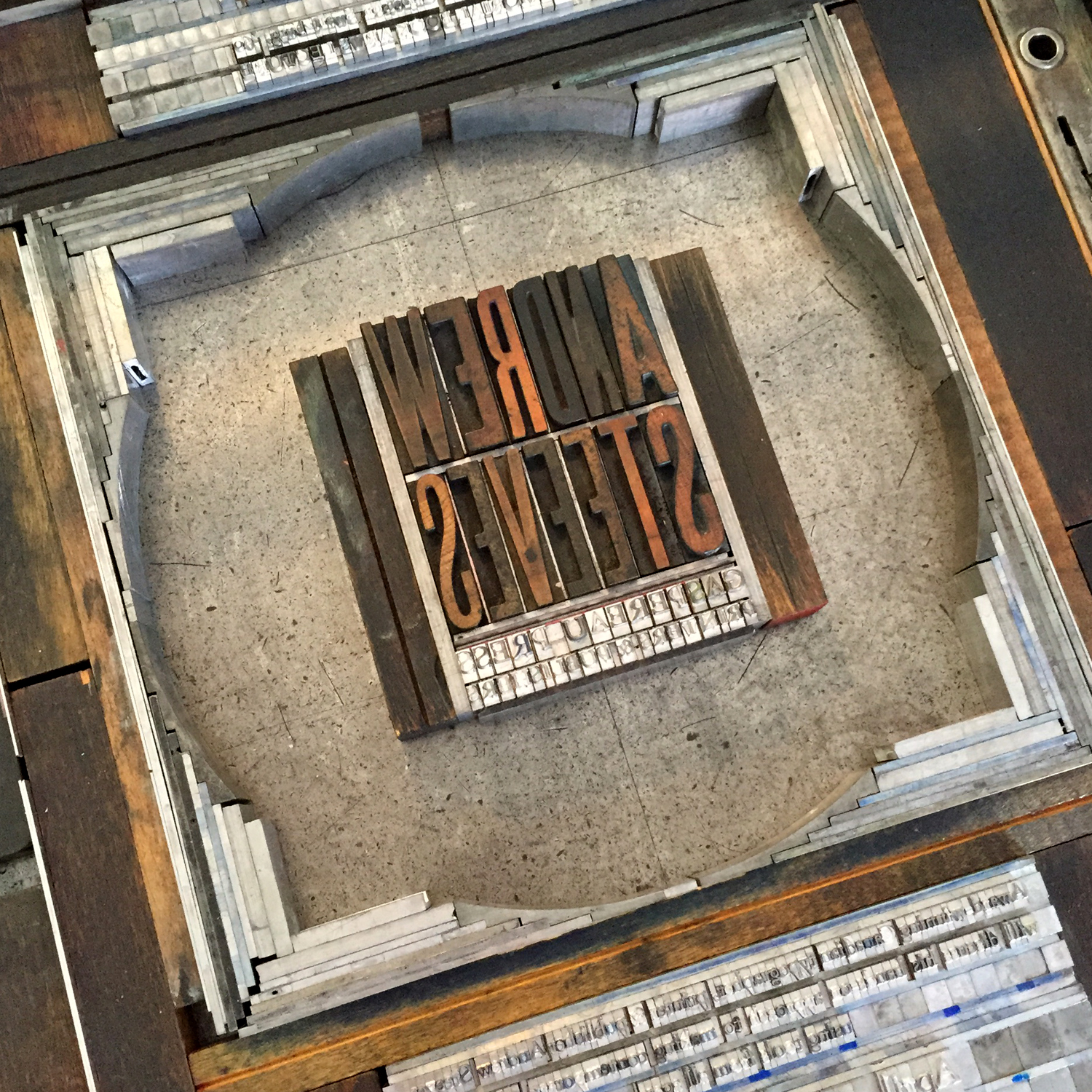
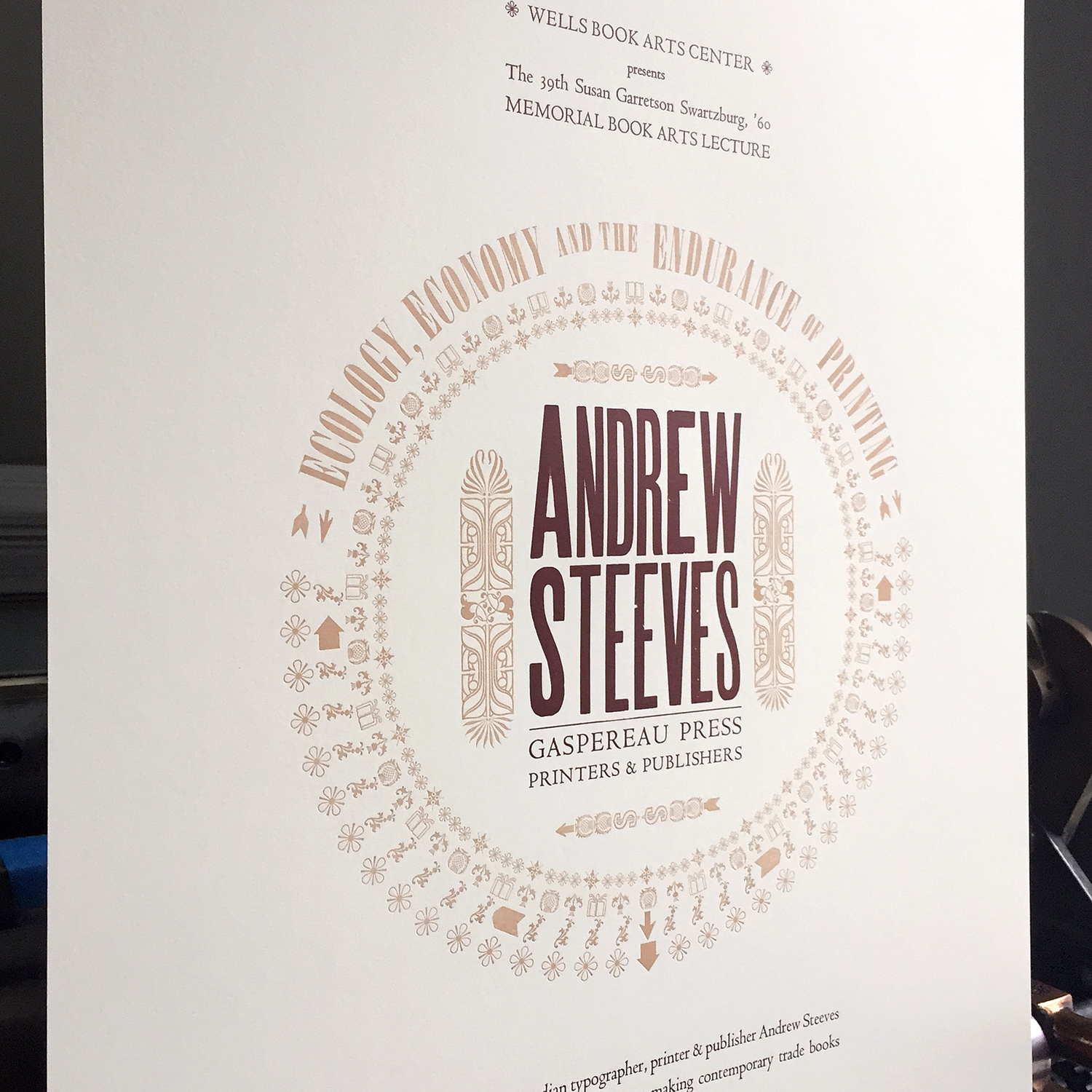
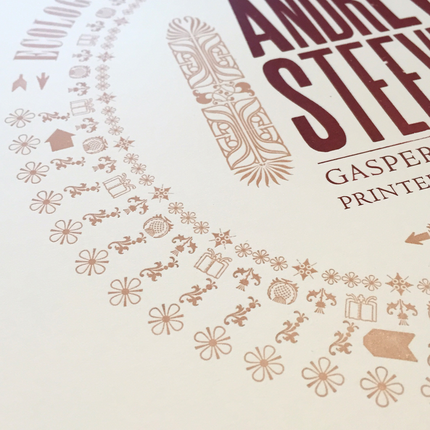
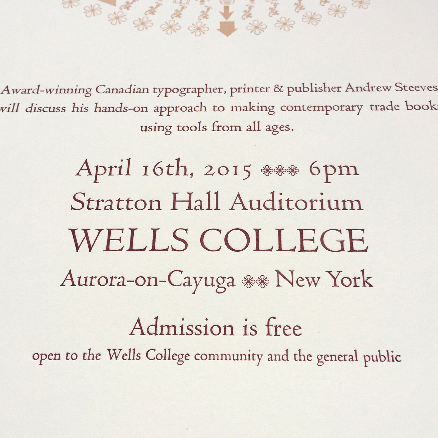
Luckily we had to create another poster for an upcoming lecture, which gave me the opportunity to use more of the Bixler's ornaments. Andrew Steeves' talk on Ecology, Economy and the Endurance of Printing begged for a layout that would pull these elements together in a self-feeding, circular manner. And so this form was born, tying in natural, organic elements with directional and monetary hints at the same time.
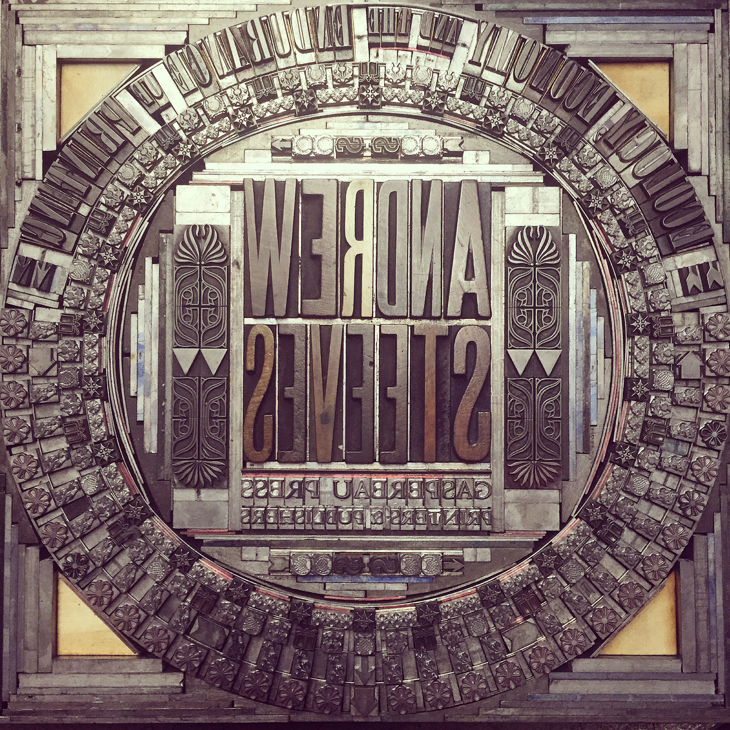
The first carbon proof was pretty tight. Students and visitors helped set all of the supporting text with a run of Centaur.

A straightforward, sexy form.

I ran the lighter circle image first as it would be nearly impossible to pull it out to run the text first.
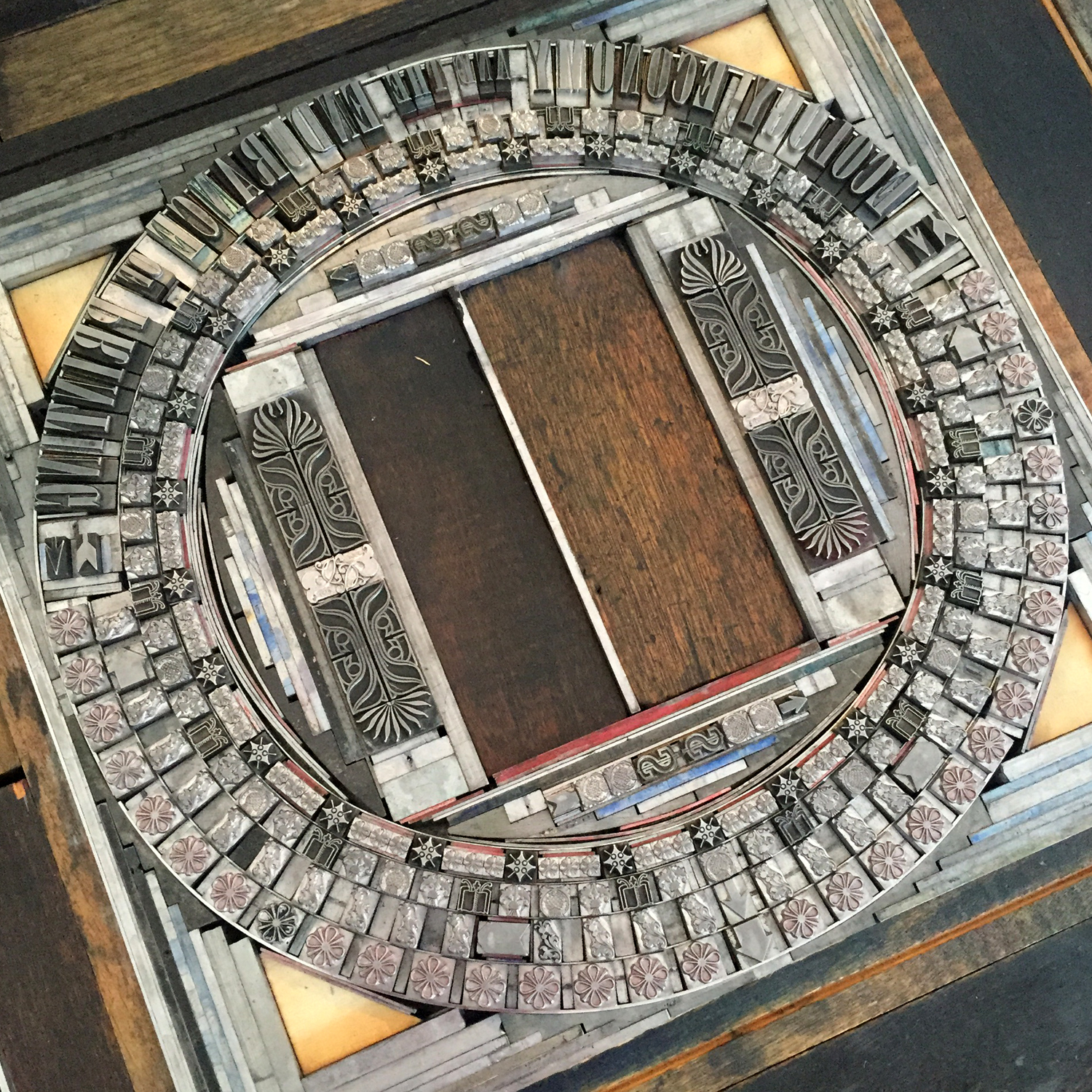

Then the main text was inserted back into the form and I deconstructed the circle right on press.
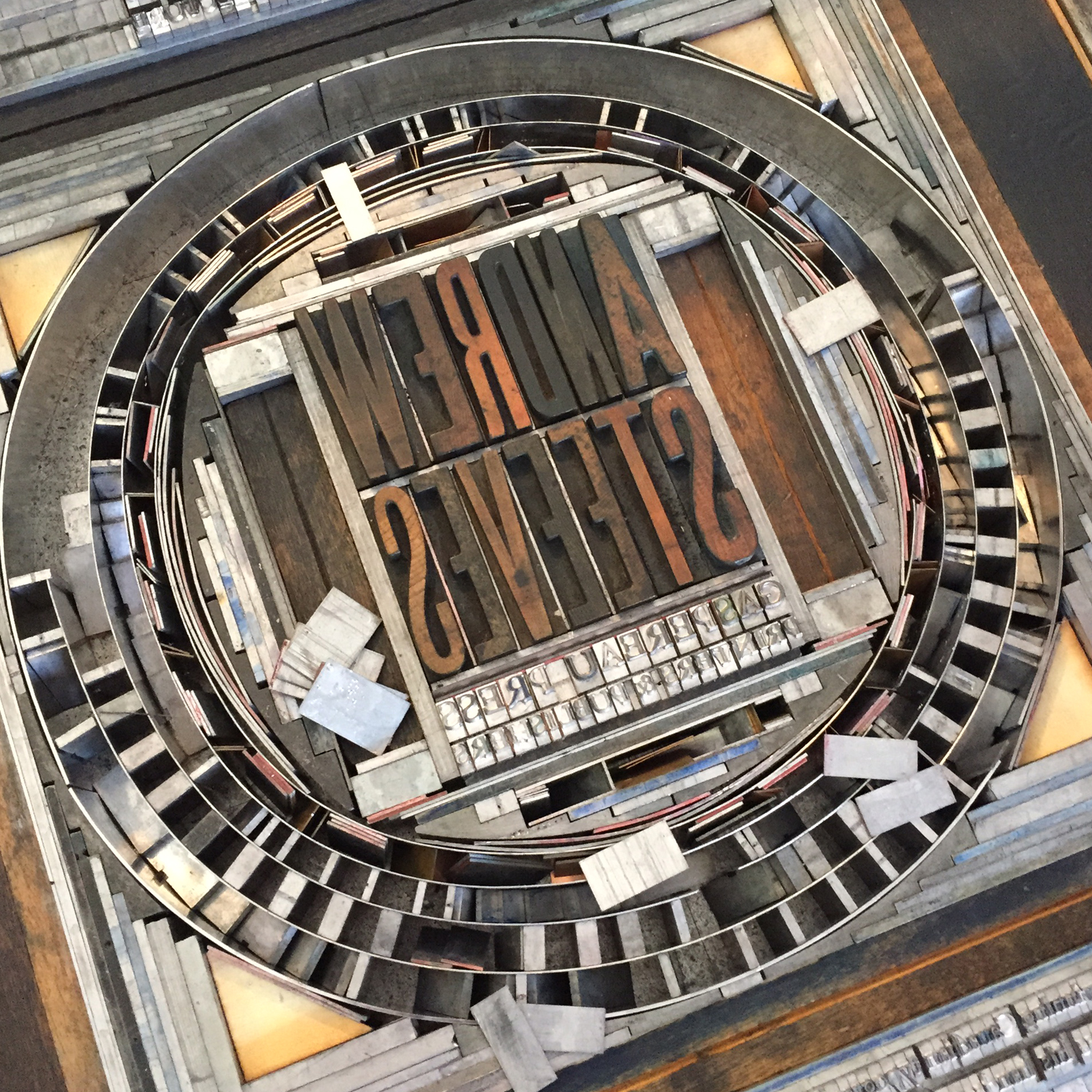
The final print was elegant and straightforward and a real departure from the Alphabet Machine.


I'm so glad I was able to work with two disparate sets of type and ornaments for both prints finished at Wells. Luckily I kept good notes on distribution when all was said and done!
While there are a lot of photos here, I feel that this post is not a well-rounded one. I was fighting a cold when I descended on Wells and didn't take photos of its charming structures or Cayuga Lake. I don't have images of all of the work done with students or the friends that came for my lecture. I don't even have as many shots as I'd like to document the collection itself, though this trip is the first of what will be many. If you want to check it out for yourself, don't miss the Summer Institute program, a veritable feast for everyone interested in book arts, typography and printing.
I do, however, have more fond memories of my visit than I can recount. Like seeing this face that Jenna, the Victor Hammer Fellow, pulled in Rich's direction every day to keep him in line.
And having a 'Holy Hell!' moment while collecting type specimens for my prints.

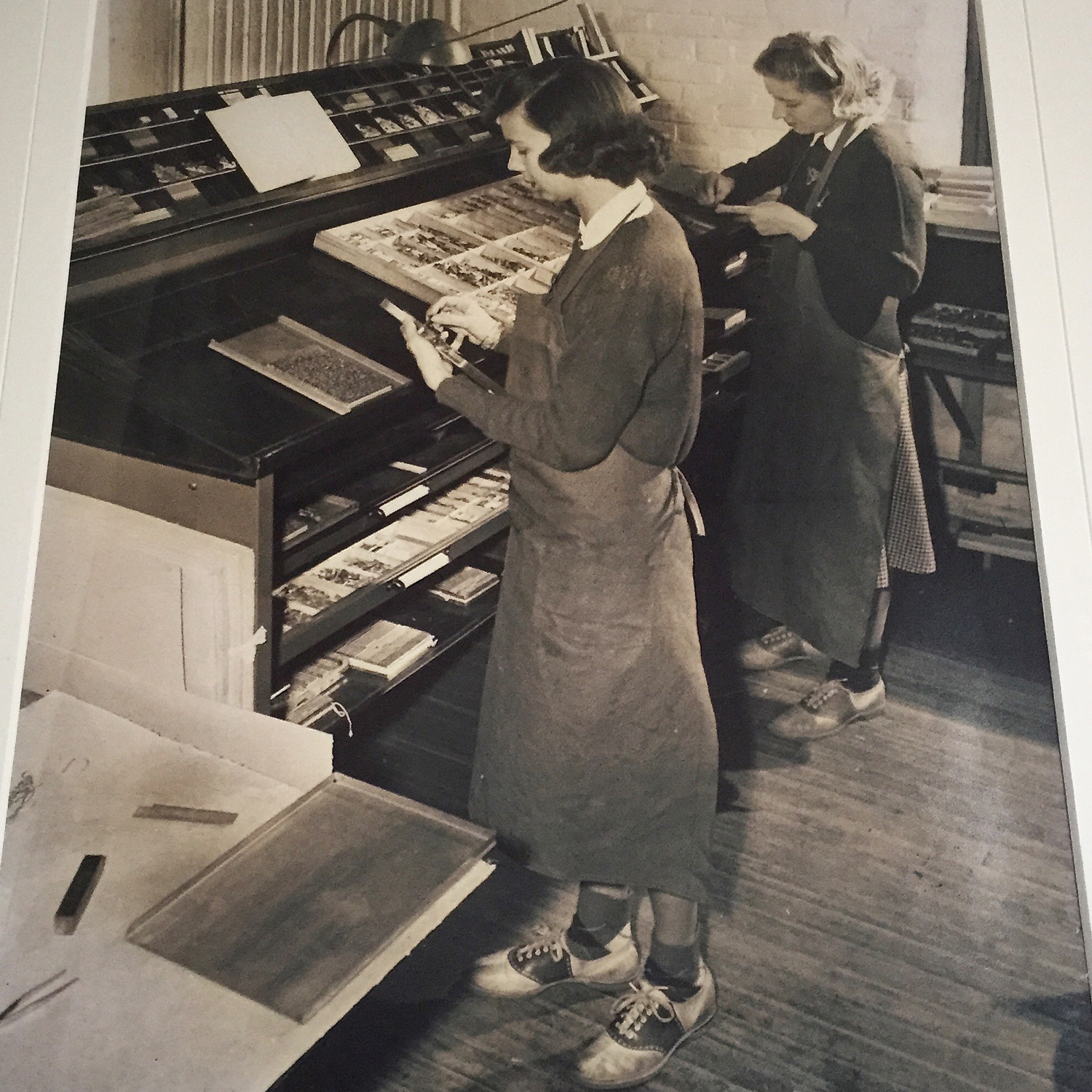
And seeing these classy ladies over the press every day, reminding me of the legacy of the Center.
And this. Because that's how I felt every day I got to work there. Can't wait to get back.