
I came to letterpress printing while studying graphic design and typography but have discovered over the years that many printers have no background in any design fields. This isn’t surprising given the rise of the DIY movement, the wide appeal of letterpress’ tactile nature and its less critical role in commercial printing. You don’t need a degree to get some type, a press and ink and start messing around to create something, anything really, and enjoy it. In some ways, letterpress printing has always been the great equalizer. After all, the private press movement existed alongside the production of trade publications, as did DADA next to the Sears catalog. The means of production was perhaps the only link and the results changed based on the hands into which it fell.
That said, I’ve often been asked how I manage to wrangle metal & wood type into so many different designs for the commercial work that I do. It’s not magic, but rather the reliance on some basic design principles that I learned in school and continue to fall back on. If you don’t have a formal design education or don’t have much experience with 2D design, I highly recommend seeking out a few basic books on the subject. These are just a few in my library; there are hundreds out there and it doesn’t necessarily matter what decade they’re from as, gasp, good design concepts haven’t strayed far in the last 100 years. I can also suggest reaching out to any design educators you may know as they probably have favorites, too.

I’m going to approach three basic concepts (visual hierarchy, grids, typography) in this post and use two wedding invitations as samples. Each has very similar sets of information to convey but with different stylistic approaches.

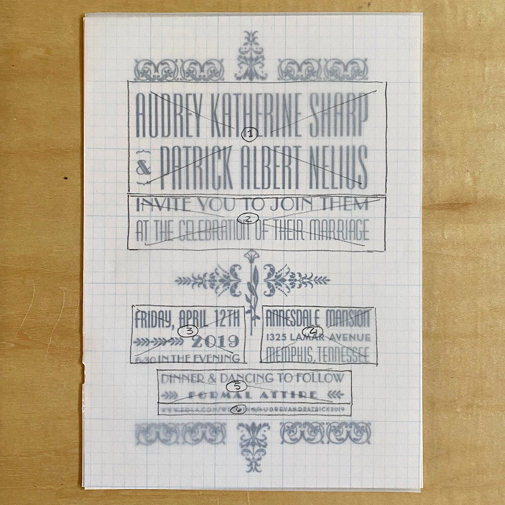
The first approach I took was to establish a visual hierarchy of information with what the client gave me. Below are the two sets of text I was emailed for the invitations. I broke it down and numbered each section based on its importance as this helped me establish the overall importance (often by size) of that text. My invitation designs tend to be quirky with a lot of type styles that indicate a particular wedding collection so this approach helps me start to ‘see’ how the type will fill the space.

Whether I start to sketch an invitation by hand on pica paper or digitally on the computer often depends on the invitation itself. Below I’ve sketched out how the above text fell into blocks based on what I felt their importance should be.

Blocking out where the text sections will go helps to determine where any design elements will be, like the floral borders below, as well as what space you have to work with. For the first invite, I didn’t want the ornaments to overwhelm the type so I looked for type that was more prominent with smaller, accent ornaments. The benefit of blocking this out is that now I’ve limited my selections of ornaments to just the pieces that will fit this sizing and style. This kind of planning helps to prevent you from getting caught up on type or ornaments you think are ‘cool’ but don’t ultimately work for your design concept.
The invite below is from my Wanted! Collection and type that fills the page is important, as is a giant ampersand. Knowing this, I already have a few large ampersands from my wood type collection proofed and scanned to show couples. The ampersand might change depending on the wood type used for their names and the negative space that remains. For tips on mixing wood and metal type at this scale, see this post.
Blocking out your ideas of where the information is going to go (Pro Tip: don’t just do one mockup as this can change!) also helps you ‘see’ the white, non-printed space. Some type has a lot of white space around the letters and this can be as jarring as using a typeface that’s considerably bolder than its neighbors.

I’ve spent years building not only my metal type collection but a digital ‘cheat sheet’ version of it that I can pull from to lay out mockups for clients (I talk a little about this here.) Yes, it involves having digital versions of the metal type and they don’t always align, but they are often close enough to get an idea across. If I don’t have a digital version then I can pull a full black proof of the actual type, scan it and build with that scan in InDesign. Sometimes I will just set the line of type I need, proof that and scan it, depending on if I am designing at home or in the studio.
Below is a selection of the typefaces I grabbed from my digital cheat file for the first invitation. Committing to a style (Deco, 20s/30s type, etc.) helps me limit my selections to these families instead of the full range of 700+ metal faces I have. Giving yourself parameters based on the project at hand involves critical thinking about the idea you’re trying to convey; it’s not just what you want the text to say, but how you want the type to say it.
Aren’t sure what typefaces convey what meanings? Do the research! Get McGrew’s book on 20th century metal type and it’ll tell you when it was manufactured; that’s your first clue as to when it might have been popular. Start to look at ephemera from different decades (including the boring stuff, like 70’s ads in magazines, etc.) What typefaces were used? Follow libraries on instagram for inspiration if you can’t get to them. Going to this original source material is the best way to achieve a certain look and feel. If you want something that feels fresh and modern you can do that, too; your first clue is that 19th century type isn’t necessarily going to get you there, but Eurostile might.

Below are some of the typefaces I grabbed to work with for the second invitation. Looking back now, I don’t love a few of the choices but I was limited at the time to what I had to fill certain spaces in my hierarchy grid. But! The beauty of this constant practice of designing with metal type is that you start to develop a sense of what you actually need in your studio. Instead of impulse buying a wacky 19th century typeface because it ‘looked cool’ you’ll start to see things that fill holes in your collection based on the kind of design work you find yourself doing. I’ve been known to get excited about 8 pt. News Gothic because it filled a gap in a family that will make a certain design style faster.

Establishing visual hierarchy, blocking for positive/negative space on a grid and working with typefaces that play well together are just a few graphic design principles that are easy to pull into letterpress work. Yes, there will always be room for experimenting with techniques in print. But if you want to expand your design vocabulary and understand how your materials and type will work together instead of hoping for the best when you put them in the same form, there’s merit in studying design principles. And digging into these rules and developing the muscle memory for them is often where the most creative explorations for breaking them come in.