
My talented pal Geri, the woman behind Virgin Wood Type, says that her gothic wood typefaces sell exceptionally well. To me that’s no surprise as they offer the widest array of design possibilities. And while there are a ton of ways to jazz them up, here’s a fun option with linoleum cuts.
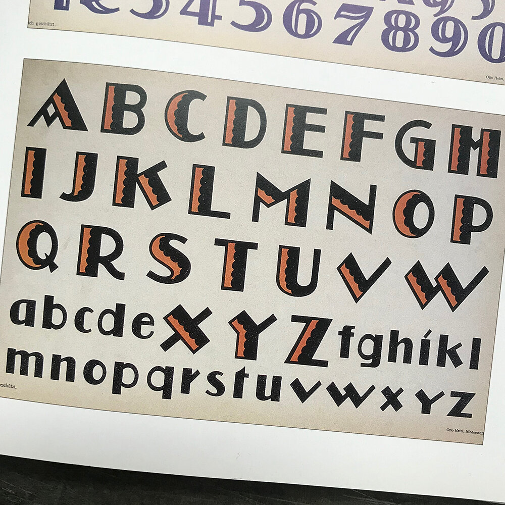
I’ve always admired the way these Deco alphabets had dimension.
Using linoleum is an easy way to create a second color with gothic type. After choosing type and tweaking the letterspacing, I pull a carbon paper proof.

Then I use tracing paper to sketch out a design that will be the second color. This is the final design but it’s easy to try a number of options to see what you like the most. I recommend looking at type around you, whether it’s in books or in the alley for ideas on ornamentation, pattern and shading.

After reversing the design, I transfer the image to linoleum; this design is pretty easy so I used transfer paper to get it onto the linoleum for carving.

Sweet!

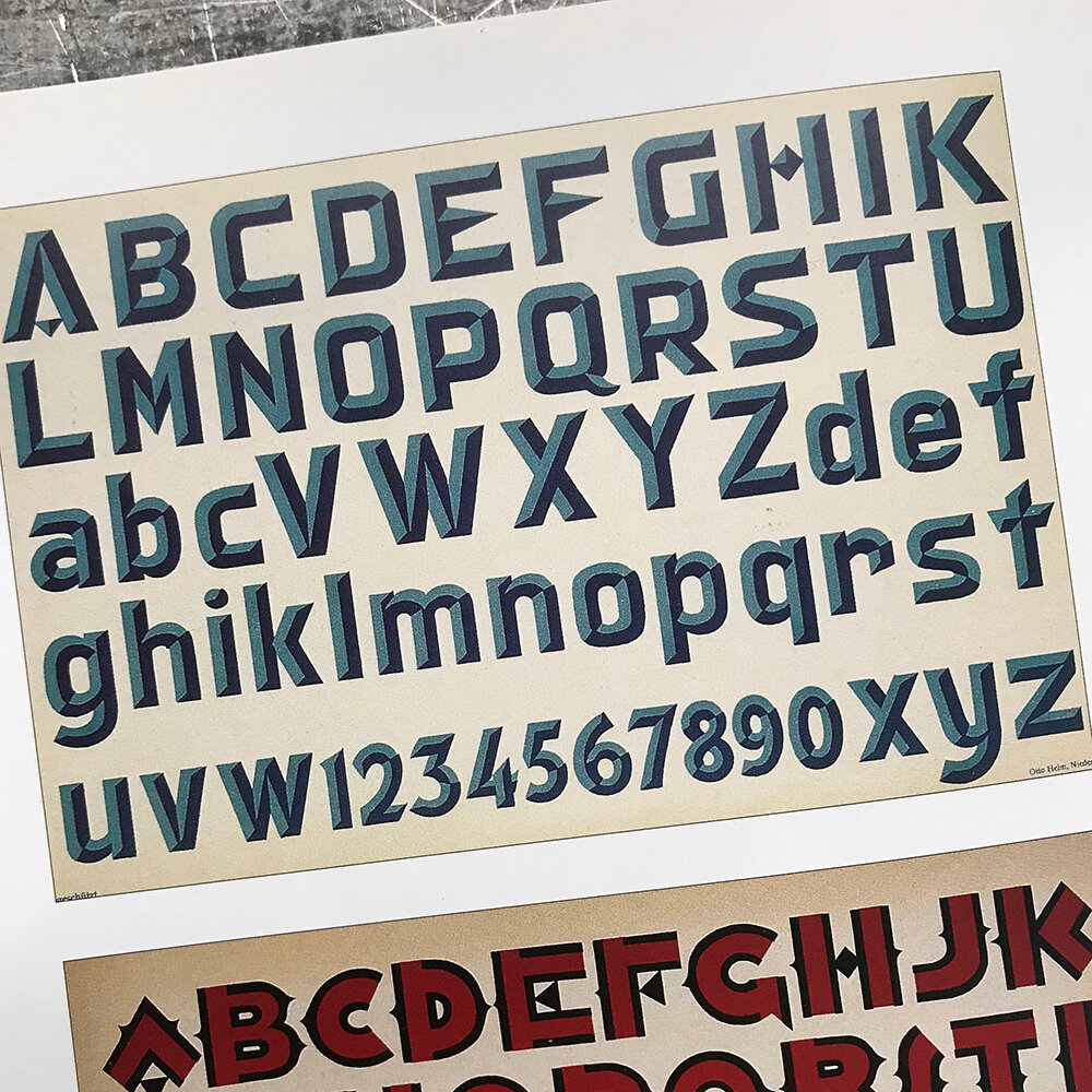
Here’s one more example of using linoleum to create a second color, this time with more angular strokes.


Yes, there are many ways to create layers with existing wood type but I love linoleum because it’s very hands on and not perfect. In this way I think it can soften angular typefaces. So don’t overlook the simple, understated gothics of the world; they’re the workhorses of any shop and with a little imagination, can be the entertainment as well!