
One of the many things I love about setting metal type is the puzzle of making disparate sorts come together. And like I always say, understanding the math makes it come together faster.
Inspired by recently winning the ticket lottery to see Hamilton, I’ve outlined a simple way to think about combining different sizes of type.

After sketching an initial idea for how I’d like it to look, I chose my News Gothic family to realize it. If you don’t have a lot of experience combining typefaces, it’s great to start with a family because they were designed to work well together. And various sizes will add visual dynamic to the printed piece.

I can then go into my initial sketch and map out sizes. Next to this, I’ve drawn out what space the various fonts take up so that I know what linespacing I need. Adding the incorrect amount of leading between the lines will throw off the ‘square’ of the block you’re setting.
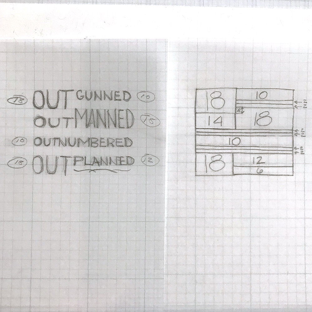
Now I can set the type and see how it lines up to my initial sketch. When using different sizes on one line, I like to line up the baselines or the top of the capitals. This allows for a smoother transition between different fonts.
And if you’re setting any of the type solid, i.e., with no leading between it for aesthetic reasons, there is the possibility that one line will bind on the one below it (or a pesky thin space will want to travel without leads to hold it in place.) Then I suggest cutting ‘leads’ from thin paper to put between the lines of type to keep them separate without increasing the line spacing by much.

The first carbon paper proof revealed that a little more space was needed between the lines indicated. The proof below it was just right. I love carbon paper for the ease of proofing quickly; the print quality isn’t important until you’re set and ready to go.

Switching up sizes for a design is an easy way to add interest to a layout and it doesn’t need to be done in the style of a ransom note. Up your setting game and give it a try!
