By popular demand, this is happening! This will be the inaugural class, and I hope to have more throughout the year. Email for more info!

Your Custom Text Here
By popular demand, this is happening! This will be the inaugural class, and I hope to have more throughout the year. Email for more info!
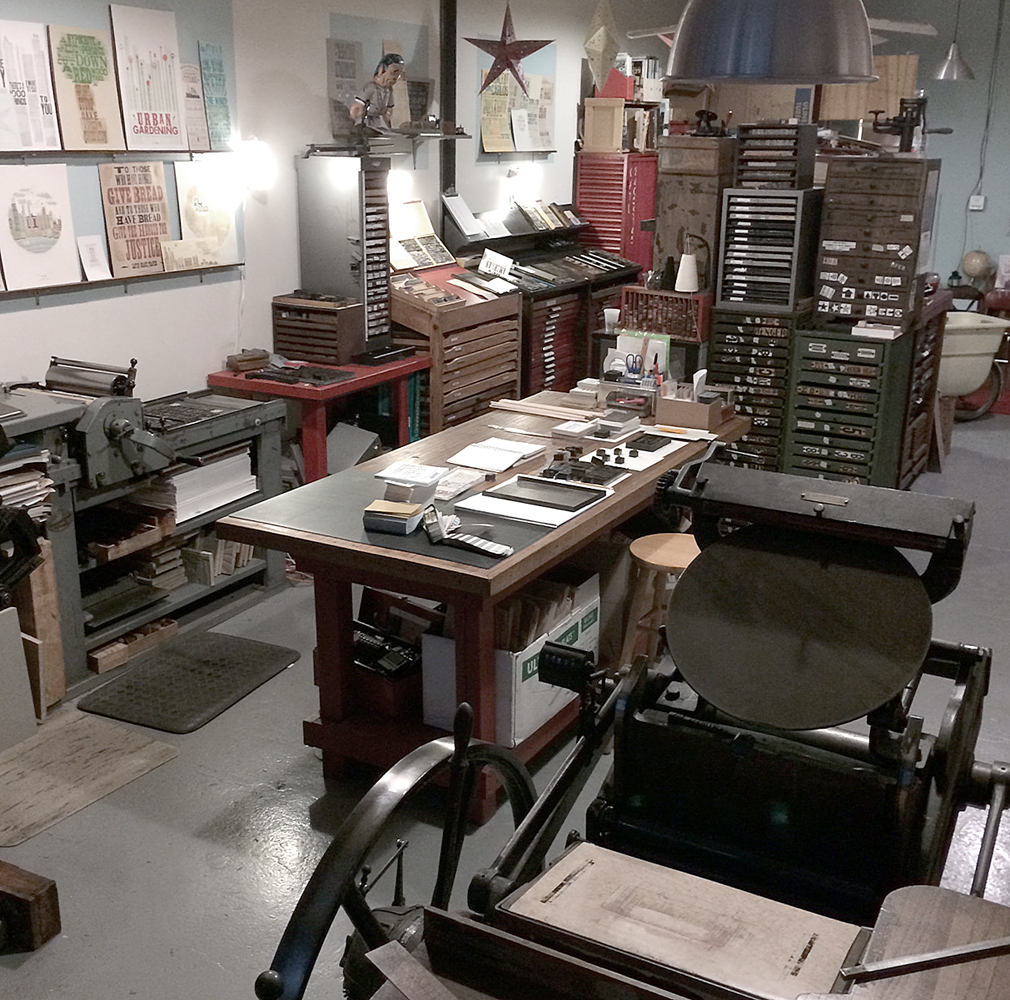
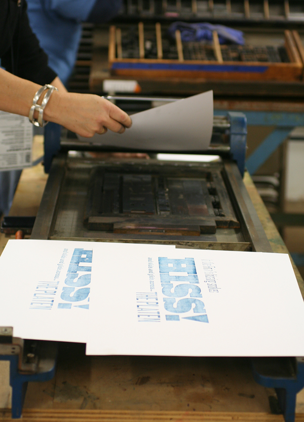
Way back in 1996, I started working at Fireproof Press, run by John Upchurch and Matt McClintock, known for producing music packaging, posters, business cards and other oddball print pieces, mostly for Chicago-based artists. The third floor workspace, shared with Screwball Press, was hot in the summer, cold in the winter, scattered with press bits and flying sheets of paper. I loved every minute of my time there (almost). Everything was made better with root beer. John closed Fireproof in the winter of '98, and I like to think that had he not done so, I'd still be there today. Forced out into the world, I got one press, and then another, and in the summer of '99, Starshaped Press was born, at least in name. I took over a number of jobs that had been intended for Fireproof, and then began a two-year stint at Columbia College, alongside John in his new position. During that time I grew the business and set up our first studio, about 385 sq ft in the lovely Ravenswood area, where I worked exclusively for two years after leaving Columbia. In the summer of 2003, the studio moved to a bigger, brighter space also in Ravenswood, where the work continues today. Here's what an average day look like:
 To celebrate the 15th year of the studio, I've planned a series of prints to showcase some of the fine type in the studio as well as the ideals that have guided the work of Starshaped over the last 15 years. The first print pulls a quote from the Barnhart Brothers & Spindler type specimen book of 1923 and is printed in three colors.
 The first layer is printed using the back sides of wood type, allowing the texture of the wood to come through.

 The border elements are composed of ornaments from different collections, mostly cast at Skyline Type Foundry.
 'Tradition' and 'Progress' were printed with wood type that's in pretty rough shape. But I wanted to contrast the rustic aspect of this 100-year-old type with some of the newest metal type; 'typographic art' is set in Runic, a brand new cast and not used before this project.


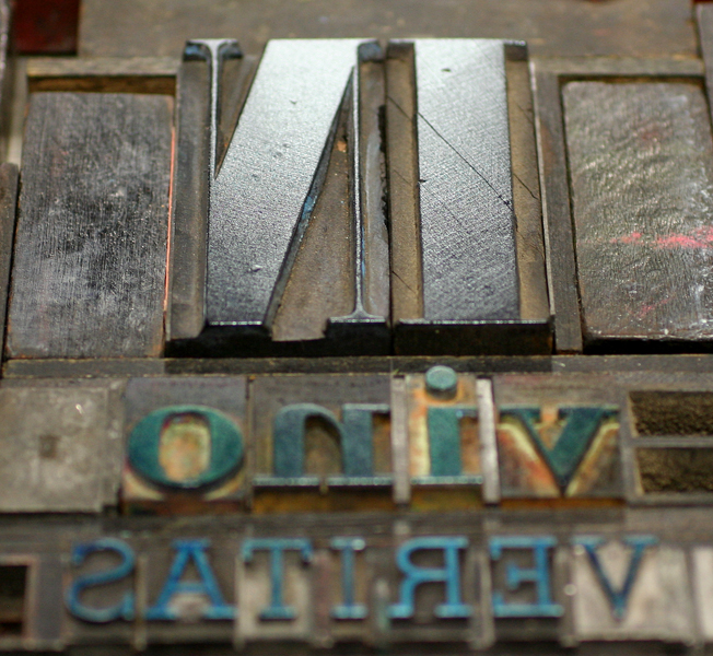
 Where did the time go? These four typefaces (Railroad Gothic, Onyx, Engravers Old English and Stymie Bold) have all come to the studio collection from different sources over the years.

 Here is a full shot of the final print. I wanted to deconstruct the traditional text-heavy broadside of the late 1800s while maintaining the 'more is more' approach to typesetting of that time. I felt this quote was particularly forward thinking, especially given that it appeared in print in 1923.
I am sending the print (along with ones to come this year) to the printers and designers that I admire, and that have championed Starshaped over the last 15 years, as well as folks that have a passing interest in letterpress and typography. There are still many copies left in the studio and I'm happy to send one to anyone that would like to have it! Just email with your info. And thanks for the support. 2014 is going to be a great year in the studio.

It's not often these days that we have an opportunity to build an entire stationery identity, so it was a delight when Jeff Story called in need of pieces to represent his new law practice. He loved the simple red and black sans serifs often used to represent the work of poet Kenneth Patchen and sent this image for inspiration:

Here are the three pieces we created, printed on lovely Oxford textured paper from Neenah.
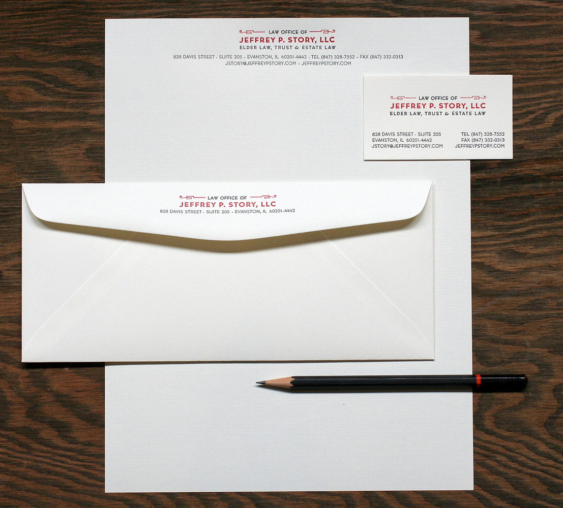
 Bernhard Gothic is the typeface that played a big role in this design, in various weights. I often refer to this as the 'house' typeface at Starshaped, as there is a large run of it in the studio. It was a favorite back at Fireproof Press as well.

The disappointing part of this project was that we were one 'L' short of setting Jeffrey's full name in this particular size. We played around with similar options but none seemed quite right, so we had to bite the bullet and order a magnesium plate. Hopefully we'll have more of this particular font the next time we're printing this job! I love this image which shows the mashup of new technology (the plate) and a very old (19th century) set of ornaments. In this photo, the ornament appears to be in pretty rough shape; it actually prints quite well despite its age!

 I find really traditional cards printed in the studio to be particularly enjoyable as they blur the lines of the time period in which they were created; these could have been done last month, or 50 years ago. Clean lines are always in style!

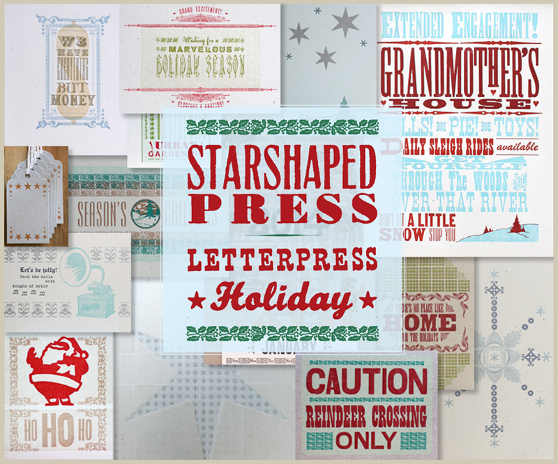 ...the best printing time of the year! I like to think that this year we've really put together a wide variety of cards, prints and posters that highlight myriad letterpress techniques available with a great type collection. From new Artistic Prints to patterned cards to kitschy wood type prints, there's a little something for everyone.
One of my new favorites is this print that we threw together for the open house and then liked so well it got an upgrade to two colors that's ready to frame:
...the best printing time of the year! I like to think that this year we've really put together a wide variety of cards, prints and posters that highlight myriad letterpress techniques available with a great type collection. From new Artistic Prints to patterned cards to kitschy wood type prints, there's a little something for everyone.
One of my new favorites is this print that we threw together for the open house and then liked so well it got an upgrade to two colors that's ready to frame:
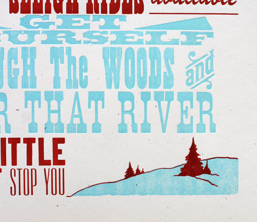
 Consider it a gig poster for Grandmother's House, and a quirky take on the classic holiday song. There are a lot of fun details, including my first use of these great Moore Wood Type ornamental rules and some endearing hearts.
 The image at the bottom is an old cut that's been floating around the studio for years. This time around, I made it two colors by adding the light blue linoleum cut. Grandmas everywhere will approve!
 I love the sweet simplicity of the form:
 Another print for the holidays is the next in our series of 'Artistic Prints', which glorify the techniques and typefaces of the 19th century.
 There are some lovely details in this one, from the type on curves to the details hidden in the 'marvelous' typeface. The background is a border that's stacked to create a texture with a very subtle pattern.

 Another lovely form! 'Holiday Season' is set with initial caps, hence the bouncing baselines.
 If you've got your gifts and you're ready to wrap, our classic wood type wrapping paper is available, as are these new tags hot of the press. There are cityscape tags, as well as manicules (printer's fists) and stars, all printed in bright colors on diecut kraft card stock. They're strung up with butcher string, and ready to go.


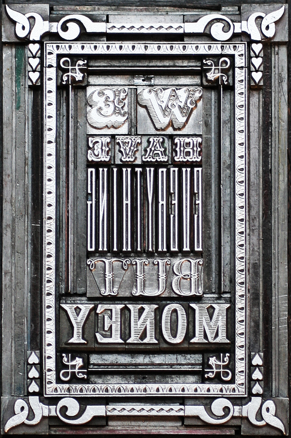
 And though it's not specifically for the holidays, I also finished another Artistic Print recently that's near to my heart. Inspired by the comment of an elderly individual that lived through the Great Depression:
 And it's so true. I wanted the ornate type and ornamentation to resemble that found on paper money. The 'everything' type is actually designed to function as monogram type, but was just the tall and skinny thing needed here.
 Love the shadow on that scroll type, as well as the slight bit of wood texture in the dollar sign. It's a perfect gift for your sweetie.
 And like all of our Artistic Prints, there's an image of the type form included with every one.
 Gift wrapping can be one of the most fun parts of gift giving, unless it isn't. If that's how you feel, we can gladly wrap our prints, posters, cards, etc. for you and ship them direct to the receiver, along with a little tag and note. Just let us know when you purchase something from the shop and we'll handle the rest.
As always, thanks for supporting letterpress at its finest! We source all of our paper in the midwest and continue to use type that has existed for decades, if not centuries, making us one of the most eco-friendly American printers around. And if buying local is your thing and you live in Chicago, be sure to stop by and see us at the Renegade Holiday Craft Fair, December 7th and 8th. The selection of beautifully handmade goods at the Fair will surely mean that you can finish your holiday shopping in one weekend.

Of all the wonderful things that Fall brings, one of the most endearing is the annual gathering of printers and type enthusiasts that flock to the Hamilton Wood Type and Printing Museum in Two Rivers, Wisconsin. I've written about the museum here many times, and it was a treat to attend our second Wayzgoose there. The museum has had one hell of year, having to move from their location in the original Hamilton building to a new spot overlooking Lake Michigan. And they've done it up in style, with this classy sign painted with the humbling talent of John Downer.
 Let's face it. The best thing about getting to Hamilton is the folks we meet. This is the only time during the year that I get to see some of the printers and type enthusiasts I admire from around the world, as well as meet new, up-and-coming craftspeople. One of those I greatly admire is Tracy Honn, from Silver Buckle Press in Madison, who provided this year's incredible poster:
 More on that later. After first arriving at Hamilton, we had a lovely dinner with old and new friends. One of the old friends was Scott Moore of Moore Wood Type, along with new friend Phil Moorhouse, all the way from Australia. Here they are enjoying dessert and sketching details of wood type production.
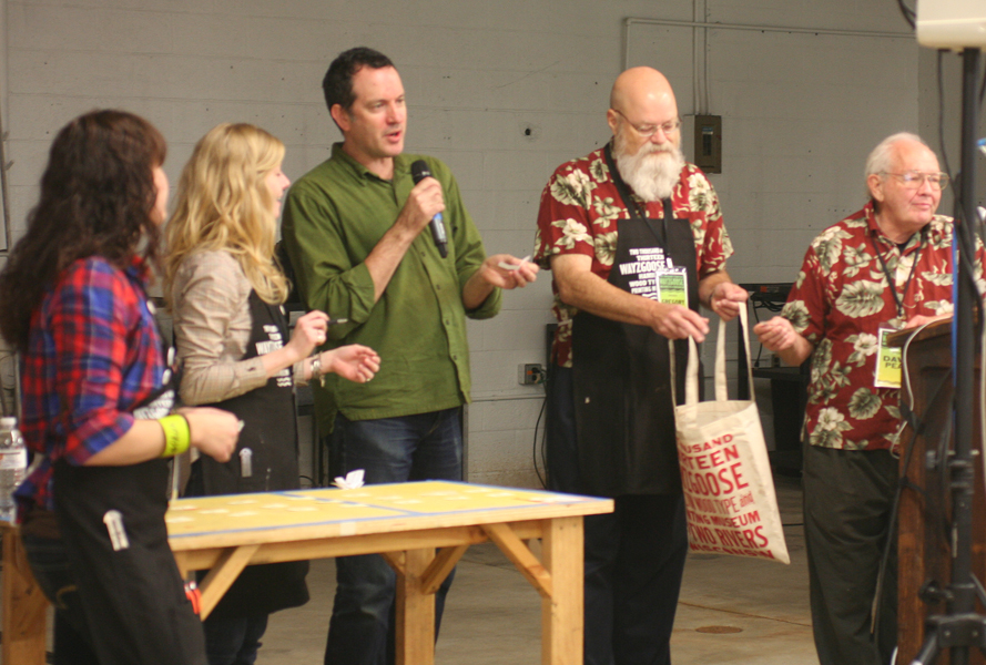
 Friday was workshop day, and I taught Mastering Metal and Wood Type Composition, hoping to help the attendees improve their game with typesetting, really look at spacing issues and work with various typefaces in one piece. The museum's new space is incredible, and a better fit for the direction in which they want to go. There are distinct areas set up as 'classrooms', and this was our area, outfitted with a number of sign presses and a substantial run of wood and metal type:

 Here are a few of the happy printers and prints from the day. The first print immortalizes one of the statements I made while introducing the concepts we'd be covering in the workshop.

 Talented and all around great guy, Brad Vetter, helped out in the morning. Here he is assisting with hand burnishing some of the peskier type from Arlene's form.
 Clint and Tahlia made the trek all the way from Australia so they could use this giant quoin key.
 Amy took on a simple form in the afternoon and it was very successful. She nitpicked the justification for some time and the result really paid off.
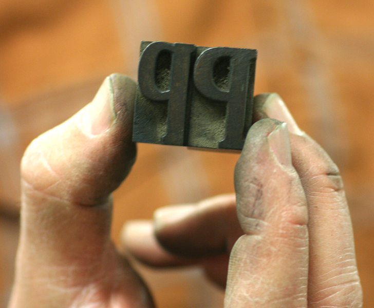
 Which one is a 'P' and which is a 'd'? We printed a handful before catching it!
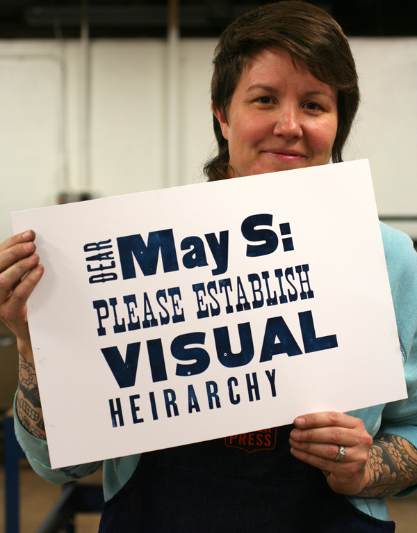
 A print that takes my 'establish a visual hierarchy' rule to heart:
Saturday was lecture day! This time around, I was speaking about Documenting Type Forms in the studio. Here's one of the three enthusiastic groups that sat in on the discussion. Notice anyone intimidating in this crowd? Yep, I was sweating.
 Three of those intimidating people are right here. David Shields from Virginia Commonwealth, Paul Brown from Indiana University and Erin Beckloff from Miami University. Too much typographic knowledge for one photo. I'm surprised the camera didn't pop a spring.
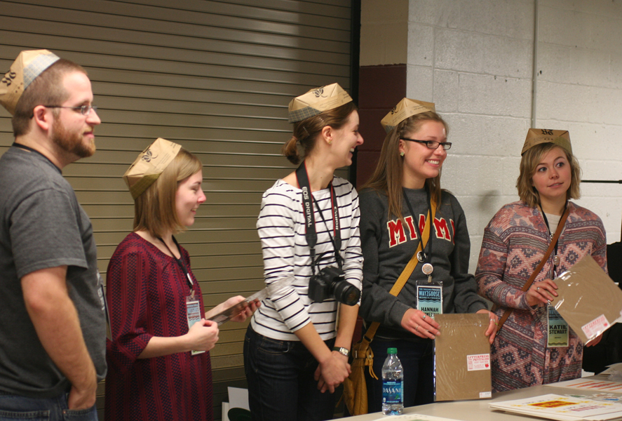
 Erin also brought this energetic crew of Miami students with her, in all their matching t-shirt glory.
 While I was talking and answering questions, Jo was busy in the back printing up a storm! We packed her little homemade press and she created a number of pieces (hand illuminated, of course) for the Sunday print swap.

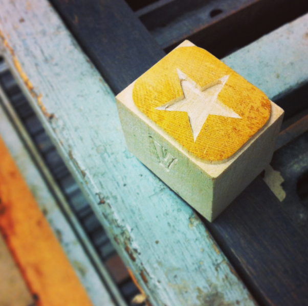
 I had the pleasure of meeting Geri from Virgin Wood Type... finally. You know you're in the right place when a little gem like this ends up in your apron pocket.
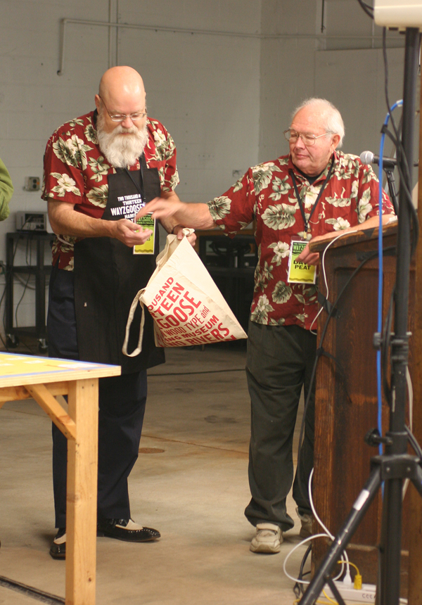
 Sunday morning presented one of the more thrilling moments of the weekend. The incomparable Dave Peat brought a large number of items to be given away as door prizes. You can see the crowd here, anticipating his talk about how different type forms can be created and the following giveaway.
 This entire table was set up with prize items. Books, presses, type, mystery boxes and candy... If these items were 'throwaway' to Dave Peat, imagine what his personal collection looks like.
 Greg Walters, another fine APA member, was on hand, along with Bill Moran and Stephanie Carpenter, to call names for the prizes. It was agreed that this was the best form of The Price Is Right. Come On Down without having to guess at pricing!
 Our new friend Tammy of Red Door Press from Iowa scored some large wood type.
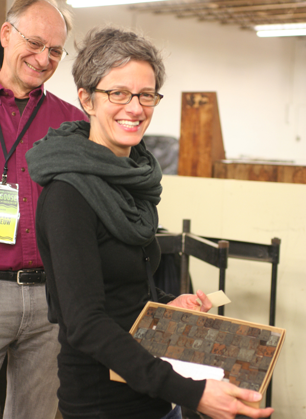
 Judith Poirier also scored some lovely type. And looks who's looking on... it's John Risseeuw, an incredible papermaker and printer. I was delighted to meet him back in June at the Phoenix Wayzgoose.
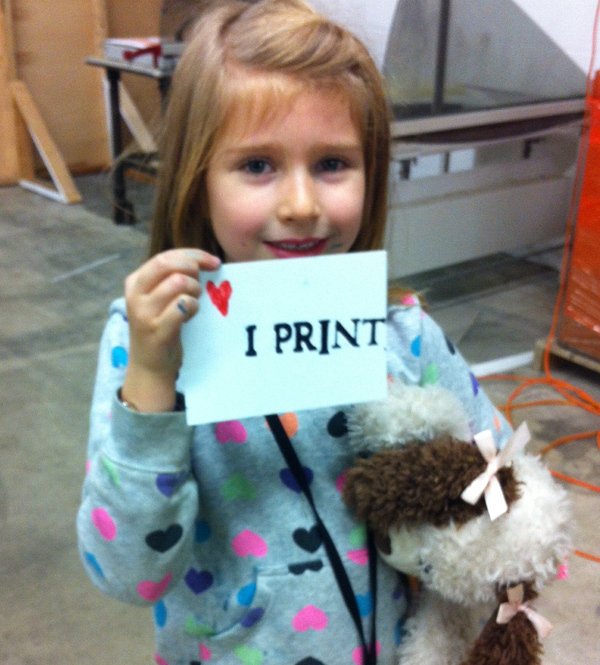
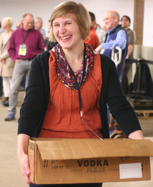
 Look who else scored something great! Jo picked out a small card press and couldn't have been happier. The dolphin was also a 'prize', so it was a good morning to be six years old.
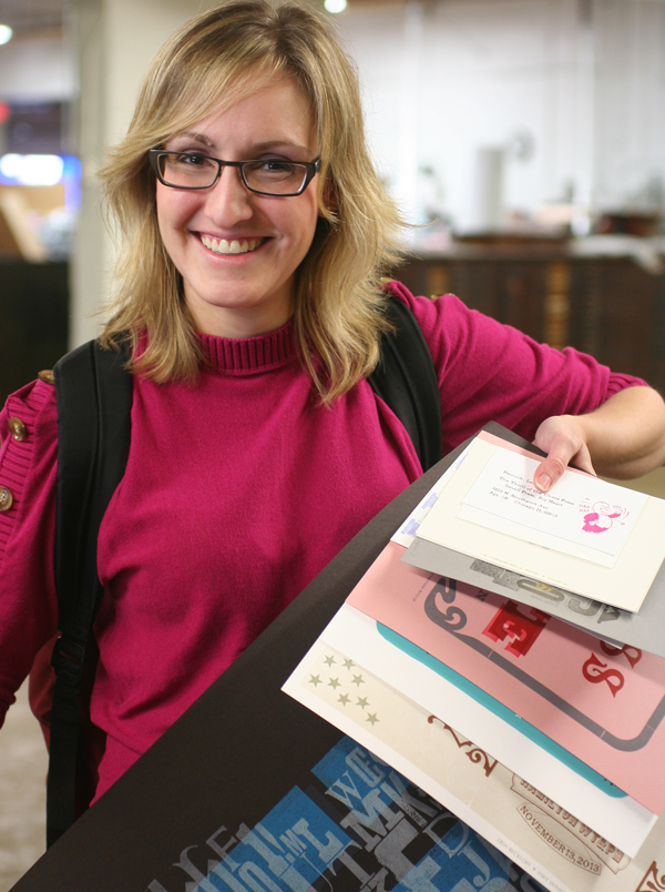
 Following Dave Peat (though it's hard to do so), was the annual print swap. All participants grabbed a table on which to spread their wares and got an opportunity to talk about print projects, techniques and interesting tidbits related to the craft. Here's our friend Lorraine with a growing bundle of awesome samples.
 The Miami students had a number of fun things to share, besides just smiles.
 And here's Andy, the other half of Red Door Press, with some awesome prints and bookmarks to coordinate with his dapper printer's cap.
 Jo always has a keen eye for art that's worth investing in, and she didn't disappoint this time around. Here she is with her first Dafi Kuhne print. And of course, Dafi himself, who led experimental chipboard type workshops on Friday.
 A gratuitous shot for me, it's Matthew Carter holding one of our type specimen prints. Fuzzy photo? Sure. But you'd shake, too, if a MacArthur Genius was holding something you made.
 Two of my favorite ladies in print, Martha Chiplis (who co-authored this informative book), and Jessica Spring of Springtide Press. Personal heroines.
 Loved these little punch out kits for building letterforms!
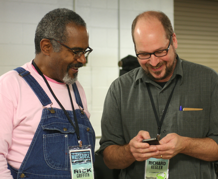
 Amos Kennedy Jr. (don't let the tag fool you) and Rich Kegler take a print break to visit that new-fangled technology.
 More APA members! Bob Piontkowski and Rick Von Holdt dressed for success on Sunday.
 It's always hard to say goodbye and head home. Jo had a great time hanging out with my two helpers for the weekend, Brad Vetter and Dan Elliot. And yes, Richard Zeid photobombed the second image. But we're sure glad he did.

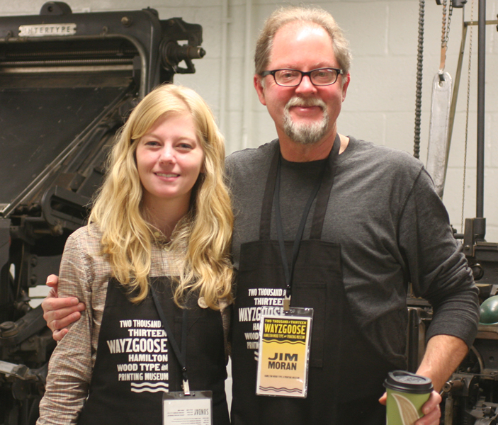
 And of course, the brains and heart behind the entire operation, Stephanie and Jim. The pure love for what they do coupled with a breakneck schedule for opening the museum cements the fact that this place is around to stay.
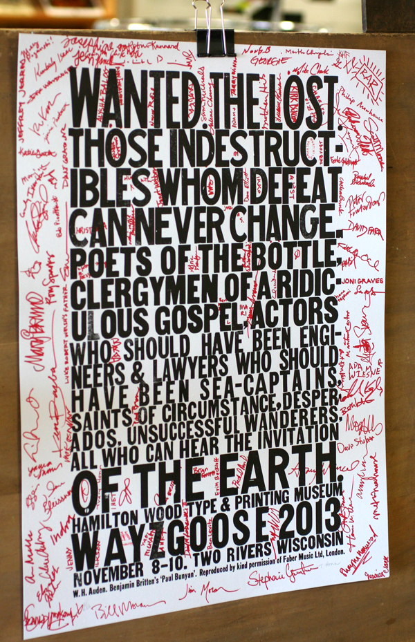
 By the end of the weekend, this was the Wayzgoose poster.
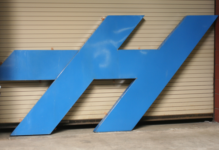
 H. A little remnant of the old building, now living in the new. Yet another reminder that the building may change, but the spirit of preservation and good old-fashioned midwestern gumption will guarantee the success of a project, no matter how far fetched it might seem. While I like to think that we'll be at the museum again before the next Wayzgoose, that may not be the case. But the wait is made easier by the now constant connection to the friends we made while there, and that shared aspiration to become better printers, designers, typographers and teachers will sustain us all. Until next November.