14 Years and Printing

Setting up Starshaped Press back in 1999, I threw together a small open house for family and friends to come see my limited collection of printing paraphernalia. Fourteen years later, the open house has become a large annual event, where printers and printing aficionados come to eat, print and enjoy good conversation. I'm proud of the community that has built up around the studio and that continues to bolster our efforts to preserve the craft of letterpress printing. It's that time of year again when we ink up the presses, clean the floors and stock the studio with sweet treats for everyone to enjoy. And of course there's a poster to both announce and celebrate the evening:

openhouse1
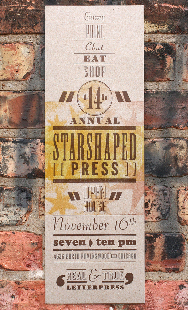
Inspiration for the open house posters comes from a different place every year and gives me a chance to push our type collection into a certain aesthetic. This year I revisited some of the design work done by Vaughn Oliver and v23, the longtime in-house design force behind most of the early 4AD record releases. It's an understatement to say that this design work changed the course of my creative life and showed me incredible, contemporary typographic work. I wanted to play with some of the type we have that doesn't see the light of day too often yet evokes the conscious typographic decisions made in v23's work.

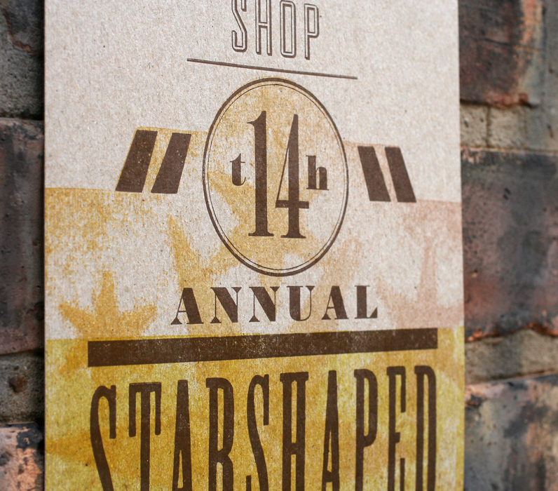
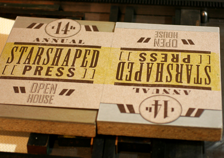
I haven't had much experience printing brass circles and this was a great opportunity. It's a bit tricky getting the type inside to stay straight, and buffer around the edges to hold it in the form. Letterspacing 'th' around the 14 was also a challenge, as the 4 needed to be mortised so that the 'h' could fit closer. Love that band saw.

form5
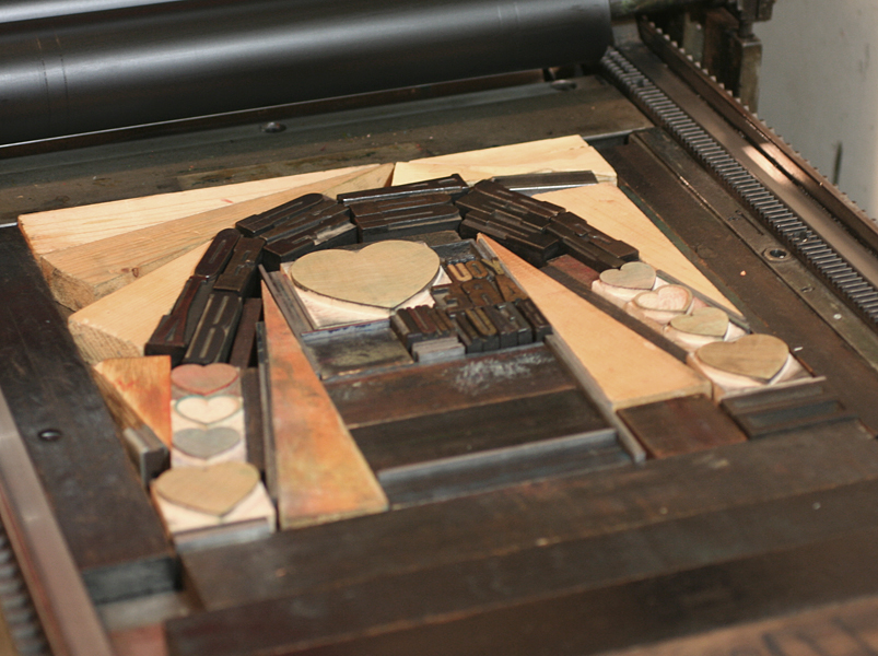
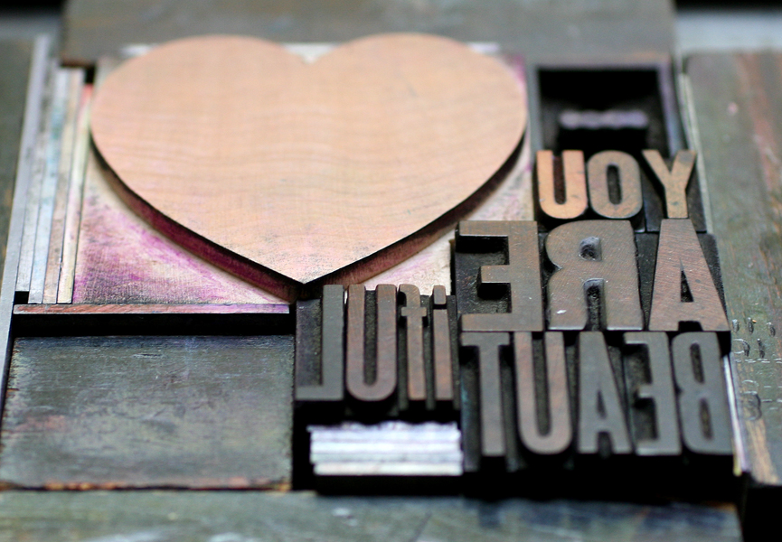
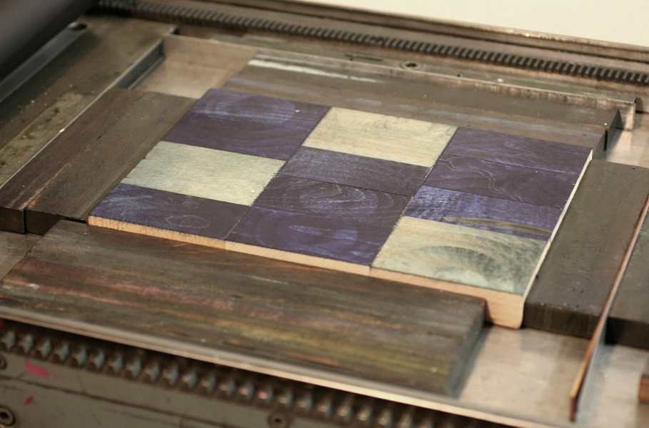
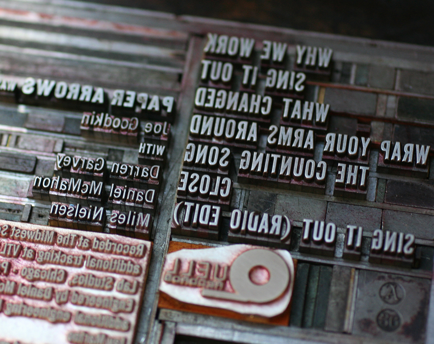
This is one of our more attractive forms of late, hanging out on our imposing stone. The quotation marks come from larger wood type that I trimmed to size to fit comfortably and allow for maximum flexibility of placement.

forminwindow
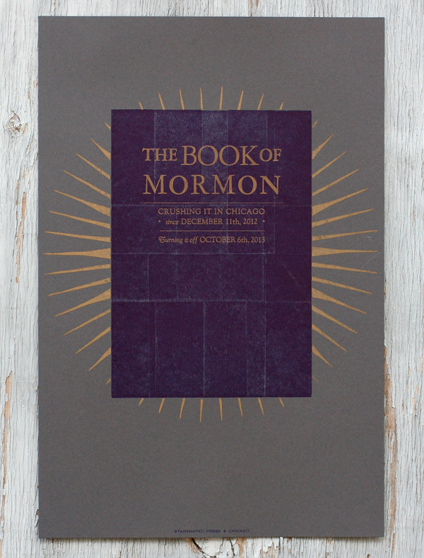
I really didn't want to carve any specific image for this print, but instead wanted a moody feel with a hint of stars.

openhouse4
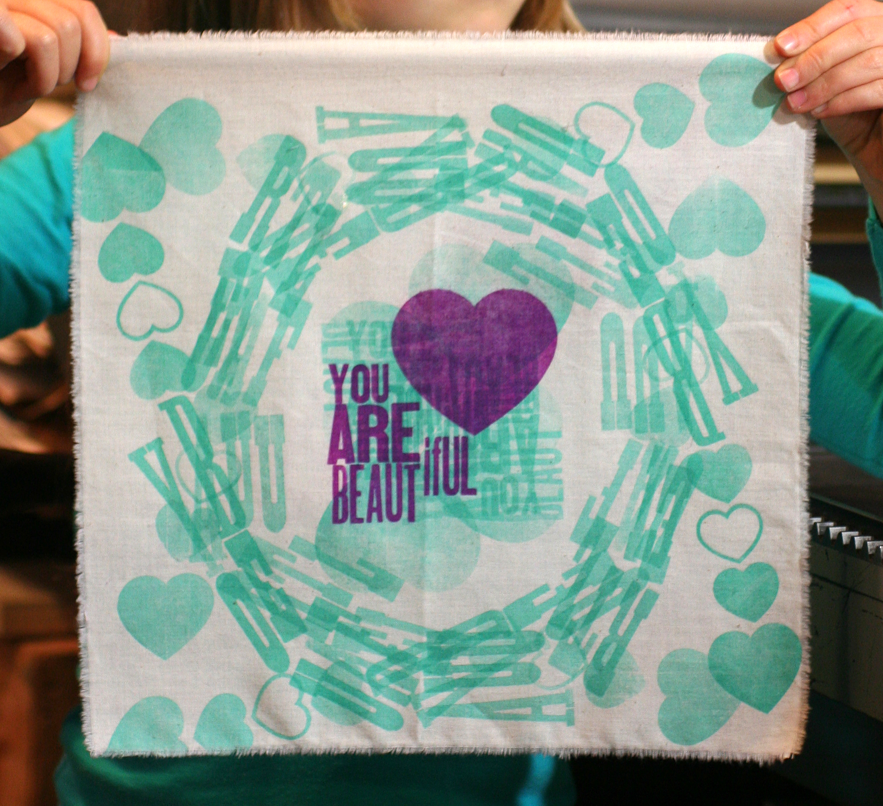
The best way to achieve this is with a pressure print, which means adding shapes to the makeready of the press and running the paper over them through the press. I used linoleum as the inking medium and trimmed two pieces to the outline I wanted for the poster. The dark copper brown was run first, followed by a strip of yellow printed with the back sides of wood type. It was done as a work-in-turn so that I could get two prints out of each sheet of paper.

linocutsetup2The chipboard stars were then added to the cylinder of the press, under the poster paper. When the paper hits the inked linoleum, the areas where the stars are will hit heavier and will therefore make a stronger impression.

starsetup1Here are the linoleum blocks inked; both light orange and pink were on the press in what's known as a split fountain. The stars here are not carved in the linoleum; this shows where the paper is hitting the block hardest and picking up the ink for the print.

linocutsetup3
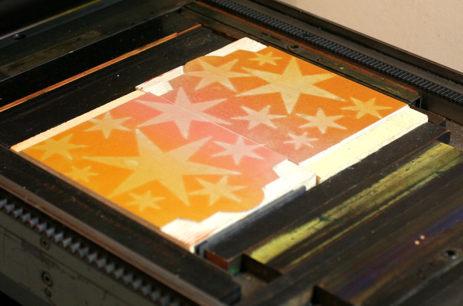
All together, this achieved the exact effect I was looking for, coupled with the beautiful type.

openhouse2Real and true letterpress indeed! I'm awed by the successes, epic failures and enthusiasm I've met with over the last 14 years and love throwing the doors open for a cozy night of printing with the community. We'd sure love to see you!

Saturday, November 16th

7-10 pm

4636 N. Ravenswood #103

form1

You Are Beautiful

Having a child and a business are two great things that don't always go great together. When my daughter was born almost seven years ago, the best laid plans to preserve the studio fell into shambles and there were rocky periods of wondering if I could pull off printing and mothering on a daily basis. Fast forward to now and I'm beginning to see the ways that the two disparate identities can come together as one. Jo has been experimenting with printmaking at the studio, where she can often be found after school and on Saturdays. I'm not always convinced that she takes delight in the process as her attitude can be quite cool, case in point our latest collaboration. We were asked to contribute a piece to the You Are Beautiful exhibition at Galerie F here in Chicago. You are probably familiar with these little stickers, and this show is a celebration of the success of the campaign. All pieces submitted are 12x12" square and represent various media.

I thought this would be a great collaborative project, and an opportunity to explore printing on fabric, something we've been experimenting with this year. I wanted the opportunity to work together on a project that promoted a very basic concept of accepting oneself and recognizing beauty where it exists. Having a daughter is a constant reminder that societal pressures on women and girls to conform to ideals of beauty and behavior has not lessened, and that it begins at a very young age. I constantly strive to expose Jo to women who do marvelous things, from writing books and making art to seeking advanced degrees in science to better the lives of others.

But of course my effort to read into the project didn't make for a smooth start. The night we had to get moving on this project, Jo was completely uninspired and had no interest in working with me. I resigned myself to creating a print on my own and pulled out books and sketch paper to get going. Not surprisingly, seeing my thumbnail sketch efforts and fumbling with a compass was just enough to pique the eye of a curious six year old, and Jo quickly started to put together her own ideas. Her sketches involved lots of hearts and circles, which doesn't make for the easiest type form on press:

sketch2

sketchI pulled the smaller type and let her find some that would still spell You Are Beautiful even when twisted into other shapes. We could almost create a circle and with the help of a cache of triangular furniture, we got it together.

typeform1

typeform3We realized that running the fabric through the press 4 times (one in each direction) achieved a true circular shape and produced very interesting effects in the overlapping.

jopress2

jopress6All of the green runs went first, followed by the main purple color.

jopress8

See our printer's devil in action... just tall enough to run the Vandercook.

[wpvideo ipQpfFBQ]

We printed the muslin at a larger size then tore it down and heat set the print afterwards so that it would be 12" square. Here's the final! We'll be heading to the opening of the show to check out all of the other great pieces that make up the exhibition and to share in the positive message.

finalprint2

Printing in Biblical times...1823

Love for the world of theater and spectacle runs deep in me and as luck would have it, I am married to a stagehand here in our windy city. Brad, otherwise known as Mr. Starshaped, is not only the muscle behind Starshaped but is a member of the Stagehands Local 2 union, which means he is usually found in one of the larger theaters downtown. For the last year he has worked on The Book of Mormon which needs no introduction. What might be less commonly known is that at the end of a long and successful theatrical run, the cast, crew and production staff will often share gifts given in a 'we did this together' spirit of solidarity. This is why our home is overrun with esoteric t-shirts from Kinky Boots, a transistor radio from Jersey Boys and other odds, ends and personal notes from the various productions that have toured Chicago.

Having printed a fantastically fun and vintage-inspired poster for Jersey Boys, we decided there was too much great material in Book of Mormon to let the opportunity pass. After exploring a number of ideas that were riffs off of the current print materials, I thought perhaps we could move in a different direction and mimic the actual book of Mormon. This decision was also fueled by the fact that the studio has some beat up old sign type that closely resembled that of the book.

Tbom3Instead of printing a solid background or otherwise literal image of a book, I created a more textured rectangle out of two layers of wood type, which gave the area a somewhat rustic (and a little pleather-y?) look. This is easily achieved by printing the back side of large wood type, and I used both 30-line and 20-line sorts. You can see how the individual letters are flipped:

Tbom4

Tbom1

This is the final print. I used a dark gray paper, and brought in the gold starburst from materials used to advertise the show. If you're familiar with the songs of the production, then you will get the references to 'crushing it' and 'turning it off'; don't want to explain that and ruin it if you haven't seen it! The dates refer to when the show began and ended. After distributing these to everyone at the theater, the cast and crew passed them around to collect signatures, yearbook-style.

bom1

bom3

Research led me to an extraordinary article about the original printing of the book of Mormon (letterpress printed, of course), and the potential for it having been a miracle given the short amount of time in which it was produced. Getting these posters done quickly was also something of a miracle, as they were hot off the press a few days before the end. And we don't have any angels sneaking in at night to sort our type!

It is always inspiring to see a show come together in a theatrical space, with so many disparate elements needing to work together. From the teamsters and stagehands that move and setup equipment and sets in a raw space to the crew that runs the same thing over and over for a year or more to the cast that has to bring it for every performance, it's a truly working class form of art. I couldn't be prouder of Mr. Starshaped and his continued passion for the work.

It's Beginning to Look a lot Like...

...Holiday card season! Sure, it's not even Halloween, but our presses are running nonstop and we want to make sure you've got a chance to place custom orders in time for the holidays. holiday2013bOrders start at quantities of 25 and run as little as $2 a card for 100+ cards. Letterpress personalization is also available for an additional flat $50 up to 200 cards. Check out our designs to choose from, and contact us (below) for more specific details. We're always happy to reinvent the wheel, so if you'd like a completely new design catered to you, we can do it. Orders placed by November 4th ship before Thanksgiving. Just need a handful of cards without any personalization? You can shop our Holiday selection here.

[contact-form subject='I need holiday cards!'][contact-field label='Name' type='name' required='1'/][contact-field label='Email' type='email' required='1'/][contact-field label='Comment' type='textarea' required='1'/][/contact-form]

Paper Arrows Take Two

Years ago, I designed and printed a cd package for the band, Paper Arrows. An enjoyable collaboration, it featured some of the elements that make working with antique type a unique challenge. oldpaperarrowsRecently, the studio was tapped to produce a new EP sleeve for the band. They wanted something that was simple and could easily be mailed for promotional purposes. We've printed a number of different formats for music packaging, and have two dies for simple pocket sleeves; we decided on the Tab N Slot sleeve, which has a tab at the top that tucks into the back of the sleeve. I usually recommend working with a color palette that wouldn't be easily achieved with cheaper methods of production: dark papers with metallic inks, varnishes, textures, etc. Something that's not just black and white, since a variety of color choices aren't any pricier. Get more bang for your buck!

The band liked charcoal paper, which means using a metallic ink; a light ink alone will not read when letterpress printed on a dark paper. I thought we could bring in texture in a subtle way, as this ties into the sleeve we did before, as well as provide a simple background element. These two-color hearts really grabbed us, so they made it into the form as well.

Tpaperarrows1

Tpaperarrows3Because we print most work on platen presses, it's easy to diecut the flat sleeve first and then print. The first layer is dark blue, which definitely reads as blue; printing dark colors on dark paper don't always perform the way you think they might. The metallic ink is a sort of champagne color that's not quite gold or silver.

paperarrowssetup1This gothic type is in pretty rough shape, but works hard on many Starshaped projects, including this one. You can see here the end result of the two color heart.

Tpaperarrows2Here's the final front, followed by the back.

paperarrows2

paperarrows3We had a plate made for the logo and the small text. This text was designed to work with the type we have in the studio, but the last line had a pesky Publishing symbol, which we sadly don't have and haven't been able to frankenstein from something else. Yet.

Tpaperarrows4Another factor to consider was how these would be mailed. Certain clear sleeves are post office safe, so I suggested adjusting the final design so that they could ship in clear sleeves that would not only save the cost of purchasing separate mailers, but would allow the art and important details to show clearly to the receiver. Mailing labels and stamps can be applied directly to the outside.

finalpaperarrowsAnd so our little heart is a surprise when the cd sleeve is pulled out of the mailer! Give Paper Arrows a listen, and keep an eye out for the Good News For Love release.