The Amalgamated Printers Association (APA) is one of the great organizations that I've been a part of for the last ten years. It's a group of 150 printers that range from hobby to professional, and issues a monthly 'bundle' of print samples from members in the group. Every year they host a Wayzgoose (a traditional printers gathering) in a different location around the country. This year the Goose was held in Phoenix and I was one of the members asked to speak. The weekend features hands on demos and workshops along with lectures and hospitality (great chance to share printing tips!), as well as a great swap meet, auction and banquet. When there's time, it's possible to visit the shops and studios of members in the group that live in the vicinity. This year's Goose was packed with great events! Clearly, though, the hotel didn't ask any members to contribute signage:
 On Friday, there were a number of great presentations at Letterpress Central, the home of Cindy and Gary Iverson, who kindly opened up their impressive paper and print studio to all APA'ers. One of my favorite lectures was by Kseniya Thomas, the co-founder of Ladies of Letterpress and the owner of Thomas Printers which were the topics of her presentation.
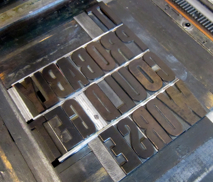
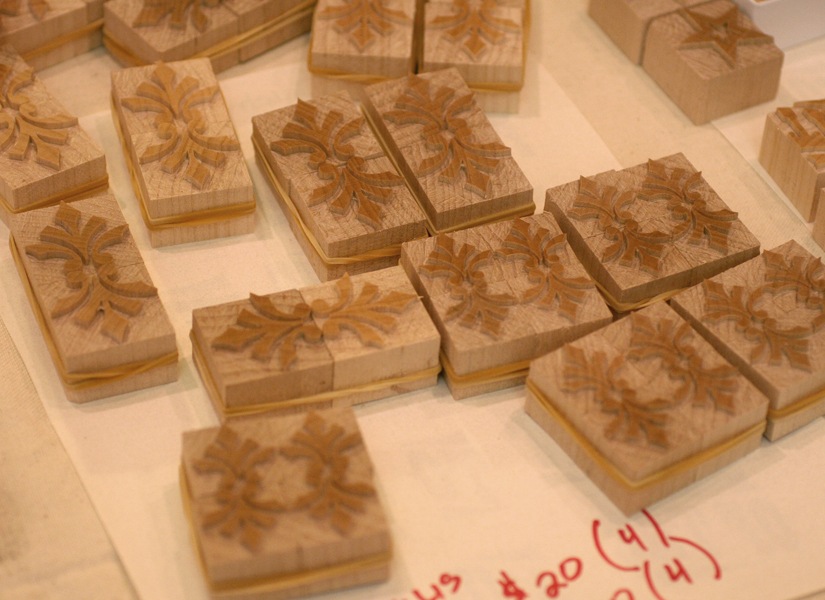
 Saturday morning is always a highlight because it starts with a big swap meet. This year was fabulous... so much type to choose from, both old and new. Below is a shot of the Letterpress Things table, and some of the type I couldn't get enough of. There's also newly cut wood type from Stan Harris and the beautiful ornaments of Moore Wood Type.


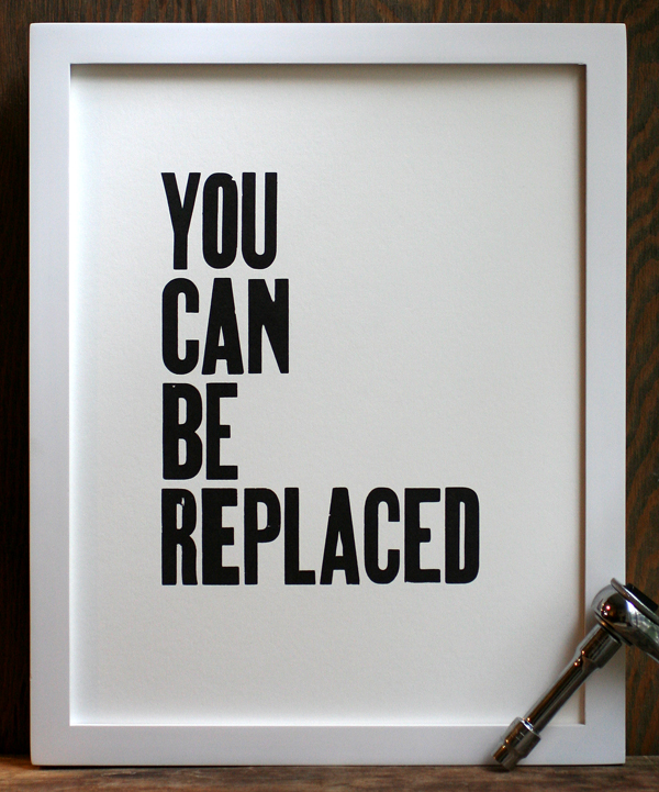
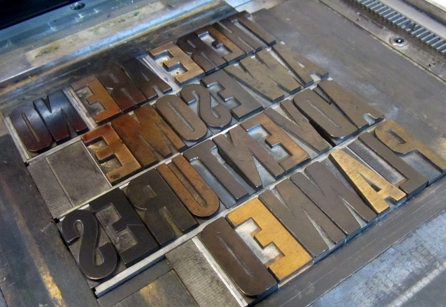
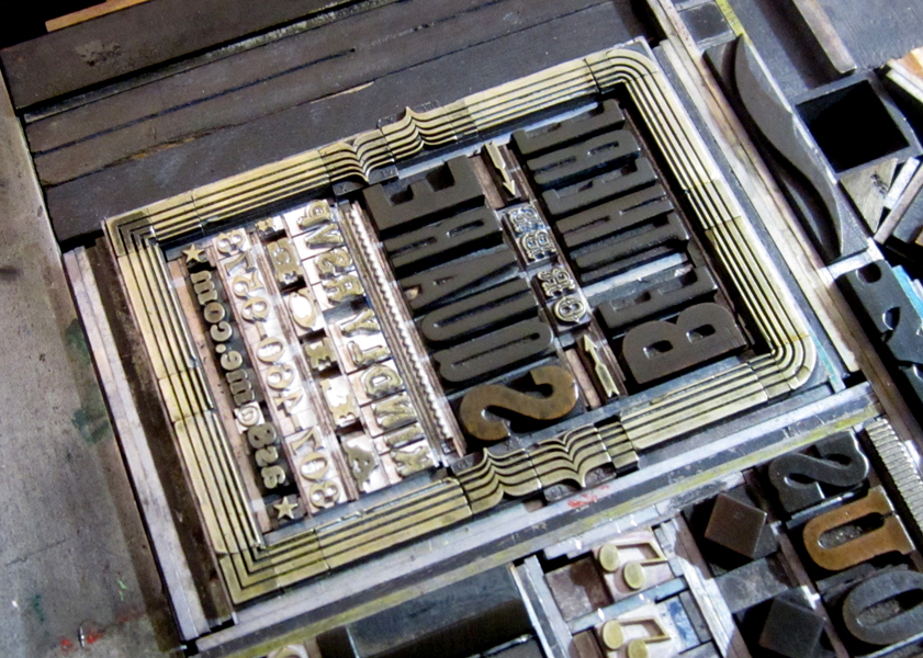
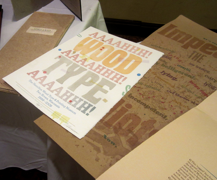
 Here are some of the treats I added to the Starshaped collection:


 After the swap meet there's an auction of even more goodies. Had to get a rough shot of Dave Peat at his finest here!
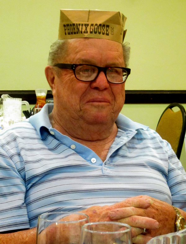
 Saturday evening there was a banquet for all of the members and guests and we were treated to BBQ this year. Here's a shot of our fine organizers wearing the printers caps they made for everyone. From left to right is Jeryl Jones, Mike O'Connor, Cindy and Gary Iverson.
 Here are the Bauders, local to Arizona. They ran a print shop together for 33 years and just celebrated their 60th anniversary. Chatting with them was a highlight of the trip.
 This is the venerable Don Black of Don Black Linecasting fame in Toronto. He knows a whole lot about printing equipment, and even more about the Canadiens.
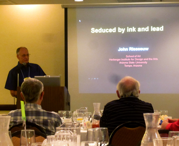
 Our guest speaker for the evening was a real treat. John Risseeuw outlined his fine career in printmaking and teaching and brought along a lot of stunning examples of his work and the work of his students.
 These are a few of the pieces from a series on landmines and their effects on the people who live in their path. Absolutely incredible technique, layering and use of materials, not to mention the social impact of the printed word. Read more about it here.

 After dinner there was more time for socializing in the hotel and more chatting about printing and presses.
 Here's a motley crew representing many lifetimes of printing and type knowledge!

 One of the lucky things that came together for the weekend was that former Starshaped intern, Claire, who left Chicago for LA, was able to meet up and join in on the fun. Here she is enjoying an animated conversation with Don. You can find her work at Small Press LA and VIA.
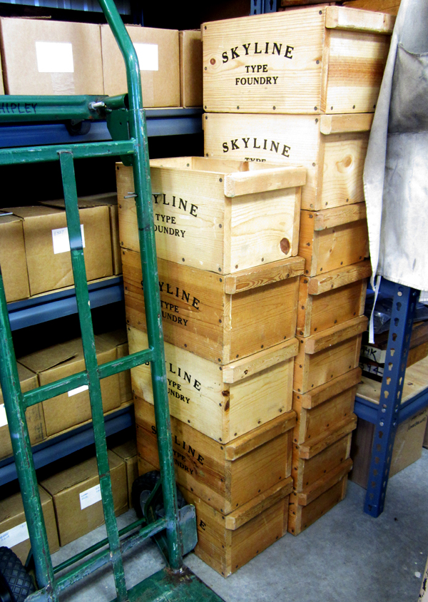
 On Sunday we headed up to Skyline Type Foundry. If you've seen any work that's come out of Starshaped, then you've seen the results of Sky's typecasting adventures. His shop and foundry are the gold standards for organization, layout and quality in production.
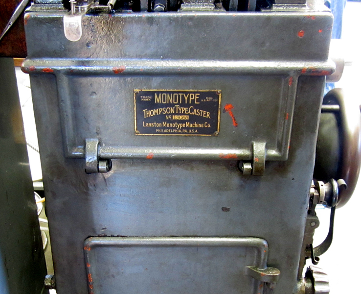
 Sky, along with Dave Macmillan, had two casters up and running to show everyone the process of casting metal type. The equipment is meticulously maintained and in great shape, so it goes without saying that the results are stunning. Good hard type in hard to find faces!


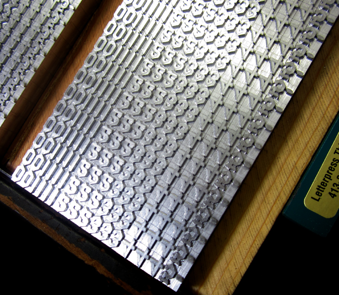
 Sky preps the type on galleys by sort so that it can easily be fonted up into classy little boxes and sold.

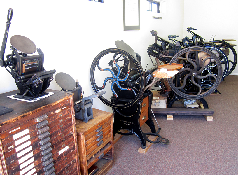
 There is also a space for the press and type collection.
 Shopping! All of the type options for sale were out for all to see. It was like being a kid in a candy store. So many choices!


There are also lots of fun bits and pieces of type history floating around the shop.


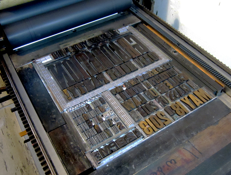
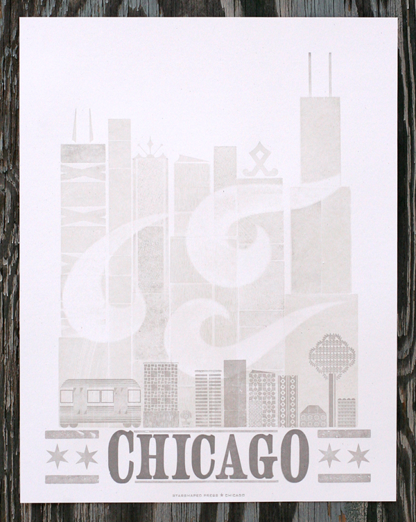
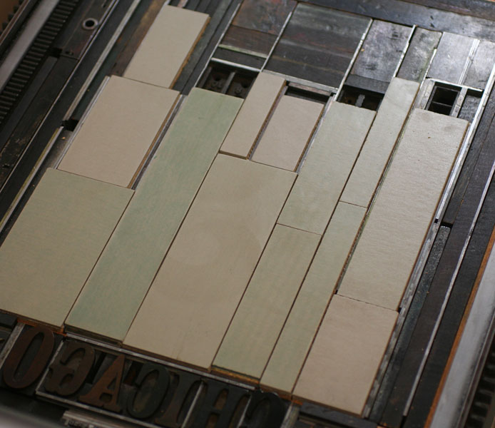
 One of the highlights of the visit for me was picking up a complete set of Sky's newest casting, Arboret in 12 and 24 point along with a set of ornamental pieces to accompany the typeface. This is an incredible face with many options for constructing literal arbors or anything you can imagine. Below is the print Sky created to showcase the type along with the form for printing.


This is one of my favorite shots; two Starshaped Rock Stars in one place! Sky of Skyline Type Foundry and Scott from Moore Wood Type. The enthusiasm of these two along with that of the rest of the crew in Phoenix was really inspiring and breathed new life into forthcoming Starshaped projects. Looking forward to next year's Goose!