Renegade Holiday 2012

We're getting ready for the Renegade Holiday Craft Fair this weekend in Chicago!

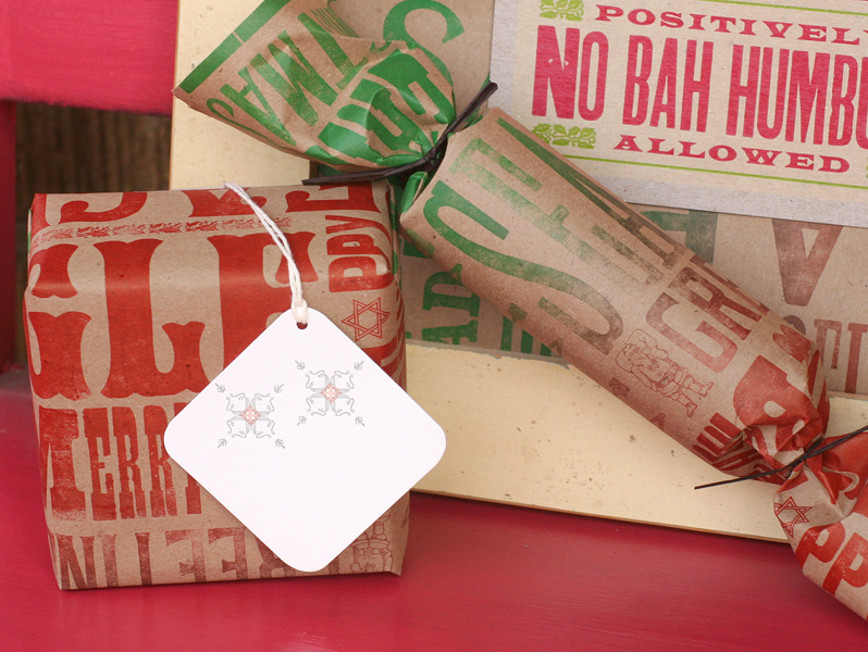
We'll be bringing lots of wrapping paper, gift tags and holiday cards. Here are just a few of the items we'll have on hand...

Not in Chicago? Bah Humbug. You can always check out our etsy shop and get what you need there. And in case you missed it, we've got a 20% sale going on through December 3rd. Just use the promo code SMALLBIZ12 when you check out.

See ya this weekend, Chicago!

Abe's Peanut postcards

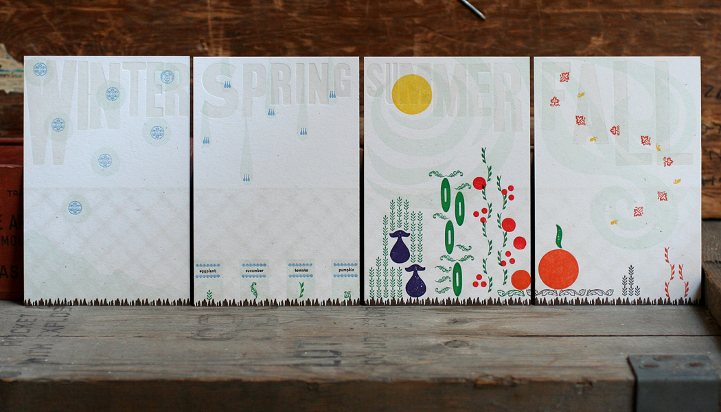
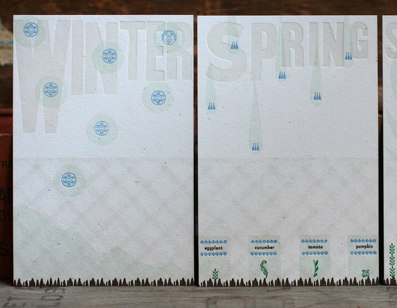
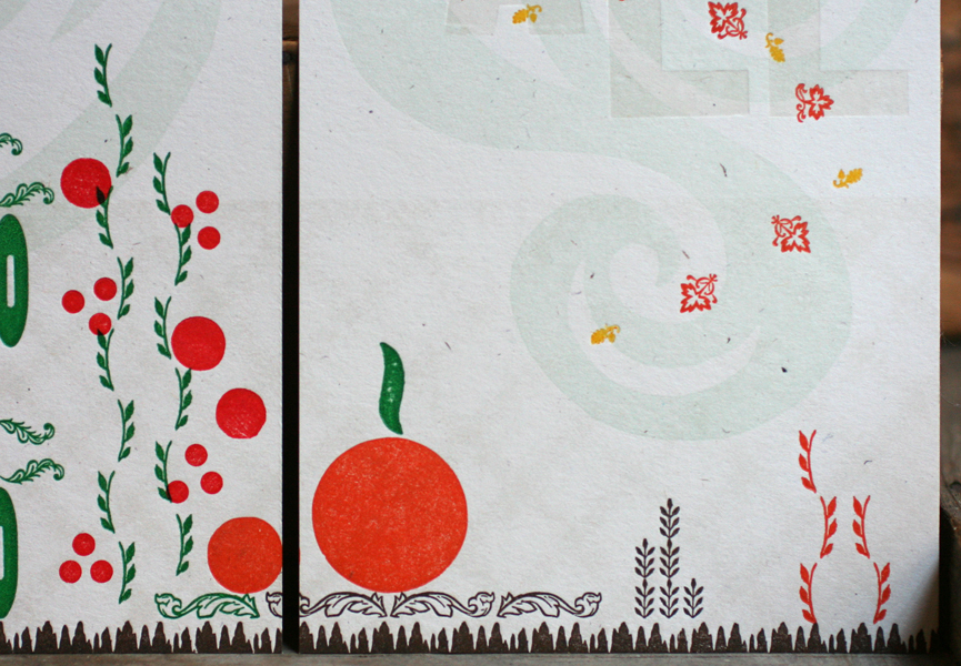
We've had a number of interesting projects this Fall, and this was a favorite. We were approached by Abe's Peanut, a postcard subscription series for children, about creating a set of cards. There are four cards in a series, and each has one part of a story that is completed when all four cards are received (one a week). Illustrators are teamed up with writers to create stories and images to engage children and excite them about getting their own special mail. Fortunately, I was able to work with one of my favorite writers, Julia Bryan, to put together a lovely little story about a girl, Daisy, growing up in a city and wishing for a tiny garden. She works with her parents to create a plot by their chain link fence, and to order seeds to be planted. She watches as the seasons change from winter to spring to the wonderful summer harvest. The cards were printed as one piece in seven colors and then trimmed.

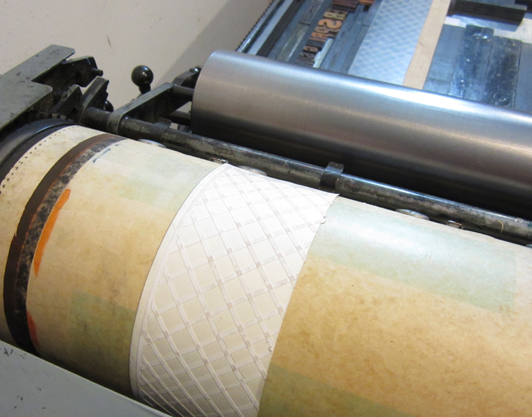
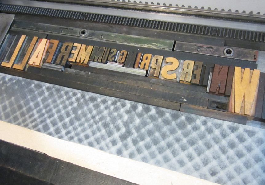
The seasons and representation of the chain link fence were printed first in a very pale gray. The fence is a pressure print; it is created by printing a solid object (in this case, a piece of linoleum) over a texture added to the press behind the paper being printed:

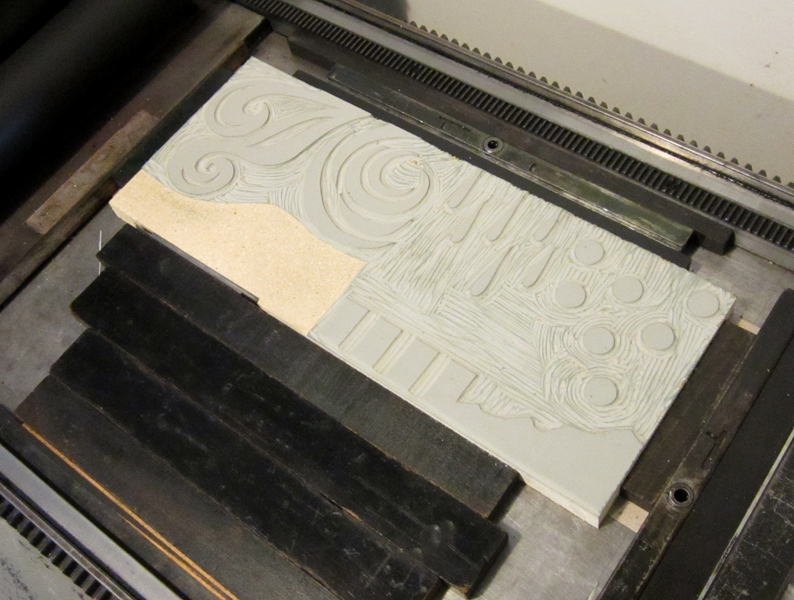
You can see the ghost of the texture left behind on the linoleum:

After the first color, a carved linoleum cut was printed in pale aqua to add 'weather' to each of the seasons.

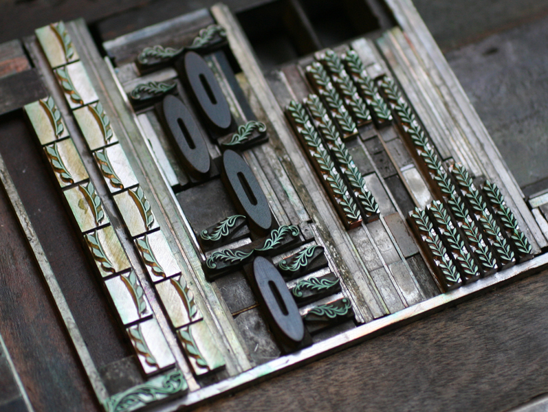
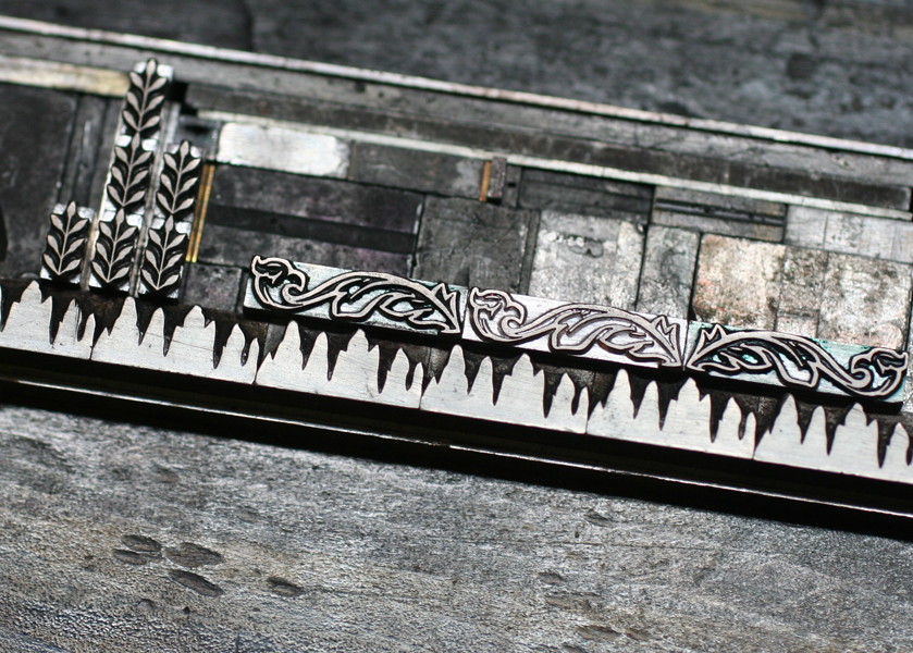
These runs were printed on a Vandercook press. For the details, it was easier to switch to the platen presses. All of the plants, seed packets, dirt and leaves were printed with ornaments, both wood and metal. This required a little careful planning to place everything in the right area to come together and make sense as a representational garden.

Love that little moon! The cards build layers of color as the seasons progress. From the little seed packets come eggplants, cucumbers, tomatoes and pumpkins, which carry into the fall.

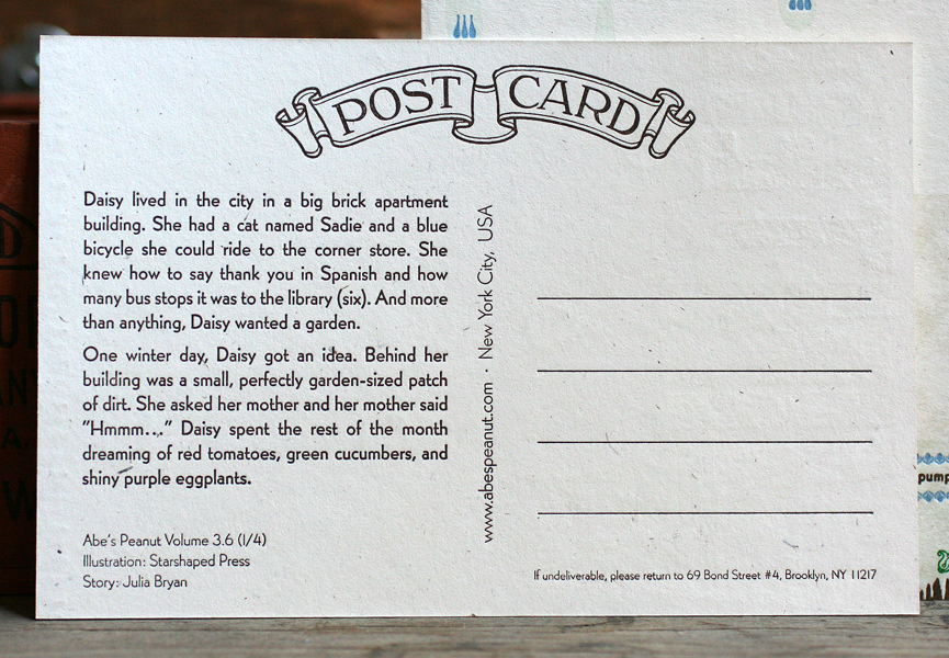
The back side of each card is the same overall layout, with just the story changing from season to season. Hopefully the kids receiving the cards enjoy the imagery and story as much as we did while creating it.

Our 13th Annual Studio Open House

Image It's our favorite time of the year again... time to polish up the presses, bake tons of sweet treats and throw open the doors for our 13th annual Starshaped Press Open House! Join us this Saturday, November 10th between 7-10 pm for great conversation and a little old fashioned printing which yes! you can do yourself. We'll also have all of our prints, cards, holiday tags and wrapping on sale, and you can check out our new self promotional mailer that's hot off the press. Hope to see you there!

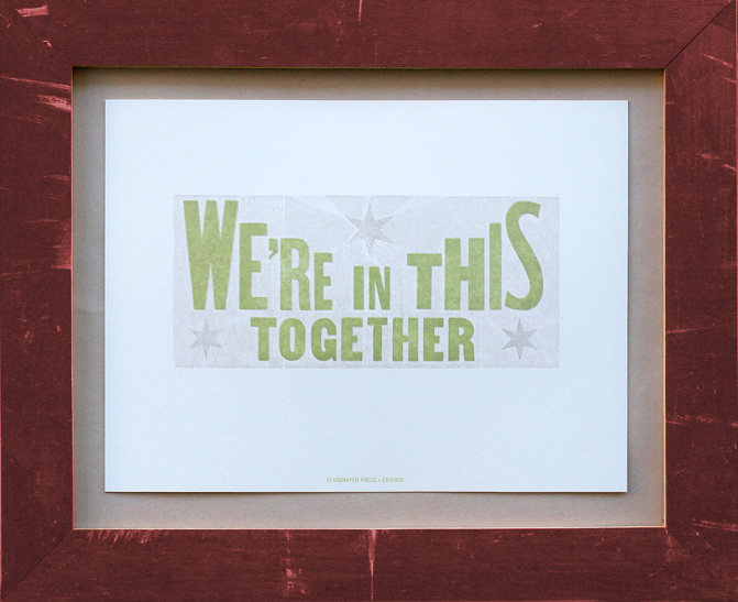
And because the form was so attractive for our poster this year, here it is. It combines wood type and borders, metal type and rules, newly cut wood type ornaments, wood type from India and Pastel, our favorite Chicago-designed metal typeface made popular by silent films. Hot damn.

Image

The Hamilton Wayzgoose 2012

This weekend we attended the annual Hamilton Wood Type and Printing Museum's Wayzgoose, or printers gathering. It was an unbelievable experience chock full of some of the greatest printers, designers, bookbinders and enthusiasts from around the world. While Chicago has always had a supportive printmaking community, much of it revolves around screenprinting, which leaves us letterpress folks a bit off to the side. The wayzgoose presented the opportunity to be completely in our element, talking about the intricacies of metal and wood type as opposed to screens and rubylith!

Many of our old friends were in attendance, including these two: Celene, recently transplanted from Chicago to Nashville to work at Hatch Show Print (many alumni of Hatch were in attendance), and Rich of P22/WNYBAC fame.

Rebecca from Rar Rar Press right here in Chicago (showing her killer new pennants):

And Erin of Inky Winke alongside Dave Peat, a man with one of the most incredible collections of type I've ever seen in print:

Sunday morning we had the privilege to hear about the Globe Collection that Hamilton now houses. This was a job shop located in Chicago (with sister shops in Baltimore and St. Louis), that created some of the hardest working posters in show business. The last was a real treat to see, as it was printed for a carnival 5 minutes away from where I grew up.

Here's Erin demonstrating what happens when your husband is out of the country... you cozy up to a vintage halftone image of Marvin Gaye!

The event also featured a print swap which was a fantastic way to see what everyone's been up to this year. We took our new self promotional packs and open house posters (more on those later this week...), and Printers Devil Jo took our collaborative Family Canning posters. The man with the camera is none other than Scott from Moore Wood Type, one of the few folks in the country creating new wood type.

Amos Kennedy Jr. was there to get folks on press, and lots of esoteric prints were floating around everywhere...

As the youngest participant, Jo met a lot of new friends, including Bill Moran, the Artistic Director at Hamilton. Here they are discussing the Press Bike and how they could create a stationary bike that prints stationery at the museum. She also autographed prints during the swap and got a picture with Brad Vetter, her new favorite printer.

What a whirlwind of a weekend, and an honor to be involved with so much talent and creativity in one room. Hoping that inspiration translates into some new awesomeness in the Starshaped studio. And on a slightly downer note, Hamilton's future isn't clear; the building in which the museum is housed is now empty and for sale, and they will most likely need to move in the Spring. Please help them out... spread the word, donate time or money, do what you can. This is an American treasure that needs to survive.

And in conclusion, would any trip to Wisconsin be complete without this?

Thanks to all the entertaining Packers fans in our hotel!

Emily + Frank

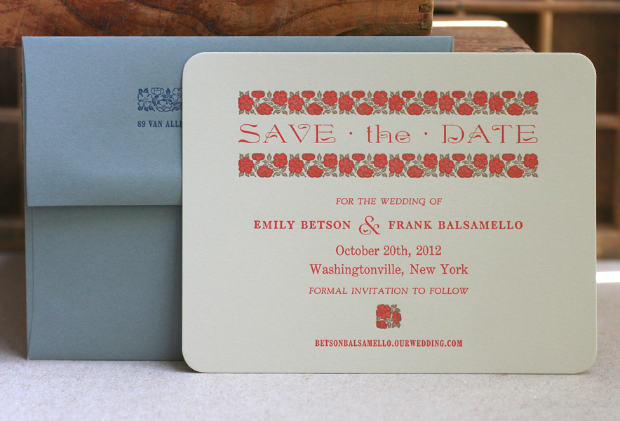
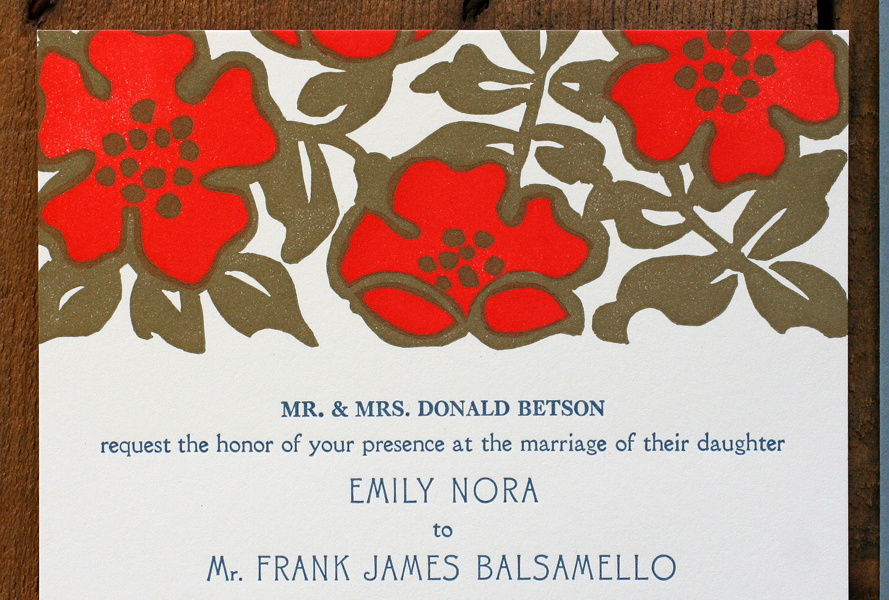
It's not every day that I get excited to print flowers, and our wedding invitation collections are decidedly devoid of them. But when Emily approached me about working from vintage Wizard of Oz book designs, these ones fell into place:

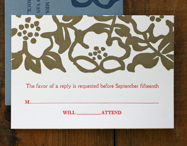
The flowers are actually from a border known as Wild Rose, which was originally produced by the Keystone Type Foundry around 1903. The studio has the two color variety, meaning that there are two sets of sorts, one for each color, in this case gold and warm red. With the success of the save the date cards, we moved on to the invitations. We tried options using the ornaments as is, and then considered enlarging the pattern to see how that would look. I would carve the two color image out of linoleum to give the invites a block printed feel.

The first set of linocuts went well, until I realized the trapping between the gold and red was sloppy. I carved the red color again to match it better, using a proof of the gold color as a stencil for this second set.

Then they were set to go, as was the type, a considerably simpler forme for us this time around!

Here is the final set, continuing the theme of warm red, gold and muted blue. The type is Canterbury, Della Robbia and Caslon.

Congrats to Emily and Frank, and a big thanks for being open to experimenting with our vintage type and linoleum cutting!