Accent the Accent

Once upon a time, in the magical era of purchasing brand new type direct from a current specimen book, you could acquire popular metal faces for various languages that included 'special' characters unique to that language. If you didn't want to invest in a full typeface then you could purchase accents to add to your current faces. I have not seen too many typefaces in the wild that include the special character set (my only font that does is Typewriter, and I'll spare sharing that monospaced dog) but I've seen my share of accent handy boxes.

typoaccessories.jpg
typoaccents.jpg

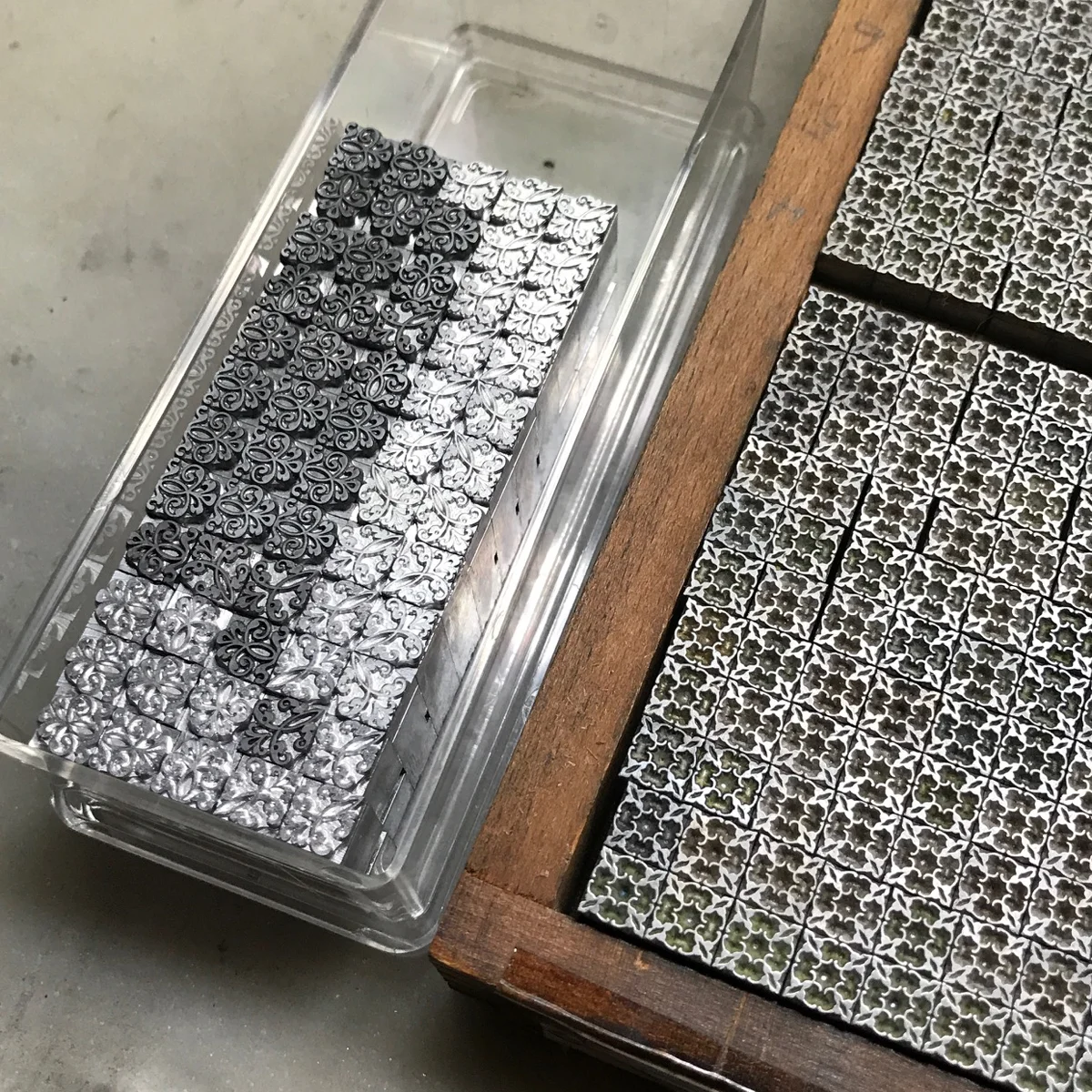
I've stumbled across various handy boxes containing different styles and sizes of accents.

handyboxes.jpg

While it's rare to add these to text in my studio, the need has arisen over the years. It's not difficult to do, though lowercase adds a challenge. I'll show a few options for uppercase here.
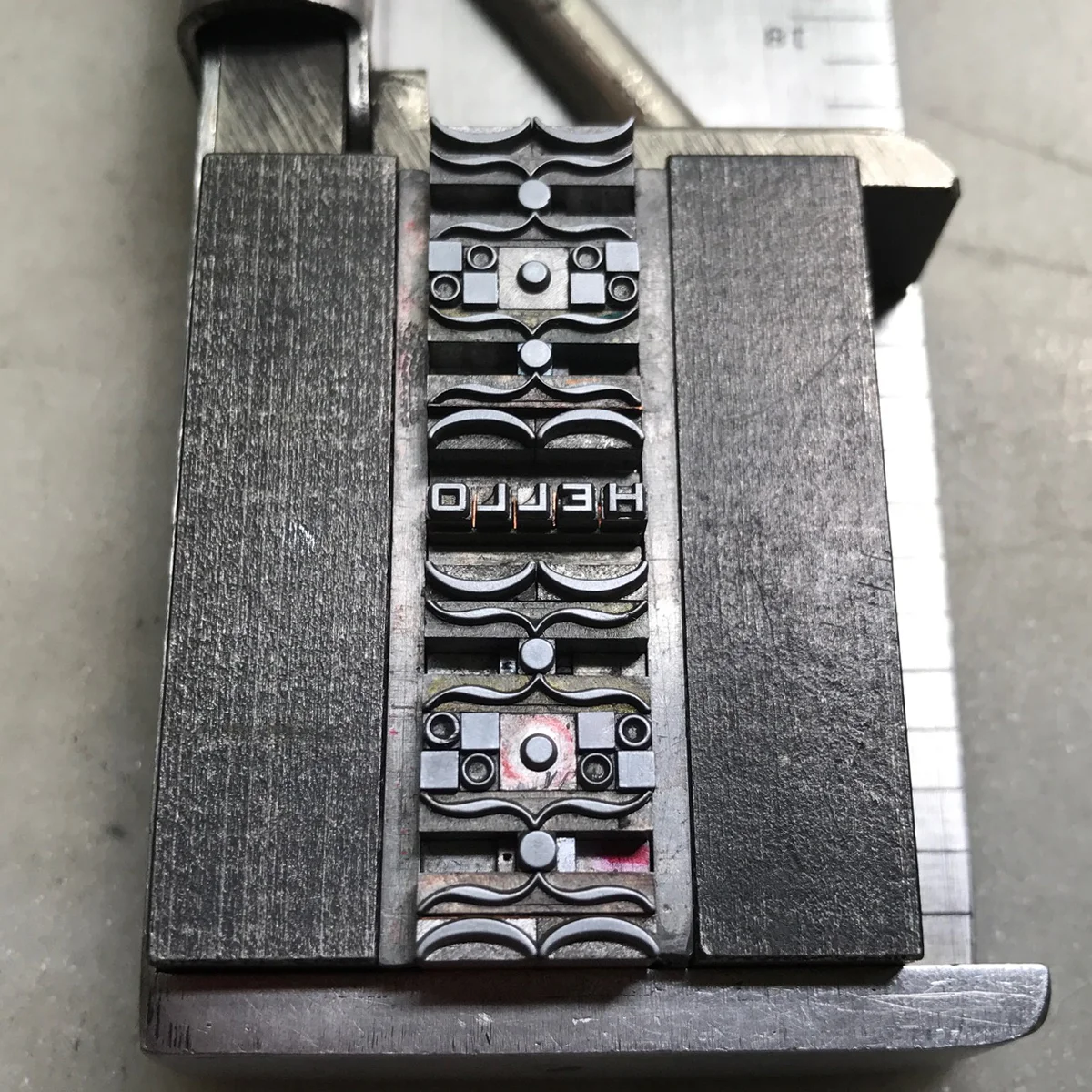
In the first example, I set the line first then scooted it down slightly to have about 2-3 points of space above the line. Then I inserted the accent above the appropriate letter. It's not a bad idea to write the word with an accent first, so that you have a visual of how NOT to set it; remember to continue thinking in reverse when adding accents.

entreewithspace.jpg

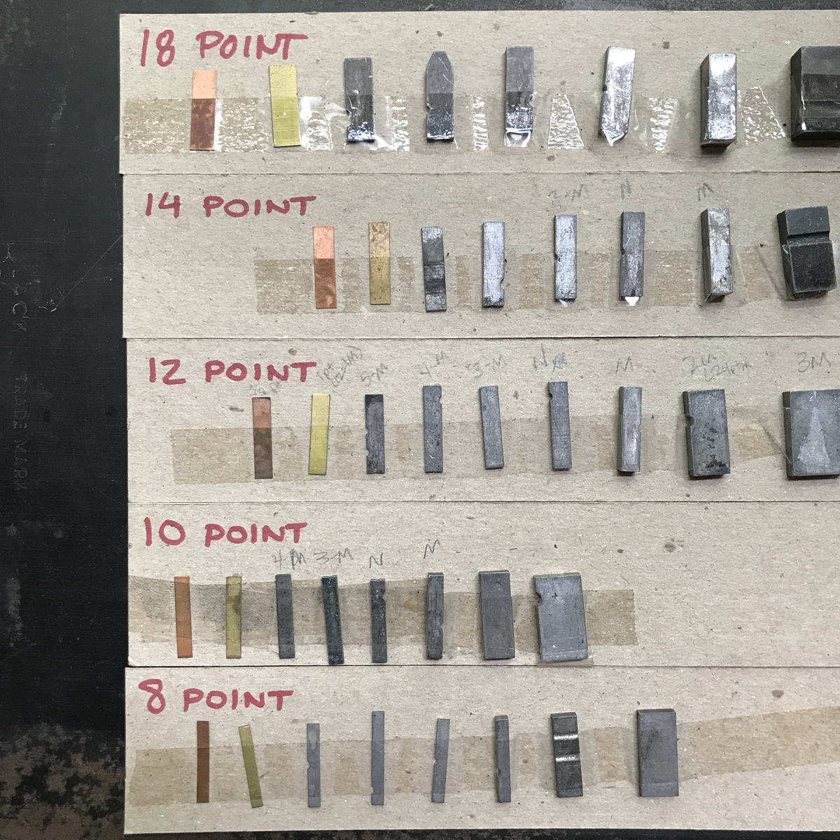
See the gap above the spacing and next to the accent? Now measure that based on where you want the accent to be and also take note of what size it is. In this case, the accent is 4 pt and the type is 12 pt for reference.

entreemeasure.jpg

Because this accent is only 4 pts I fill in on either side with leads that are the correct length (or close to it; when you lock up this form the pressure from top to bottom will most likely hold the accent and type in place, even if there's a slight gap.) The less wiggle room the accent has the better, as it can shimmy away from being exactly where you want it to appear in print.
The other option is to work with standard size accents. In the bottom word, the cédille is 8 pt which is much easier; I only had to put 8 pt spacing on either side and set it solid to the word above (no leading between the two.)

entreefacade.jpg

Using piece accents with lowercase is a little more challenging because of the obvious space about the letterform. I have been known to let an 'e' 'take one for the team' and get trimmed/filed down to just the raised letter so that an accent can sit directly above it. Not recommended for small sizes.
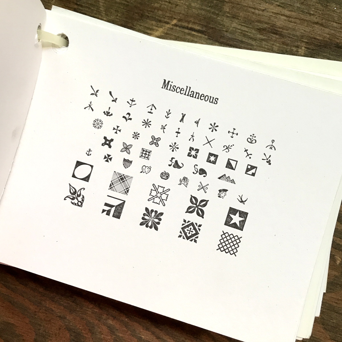
Remember, too, that accent boxes can be a whole lot of fun as design elements! I've used them in various projects, so don't pass them up.

preissigdetail2.jpg
frutiger4.jpg

Agitate! Educate! Organize!

Before you start a revolution in your print shop, you need to get your house in order. Raychel (my right hand woman) and I recently tackled proofing the ornaments acquired over the last year to document and inventory everything in the Starshaped collection. If you don't know what you have, it's that much harder to approach a design project. Over the years we've taken care to proof everything that comes into the studio in order to have a handy reference guide. This is the basic collection of typefaces in the studio, made up of about 50 sheets showing type families and styles:

And this is the giant, well-worn stack of borders and ornaments:

Are they meticulously categorized, researched and labeled correctly? No. Do we know what's in the collection? Yes.
All of the metal typefaces are recorded on a spreadsheet by name, size and location. This alphabetical list stays near the typecases so we can quickly find what we're looking for. It doesn't matter if you have 5 or 500 typefaces; starting the list immediately not only saves you time in the future but is a handy reference when you go to letterpress sales. You can bring it along to remember exactly what you already have and what you might need to complete a family.

Each type bank (the cabinet that holds the type cases) gets a letter and each case a number, starting with 1 at the top. This way you can find 8 pt Bernhard Gothic Bold in A7, the 7th case down from the top of the A bank. I stole this system from Paul at the Platen Press Museum because it's simple and works well.

Quarter cases are so wonderfully ideal for ornaments and it's how the majority of mine are stored. Four will fit in a blank California job case (hence the 'quarter') or you can luck upon a rack for them. I also have a few homemade shelves that fit these cases. They're compact and useful!

After making simple proofs of your type and ornaments (and ours are just 5.5x4.25" on whatever scrap white stock is sitting around) you can then use them for labels on cases and quarter cases.
Rules for printing (not to be confused with perforating and scoring rule which is made of steel) are also kept in quarter cases. I have one for type metal rule and one for brass.

Ornaments and initial caps that don't see a lot of use or are rare go into these blank wood boxes that you can find at most craft stores (though often through their websites and not necessarily in store.) I cut strips of chipboard to put between rows then label the boxes. They are small and compact and easy to move around the shop as needed.

Recently, a gift of never-used borders from the Damon Type Foundry were sent my way. They are on deck for proofing right now so that we can get a look at them and figure out where they'll end up in the studio.

I started proofing type when I had about 10 faces and a handful of stars and brackets and I'm grateful to have started right away as it's a daunting task if you have a considerably larger collection. But the benefits are immense; seeing what you have in right-reading print helps your brain make faster decisions when starting a design. It also allows you to make connections between disparate typefaces and how they might work together and with ornaments. And it's great practice for setting tidy forms and doing proper makeready on press. They don't have to be perfect and you don't need to create the most incredible specimen book of all time. Getting comfortable with your collection and organizing it in a way that speeds up your process and gets those protest flyers out there faster is the goal.

Gimme a Hand(y box)

Sometimes the best ornamental experiments come from the simplest pieces in your collection. No doubt you've seen countless small handy boxes at various letterpress events and sales. Sold as auxiliary sorts for your existing type collection, they range from dots, lines, mathematical figures, parenthesis, and foreign accents. Don't pass them up! You can create a range of work with very few pieces and the bonus is they take up so little space.

I pulled out squares, dots, brackets and parenthesis from my collection.

Here are two quick forms set directly in a composing stick, using just sorts from these four boxes. To keep it even simpler, I used only those that broke down to 6, 12, 24 or 36 point.

I put the sticks on press for a quick, down-n-dirty carbon proof to see what the pattern revealed.

So much potential with even the simplest shapes! So when you come across these handy boxes, don't pass them up; just think of the repeating patterns and illustrations waiting to be printed.

Easy Ornaments

While attending the 2017 APA Wayzgoose in Los Angeles, I was inspired by the beautiful and simple ornamental work of Richard Hoffman and by the students in the workshops I taught. I also studied samples of patterns designed by Monotype using their own type:

It doesn't take much to create showstopping ornamental combinations. For the following samples I've chosen ornaments cast by the Bixler Letterfoundry, Three Ton Bridge Foundry and Skyline Type Foundry, all of whom currently offer these or similar pieces.

If you don't have a lot of experience building with ornaments, I suggest working with sizes that are divisible by 6 (6pt, 12pt, 18pt, 24pt, 30pt, 36pt) as they play well with each other and require minimal spacing.
I set 4 different sections showing what you can do with both 1- and 2-color options. Most of the sorts are 18 point, with a few 24 and 30 thrown in.

Note how corner pieces can be mixed with other ornaments and turned in different directions to create a new look or give dimension to blockier pieces.

If I'm not sure how sections will look together, I make a quick carbon proof (run a sheet of carbon paper through your proof press with whatever paper you use to proof) and scan it for digital manipulation. While the quality isn't great, it allows me to see a rough sketch of what it'll look like as well as colorize it for ideas. This is the carbon proof, scanned as a 600dpi black and white tif, with contrast adjusted. The bottom sections would function well as repeating patterns in 1-color.

I use InDesign to alter the images and play around with the color. It also shows me if I got the math right on combining elements for 2-color patterns.

This screenshot shows how the grid breaks down for the layout. I could go in and remove sections to change the design (such as taking out four 18pt pieces and putting in one 36pt sort, etc.)

Easy, breezy beautiful! Here are a few shots of Hoffman's work for inspiration. Be sure to share your experiments!

Left! Right! Center!

Without a doubt, typesetting is all about what you DON'T see on the printed page and this invisibility can be the hardest thing to learn when setting. So many parts of your brain have to be firing at the same time that I get tired just thinking about it.
When you start to set a new block of type, consider sketching out what you want it to accomplish. Will it be left or right justified? Centered? Staggered? Drawing this out can be very helpful so you know exactly what direction you're headed in and what size spacing you need to have.
If you followed the tip in the last post to organize your spacing by size, grab the box that coordinates with your type. I'll be working with 24 pt. because it's easy to see.

IMG_3721.JPG

You probably already know that each line of type needs to be solid and flush in the composing stick. Run your finger along each line to see if anything stands out; occasionally you may run across thin spaces that were possibly cut by hand and they are a point too wide. Years ago I received what I thought was 12pt brasses and coppers. They were actually 13, and are now the bane of the 12pt spacing box. As I am able, I move them to the 14pt box where being a little under is no problem. But a point over and you could spend all day wondering why your form won't lock up. It's very much a princess and the pea situation.
I rely on my Blatchford guide for measuring spacing; a similar guide is available from Paul Aken at the Platen Press Museum.

IMG_3723.JPG

If you are left or right justifying your form, determine what amount of spacing will be consistent on the leading edge; I like to have at least an em-quad. If you put the largest spacing material to either edge your form will be so much easier to work with because tiny spacing on the ends will certainly fall over when you remove the form from the stick.

IMG_3727.JPG

If you think you will want to hang punctuation in your form, you can build this in ahead of time, allowing an easy space to remove for it. This is the beauty of sketching a plan first! Below the quote mark hangs into the right justified space; I added a little extra to all of the lines so it would be easy to include this.

IMG_3729.JPG

When setting a lot of text, I first pull all of the type and then go back to space it. This way your brain is focused on one thing at a time: first, you quickly spell out what you're trying to say and second, you focus on having the same spacing between the words.

If you don't have a design background, consider purchasing a book of simple typographic norms. Setting metal type is the best way to learn because everything you're working with is a physical object vs. the unseen in design software! It is commonplace to letterspace all caps, or 'give them a little breathing room' as I like to say. It is not considered good practice to letterspace lowercase, though occasional pairs will give you fits. More on that in the future.

IMG_3716.JPG

Start to look closely at the visual space between letters and you'll begin to understand why kerning is a thing. If you set all of the spaces the same, the print may look very wrong, given the limitations of the material (metal.) And the more you set type, the easier it becomes to see these potential problems. Below I added 2 points of spacing between the O and U and T to compensate for the additional visual space created by pairing W and A and Y together. This is a quick carbon paper proof to test the kerning; I often do this before taking the time to ink a press.

IMG_3738.JPG

Give it a try; set a few lines and try to see the things that won't be seen when you print. Below is a line that has been letterspaced and you can see how the largest spacing is to the outsides of the centered line and it's flush between the slugs. Always set in a composing stick and don't leave gaps to be held in place with magnets; nothing wounds my soul more than seeing sloppy typesetting that relies on other materials at hand to make it work. If you do the work ahead of time and set a solid form your makeready time on press will increasingly diminish over time.

You got this!

Leads and slugs and spacing... oh my!

Leads, slugs and spacing are the mortar to all well-built type forms. And just as in construction, incorrect usage can bring otherwise solid bricks crashing down.
Leading is the space between lines of type, and it is commonly found at 2 points thickness. It is also possible to find 1, 3 and 4 point thicknesses (tip: I've been known to use 80lb cover weight paper as 1 pt. leads.) When leading is 6 points or above, it is then called a slug. Lead and slug racks often have divided space for each, with leads on top and slugs beneath. Slugs can also be found in thicker sizes; I keep these in a drawer so they don't take up all the space in the rack.

leadsslugs1.jpg

Leads and slugs can be trimmed by hand or with a saw. Both work great; they need to fit within a composing stick snugly at your desired length, but not so tight there is bowing. The top stick below shows hand cut leads and slugs (using a slug cutter, a staple all shops should have) and the bottom ones were trimmed on a saw.

leadsslugs2.jpg

If you plan to add leading to your form after removing it from the stick, be sure to test that it fits within the SAME stick before you then add it to the form on a galley. There can be slight variations in old sticks, especially if the knee (the movable piece) and main section do not have the same serial numbers.

I've often said that spacing is what separates us from the animals. Understanding it is the secret to excellent typesetting. Before breaking the bank on 19th century eBay type, consider investing in spacing. Otherwise, that glorious type won't be put to use! I recommend ordering from M&H Type Foundry, after checking your collection to figure out which sizes will be most useful. Or hit those letterpress swap meets and buy a coffee can full!
Creating down-and-dirty cheat sheets for type can be very helpful. This is what ours look like, one for each point size:

spacing1.jpg

We'll save letterspacing for another day! In the meantime, don't be lazy; get the correct spacing in a range from thin coppers and brasses to em quads and 2-em quads for each size you plan to use or based on what size type you have in your collection. I have found it very helpful over the years to consolidate all spacing into separate containers by size instead of storing it within the type cases. This way you can easily move it to wherever you are setting type and you don't have to dig through all the 12 point cases to find a handful of coppers. Ours are in old wooden boxes but new-fangled plastic dividers work great, too. So do those small, metal hardware containers found at hardware stores.

spacing2.jpg

When you have the correctly-sized leads and slugs as well as spacing prepped and ready to go, your typesetting speed will increase exponentially.