
Before you start a revolution in your print shop, you need to get your house in order. Raychel (my right hand woman) and I recently tackled proofing the ornaments acquired over the last year to document and inventory everything in the Starshaped collection. If you don't know what you have, it's that much harder to approach a design project. Over the years we've taken care to proof everything that comes into the studio in order to have a handy reference guide. This is the basic collection of typefaces in the studio, made up of about 50 sheets showing type families and styles:

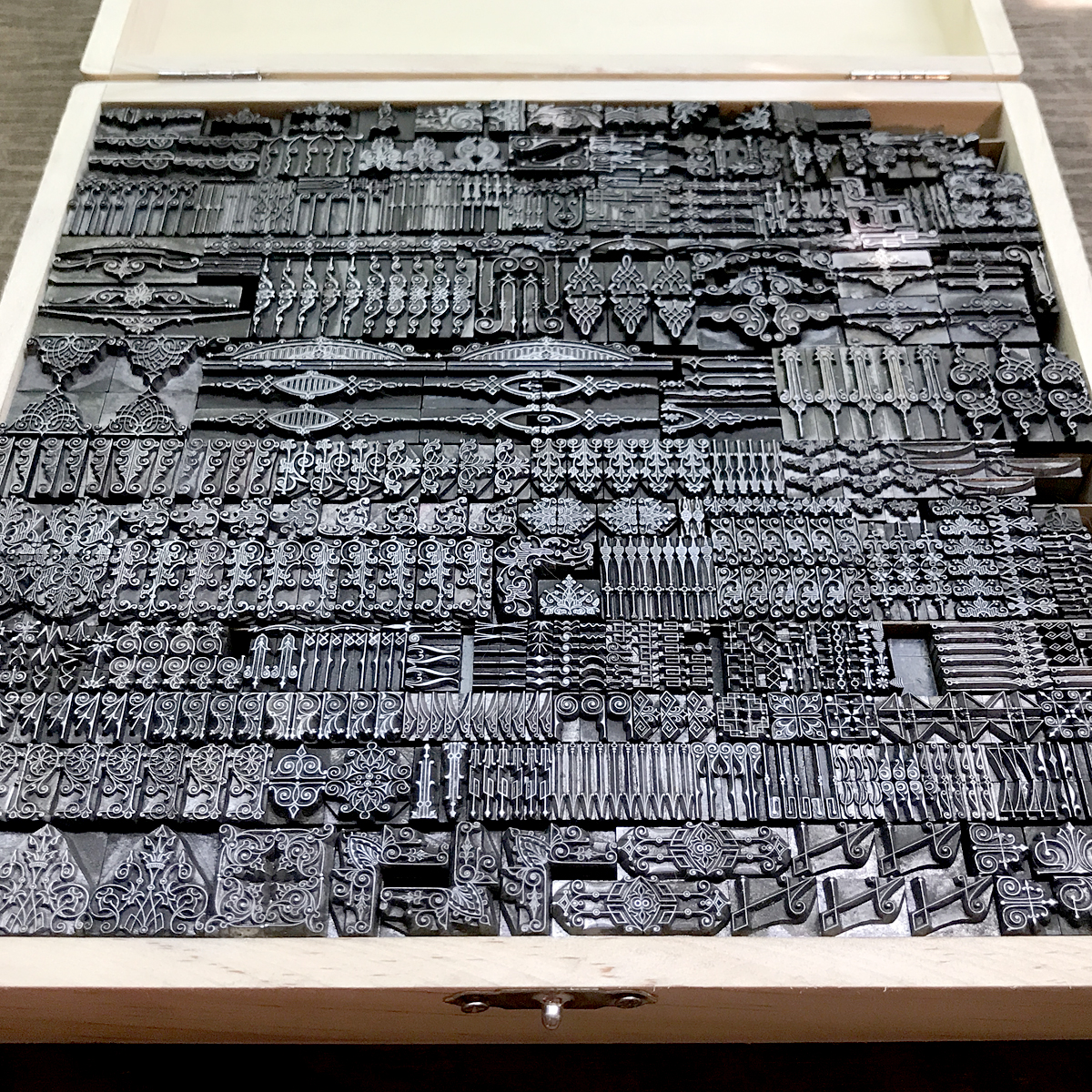
And this is the giant, well-worn stack of borders and ornaments:

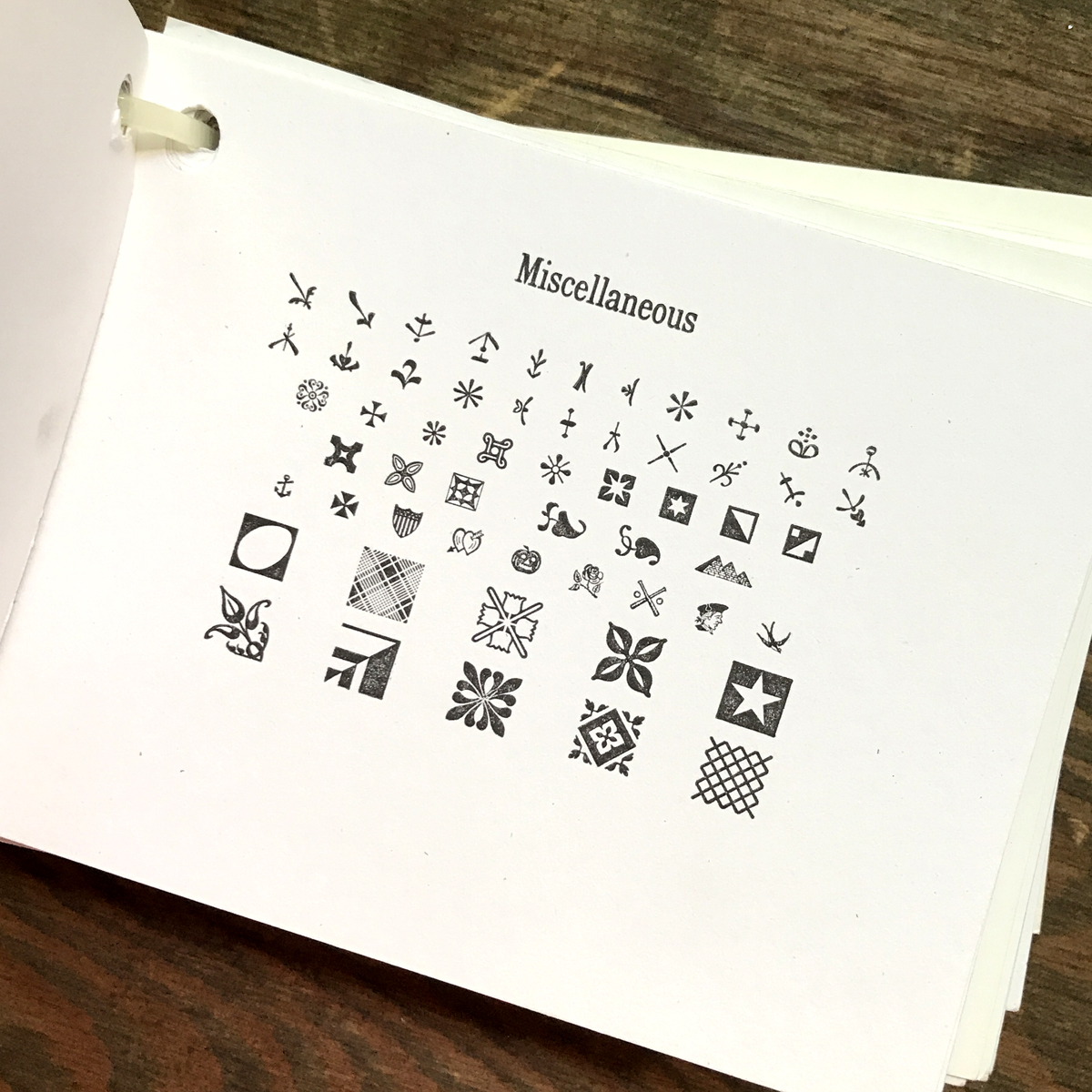
Are they meticulously categorized, researched and labeled correctly? No. Do we know what's in the collection? Yes.
All of the metal typefaces are recorded on a spreadsheet by name, size and location. This alphabetical list stays near the typecases so we can quickly find what we're looking for. It doesn't matter if you have 5 or 500 typefaces; starting the list immediately not only saves you time in the future but is a handy reference when you go to letterpress sales. You can bring it along to remember exactly what you already have and what you might need to complete a family.

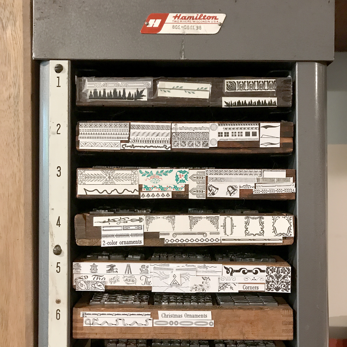
Each type bank (the cabinet that holds the type cases) gets a letter and each case a number, starting with 1 at the top. This way you can find 8 pt Bernhard Gothic Bold in A7, the 7th case down from the top of the A bank. I stole this system from Paul at the Platen Press Museum because it's simple and works well.

Quarter cases are so wonderfully ideal for ornaments and it's how the majority of mine are stored. Four will fit in a blank California job case (hence the 'quarter') or you can luck upon a rack for them. I also have a few homemade shelves that fit these cases. They're compact and useful!

After making simple proofs of your type and ornaments (and ours are just 5.5x4.25" on whatever scrap white stock is sitting around) you can then use them for labels on cases and quarter cases.
Rules for printing (not to be confused with perforating and scoring rule which is made of steel) are also kept in quarter cases. I have one for type metal rule and one for brass.

Ornaments and initial caps that don't see a lot of use or are rare go into these blank wood boxes that you can find at most craft stores (though often through their websites and not necessarily in store.) I cut strips of chipboard to put between rows then label the boxes. They are small and compact and easy to move around the shop as needed.
Recently, a gift of never-used borders from the Damon Type Foundry were sent my way. They are on deck for proofing right now so that we can get a look at them and figure out where they'll end up in the studio.


I started proofing type when I had about 10 faces and a handful of stars and brackets and I'm grateful to have started right away as it's a daunting task if you have a considerably larger collection. But the benefits are immense; seeing what you have in right-reading print helps your brain make faster decisions when starting a design. It also allows you to make connections between disparate typefaces and how they might work together and with ornaments. And it's great practice for setting tidy forms and doing proper makeready on press. They don't have to be perfect and you don't need to create the most incredible specimen book of all time. Getting comfortable with your collection and organizing it in a way that speeds up your process and gets those protest flyers out there faster is the goal.