
You've probably come across these fantastic two- and three-color ornaments in spec books and don't they look like fun?

But often, the second and third color blocks can be separated from the first and once that happens they are usually rendered useless. If you come across blocks that look like blobs or have a series of random dots, you might not understand what the point is. Take a look at these matched pairs and you can see how the secondary color might not be much fun on its own.

When I proof two-color ornaments, I do both black and color so that I have a set to scan to build digital designs and one showing off how they look when printed together. You can see how the holly berry dots might not make sense or be appealing on their own.

I set up a holiday card that uses a LOT of these ornaments to show how to build the form and plan for the second color. I started with the green because in this case, these are the dominant or key images and will give me the best picture of how the card will look. To the side, on a galley, are the secondary sorts.

Obviously, it's good to do a count to make sure you have enough of both to create the design you want.

After the completion of the first color, LEAVE THE REGISTRATION and makeready set up on press for the second color. When swapping out the blocks in your form, pay attention to the nick marks so that you replace the first color with the second in the same orientation.
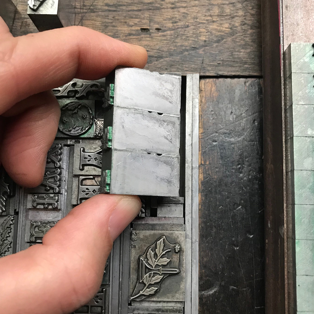
While most two-color ornaments are made precisely to match in registration, occasionally some are different in one orientation. If that's the case, do the printer math and fill in the remaining space to make up the difference.

The second form will look something like this... a little more abstract, but with everything in the right place.

If you left your makeready, then you can place the chase right back where it was and the registration will be nearly spot on, give or take a point or two that can be adjusted with the gauge pins.

And obviously, change the ink color in between the runs! The more two-color ornaments you're working with, the greater the probability that they won't all line up perfectly. For this card, I've found the best possible outcome I could, understanding that some might be off by a hair. Toss that up to the inherent charm of a hands-on process.
If you've got cool two-color ornaments in your arsenal, pull them out to print and share!
