
The big fail of metal and wood type is that the physicality of each letterform can work against best practices of typography, in particular when it comes to kerning. To kern type is to set each sort so that it forms visually pleasing words and sentences that don't distract the viewer from the message they convey. Before the digital age, this was painstakingly done (though very often NOT done) by hand, though I would argue it should still be done by hand/mouse on the computer as well.
I'm looking specifically at wood type capital letters from my collection that came to me with evidence of this practice.

Notice the cuts within the base of each letter and then notice the letter itself. What do they have in common? These letters have a great deal of negative space that doesn't print. A large part of improving your typesetting is developing a sense of what part of your sort will print and what part will create a space on the page. These forms have been cut so that they can snuggle next to a letter that has also been trimmed.
Good examples of this are capital letters that have extreme angles like A, V, Y and W.
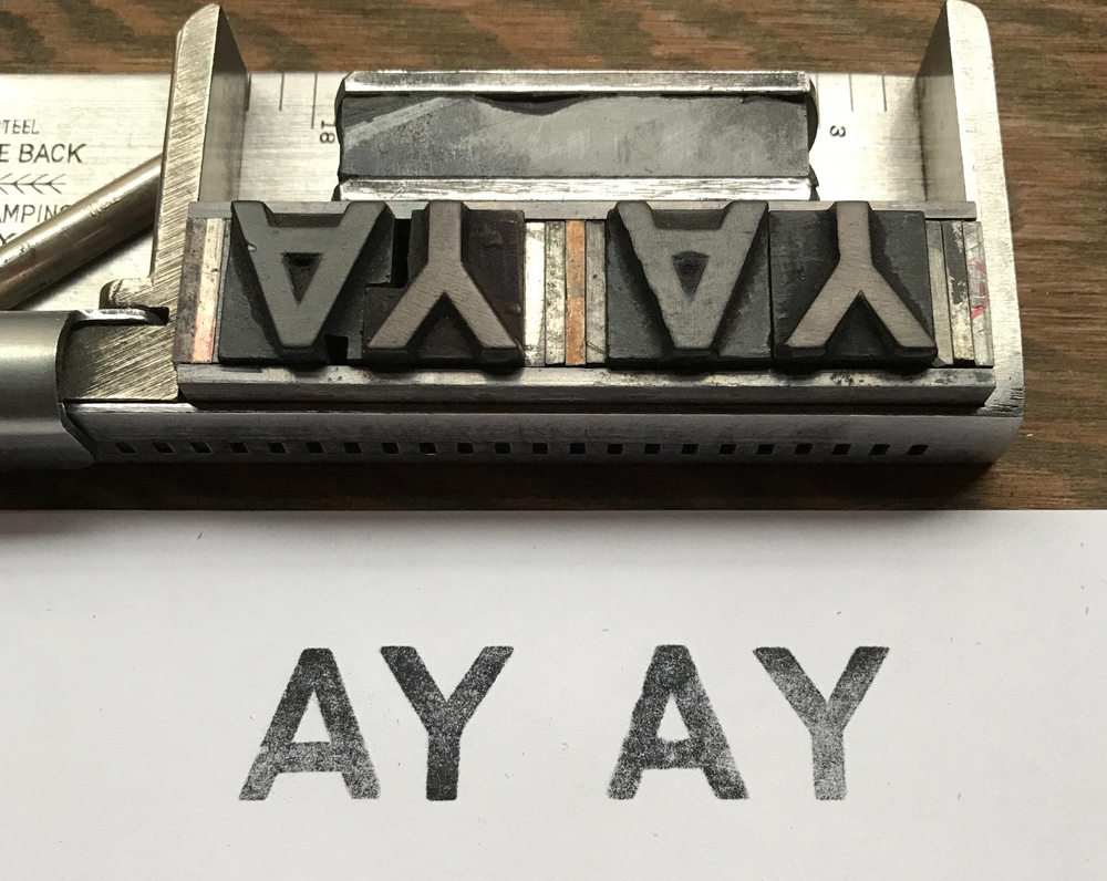
Above you can see two sets of the AY combo, as well as the kerning cut into the letters on the left. Without this there's a ridiculous amount of space between the two.
But this is my favorite example:

While still not quite right, the kerns cut into the bottom letters are a step in the right direction. With a little more effort, I kerned the rest of the word to improve it.
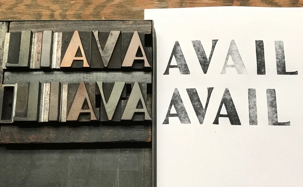
Here you can see that in order to make the letters feel like a word at the top, the rest of them have to be spaced to a ridiculous degree. The bottom is more reasonable but could be a little tighter, and I could trim out more space on the middle A to make this happen.
My preferred method of 'surgery' is a bandsaw because of the detailed cut I can get. I don't like cutting down the long side of these diagonal letters as you never quite know what will be next to it in the future and if you leave it 'squared' then it'll still butt nicely to its neighbor. And if it's too close then you can insert leads/slugs to space it out.
I can often tell if a piece is printed from wood type vs. digitally-set-to-look-like-wood-type because of the kerning. A computer allows for easy kerning pairs and eliminates much of the pains of hand setting type (though not all.) If you are printing wood type and wish to fool me into thinking it's digitally set (ha!) keep tweaking your kerns to make those awkward spaces disappear.
AND... consider this permission to cut/trim your wood type to improve typesetting!