Maybe You're Right But This Is My Song

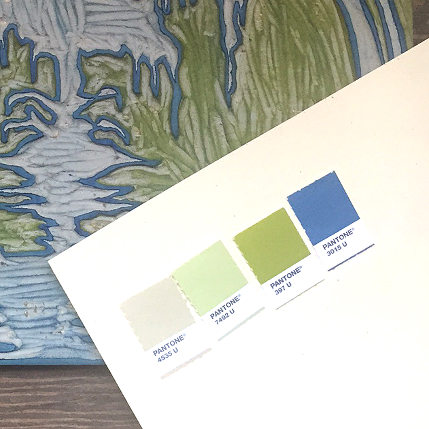
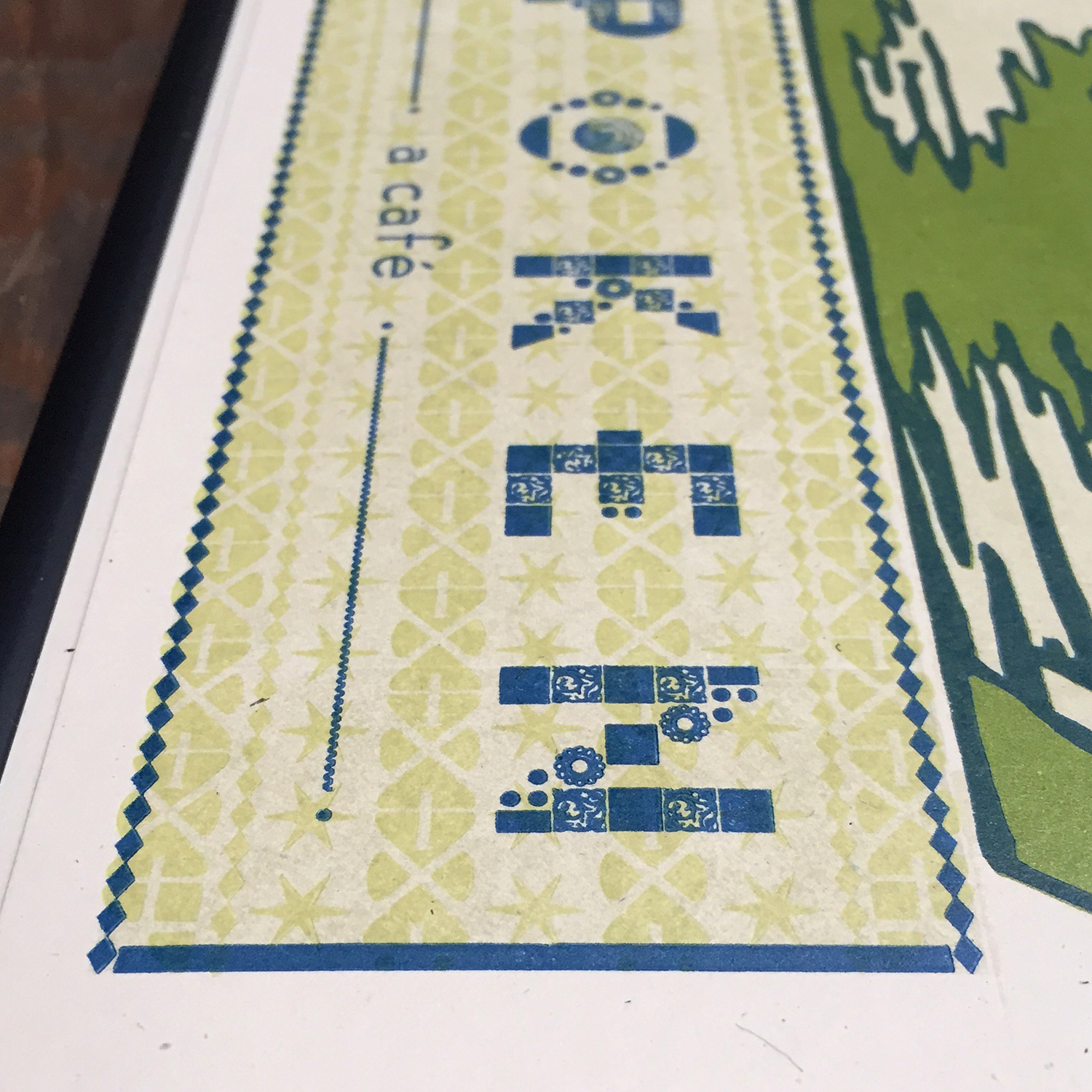
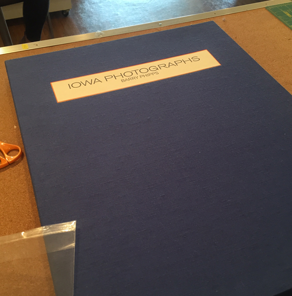
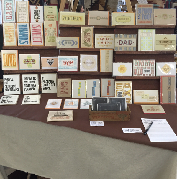
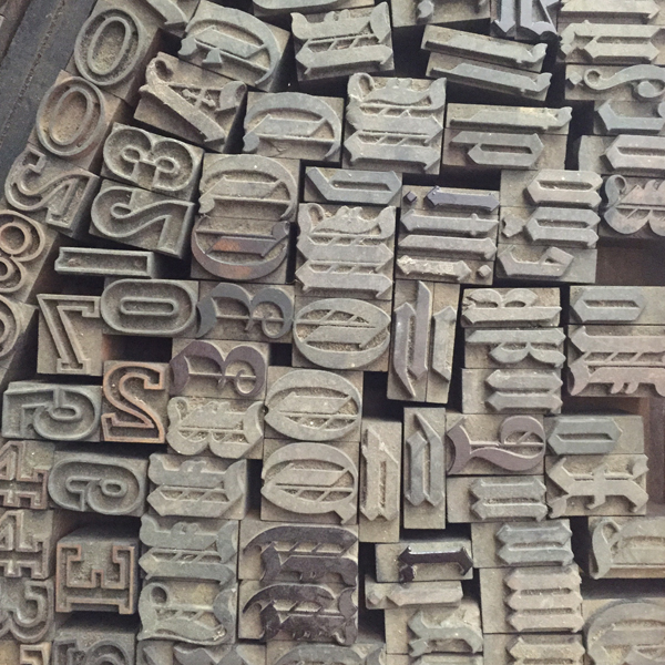
"No, no, no, no. If the book is made up of ornamental patterns then no pattern paper made by someone else will fit."
"Well what do you suggest then? Printing your own end papers?"
"I guess so. Yes."

This snippet of conversation between Richard Kegler (RK) and myself during the early development of An Alphabet of Sorts is representative of many of our collaborations; a lack of satisfying answers until one that involves a lot more work presents itself. And that 'lot more work' is what pushes our projects to be stronger than we ever thought they might be. This post, told through a few recent projects, is the anatomy of an ongoing professional partnership that has always been greater than the sum of its parts.

VERSE

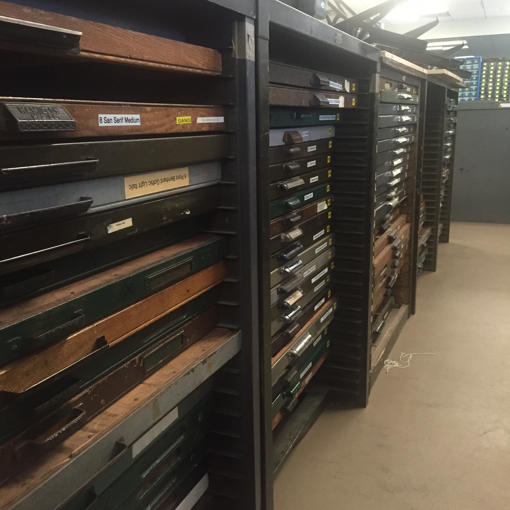
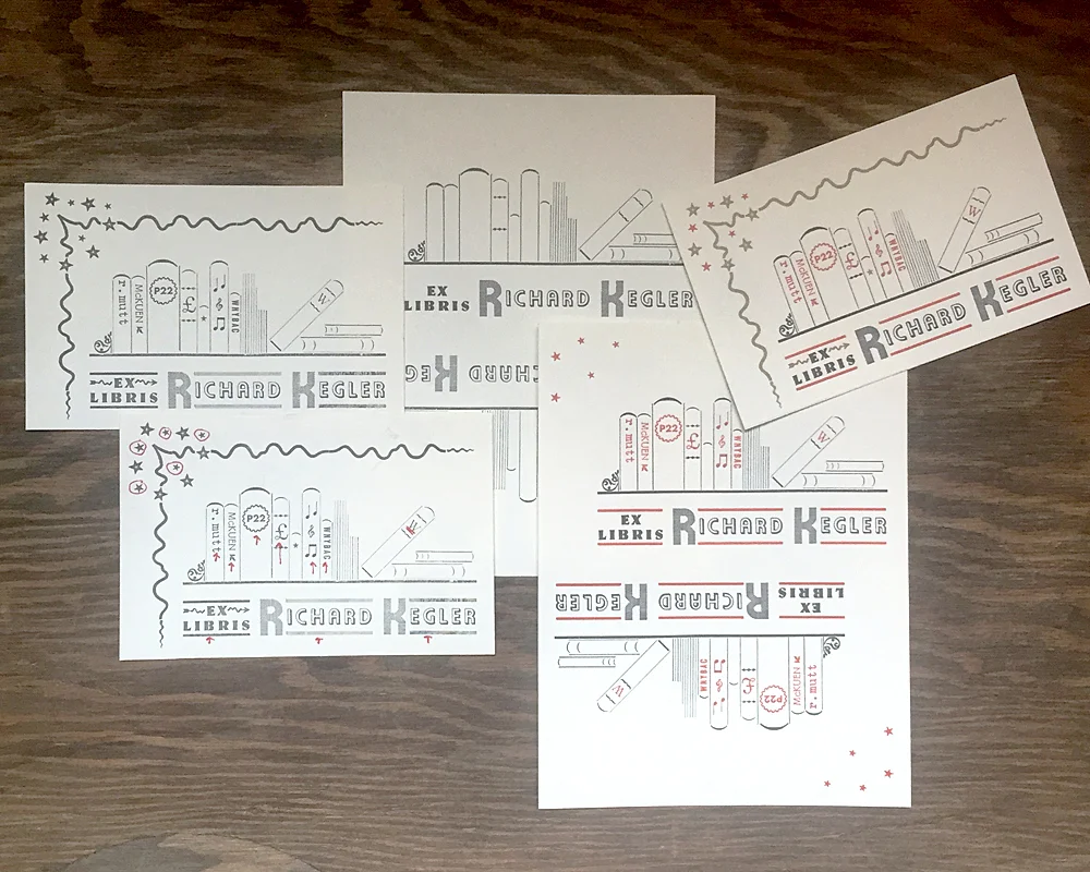
During my residency at Wells Book Arts Center in March, I stewed on an appropriate gift for RK to thank him for securing the position as well as suggesting the creation of An Alphabet of Sorts. When he showed me his library at the Center and mentioned needing a way to differentiate his books from those of Wells I knew immediately that bookplates were in order.

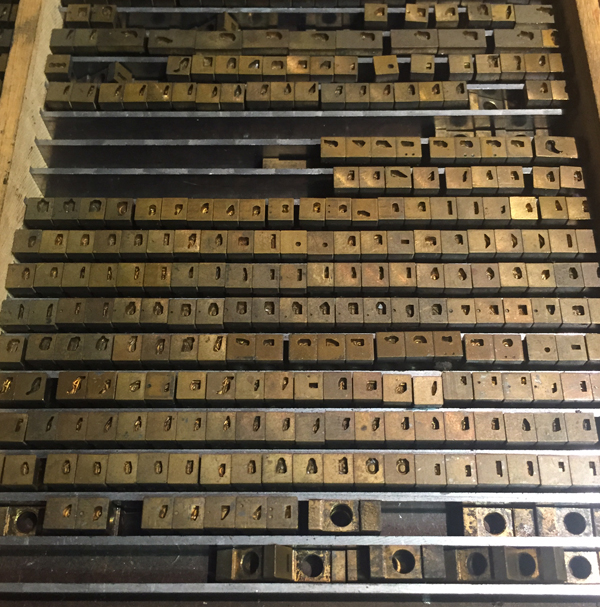
The bookplates I designed were a stew of all the things that came to my mind when thinking about him and what he was passionate about and involved in at various points in life. I created an image of books on a shelf, alongside records in the middle (including the lone 10" that got away, RK). The type is German and includes initials in Alpha-Blox. Rather prophetic.

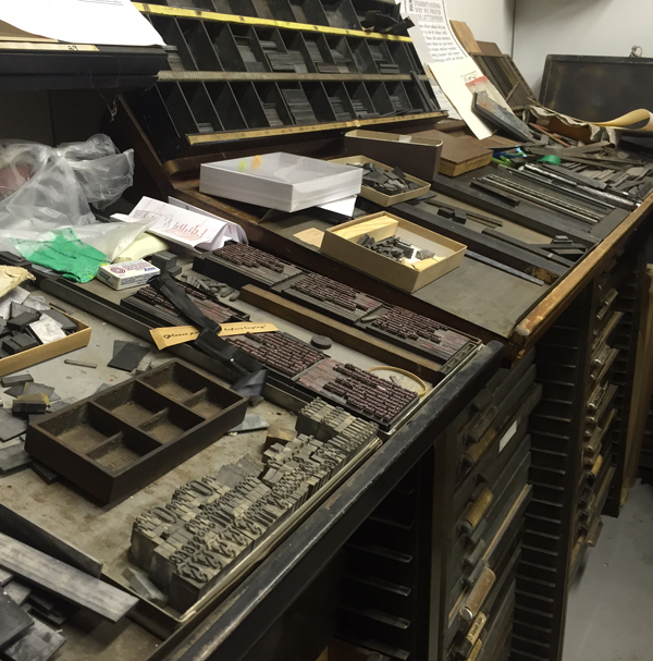
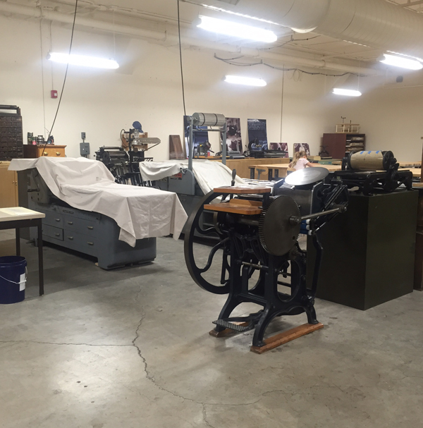
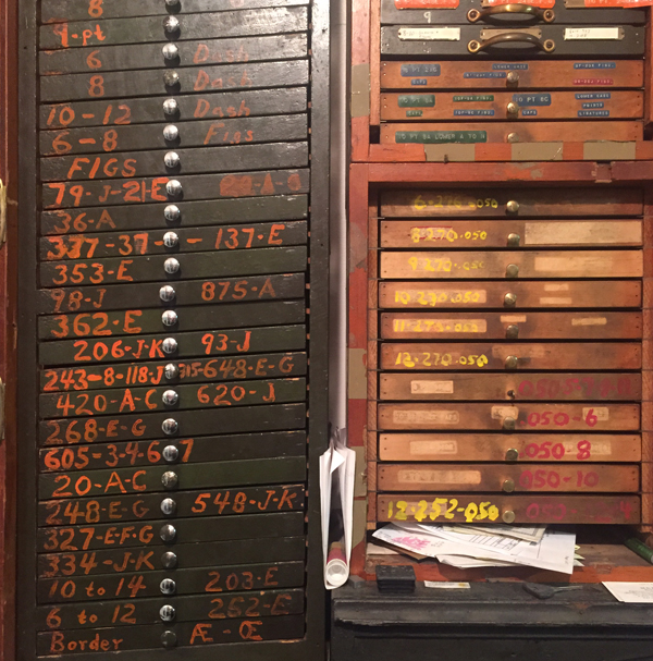
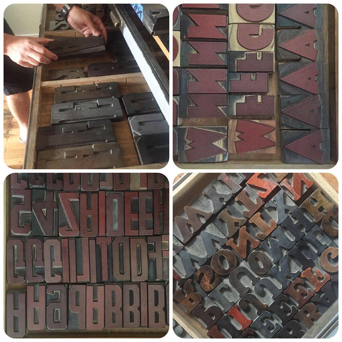
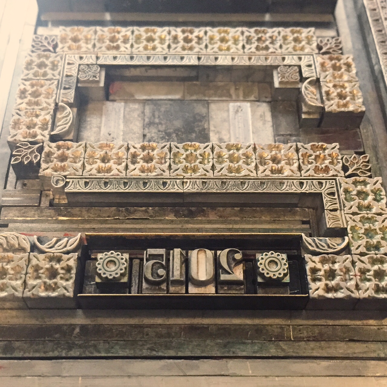
The form for these was particularly pleasing, with so many tiny pieces all coming together. I pulled a carbon paper proof to check the result and was relieved that they looked like books, especially the angled one. It was time to separate the different colors and mark them in a way to keep every piece of spacing in place.

I started with gray because it was the key color. You can see where marker delineates which spaces are placeholders for the other colors.
It was right about here when RK started texting me how badly he needed bookplates. Unbelievable. I bit my lip and kept printing, all the while being bombarded with images of "stuff I really like... y'know, for inspiration."
I replied, "You're breaking my heart. Can you wait on this until Friday, please?" thinking that would give him a hint. It didn't. He sent more.

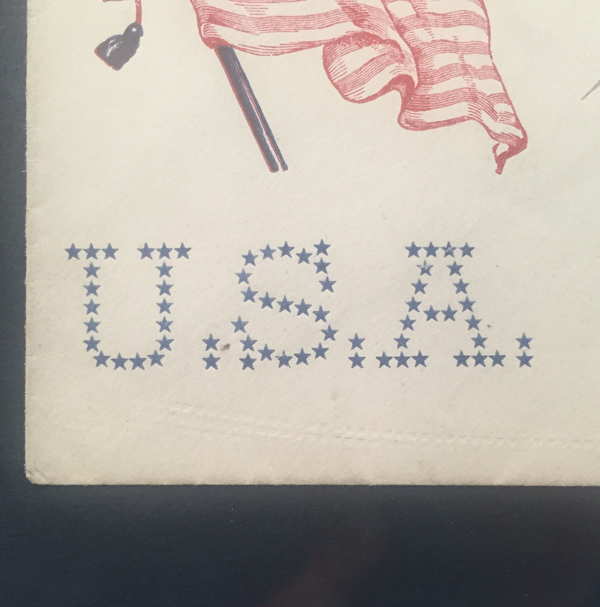
Gold followed the red. The tiny star in the middle represents the gold star on the spine of An Alphabet of Sorts. I wasn't about to leave that volume off the shelf.

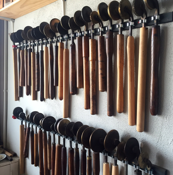
I loved the little detritus left behind when I started to put it all away because it's a fine example of how not to set something unless you're doing exactly what I did; moving minuscule sorts for multiple colors.

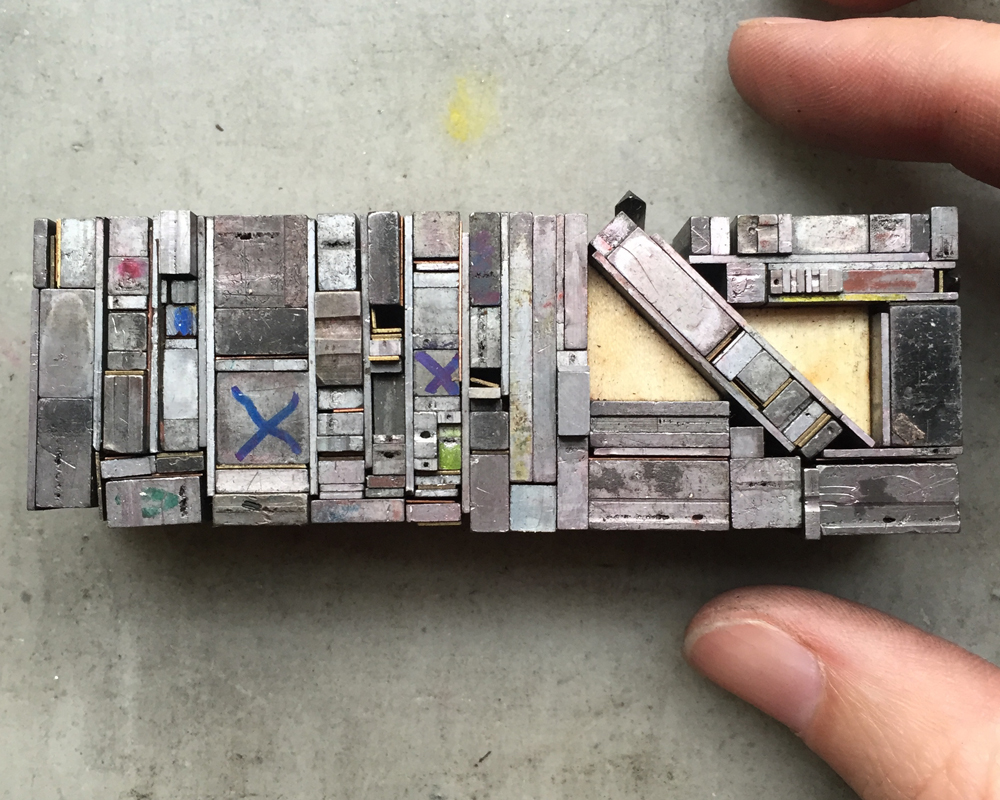
This is a rough shot of all stages of the printing, from the first single-color proof to the end result.

I was quite taken with these until I remembered I was no Rogers or Dwiggins or Preissig, or ANY of the imagery RK had sent during the process. But I mailed them anyway.
I have been asked to occasionally run something through what I've coined 'the RK translator,' meaning his expressions can be difficult to read, especially from a distance. I have discovered that 'nice' means 'that's really f-ing amazing and I'm jealous' and that '!!!!' is the highest praise one can receive.
So when I got this anomaly a few days later, I kept it:

Sorry, RK, but there are actual, complete sentences here and it needed to be documented. I nailed it; a challenging project we were both happy with.

CHORUS

There's no doubt, no doubt, that RK and I butt heads on many things. Anyone privy to our phone conversations will likely overhear one of the following statements:

"You never listen. You're a horrible communicator."
"Don't be so taunting."
"Get off the spectrum and put yourself in my shoes!"
"You're really reading too much into this."

Tension, anyone? But the arguing brings breakthroughs that are the seed of the Next Big Thing. I may be angry, but it channels into pushing my design work beyond myself, all while knowing, feeling I have the full confidence of someone whose respect for me means something.

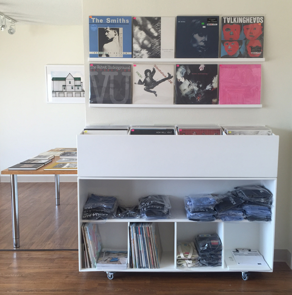
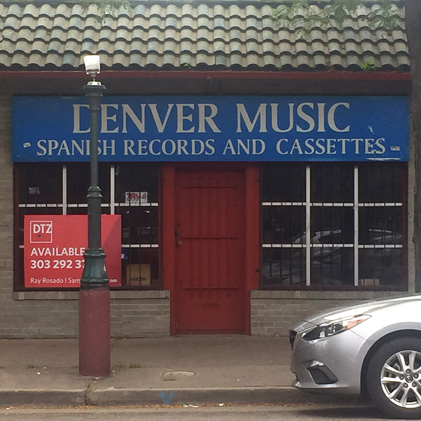
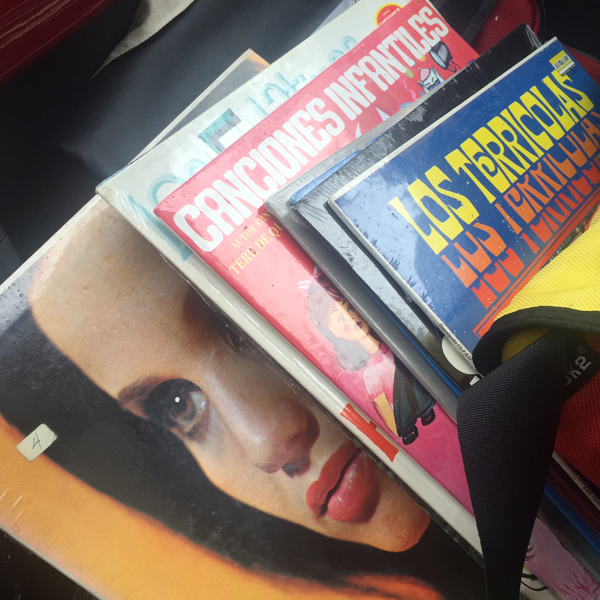
One thing we almost always see eye to eye on is music. With our record store pedigrees and heavily used Spotify accounts, countless playlists have furiously flown between us as our tastes mirror each others. Kiwi bands: Go! Top Ten Wedding Present songs: Go! Cover songs: Go! I made the 4AD list, he followed with Factory Records. We tackled Creation together, all the while avoiding Oasis. It is truly a level of geekiness of which I have no shame.
There are no ground rules but we each have our limits. My 'No No' list: Pink Floyd, Johnny Cash, Nick Cave. His: Morrissey, Death Cab for Cutie, Sleater Kinney. Fair enough.
My favorite playlists are coined One Degree. With these, one person adds one song to the list and the other follows it with something that is one degree of separation away by song title, band name, band members, record label, country of origin, producer, etc. Most of these run about 3 hours long.
One evening Mr. Starshaped came into the office and saw me belaboring a song choice. When asked, I explained how the One Degree lists worked.
"Well, he started it with The English Beat so I followed with Beat Happening. Luna did a cover of 'Indian Summer' so he added 'Ride Into the Sun' which Luna also covered. So I followed with an actual Luna song which he then chased with Wire's 'Outdoor Miner', another song Luna covered. So I followed with a Felt song because, duh, Felt and Wire!..."
And this is when Mr. Starshaped exited stage right, trailing, 'I'm glad you have a work husband to share this with...' and hence that terminology was born.
Side note: I have a second 'work husband' but he surely deserves his own post someday, no?

Sometimes records arrive in the mail at the perfect moments. After lamenting that a beloved De La Soul CD didn't make it out of our old car when trading it in, it showed up just in time to print the aforementioned end papers for the book.

The Bill Drummond record was sent to remind me of the time I couldn't quite place it when he played 'you have 20 guesses to figure this one out.' The Bedhead when I was having a particularly bad day, depressed and struggling with the Magic Hour print. I texted:
"Bedhead live in Chicago record store day only release. Lame. Can you find me one?"
"Of course."

Three days later it showed up with the silly secret admirer note.
And the most recent addition, my holy grail, Velocity Girl's cover of Seven Seas. Note packaging that arrived to Jennifer Gedge, a nod to my crush on David Gedge of The Wedding Present. Aren't you funny, RK.
Lest it seem one sided, I have been hunting for two LPs I want to send and can't find them. I prefer perusing stores to ebay so it's going to take a while. But I have been known to put a little heart into custom notes for special occasions, like his solo show at WNYBAC.

Music softens the proverbial blows we repeatedly throw at each other and I am grateful for it.

VERSE

"How many bookplates did you send, out of curiosity?"
"I don't know... about 400?"
"Do you know how many books I have?"

Do you see what he did there? I certainly did.

Sigh. "What do you want this time?"
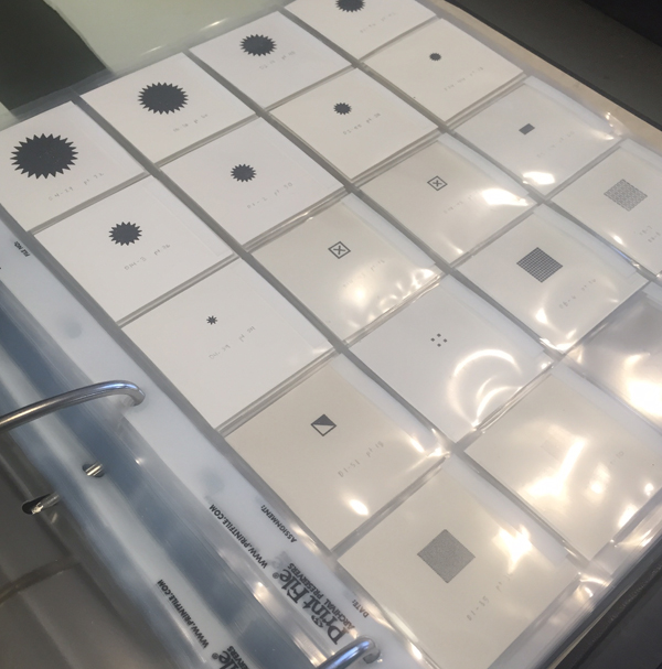
"I need really tiny ones for my small artist books."
"Okay. What should these ones look like?"
Enter the best art direction I have EVER received:
 

And I did know exactly what to do, right after I joked about the book I was writing, with Replacements reference, 'Unsatisfied: 25 years of bookplates for Kegler.'
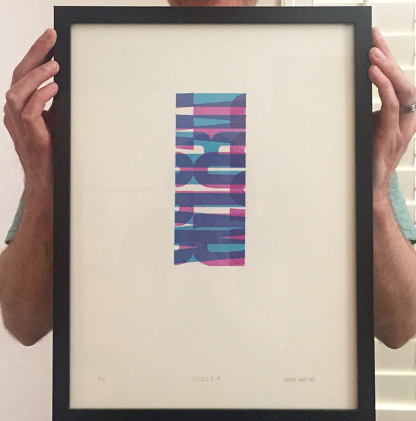
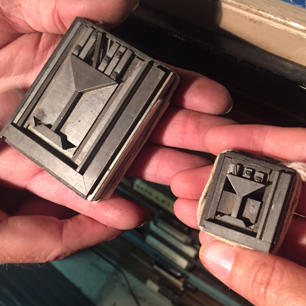
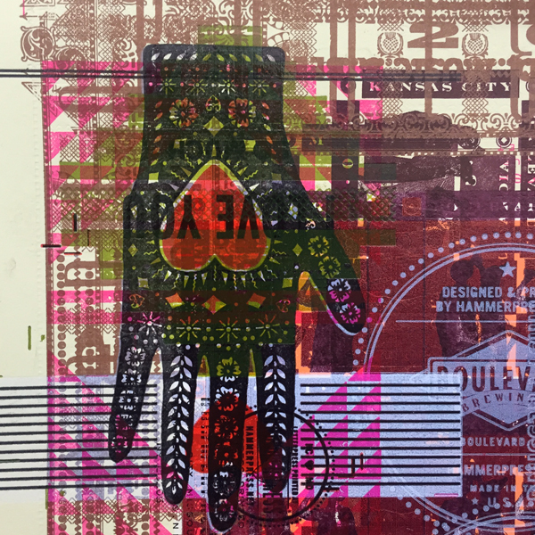
First, a Wedding Present nod as mentioned. This is one of our favorite bands, hands down, and the 'Too Much Apple Pie' line comes from the song Kennedy. I wanted to add it in a way that would be obscured but there. The inner circle would print to help ground what I planned next, but the outer would not. The type is 6 pt. Remember his size requirements? I used an etching needle to shove those tiny brasses in place.

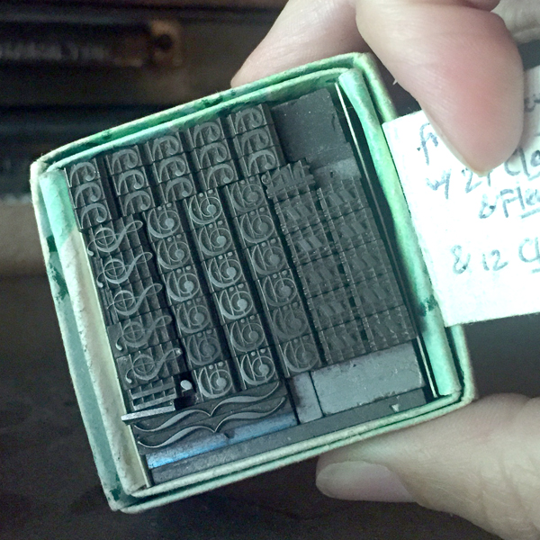
I set and proofed the three main elements so that I could scan and digitally manipulate them to find the best angles. I also gave him options on the tiny inner ornaments.

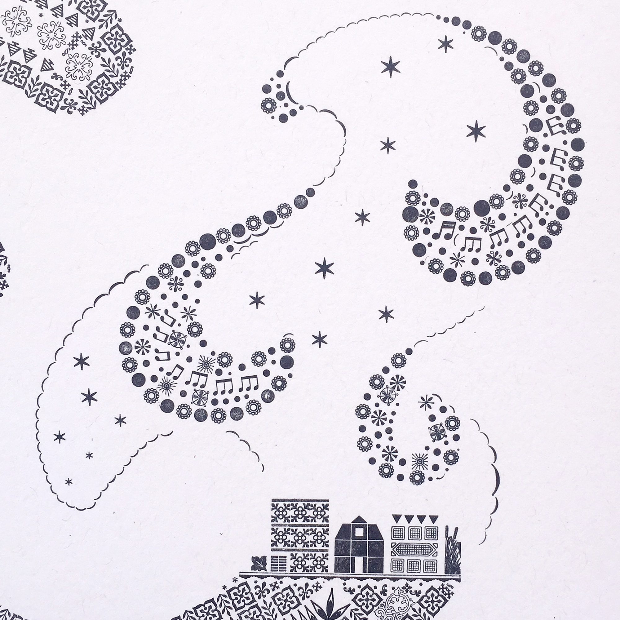
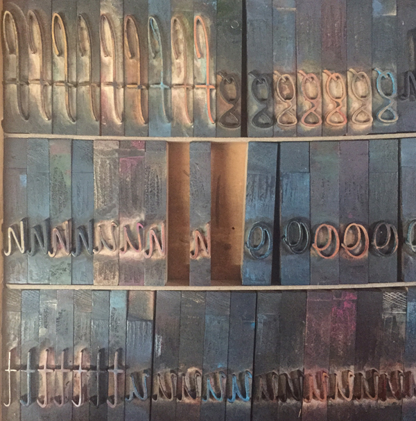
'Dense' and 'dynamic' weren't going to happen in 2-3 color. To create a time warp it needed to be layered and a little nuts. This coil was printed in four different directions, with each ink being slightly tinted with CMYK, as per RK's request.

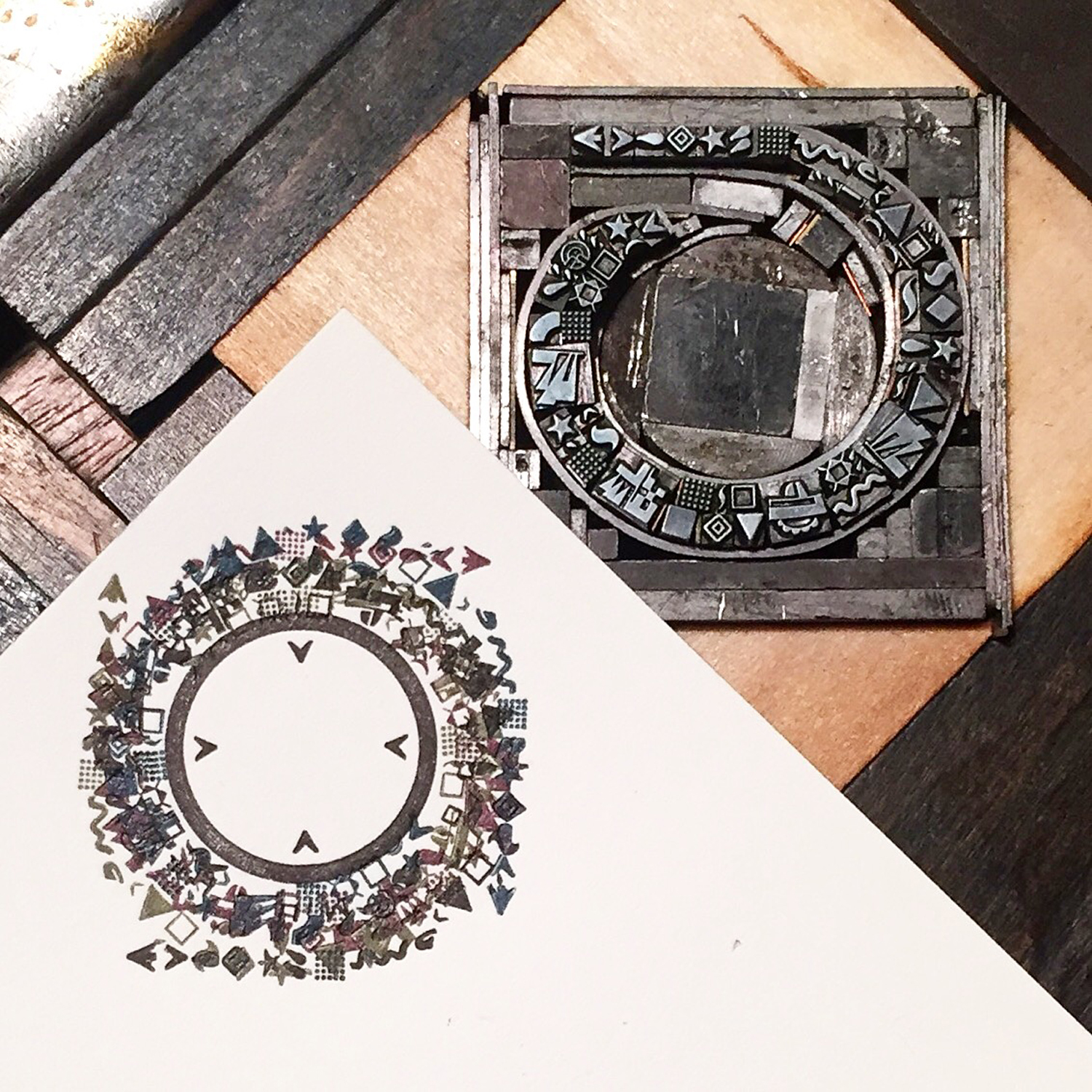
Here are the 6 (yes, 6) color separations.

While finishing up, the deluxe 10" set of The Wedding Present's Bizarro album showed up in the mail. Perfect.

BRIDGE

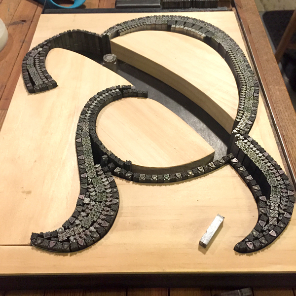
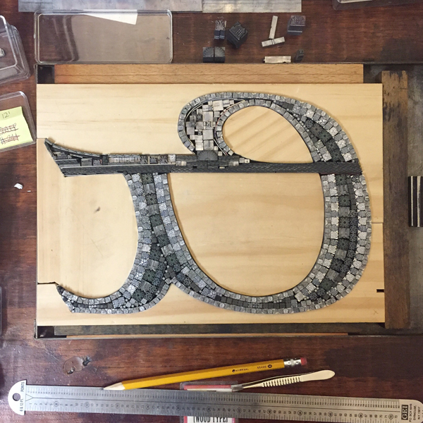
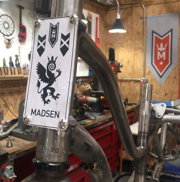
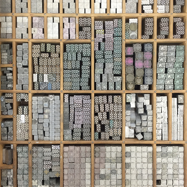
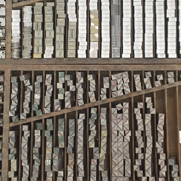
While teaching again at Wells this summer, RK showed me his plans to create an Alpha-Blox style modular type system and I said "I want in. What can I do?" without having any idea of where I'd fit beyond getting to play with the end result. Two months later, a $20k+ kickstarter and plastic injection molds being made as I type, I'm in deep.

I am crazy proud of my work on P22 Blox. With shockingly few moments of wanting to poke out my eyes (or his), I have never been involved in such a successful and equal collaboration. RK had the pieces modeled and drafted and found the injection mold company. I brought in an engineer for second opinions and drawings. He quoted and budgeted the pieces while I quoted and budgeted the prints, packaging and shipping. He threw up all of his thoughts and research into the kickstarter site and I cleaned it up and rounded out the story. He made a clever video while I printed cards and built P22 Analog. He oversaw the start of production while I designed the key chart for the digital release of the typeface.
Our enthusiasm is matched by that of the print community and the support we've received is borderline overwhelming. I like to think my ability to edit and focus and appeal to the right crowd was the perfect complement to the respect RK receives for being a hard worker who delivers (with charm!) on promises of typographic greatness.

CODA

The lack of tension directly related to Blox almost makes me worry something isn't quite right, but we've managed to annoy each other in different ways throughout, so I think it's on the level. It's very possible our friendship will come to blows and explode in our faces (you heard it here first, folks!), in which case I hope we have enough of an understanding of what was to send it off with a proper requiem drink and of course, a playlist centered around the theme of Death.
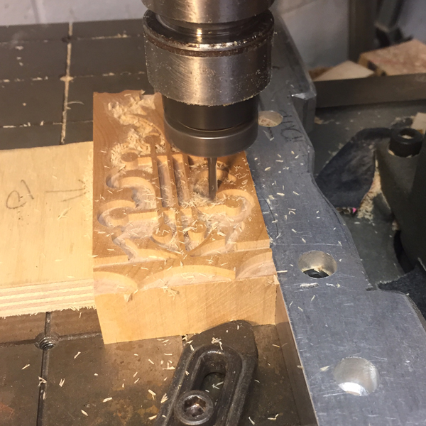
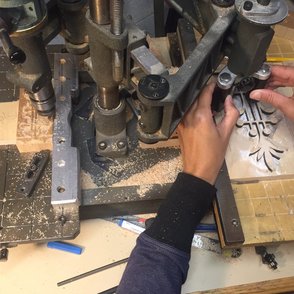
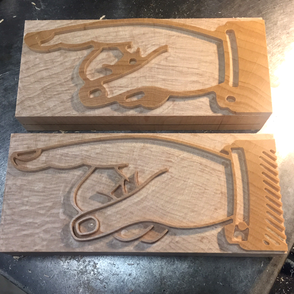
But we must be gluttons as the next project has already happened! Here's a peek:

I've roped in RK for my Next Big Thing that will be announced in November; I'm excited about this one and wouldn't have had the presence of mind to present it to the public without his guidance and enthusiasm, which I am reluctant to admit but it's the truth.

This in a recent email: "Collaborating has been good for us. Better things yet to come."
If this is true, and collaboration continues, then my best work hasn't even been imagined yet. And that's the challenge that gets me into the studio everyday, as well as the prospect of seeing '!!!!' when I shoot off an idea.
Thanks for keeping the faith, RK.


Disclaimer: If your fact checkers confirm with RK that all of the above is a fabrication, please refer to title of post, courtesy of Lush.

The Well-Traveled Ampersand

Who doesn't love a great ampersand, that 27th letter of the alphabet, in all of its varied and interesting forms? The Starshaped collection of metal and wood type includes hundreds of examples of how fantastic this form can be in print. Ampersand imagery is one of the biggest sellers in the studio and I wanted to go big to create larger versions from the metal ornament collection. Instead of being locked into the rigidity of a standard letterpress form, I could create wood furniture (the pieces used to hold a form together) that was based on existing ampersands. This would allow me to be true to a pre-existing design.

And because that one concept wasn't enough, I started thinking about how the ampersands could tie into a geographical region or city and somehow represent that location. And thus, this was born:

Before solidifying my idea for The Well-Traveled Ampersand, I built the structure for the first in the series, Frederic Goudy's Californian, a typeface he designed for the University at Berkeley. I timed this to coordinate with our trip to the Renegade Craft Fair in San Francisco so I could gauge the response.

Filling in a frame isn't as challenging as some of the other work in the studio. However, building in a mini set of row houses and hill-climbing trolley was a lesson in holding things in place while squeezing in spacing. This ampersand was ideally suited for the hills of San Francisco for this reason and the result was very pleasing.

The second ampersand was done while teaching at the Wells Book Arts Center in July. It features Victor Hammer's American Uncial, designed while at Wells College. I love how different this form is from Californian.

Wells College is nestled next to Cayuga Lake, one of the beautiful Finger Lakes of Central New York. While not saturated with people and structures, it does have a fantastic sunset over the lake which informed the imagery in this print.

The third print is near to my heart. Before even casually mentioning what typeface would be used to represent Chicago, folks said 'it has to be Cooper, right?' Indeed. Cooper Black is the only typeface meaty enough to carry a substantial skyline of the city I love.

I had an epiphany the night I embarked on this one, realizing that there has to be a way to represent wind for The Windy City. This involved a lot of lead curving and some tricky setting to retain the shape but hint at the sky. It's almost ridiculous how much is going on in this design.

The fourth ampersand representing the London Underground is fresh off the press!

This form for printing the prospectus will also appear on the final sleeve that houses all of the prints. I arranged the ampersands in order of size to make it look like the tiny airplane was pulling them in banner form.

Here are the details! While each print will be available individually, 50 sets will be packaged in an LP-style sleeve and include a digitally printed colophon showing photos of all of the type forms used to create the ampersands.

The series is available for sale here and individual prints will be listed on our etsy site as they come off the press.

Well Spoken

A while back, Mr. Starshaped shared the story of meeting a Russian man in a coffee shop, downtown Chicago. This man lamented that he hadn't seen the cafe culture in the city that he longed for: the camaraderie, the discussions, the sharing, excellent coffee. My response was that he was in the wrong part of town, as all of this exists in a tiny, magic corner of Ravenswood, the neighborhood Starshaped calls home. For years we've visited the shop formerly known as Beans & Bagels, situated next to the Montrose Brown Line stop. We've witnessed many exciting and positive changes happen during this time, not the least of which included a makeover of both the interior and the menu. And when Will & Sido, the tireless leaders behind the counter, took over as owners, it was time for a name change as well.

I was honored to be asked to contribute a print to commemorate this grand reopening, with the only art direction being to retain the new logo (with its hint of a Cypress tree and nod to Will and Sido's home state, Louisiana) with the name.

fullprint

The print was actually planned as 4 colors but became 5. After laying down a light texture of wood as the first layer, I started what would be a 3-color reduction linoleum cut, meaning it would be carved then printed, then carved and printed, then carved and... you get the idea. The first was solid and printed in the same very pale brown as the wood type to give it more depth. There were a few late nights of carving alongside my Wedding Present albums. It's a good way to work.

lincutting

The second run of the linoleum cut was a deeper moss green.

closeup

I brought in a pop of blue to tie the elements together.

colors

The linoleum cut, carved down to its final color.

linocut

I wanted to create a modular type for the title so I wouldn't have to carve it or find something similar to the logo type. This took a few different arrangements to get right. These are just a few of the carbon paper proofs done while testing out what I set.

proof

type

The 4th color, before the final blue, was a slight texture of ornaments that included Chicago-style 6-pointed stars. The first plan was to print this the same as the green for the logo but that was too deep to live behind the text and not clash. So it became another run through the press.

typecloseup

It was such a treat to see one of the final prints framed and out the night of the grand re-opening. Everyone that came through the door to enjoy a drink and some cajun-style cooking was invited to sign. Seeing a Starshaped print at the center of this outpouring of support from the community was a humbling moment I will always remember.

finalprint

When you're in Ravenswood, go and visit Will, Angela, Sido and the rest of the gang. Get some coffee. Meet a friend. Make some plans to conquer the world or just your tiny corner of it. Whatever your agenda you'll get solid service with a smile. Tell 'em Starshaped sent you.

willangelasido

The Letterpress Trail 2015 part 1: 80 on 80

I am not particularly well-traveled. I've never been out of the country (Toronto doesn't count when you grow up in Western New York), never had a passport, never studied abroad. This is largely due to lack of means; it was a stretch to move to Chicago for college and every spare penny earned from every part time job fed into my education and, well, maybe some records. And while folks will say 'there's always a way', the fact is, you still need to pay for tickets to get places even if you win a scholarship. That little extra was never available. To further the stationary trend, I started Starshaped at the tender age of 23 which necessitated extreme frugality in order to purchase equipment and establish a fledgling business with no investors or loans (1999? No kickstarter, folks). And so planning a summer trip with Jo these last two years is my effort to at least see parts of the country I haven't been to (which is pretty much most of it). When we were accepted into the Renegade Craft Fair in San Francisco it felt like a great opportunity to drive across the country and back, visiting friends and printers along the way. It timed out perfectly to take place before I was scheduled to teach at Wells College so we mapped it out... mostly. Of course the best laid plans have a way of going completely awry and the trip was much more physically and emotionally taxing than planned.

But not to worry, there's quite literally a Redemption Song at the end of this 3-part saga. Loud, thoughtful, ballsy or introspective music keeps me going on long trips and in life and for this one it was a critical crutch to keep me motivated and, well, awake. You can get our soundtrack here and all forthcoming song references are in italic. Follow along if you like!

map

Scheduled to leave July 9th, I frantically worked to wrap up jobs, pack and prep for a craft fair. I finished the last job at about 4:30am Thursday, got an hour of sleep, then threw everything along with Jo into the car to hit the road to Iowa. Our first stop was to the Barry Phipps Shop in Iowa City. While not a printer, Barry is a former Coctail (I learned to print from another member of this seminal Chicago band) and he made my custom printing apron which accompanied us on the trip. His studio is part gallery, part workspace, part record shop, part dance party, and it sums up most of Barry's interests. Outfitted in new t-shirts we took off for stop number 2 in our packed-to-the-rafters 500.

IMG_1212

IMG_1207

IMG_1209

IMG_1210

IMG_1211Pure adrenalin pushed me onward and we enjoyed a visit with Caveworks Press, north of Iowa City. Julie has a great space in her garage for a large Vandercook and plenty of type to keep her busy for a while.

IMG_1219

IMG_1217

IMG_1216Here are a few of Julie's projects, including broadsides, books and cards.

IMG_1214

IMG_1213This print is one of my favorites and lucky me got to take one home.

IMG_1226We rolled out of Caveworks to head directly to Des Moines to spend the night with our pals Tammy and Adam Winn of The Red Door Press. Their entire garage is a print shop, chock full of letterpress awesomeness everywhere you turn. They were printing into the evening in preparation for an event.

IMG_1227

IMG_1225

IMG_1222The next day we joined Tammy briefly at Domestica, a fabulous boutique, where she set up to print with any customers wandering in. Yes, corn husks were printed, too. It's Iowa, folks.

IMG_1228

IMG_1229This is one of Tammy's favorite red doors. Now Jo and I see red doors everywhere.

IMG_1230We had a great time in Iowa over the 24 hours we had to look around. I'm glad this state is close to us as there's so much more to see. We'll be back.

IMG_1224

IAskyline

DJ Jo's Musical Interlude: I'm a Cuckoo, Kiss Me Like You Mean It, Mt. Pleasant (Mom, you mean there's one in Iowa, too?!)

We moved on to Lincoln, Nebraska, to visit Porridge Papers and their glorious retail and papermaking shop. I was smitten.

IMG_1238

IMG_1240A rainbow of gorgeous handmade paper.

IMG_1241

IMG_1233Paper drying out. It's a long, tiring process, but the result is so fantastic and I'm thrilled to be working these papers into upcoming projects at Starshaped.

IMG_1234Porridge also offers a Letterpress Bar, where, after a class, you can come and do your own printing. This is the perfect space for small projects, complete with type, tools and inspiration.

IMG_1231

IMG_1232The print shop is shared with a bookbinder and his tools.

IMG_1239

IMG_1235

IMG_1236Huge thanks to Chris for showing us around and graciously hosting us at his home for grilled pizzas and stimulating conversation. As far as Jo was concerned this house had it all: a 7-year-old, a dog, a cat, a turtle, fish.

IMG_1237

IMG_1243Right before we left Chicago, I lamented to Will at Beans and Bagels (our other home in the city) that I feared I wouldn't get a good cappuccino while on the road. He then emailed me a complete list of all the best coffee shops in every city we were scheduled to visit. Now we had a second map to follow that included Cultiva, where you can also get nutella crepes.

IMG_1244

NEskyline

You're a long state, Nebraska, but we made it through. We stopped briefly in Rock Springs, Wyoming, to gas up and steal a glance at its charming features and 'town that type forgot' charm. There are a set of historic markers set up to check out so it didn't feel odd to take photos of its current state; more on this later.

IMG_1255

IMG_1253

IMG_1252

IMG_1250

IMG_1251Then it was on to Laramie, our home for the night. We hit the kid jackpot and saw the bright lights that night as it was the last evening of a carnival celebrating the town's jubilee. I'm not a selfie person, but we really lived it up on those rickety rides.

IMG_1248

IMG_1249In Wyoming, the weather seems to change fast. The next frame would show a heavy downpour that dissipated just as quickly.

WYskylineFinally landing in Salt Lake City, a place we both enjoyed immensely, I was able to meet up with longtime printer friend David Wolske just days before he was scheduled to leave town to move back to Indiana (score a big one for the Midwest). I was treated to a private showing of his last series of prints, one of the few things not packed into the Uhaul.

IMG_1278

IMG_1256David then took us over to the Red Butte Press at the University, his place of employment for one more day. What. A. Place.

IMG_1279

IMG_1277

IMG_1259The type collection is very impressive and beautifully organized.

IMG_1267

IMG_1265

IMG_1263

IMG_1262

IMG_1260

IMG_1272

IMG_1258

IMG_1268

IMG_1270Most of the ornament collection is kept in these hardware shelves and is in the process of being documented. Nice to see interns do the same kind of work in every shop.

IMG_1276

IMG_1275

IMG_1274

IMG_1273Monday we took a non-printing side trip to visit Madsen Cycles, maker of our Press Bike. A well oiled shop of a different sort, it was exciting to see the design and development of these cargo bikes in person.

IMG_1281

IMG_1288

IMG_1287We stayed with a former Chicagoan while there who accompanied us with her stepchildren. The girls painted their faces right before we left so here you see a kitty-faced Jo explaining to Mr. Madsen her ideas for kid-sized cargo bike.

IMG_1285He wasn't one to disappoint and whipped out his phone to share secret images of a project in the works. Wait for it, folks.

IMG_1286

bike

IMG_1289Salt Lake City is a place we'll definitely visit again someday. We had a day to unwind and Jo had new friends. I snuck out Monday night for a supportive and stimulating dinner with David and his wife, Lauren, that gave me much needed clarity on this trip. Their insight into following a non-traditional path in letterpress work is spot on and encouraging and David reminded me of where I was in 2003 when we first met. Sometimes you need to go back to your roots for a drink or two.

Grabbing good coffee at the Rose Establishment set us on the run Tuesday morning.

IMG_1290

UTskylineAt the urging of David, we were able to sneak in a brief visit to the Black Rock Press at the University of Nevada to meet Inge Bruggeman. The shop is large and offers a lot of typographic treats.

IMG_1300

IMG_1296My first Californian sighting, something I was in tune to having just finished a print featuring this ampersand (next image... more on this series to come).

IMG_1295

californian

IMG_1299

IMG_1301

IMG_1302A whole table of freshly cast Bixler Letterfoundry type!

IMG_1304Jo was enamored of this brass line gauge. Maybe she's cut from the same cloth as Scott Moore.

IMG_1303

IMG_1305I struggled with Nevada. It was my first moment of true homesickness and I had a near-panic attack while listening to Don't We Always Get There, wondering what the hell we were doing so far away from home. The gravity of the situation really sunk in, especially sitting in the hotel of a casino I hated, but Jo adored (kid midway, need I say more?). Then, following our coffee map, we found these guys pouring Blue Whale Coffee and all was well again. In a tiny place the size of our home office, there were two other Chicagoans there.

IMG_1308

IMG_1307Hot chocolate to go along with the obligatory casino t-shirt. That she loves, of course.

IMG_1306

NVskylineCalifornia All The Way, indeed. We made it. The two things Jo wanted more than anything on this trip was to see the ocean and to hug a redwood. After our touristy jaunt to the Golden Gate Bridge we started Thursday morning communing with trees.

IMG_1312 IMG_1311

IMG_1313

IMG_1315The kid managed a 2-mile hike through the forest and loved it. We found a few clearings with tiny stone formations from past visitors and I couldn't help but giggle over what Julian Cope would make of these.

IMG_1316After scaling redwoods we visited mountains of metal type at M&H.

IMG_1335Hopping in on a tour of the facility and Arion Press, it was great to see Brian again, doing what he does best, from describing the work to checking forms to wrangling a cranky two-color press.

IMG_1317

IMG_1319

IMG_1320

IMG_1324They have a lot of metal type. I don't know how to describe how overwhelming it is... in cases like this to the substantial hallway full of fonted up, newly cast type. I died a little with the enormity of it.

IMG_1322

IMG_1318

IMG_1327

IMG_1323

IMG_1329

IMG_1331

IMG_1328Brian pulled out some of the special treats to show me and I found more Californian.

IMG_1325

IMG_1326

IMG_1332Chris explains the casting process.

IMG_1336

IMG_1334And with that, here's some serious porn for Jessie at Punky Press, up and coming type caster. It's a room loaded down with matrices for casting, all in their tiny, organized boxes.

IMG_1337

IMG_1338

IMG_1339

IMG_1340

IMG_1341Jo should really work for P22 Type Foundry because she's an expert spotter of their type. 'This must be Mr. Rich's type case' she said then walked away.

IMG_1342Finally, we made it to the Renegade Craft Fair at Fort Mason Pavilion. Friday was open only to wholesale buyers and was very low key. We picked up a new account and chatted with many people about our custom capabilities. Mostly I was relieved to tears to see these two: Louisa, one half of Munie Designs (and former Starshaped intern) and Julie, one of half of Letterform and one whole of Nourishing Notes. My people. Hugs!

IMG_1347I felt pretty good about our booth set up this time around, like I finally 'got' how to display things in a way that people can see detail up close. Huge thanks to Dan Grzeca for help on this front, and to Matt at Virgin Wood Type for making my card displays.

IMG_1345

IMG_1344

IMG_1346And we broke out this new sign commissioned from Moore Wood Type.

IMG_1364Friday felt pretty successful and we headed out to an envelope show at the San Francisco Center for the Book. The place was really hoppin' and everyone could make envelopes while there. If an even remotely crafty project is around, Jo will find it. She made a dozen or more envelopes from their diecut sheets while I poked around at the type.

IMG_1359

IMG_1351

IMG_1350

IMG_1348

IMG_1354

IMG_1355

IMG_1352

IMG_1360

IMG_1357

IMG_1356Louisa and Jeff joined us here as well and made their own envelopes.

IMG_1358

We made it to the ocean. Do you remember your first time seeing it? Did it look like this? It was Friday, and I was In Love.

[wpvideo mC1KMcsB]

Before heading into Fort Mason Saturday morning for the fair, we made the obligatory stop at this dangerous place. So good. We also spent every morning at The Mill, enjoying Four Barrel coffee which was too good to be true. No pictures of that; the hipper than thou atmosphere would have given us the boot for sure.

IMG_1362Optimistic! But it wasn't to be. This was one of the worst shows I have ever done. We were all but assured this was the craft fair version of The Sure Thing and the next best thing to the Chicago fair which we have been a part of for the last 5 years. But just before leaving town I found out Starshaped didn't make the cut for Renegade Chicago. I was very disappointed and questioned the reasoning but experience in San Francisco leads me to believe this is a blessing in disguise. Most vendors fared very poorly in San Fran and this may point to the fact that the size of the fair was doubled without vendors being aware of it. There were two buildings and 500 sellers (can't fully say 'makers' as there seemed to be a number of fair trade goods as well) which is completely overwhelming for shoppers. Renegade has never been the most vendor-friendly fair which is fine as long as sales are strong (and they always have been exceptionally strong). But Starshaped isn't looking for 'exposure'; the studio doesn't need to use Renegade as a marketing platform the way a new vendor might, one that is able to write off the loss in sales. We just need the sales. So it looks like we're breaking up with the Renegade gang and will be moving on.

IMG_1363I did manage to get a lot of thank you notes written and Jo made new friends who were also stuck in booths with their parents all weekend. They ran between all of our booths, ate together and schemed, and probably used the free photo booth too much. But hey, it was free, unlike the $3 Diet Coke in a Cup that I got.

IMG_1366And we did get to see our Detroit friends, Arsenal Handicraft, who had the perfect print for the weekend.

IMG_1367One last romp in the ocean and we were on our way to Tahoe for about 8 hours to sleep before the longest part of our trip.

IMG_1365

The Letterpress Trail 2015 part two

The Letterpress Trail 2015 part three

The Letterpress Trail 2015 part 2: Bloodier Than Blood

Renegade was devastatingly bad. If we'd had a 'bad' Chicago show, we still would have made enough money to cover the bulk of our entire trip. As it stood, we broke even. This meant throwing everything (and Jo) into the car right after the show ended Sunday night and white knuckling it to Lake Tahoe to sleep before moving on. I had to figure out how to move money around to cover the next week, how to make the car function as so little product sold and it was packed (now with sand dollars and crab legs) and how to not sob continuously in front of Jo. We found a Motel 6 at 11pm and I tried to settle into sleeping before Monday's 12 hour drive. I won't lie; I felt pretty desperate and angry and trapped on the wrong side of the country. IMG_1369

I left each morning as early as possible so that Jo would fall asleep in her tiny back seat. It made the ride faster for her and gave me a few hours to think and listen to angry songs. The angry songs gave way to acceptance, and by the time Kegler sent Endless Grey Ribbon I mustered the patience and sense of purpose to get through the rest of the morning.

IMG_1370

We spent quite a bit of time on 50, grabbing gas wherever we could just to be prepared. That said, our mouse of a car gets extremely good mileage and it was my own paranoia that made me stop every time we saw GASOLINE. This route is the traditional Pony Express route and there are many tiny towns that haven't aged in 100 years. I don't have pictures of these; while the worn, hand painted signs and once-stately buildings hold a definite charm, the unfortunate deterioration of an economy to support the humans trying to manage them is not. We soaked up what we could to avoid partaking in 'ruin porn'.

IMG_1371

DJ Jen's Musical Interlude: Plenty Times, Wide Eyes, Box Elder, Mother of God

When Jo woke in time to enjoy southern Utah (and it was beautiful) she was ready to rock the rest of the afternoon.

DJ Jo's Musical Interlude: The Party Line, No Cities to Love (this one always makes you feel better, Mom), Nanny Nanny Boo Boo, Stars 4-Ever, Your Cover's Blown

IMG_1372

Right about when we stopped for a break and shot this photo, a rock hit us hard. When we got to Grand Junction we had a cracked iPad, iPhone and now windshield. The Sound of Breaking Glass is very expensive. I had the phone repaired in Denver as it was a lifeline for navigation.

We met up with kind and welcoming Tom Parson who toured us around the Englewood Depot, a former train station he's turning into what will be a fantastic print and book arts center. While in its early, rough stages, there is a full basement with easy access to what will be garage doors for loading in presses and an upstairs for small presses, a library and workspace.

IMG_1420

IMG_1378

Then we visited his home and were blown away by his collection of books and everything related to printing.

IMG_1381

A slightly trepidatious Jo heads into the garage to check out the print shop. Every square inch of this place is covered, mostly with type.

IMG_1382

IMG_1405

Tom pulled out a lot of treasures to share.

IMG_1395

IMG_1390

IMG_1384

IMG_1385

IMG_1391

IMG_1392

IMG_1399  IMG_1402

IMG_1403

He's been slowly proofing and cataloging his extensive collection in a few ring bound booklets to keep track of what's there. He's excellent at making notes about whatever he can learn of the type, as well as where he found/purchased it.

IMG_1421 IMG_1422 IMG_1423

IMG_1398

I am coveting these things:

IMG_1406

IMG_1407

Then we rode over to visit Jason Wedekind at Genghis Kern, who has just acquired a building he is setting up as a co-working space. This place is right next door.

IMG_1408

The print shop is in the back of the new space and is really coming along.

IMG_1417

IMG_1411

Visiting print shops can get old when you're eight, but the payoff was worth it; Jason taught Jo how to always win at tic tac toe. I only wish we'd had room to bring some Old Style.

IMG_1416

IMG_1424

There were a few (and by few I mean hundreds) of records left from the former store next to the co-working space which Jason snagged. No longer lonely LPs, these were headed to good homes, including mine.

IMG_1418

From there we went to the home of a former Chicago friend and librarian I had the pleasure to work with a long time ago. It was wonderful to meet little Bea, born about a year after Jo following their move to Denver. Getting a chance to relax, we reminisced over wine and revisited a birth announcement I did for Will. Charles, the older boy on the announcement, celebrated his 15th birthday the day we were there.

IMG_1425

IMG_1419

Off again to Kansas City, Missouri.

IMG_1426

Being welcomed in KCMO with a set of gorgeous Hammerpress prints and cupcakes was a real treat in every sense. We chatted a LOT about the state of running letterpress-based businesses and shared stories. I knew there would be a lot of ornamental eye candy to enjoy here.

IMG_1437

IMG_1442Their new retail space is nothing short of stunning.

IMG_1444

IMG_1443Matt, Brady and Kate. Unbelievably great to see them all.

IMG_1427

IMG_1428

IMG_1429

IMG_1431

IMG_1432

IMG_1438Top notch storage system.

IMG_1434

IMG_1439

IMG_1440The ink drum corps.

IMG_1433

IMG_1445

IMG_1441

From there we headed to Two Tone Press to soak up the talent of these ladies. Their prints and linoleum cutting ability are out of this world. Sometimes, literally.

IMG_1455

IMG_1447

IMG_1452

IMG_1451

IMG_1450

IMG_1453

Huge thanks to Michelle and Angie for welcoming us and sharing their work!

Best Western is Jo's idea of extreme luxury (in-room jacuzzi and the Disney Channel), so we slept well in KC. The next morning we hit Little Freshie and made our way to St. Louis.

IMG_1457

This is the home of Firecracker Press, Central Print and the Alpha Beta Club. We got in early enough to park ourselves there for the day and catch up on computer work. Greeted by the sweet sounds of Sam & Dave, this was the perfect, soul-filled balm for a long drive.

Firecracker sits on one side of the building, Central Print on the other and the Alpha Beta Club in the middle. We set up shop there in the middle to be able to see and enjoy everything that happened around us.

IMG_1471

IMG_1472

IMG_1458

IMG_1460

IMG_1459

IMG_1465

IMG_1464

IMG_1470

IMG_1468

IMG_1461

IMG_1462

IMG_1463

Deep into discussion with Kristina about designing and making zines.

IMG_1477

Central Print hosts summer workshops for teens and these prints are the result of one that involved pressure printing.

IMG_1473

The CP side also sells cards and prints. It's a dangerous section to be in.

IMG_1474

IMG_1475

IMG_1476

Our office for the day.

IMG_1478

Firecracker initiated the Letterpress Trail map a few years ago (so maybe this traveling around is their fault?). Eric nearly finished ours off as only he would be allowed to, with a giant sticker. You can still get these prints and collect stamps in all the shops you visit.

IMG_1480

We left with some real gems.

IMG_1481

Huge thanks to this great gang for welcoming us and letting us be a part of the atmosphere for a day.

IMG_1482

That night we went to Perennial for a benefit where Jo and Eric's daughter made some clever cork boards and jewelry.

IMG_1489

At First Light we headed out to Columbus. This sign was almost too much. So desperate for Chicago, it was all I could do to turn towards Indianapolis.

IMG_1490

But our time in Columbus at the home of Roni and Scott Moore always feels like home. Jo got quality time at the community pool and the impressive zoo while I went at it making wood type under the patient guidance of Scott.

IMG_1491

So many patterns, so little time.

IMG_1493

Scott has added a laser cutter to his wood type making toolbox and it was fascinating to see it in action, cutting 'new' patterns.

IMG_1494

Here are the patterns for the snowflakes we collaborated on last Fall, as well as some of the laser cut versions.

IMG_1495

IMG_1504

I settled on this ornament and set out to make two.

IMG_1497

For these we started with the fine cutting before moving to the rough cut. It's a slow, methodical process that's very easy to mess up. You have to carefully trace the pattern while the cutting side takes care of business.

IMG_1501

IMG_1502

Here are the final two. Not bad!

IMG_1503

Then I moved on to the manicules as I don't have any large sets. The patterns can be used to create any size you desire with adjustments on the pantograph. I opted for a set that is 30 picas long (about 5 inches).

IMG_1505

I started with the rough cut on these as you can see on the top piece. The bottom shows the addition of the finer cut, but not the hand finishing that needs to happen to complete the job. Did I mention this is *really* a process?

IMG_1506

I made two sets so I could share one with Matt at Virgin as well as sneaking in some sunsets.

IMG_1507

We hit a huge and scary pothole on the way into Columbus that severely damaged a front tire and we needed to replace both. Of all the places for this to happen, Columbus was the best possible location. I was grateful for Scott's 'dad mode' kicking in as he found a location that could replace the tires immediately. We had to be in Buffalo the next day so our window was small. Scott and Roni are the most gracious hosts and staying with them is always a comforting pleasure. But it was time to move on again. We found a much needed Car Wash on the way to New York and we were off for the last leg Jo and I would share together.

The Letterpress Trail 2015 part one

The Letterpress Trail 2015 part three