Lost Type... and Found

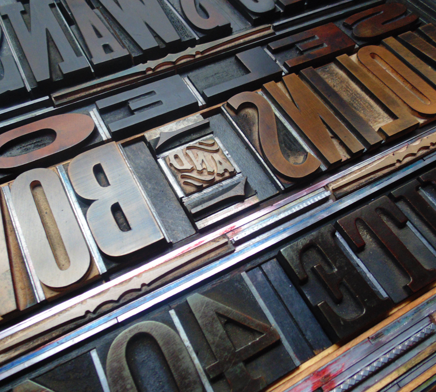
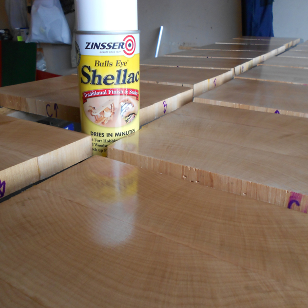
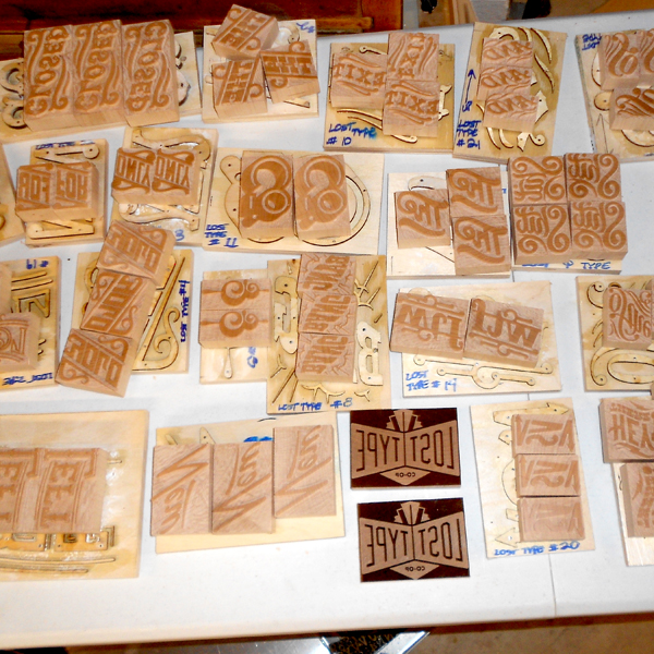
Working in a studio alone most days means that it's important to make time for collaboration. Luckily, this happens pretty regularly and these posters for Lost Type are a great example. Working with Dan Gneiding, the designer of Dude Hank along with friend Scott Moore of Moore Wood Type, the poster showcases a set of fabulous new catchphrases designed as digital fonts but cut as wood type, too, as they were traditionally produced.losttype1 
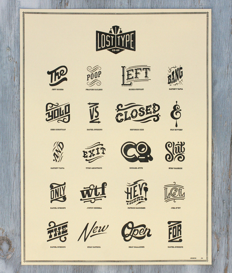
The following images are courtesy of Scott, as he documented his process of converting the files for each catchphrase into actual wood type, starting with the wood planed to type high (just shy of an inch).

scott7Stencils are created for the pantograph, which traces these while the connecting arm carves the actual wood type block.

scott4
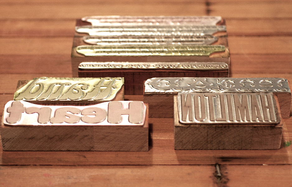
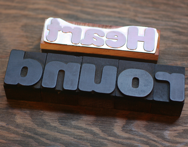
Here's a great shot of the original stencil alongside the finished piece of type.

scott3
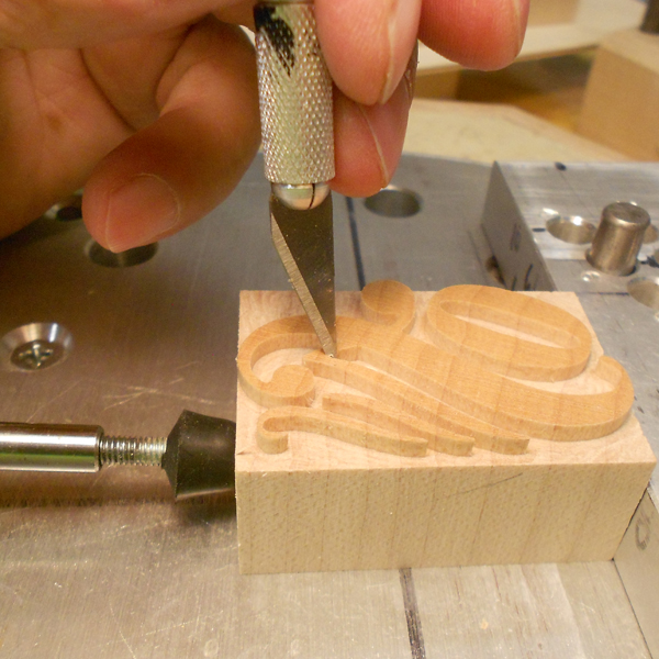
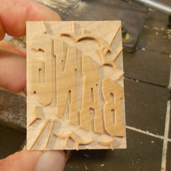
The smallest areas and details are trimmed by hand. Love the laboriousness of this process!

scott6

scott2

scott1
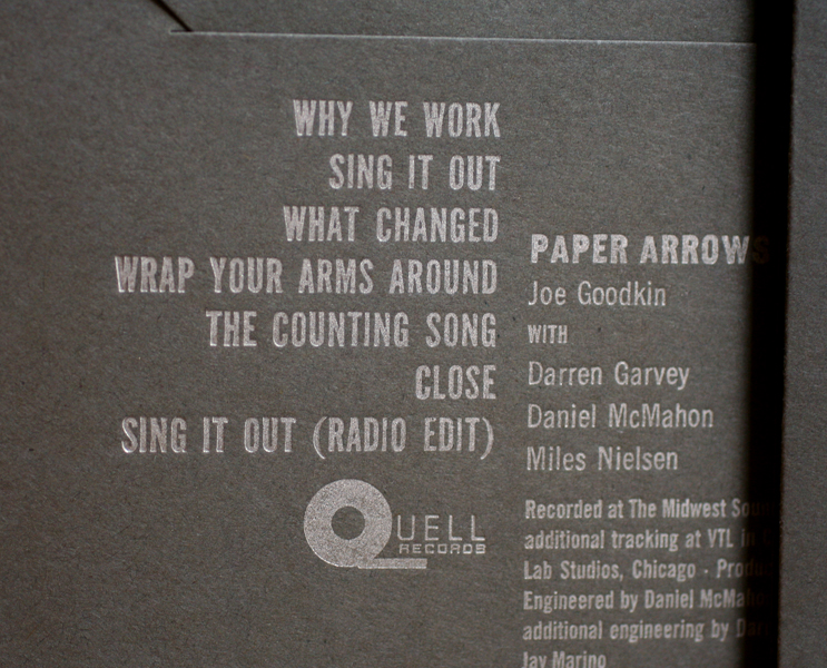
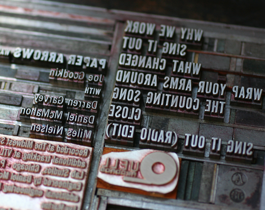
The poster I printed was the combination of a laser cut Lost Type logo, the pantograph cut catchphrases and magnesium plates of the names of the designers underneath.

Tlosttype5I printed the posters at Jim Pollock's studio, as he owns a Vandercook 320G press, which is substantially larger than our Vandercook SP-15, and capable of printing 18x24" posters.

Tlosttype2
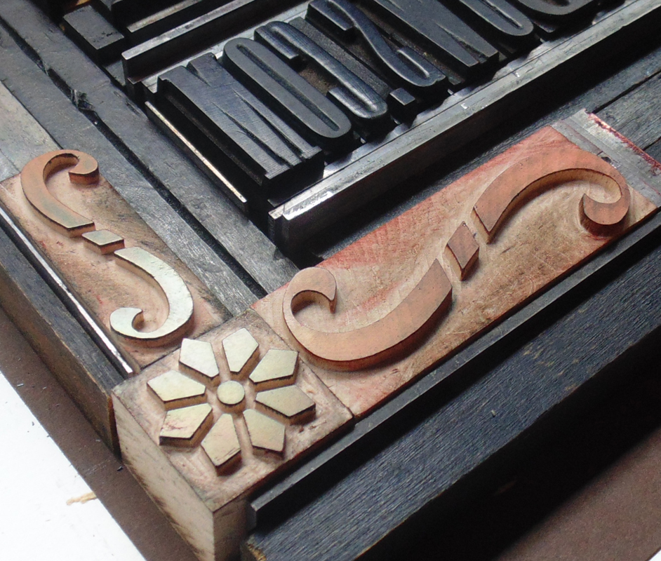
I particularly enjoy this ampersand.

Tlosttype4

losttype4

Tlosttype3See that little POOP in there? That one was designed by new friend Frances MacLeod, which I didn't realize until well after this printing!

Plosttype5

Plosttype6
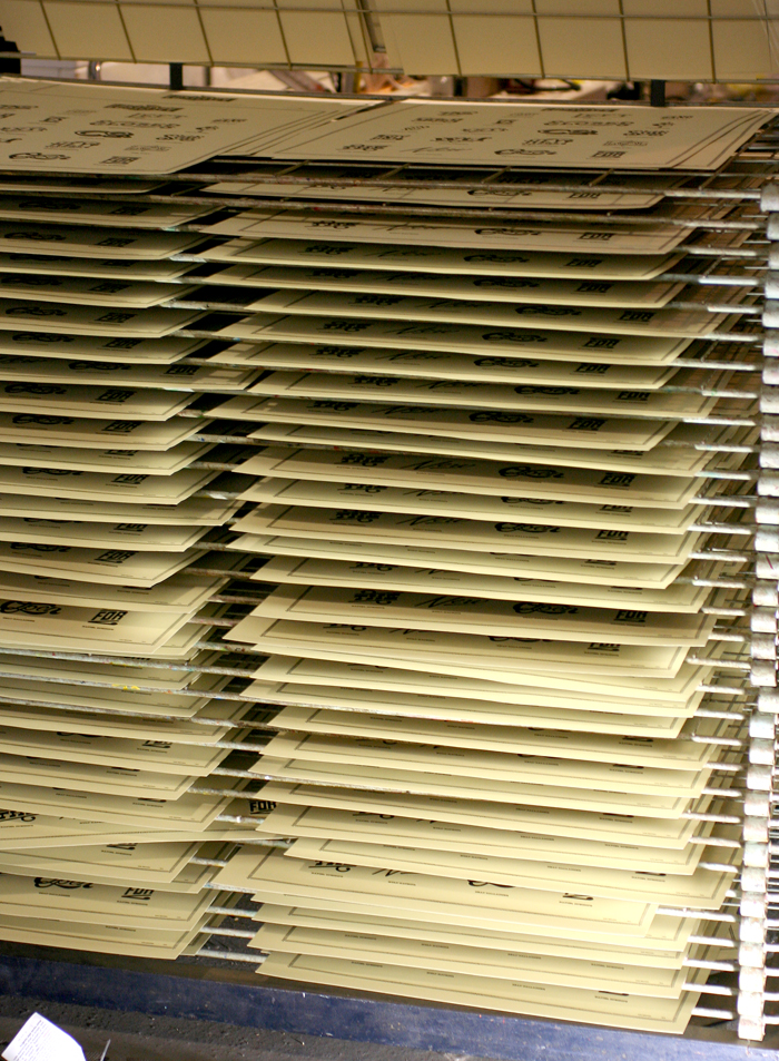
The posters had their own dedicated drying rack after printing, which was handy given that there were about 300.

Plosttype2

Plosttype3The digital catchphrases are now available, so grab 'em and update your look. You can contact Lost Type about acquiring a poster, and Scott Moore about the possibility of getting the real deal in wood.


Words + Music

Two inspiring music projects involving violins came our way this Spring. The first was a poster for Eric Swanson's workshop in the Fine Arts Building, downtown Chicago. The historic building has beautiful brass display frames for just the sort of poster as this: ericswanson1The poster measures 18x24", which is substantially larger than what our press can handle, which meant spending a little time with our building mate, Jim Pollock. His Vandercook 320G is the perfect size for large prints of this nature. As you can see, even the form was impressive in size.

Tericswanson1

Tericswanson2Eric wanted a large print with a vintage feel, including blocky gothic type. We've got that! The corner brackets were created with three ornaments pieced together. All were produced by Moore Wood Type. Mixing old and new elements gives work produced in the studio a fresher, cleaner feel than similar projects produced 100 years ago.

ericswanson2

Tericswanson3Not a fabulous shot, but this is the poster in its proper place:

ericswansonfinalMoving from one of our largest pieces to our smallest, we were asked to create tiny labels (about 2.5x1") to go inside hand built violins. What a treat! They are printed on Stonehenge cotton paper (a very soft khaki), using a unique typeface called Stern. It was the first typeface to be simultaneously released in both digital and metal form. Right up my alley! Obviously Mathew adds the full year to each label before pasting it inside his creations.

mathew1

Tmathew2

mathew2I love the juxtaposition of these two projects destined to be seen by the same style of musicians. Creating such disparate projects is what makes work at the studio so interesting!

A Story of Class

It's not often these days that we have an opportunity to build an entire stationery identity, so it was a delight when Jeff Story called in need of pieces to represent his new law practice. He loved the simple red and black sans serifs often used to represent the work of poet Kenneth Patchen and sent this image for inspiration: patchen

Here are the three pieces we created, printed on lovely Oxford textured paper from Neenah.

jstoryfullset

jstoryfullset2Bernhard Gothic is the typeface that played a big role in this design, in various weights. I often refer to this as the 'house' typeface at Starshaped, as there is a large run of it in the studio. It was a favorite back at Fireproof Press as well.

jstoryinsta

The disappointing part of this project was that we were one 'L' short of setting Jeffrey's full name in this particular size. We played around with similar options but none seemed quite right, so we had to bite the bullet and order a magnesium plate. Hopefully we'll have more of this particular font the next time we're printing this job! I love this image which shows the mashup of new technology (the plate) and a very old (19th century) set of ornaments. In this photo, the ornament appears to be in pretty rough shape; it actually prints quite well despite its age!

Tjstory2

Tjstory1I find really traditional cards printed in the studio to be particularly enjoyable as they blur the lines of the time period in which they were created; these could have been done last month, or 50 years ago. Clean lines are always in style!

jstorycard

Paper Arrows Take Two

Years ago, I designed and printed a cd package for the band, Paper Arrows. An enjoyable collaboration, it featured some of the elements that make working with antique type a unique challenge. oldpaperarrowsRecently, the studio was tapped to produce a new EP sleeve for the band. They wanted something that was simple and could easily be mailed for promotional purposes. We've printed a number of different formats for music packaging, and have two dies for simple pocket sleeves; we decided on the Tab N Slot sleeve, which has a tab at the top that tucks into the back of the sleeve. I usually recommend working with a color palette that wouldn't be easily achieved with cheaper methods of production: dark papers with metallic inks, varnishes, textures, etc. Something that's not just black and white, since a variety of color choices aren't any pricier. Get more bang for your buck!

The band liked charcoal paper, which means using a metallic ink; a light ink alone will not read when letterpress printed on a dark paper. I thought we could bring in texture in a subtle way, as this ties into the sleeve we did before, as well as provide a simple background element. These two-color hearts really grabbed us, so they made it into the form as well.

Tpaperarrows1

Tpaperarrows3Because we print most work on platen presses, it's easy to diecut the flat sleeve first and then print. The first layer is dark blue, which definitely reads as blue; printing dark colors on dark paper don't always perform the way you think they might. The metallic ink is a sort of champagne color that's not quite gold or silver.

paperarrowssetup1This gothic type is in pretty rough shape, but works hard on many Starshaped projects, including this one. You can see here the end result of the two color heart.

Tpaperarrows2Here's the final front, followed by the back.

paperarrows2

paperarrows3We had a plate made for the logo and the small text. This text was designed to work with the type we have in the studio, but the last line had a pesky Publishing symbol, which we sadly don't have and haven't been able to frankenstein from something else. Yet.

Tpaperarrows4Another factor to consider was how these would be mailed. Certain clear sleeves are post office safe, so I suggested adjusting the final design so that they could ship in clear sleeves that would not only save the cost of purchasing separate mailers, but would allow the art and important details to show clearly to the receiver. Mailing labels and stamps can be applied directly to the outside.

finalpaperarrowsAnd so our little heart is a surprise when the cd sleeve is pulled out of the mailer! Give Paper Arrows a listen, and keep an eye out for the Good News For Love release.

Wood, Metal, Type, Irony

Starshaped rarely prints work that is not designed in the studio, given our mission of printing only with the metal and wood type we have. But every once in a while, a project comes along that offers a chance to combine our materials and knowledge with the talents of others in a collaborative way. You may be familiar with the Hamilton Wood Type Foundry's new initiative to digitize some of the gems of the Hamilton Wood Type Museum (we've played around with these before). The effort is spearheaded by P22, a type foundry I have long admired, so when they asked about printing some note cards that feature the new digital versions of some of the upcoming releases, saying Yes was the obvious answer. Four cards were planned to coincide with the theme of the AIGA National Conference in Minneapolis October 10th-12th, and would be given away at the Adobe booth, as three of the fonts featured are volunteer efforts by Adobe designers. The first, Gothic Round, will be in circulation before the conference begins, and the others have release dates over the next few months.

I love a little irony in our printing and this project is a great example. We were to print magnesium plates made from digital typefaces designed from the original wood type.

Thwtf3Just for fun, I pulled out some of our 8 line Gothic Round type to shoot with the plate for the first card:

Thwtf4Each card would also feature a subtle background texture printed from the wood type in our collection. Here's the lucky piece, which has a lovely grain:

ThwtfLong ago I discovered through trial and fail that it's better to print transparent-base inks over the darker, more prominent ink color. So for each of the four cards, the main color was printed first and the lighter background wood texture printed afterwards. This keeps the darker color from pooling on top of the lighter pass, and anything with a mostly transparent base will never compete with a dark, saturated ink. In order to make sure everything would line up, I created a template on a transparency that I could place over top of the first color:

transparencyThe color palette was solid, and each card coordinated with rich envelopes from French Paper. Here's the cheat sheet for matching inks.

inkswatchesThese are the final cards together, along with a close up of the pale wood type texture.

hwtf1

hwtf3

hwtf4The sets are to be given away at the AIGA conference, and I'm told Hamilton will also have some. These faces were exceptionally designed the first time around for their wood type form, and I can attest to the quality of the new digital versions. If you can't work with the real thing, grab yourself these digital versions and support Hamilton. We've got some big doings up there in another month... more on that later.

hwtf2