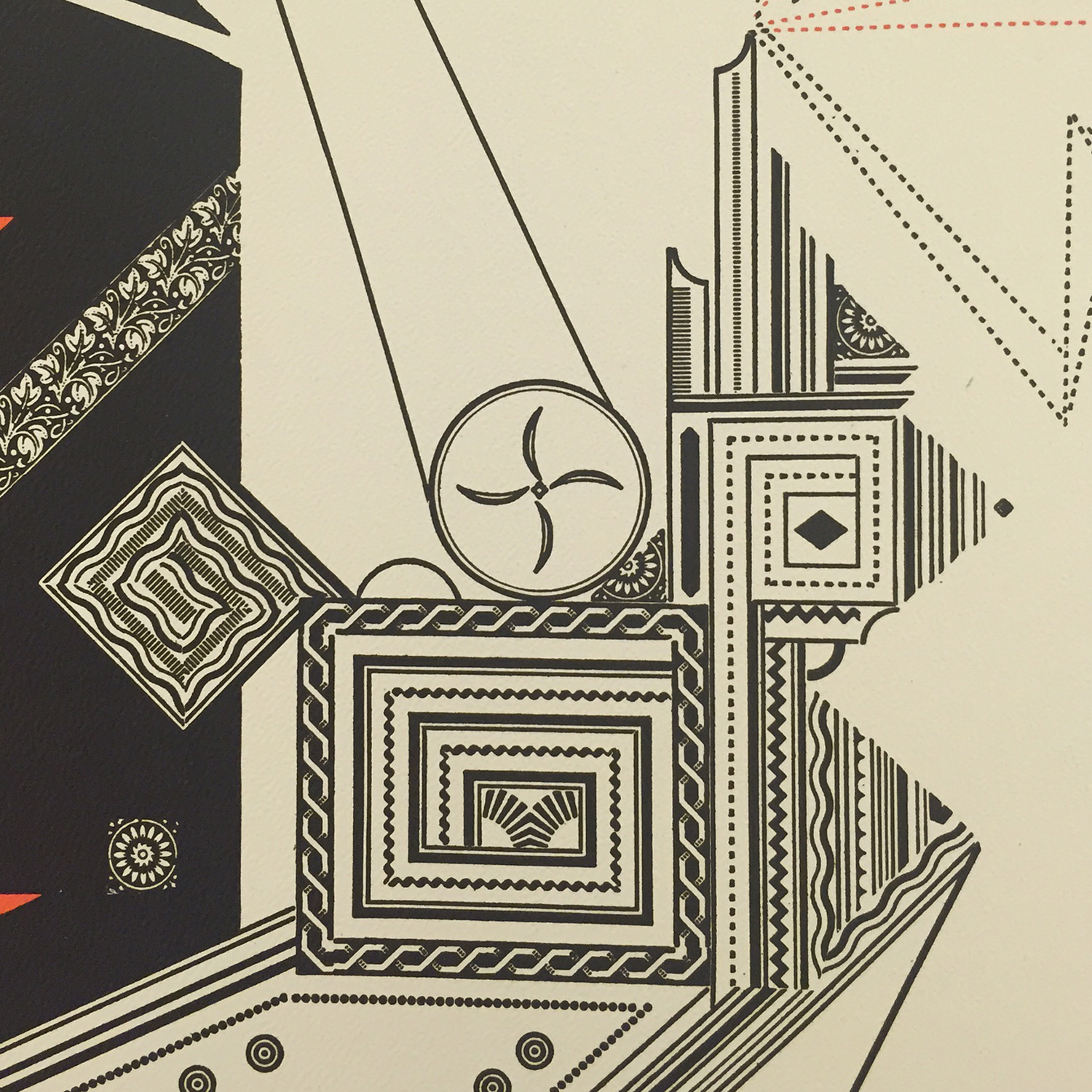
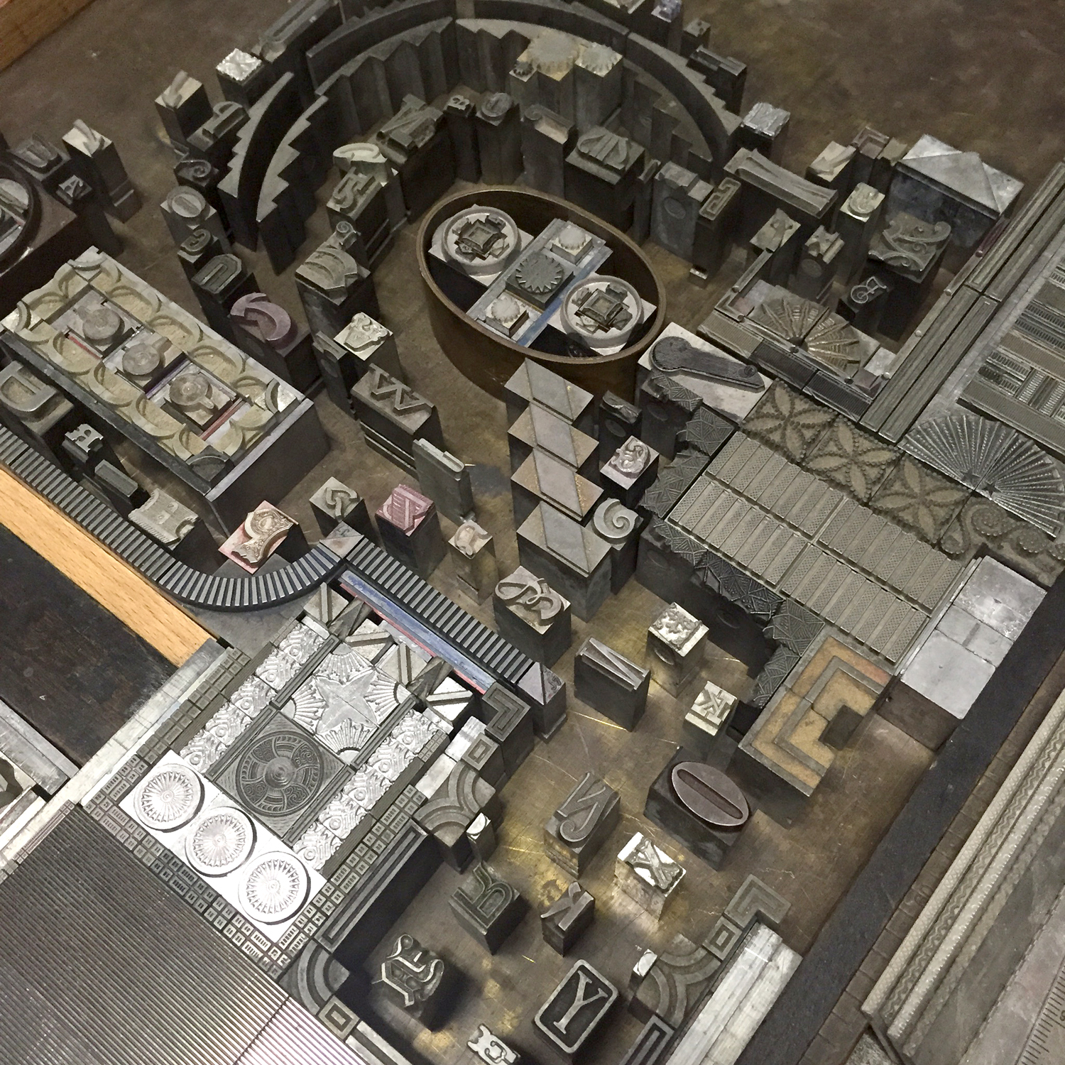
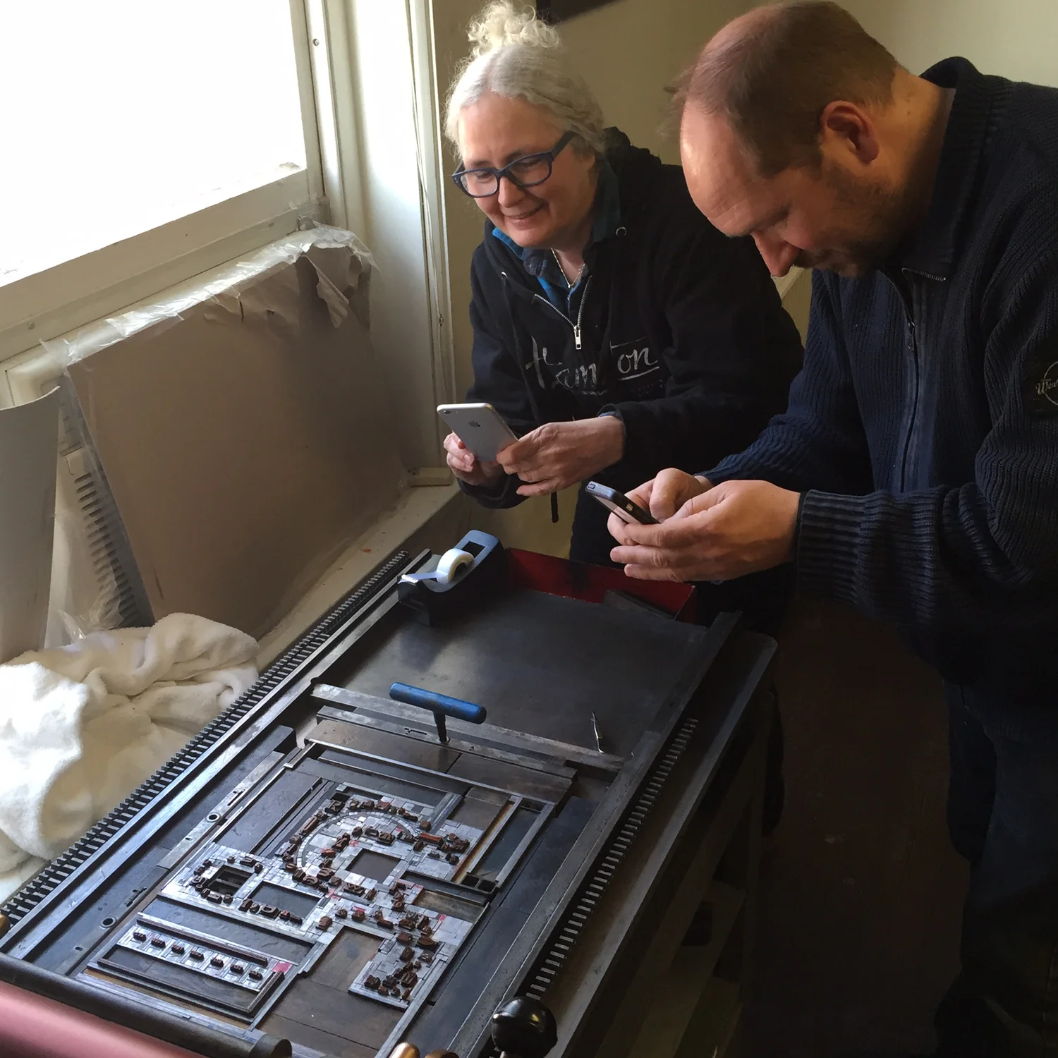
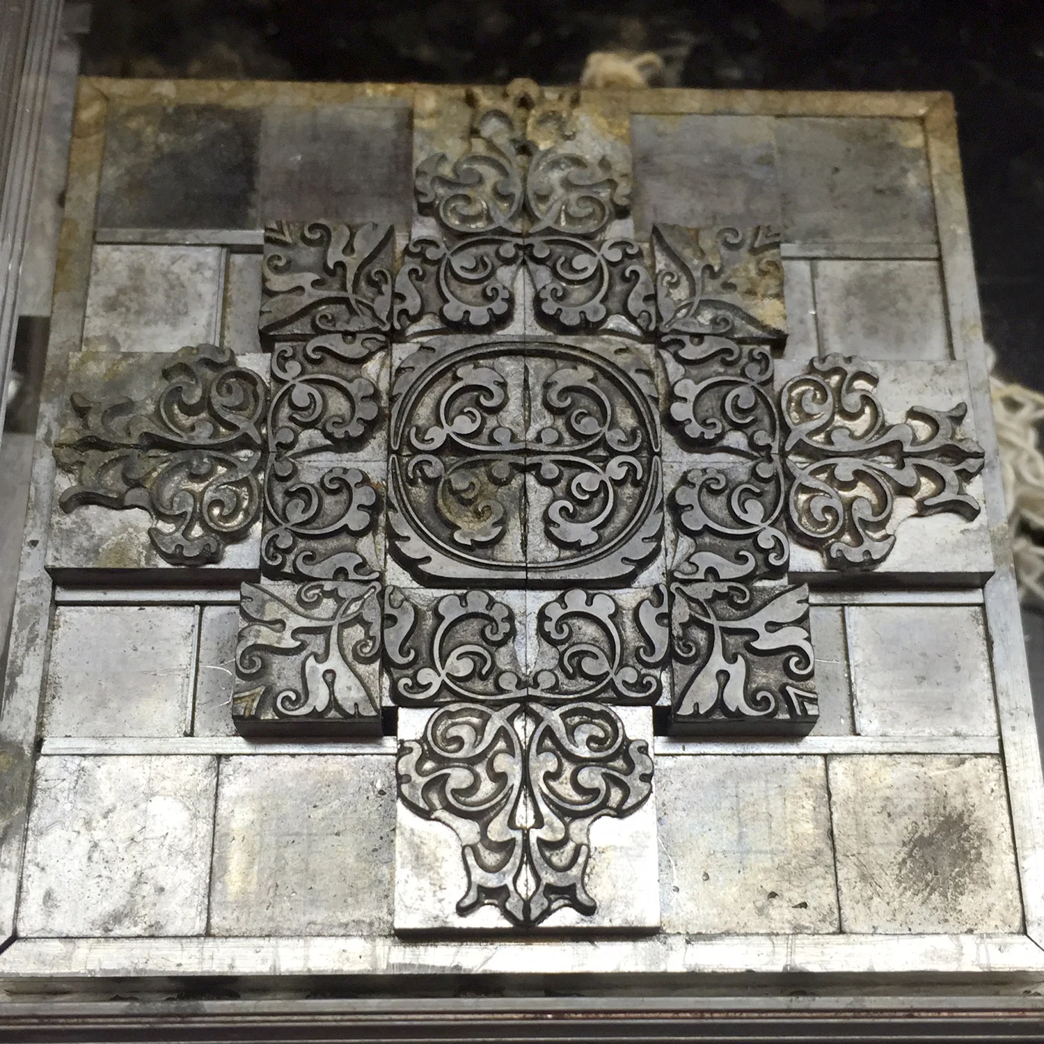
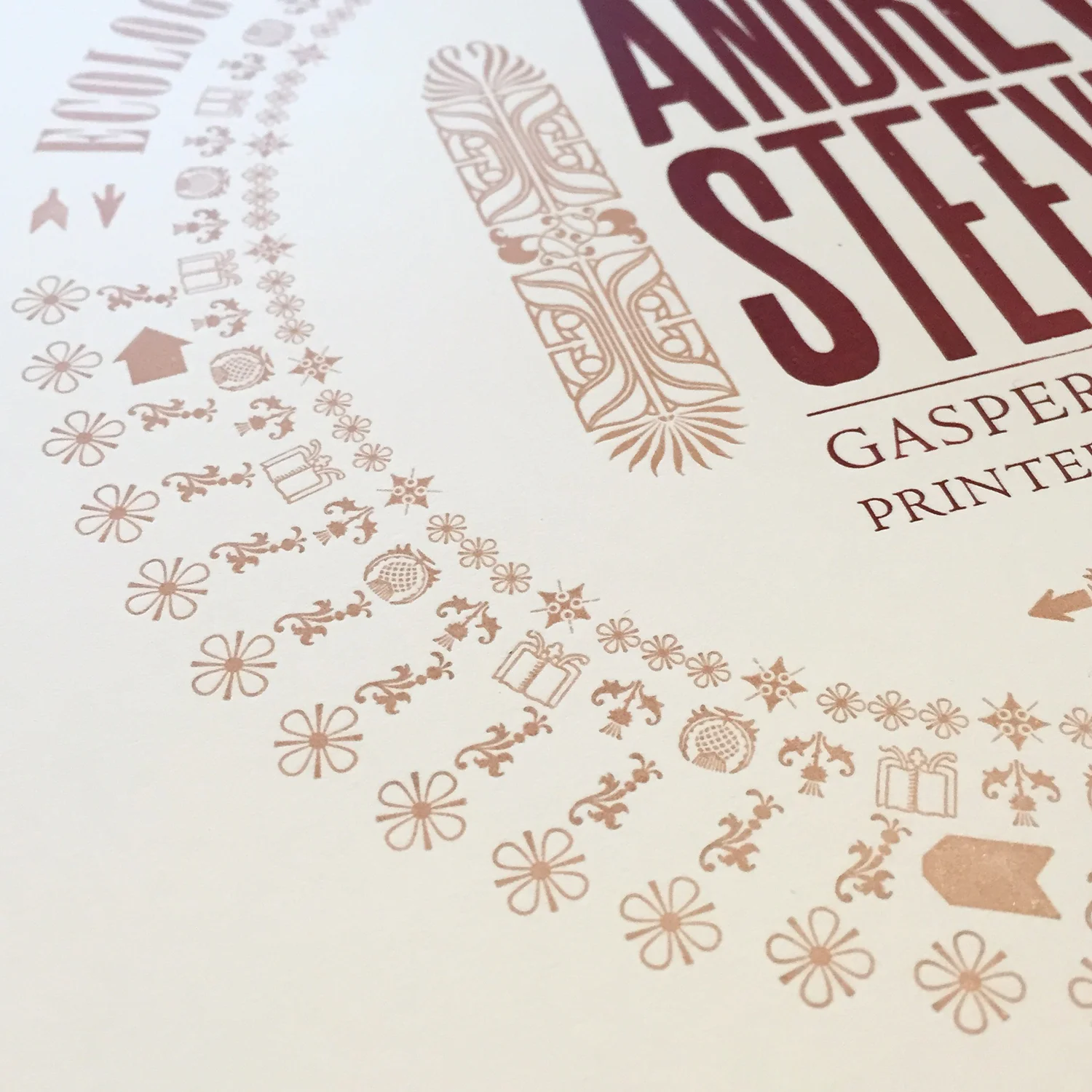
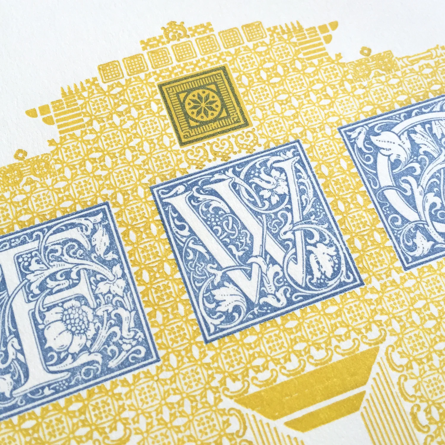
"No, no, no, no. If the book is made up of ornamental patterns then no pattern paper made by someone else will fit."
"Well what do you suggest then? Printing your own end papers?"
"I guess so. Yes."
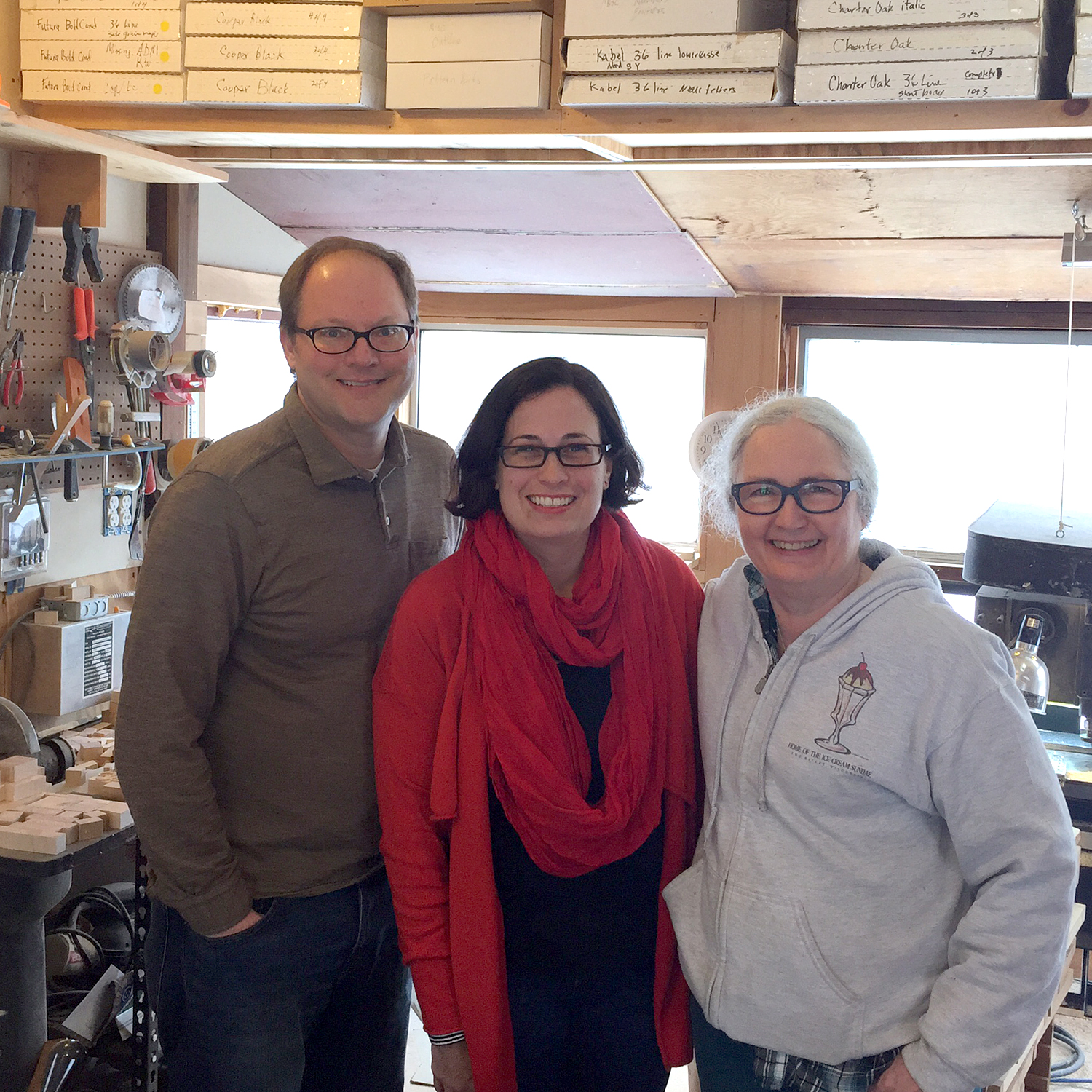
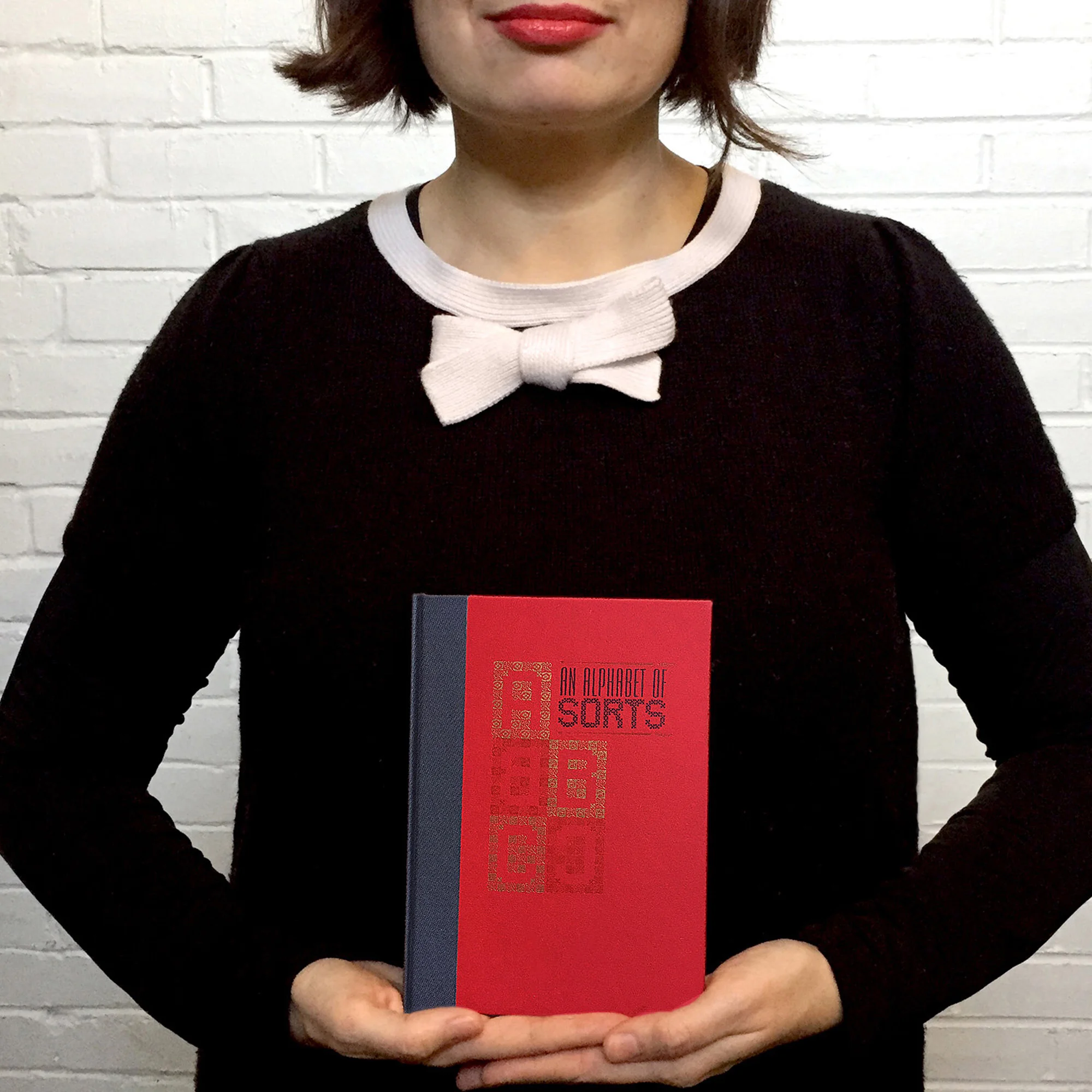
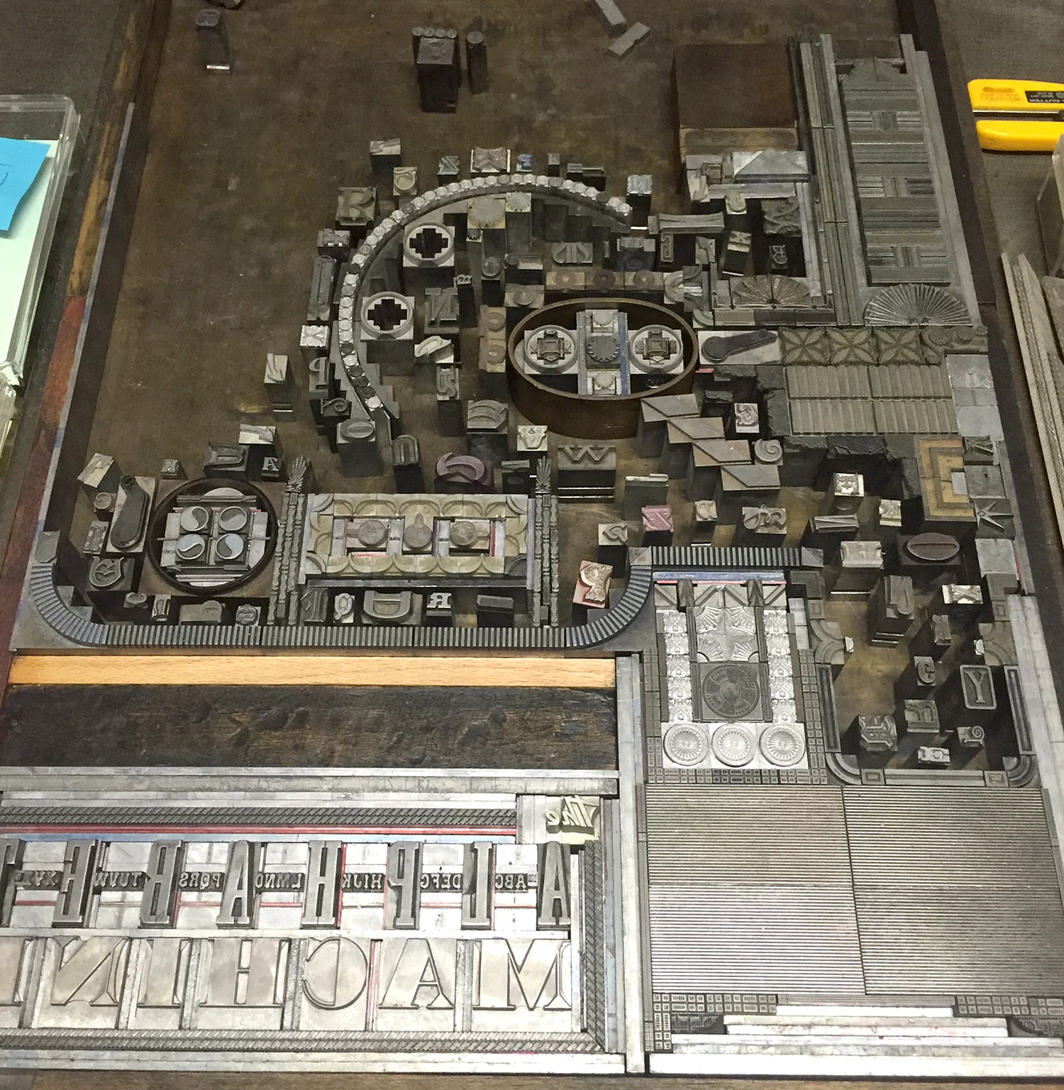
This snippet of conversation between Richard Kegler (RK) and myself during the early development of An Alphabet of Sorts is representative of many of our collaborations; a lack of satisfying answers until one that involves a lot more work presents itself. And that 'lot more work' is what pushes our projects to be stronger than we ever thought they might be. This post, told through a few recent projects, is the anatomy of an ongoing professional partnership that has always been greater than the sum of its parts.
VERSE
During my residency at Wells Book Arts Center in March, I stewed on an appropriate gift for RK to thank him for securing the position as well as suggesting the creation of An Alphabet of Sorts. When he showed me his library at the Center and mentioned needing a way to differentiate his books from those of Wells I knew immediately that bookplates were in order.
The bookplates I designed were a stew of all the things that came to my mind when thinking about him and what he was passionate about and involved in at various points in life. I created an image of books on a shelf, alongside records in the middle (including the lone 10" that got away, RK). The type is German and includes initials in Alpha-Blox. Rather prophetic.
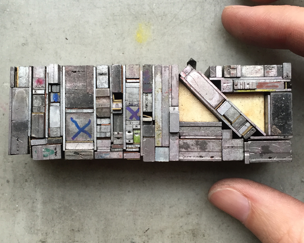
The form for these was particularly pleasing, with so many tiny pieces all coming together. I pulled a carbon paper proof to check the result and was relieved that they looked like books, especially the angled one. It was time to separate the different colors and mark them in a way to keep every piece of spacing in place.
I started with gray because it was the key color. You can see where marker delineates which spaces are placeholders for the other colors.
It was right about here when RK started texting me how badly he needed bookplates. Unbelievable. I bit my lip and kept printing, all the while being bombarded with images of "stuff I really like... y'know, for inspiration."
I replied, "You're breaking my heart. Can you wait on this until Friday, please?" thinking that would give him a hint. It didn't. He sent more.
Gold followed the red. The tiny star in the middle represents the gold star on the spine of An Alphabet of Sorts. I wasn't about to leave that volume off the shelf.
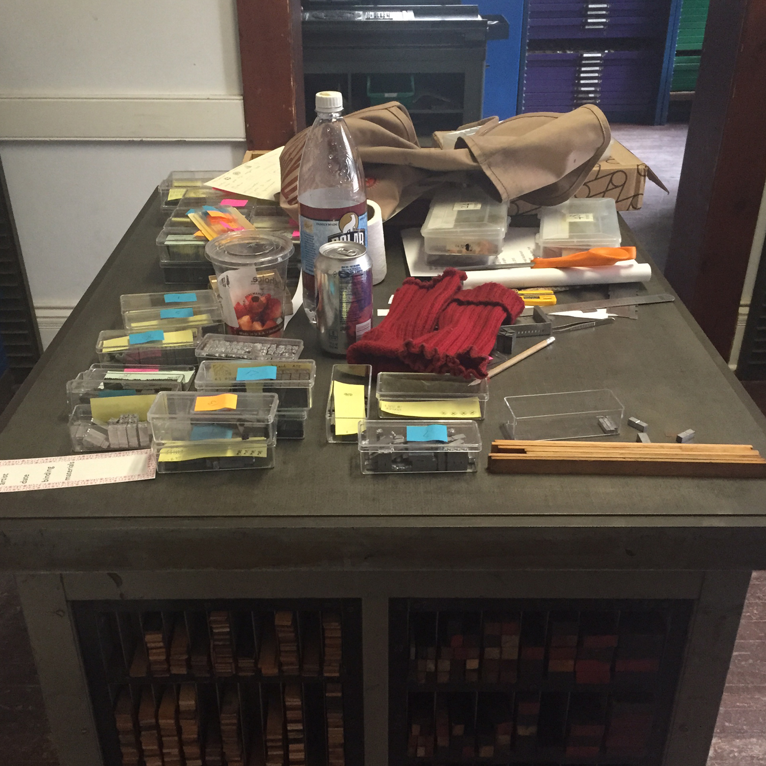
I loved the little detritus left behind when I started to put it all away because it's a fine example of how not to set something unless you're doing exactly what I did; moving minuscule sorts for multiple colors.
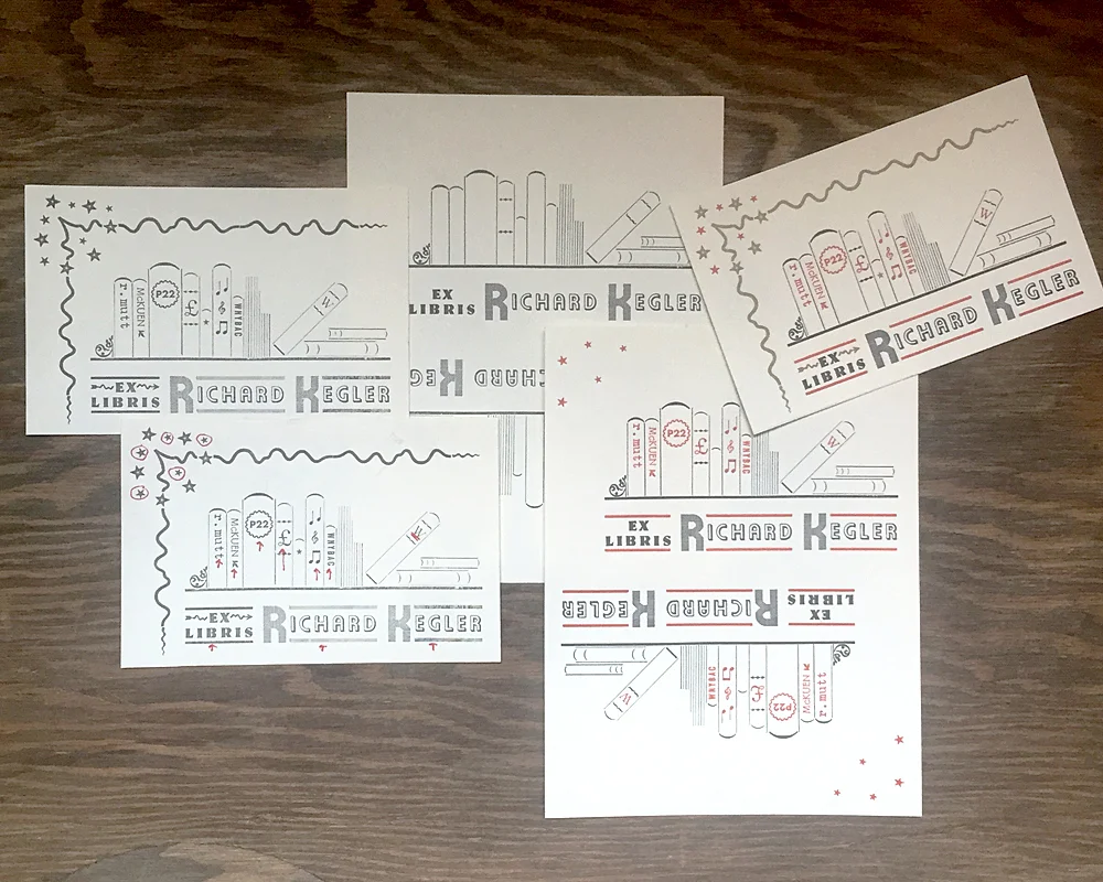
This is a rough shot of all stages of the printing, from the first single-color proof to the end result.
I was quite taken with these until I remembered I was no Rogers or Dwiggins or Preissig, or ANY of the imagery RK had sent during the process. But I mailed them anyway.
I have been asked to occasionally run something through what I've coined 'the RK translator,' meaning his expressions can be difficult to read, especially from a distance. I have discovered that 'nice' means 'that's really f-ing amazing and I'm jealous' and that '!!!!' is the highest praise one can receive.
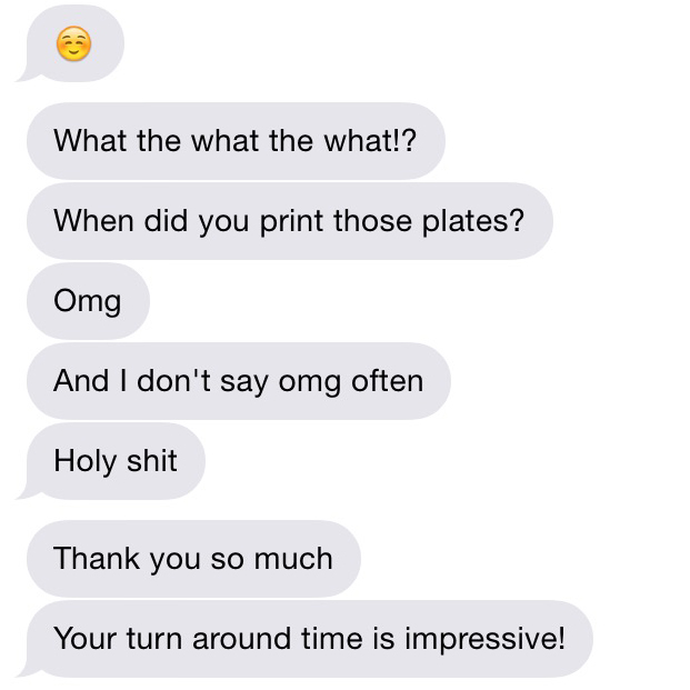
So when I got this anomaly a few days later, I kept it:
Sorry, RK, but there are actual, complete sentences here and it needed to be documented. I nailed it; a challenging project we were both happy with.
CHORUS
There's no doubt, no doubt, that RK and I butt heads on many things. Anyone privy to our phone conversations will likely overhear one of the following statements:
"You never listen. You're a horrible communicator."
"Don't be so taunting."
"Get off the spectrum and put yourself in my shoes!"
"You're really reading too much into this."
Tension, anyone? But the arguing brings breakthroughs that are the seed of the Next Big Thing. I may be angry, but it channels into pushing my design work beyond myself, all while knowing, feeling I have the full confidence of someone whose respect for me means something.
One thing we almost always see eye to eye on is music. With our record store pedigrees and heavily used Spotify accounts, countless playlists have furiously flown between us as our tastes mirror each others. Kiwi bands: Go! Top Ten Wedding Present songs: Go! Cover songs: Go! I made the 4AD list, he followed with Factory Records. We tackled Creation together, all the while avoiding Oasis. It is truly a level of geekiness of which I have no shame.
There are no ground rules but we each have our limits. My 'No No' list: Pink Floyd, Johnny Cash, Nick Cave. His: Morrissey, Death Cab for Cutie, Sleater Kinney. Fair enough.
My favorite playlists are coined One Degree. With these, one person adds one song to the list and the other follows it with something that is one degree of separation away by song title, band name, band members, record label, country of origin, producer, etc. Most of these run about 3 hours long.
One evening Mr. Starshaped came into the office and saw me belaboring a song choice. When asked, I explained how the One Degree lists worked.
"Well, he started it with The English Beat so I followed with Beat Happening. Luna did a cover of 'Indian Summer' so he added 'Ride Into the Sun' which Luna also covered. So I followed with an actual Luna song which he then chased with Wire's 'Outdoor Miner', another song Luna covered. So I followed with a Felt song because, duh, Felt and Wire!..."
And this is when Mr. Starshaped exited stage right, trailing, 'I'm glad you have a work husband to share this with...' and hence that terminology was born.
Side note: I have a second 'work husband' but he surely deserves his own post someday, no?
Sometimes records arrive in the mail at the perfect moments. After lamenting that a beloved De La Soul CD didn't make it out of our old car when trading it in, it showed up just in time to print the aforementioned end papers for the book.
The Bill Drummond record was sent to remind me of the time I couldn't quite place it when he played 'you have 20 guesses to figure this one out.' The Bedhead when I was having a particularly bad day, depressed and struggling with the Magic Hour print. I texted:
"Bedhead live in Chicago record store day only release. Lame. Can you find me one?"
"Of course."
Three days later it showed up with the silly secret admirer note.
And the most recent addition, my holy grail, Velocity Girl's cover of Seven Seas. Note packaging that arrived to Jennifer Gedge, a nod to my crush on David Gedge of The Wedding Present. Aren't you funny, RK.
Lest it seem one sided, I have been hunting for two LPs I want to send and can't find them. I prefer perusing stores to ebay so it's going to take a while. But I have been known to put a little heart into custom notes for special occasions, like his solo show at WNYBAC.
Music softens the proverbial blows we repeatedly throw at each other and I am grateful for it.
VERSE
"How many bookplates did you send, out of curiosity?"
"I don't know... about 400?"
"Do you know how many books I have?"
Do you see what he did there? I certainly did.
Sigh. "What do you want this time?"
"I need really tiny ones for my small artist books."
"Okay. What should these ones look like?"
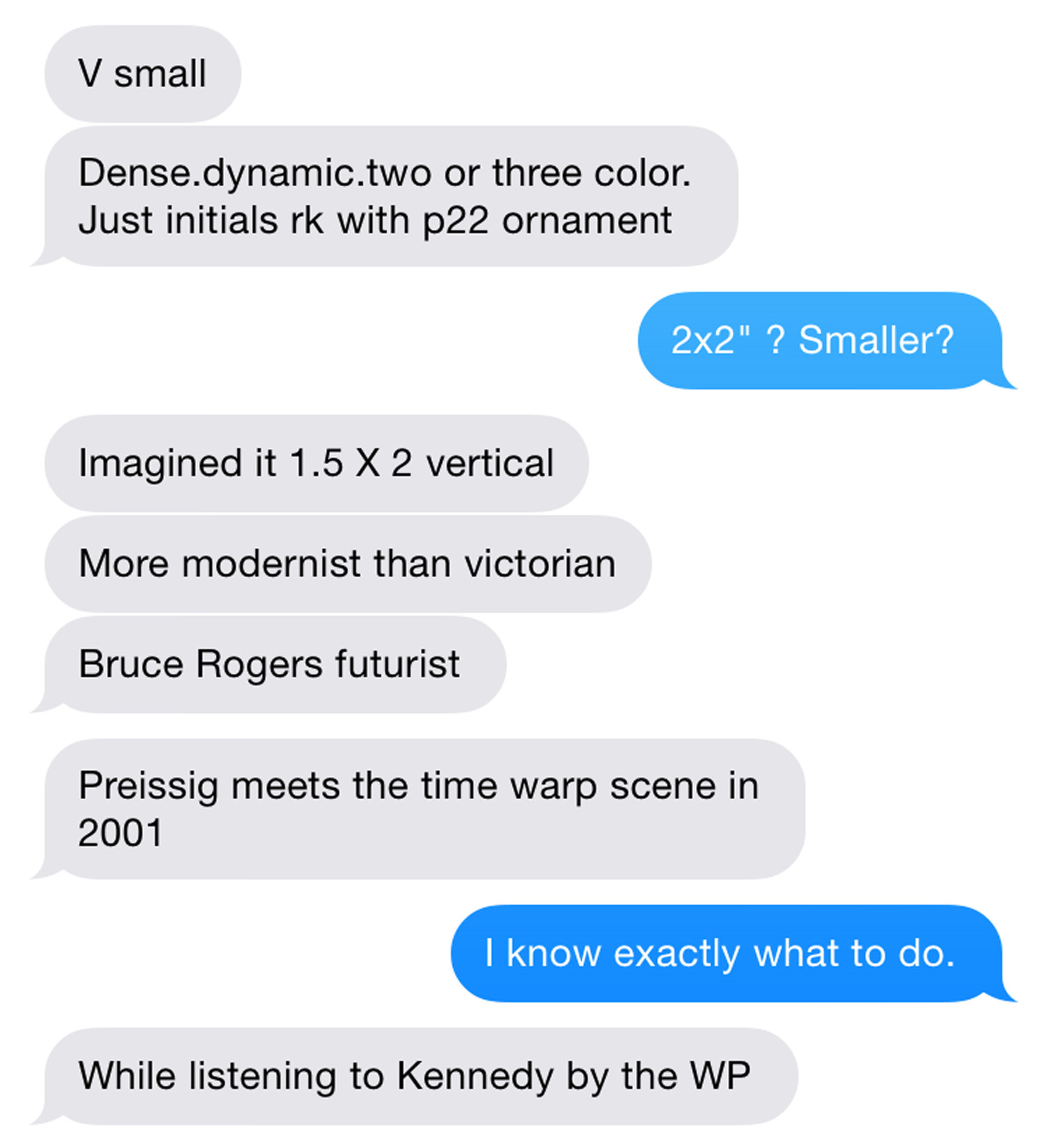
Enter the best art direction I have EVER received:
And I did know exactly what to do, right after I joked about the book I was writing, with Replacements reference, 'Unsatisfied: 25 years of bookplates for Kegler.'
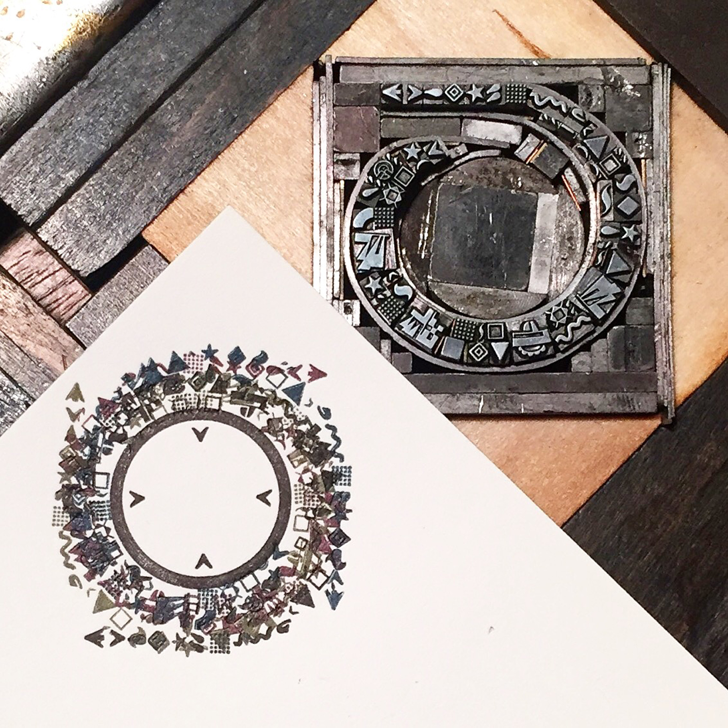
First, a Wedding Present nod as mentioned. This is one of our favorite bands, hands down, and the 'Too Much Apple Pie' line comes from the song Kennedy. I wanted to add it in a way that would be obscured but there. The inner circle would print to help ground what I planned next, but the outer would not. The type is 6 pt. Remember his size requirements? I used an etching needle to shove those tiny brasses in place.
I set and proofed the three main elements so that I could scan and digitally manipulate them to find the best angles. I also gave him options on the tiny inner ornaments.
'Dense' and 'dynamic' weren't going to happen in 2-3 color. To create a time warp it needed to be layered and a little nuts. This coil was printed in four different directions, with each ink being slightly tinted with CMYK, as per RK's request.
Here are the 6 (yes, 6) color separations.
While finishing up, the deluxe 10" set of The Wedding Present's Bizarro album showed up in the mail. Perfect.
BRIDGE
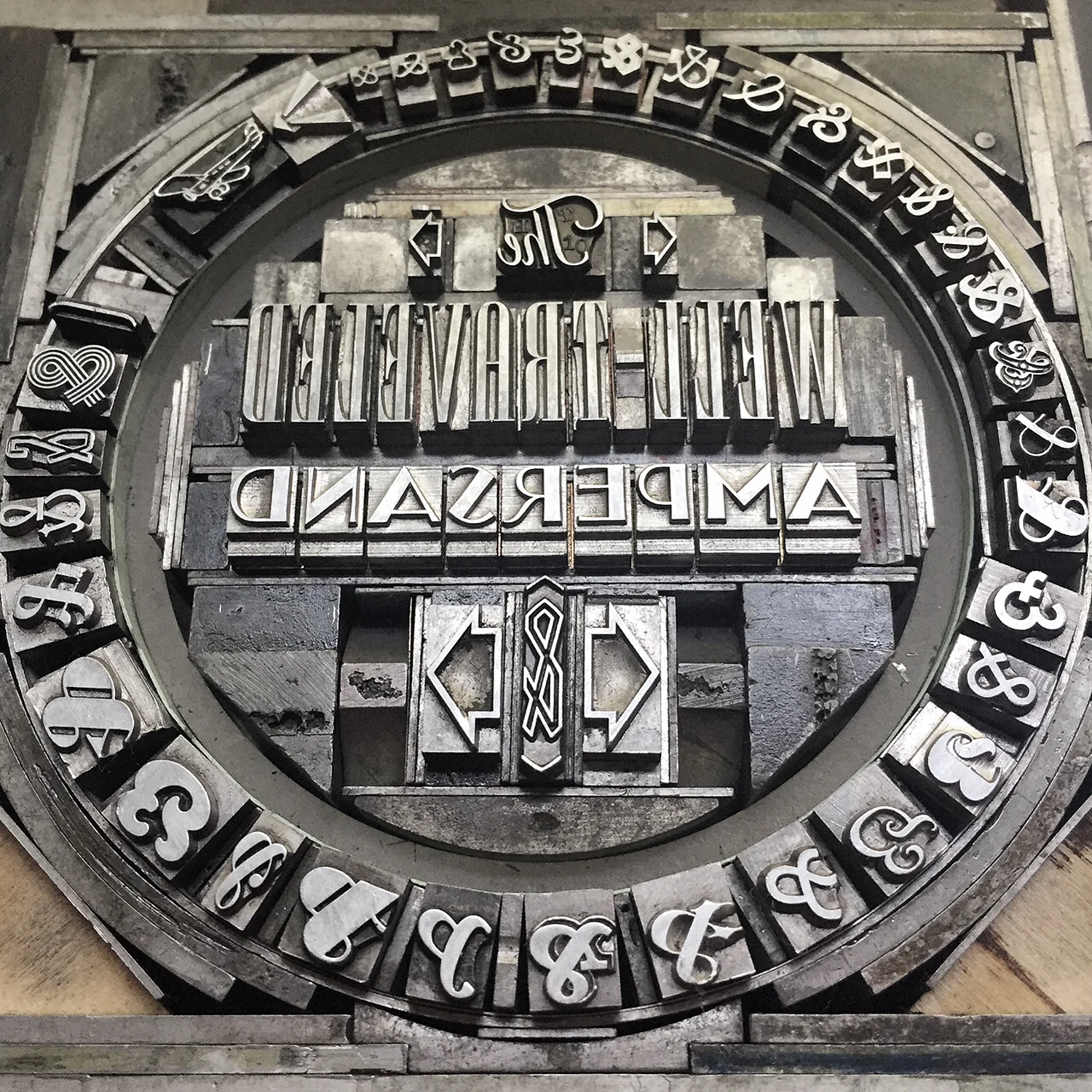
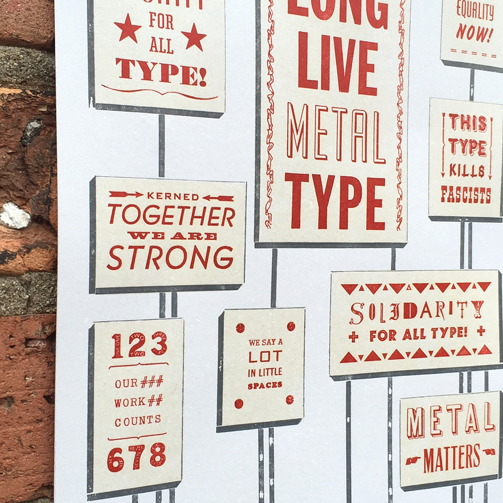
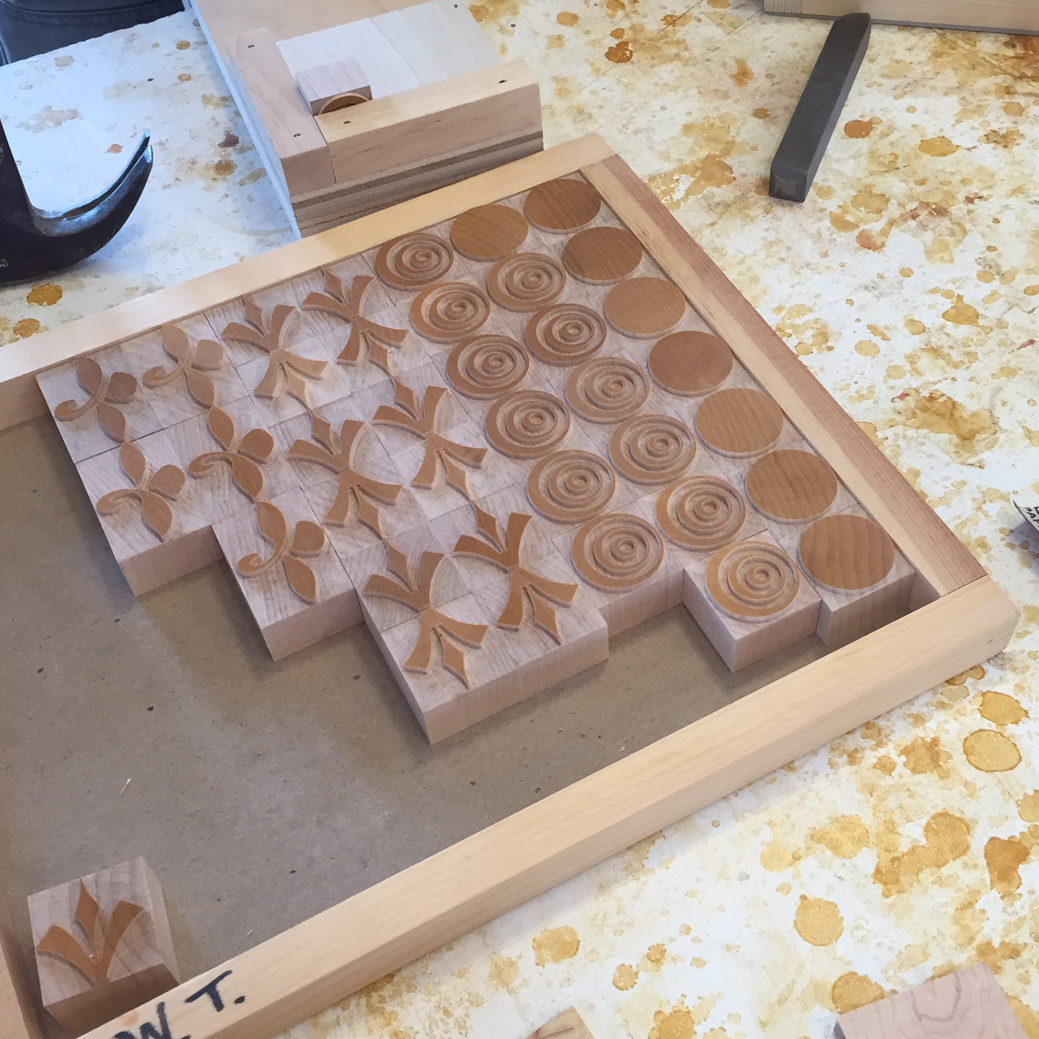
While teaching again at Wells this summer, RK showed me his plans to create an Alpha-Blox style modular type system and I said "I want in. What can I do?" without having any idea of where I'd fit beyond getting to play with the end result. Two months later, a $20k+ kickstarter and plastic injection molds being made as I type, I'm in deep.
I am crazy proud of my work on P22 Blox. With shockingly few moments of wanting to poke out my eyes (or his), I have never been involved in such a successful and equal collaboration. RK had the pieces modeled and drafted and found the injection mold company. I brought in an engineer for second opinions and drawings. He quoted and budgeted the pieces while I quoted and budgeted the prints, packaging and shipping. He threw up all of his thoughts and research into the kickstarter site and I cleaned it up and rounded out the story. He made a clever video while I printed cards and built P22 Analog. He oversaw the start of production while I designed the key chart for the digital release of the typeface.
Our enthusiasm is matched by that of the print community and the support we've received is borderline overwhelming. I like to think my ability to edit and focus and appeal to the right crowd was the perfect complement to the respect RK receives for being a hard worker who delivers (with charm!) on promises of typographic greatness.
CODA
The lack of tension directly related to Blox almost makes me worry something isn't quite right, but we've managed to annoy each other in different ways throughout, so I think it's on the level. It's very possible our friendship will come to blows and explode in our faces (you heard it here first, folks!), in which case I hope we have enough of an understanding of what was to send it off with a proper requiem drink and of course, a playlist centered around the theme of Death.
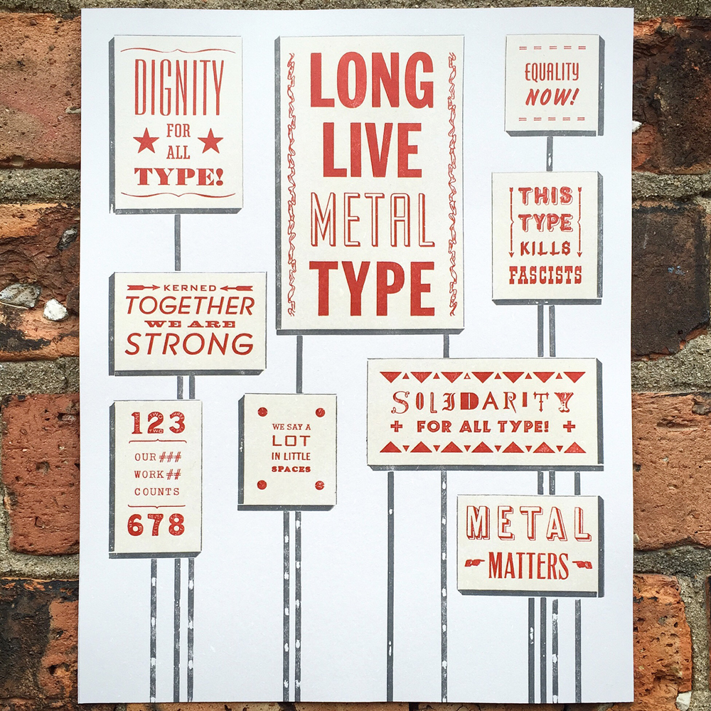
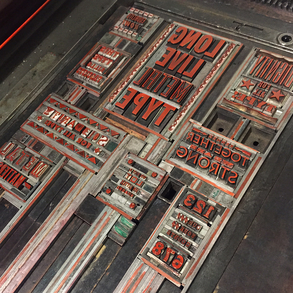
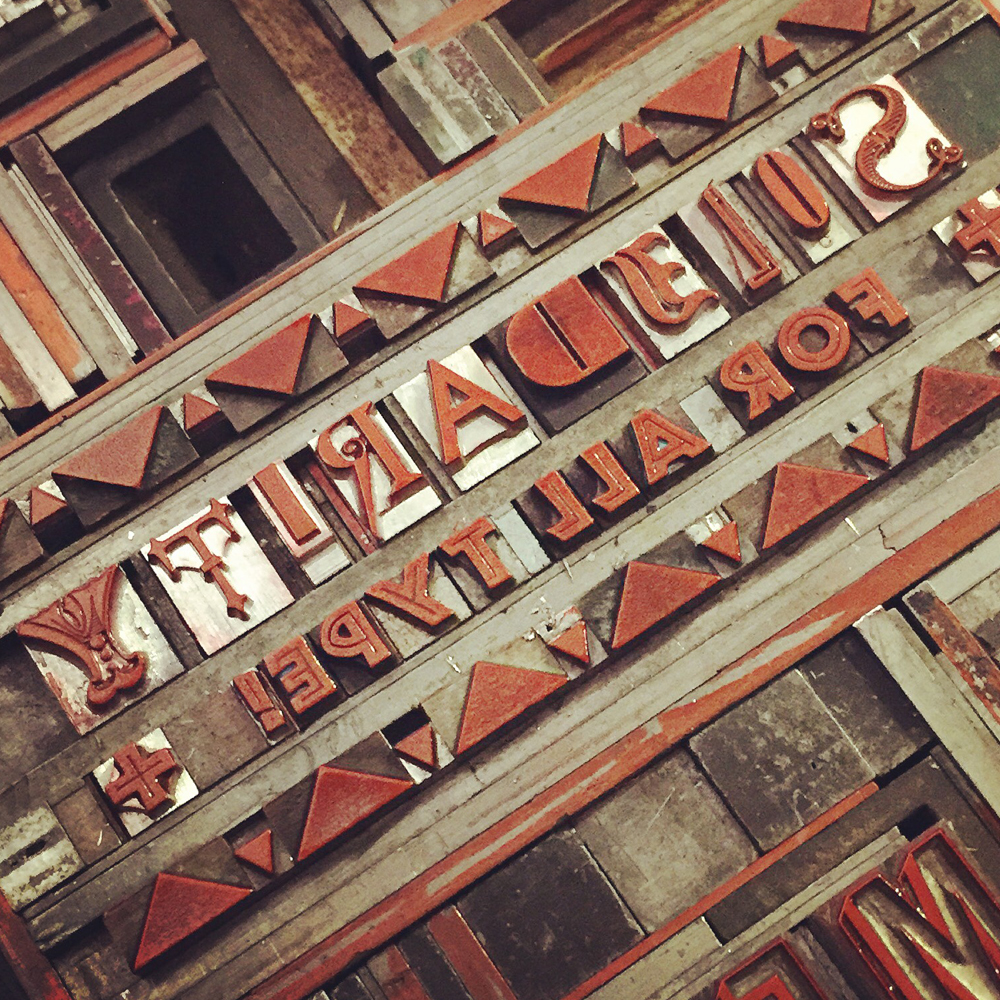
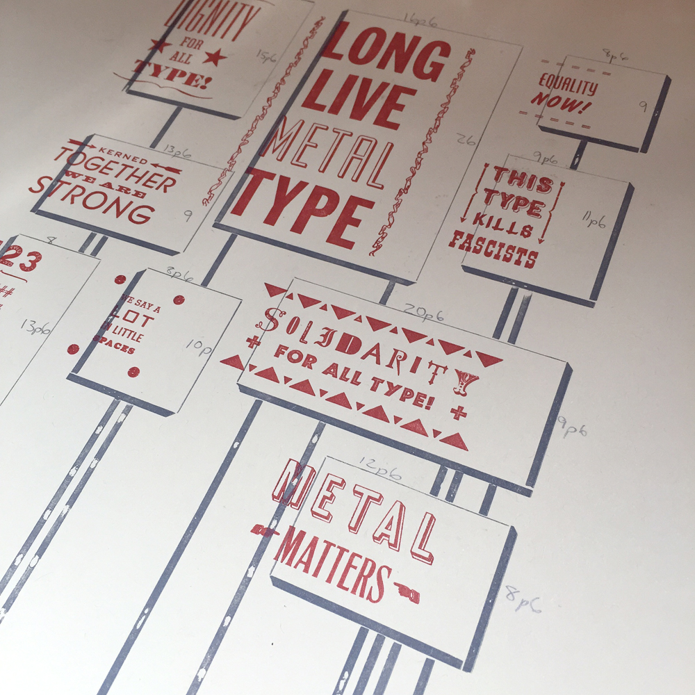
But we must be gluttons as the next project has already happened! Here's a peek:
I've roped in RK for my Next Big Thing that will be announced in November; I'm excited about this one and wouldn't have had the presence of mind to present it to the public without his guidance and enthusiasm, which I am reluctant to admit but it's the truth.
This in a recent email: "Collaborating has been good for us. Better things yet to come."
If this is true, and collaboration continues, then my best work hasn't even been imagined yet. And that's the challenge that gets me into the studio everyday, as well as the prospect of seeing '!!!!' when I shoot off an idea.
Thanks for keeping the faith, RK.
Disclaimer: If your fact checkers confirm with RK that all of the above is a fabrication, please refer to title of post, courtesy of Lush.


