The Well-Traveled Ampersand

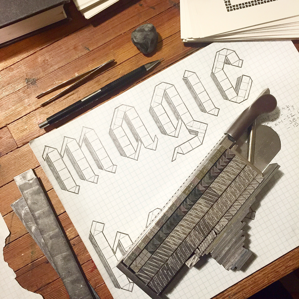
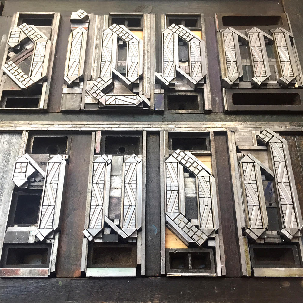
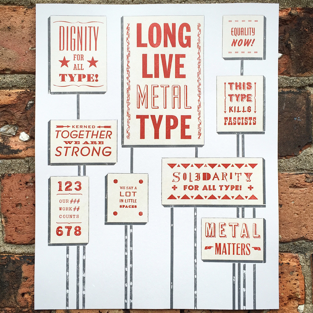
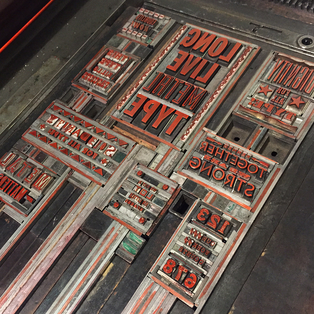
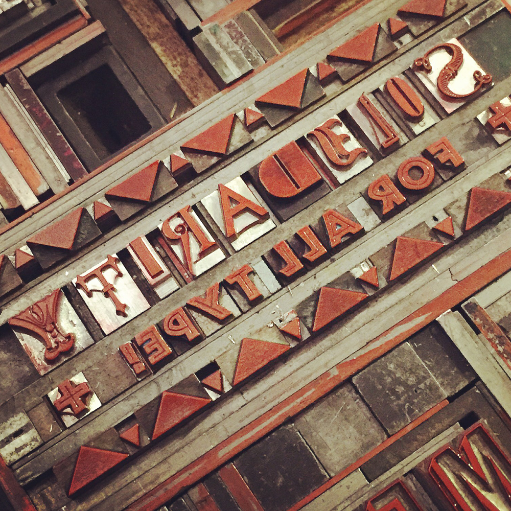
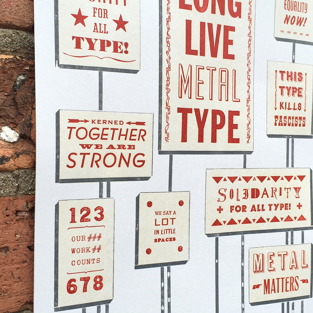
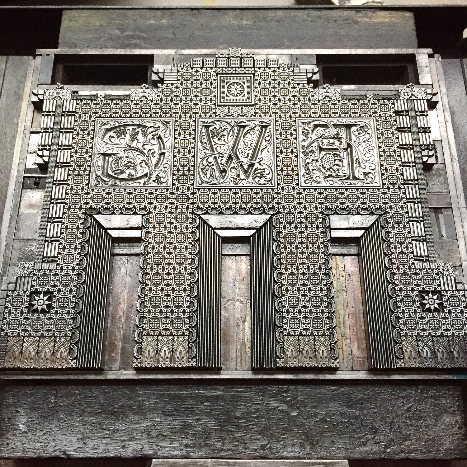
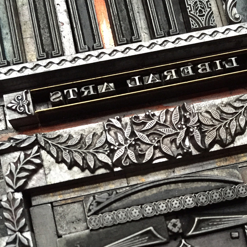
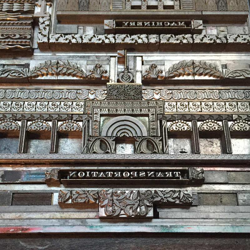
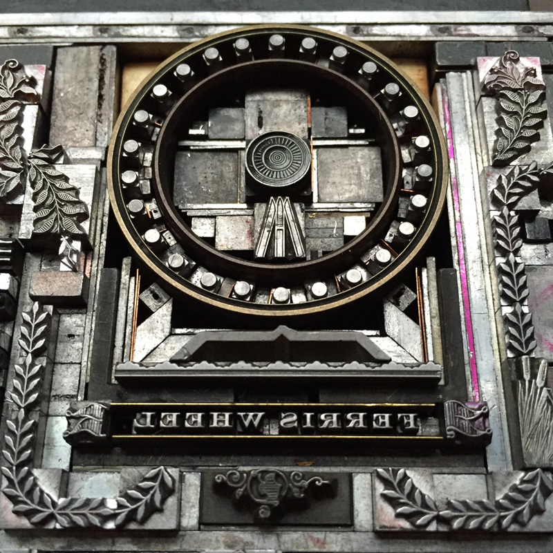
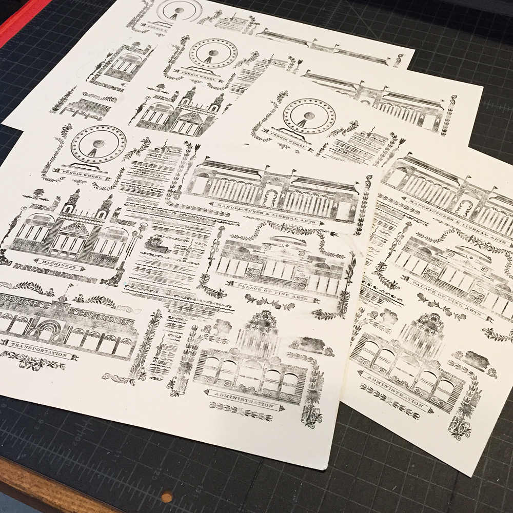
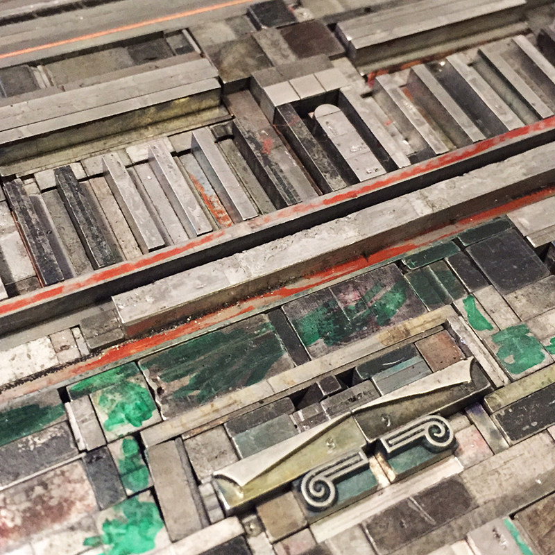
Who doesn't love a great ampersand, that 27th letter of the alphabet, in all of its varied and interesting forms? The Starshaped collection of metal and wood type includes hundreds of examples of how fantastic this form can be in print. Ampersand imagery is one of the biggest sellers in the studio and I wanted to go big to create larger versions from the metal ornament collection. Instead of being locked into the rigidity of a standard letterpress form, I could create wood furniture (the pieces used to hold a form together) that was based on existing ampersands. This would allow me to be true to a pre-existing design.

And because that one concept wasn't enough, I started thinking about how the ampersands could tie into a geographical region or city and somehow represent that location. And thus, this was born:

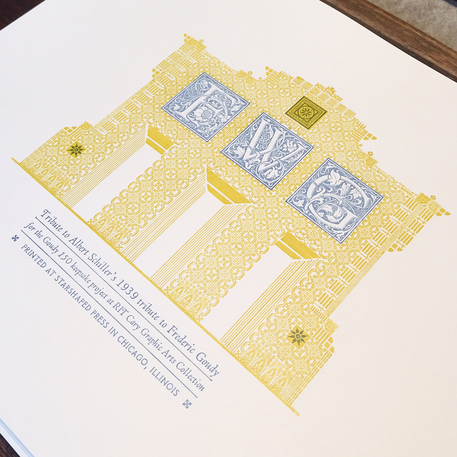
Before solidifying my idea for The Well-Traveled Ampersand, I built the structure for the first in the series, Frederic Goudy's Californian, a typeface he designed for the University at Berkeley. I timed this to coordinate with our trip to the Renegade Craft Fair in San Francisco so I could gauge the response.

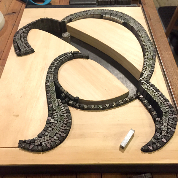
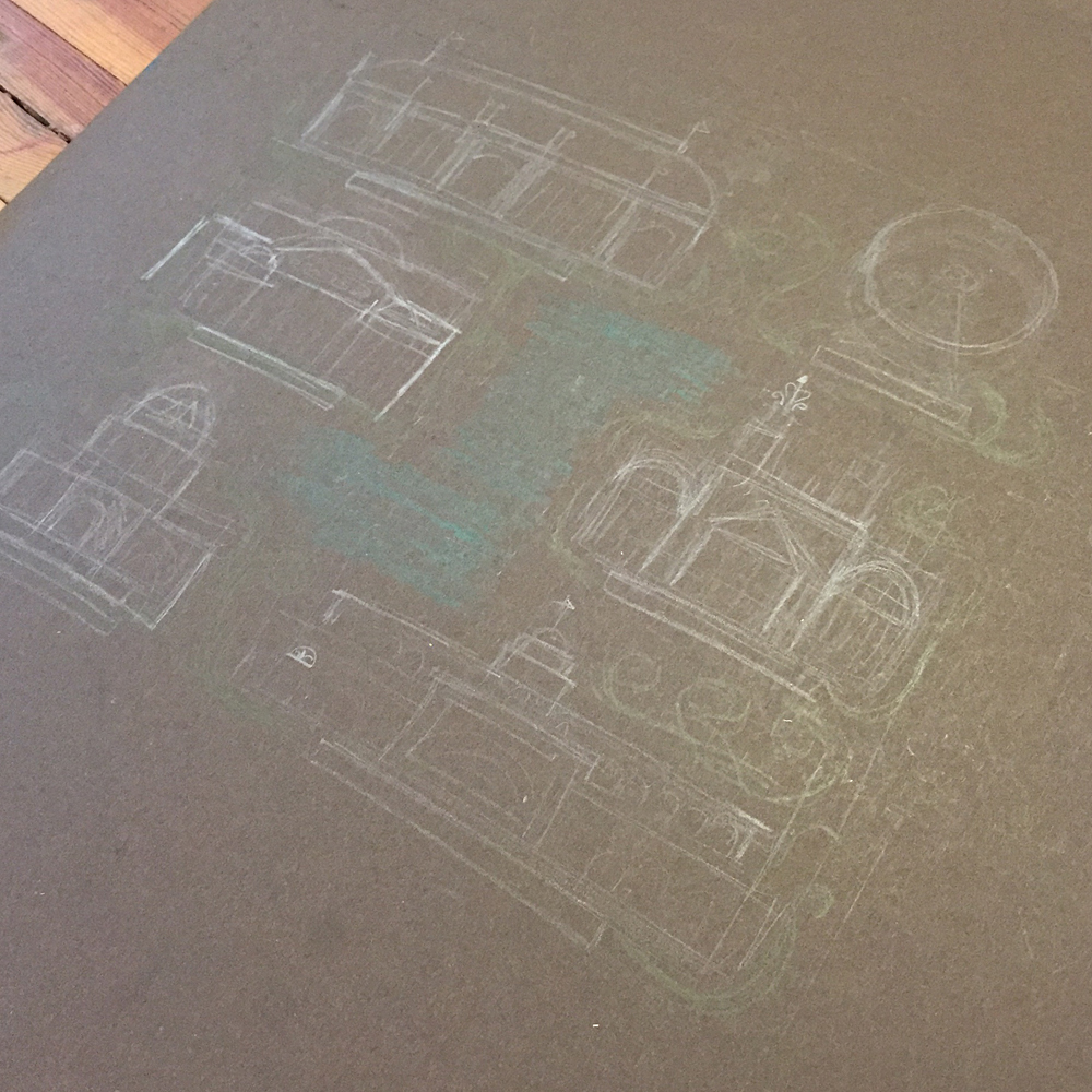
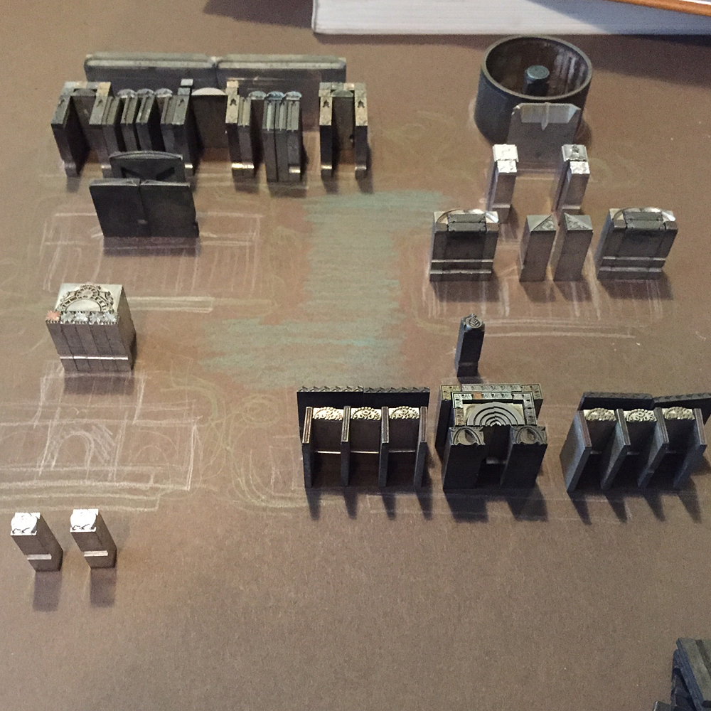
Filling in a frame isn't as challenging as some of the other work in the studio. However, building in a mini set of row houses and hill-climbing trolley was a lesson in holding things in place while squeezing in spacing. This ampersand was ideally suited for the hills of San Francisco for this reason and the result was very pleasing.

The second ampersand was done while teaching at the Wells Book Arts Center in July. It features Victor Hammer's American Uncial, designed while at Wells College. I love how different this form is from Californian.

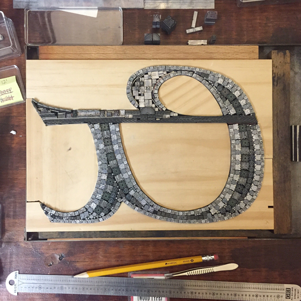
Wells College is nestled next to Cayuga Lake, one of the beautiful Finger Lakes of Central New York. While not saturated with people and structures, it does have a fantastic sunset over the lake which informed the imagery in this print.

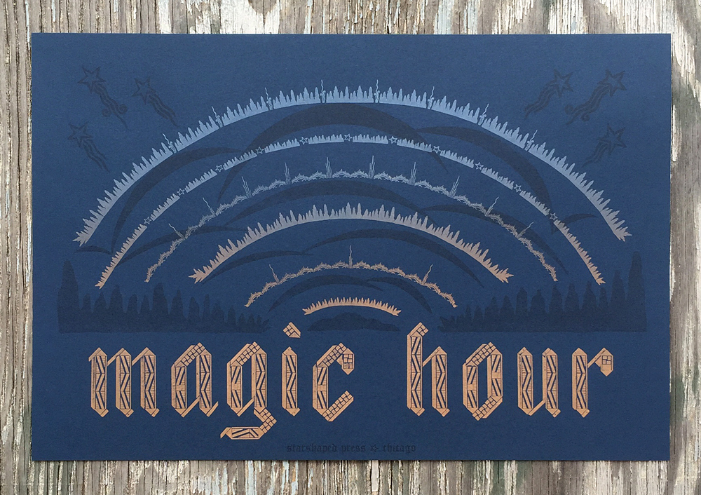
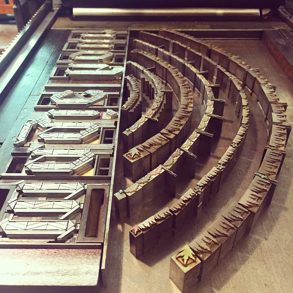
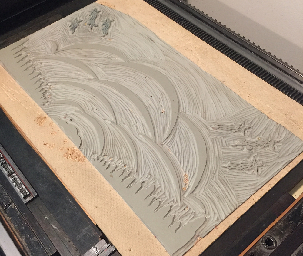
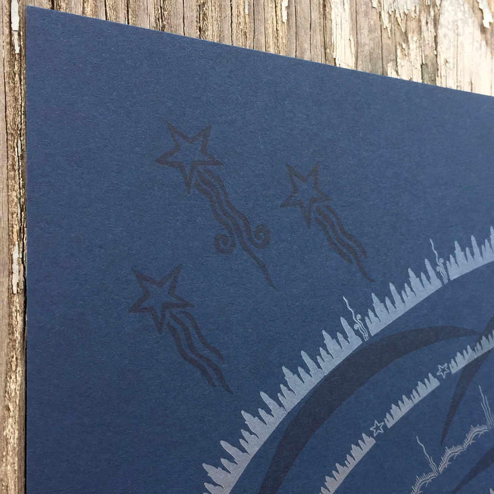
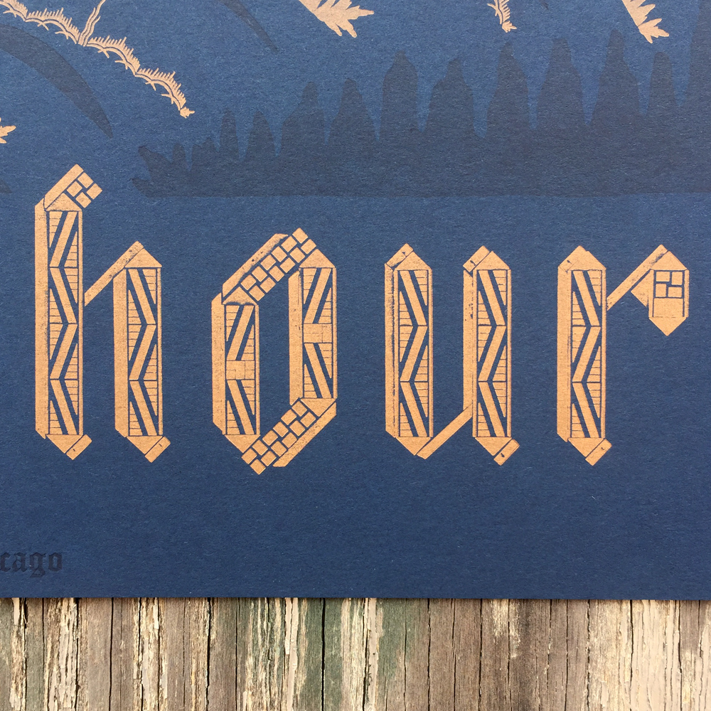
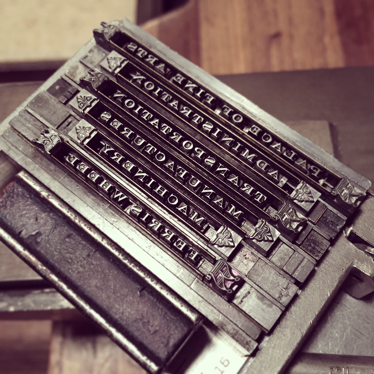
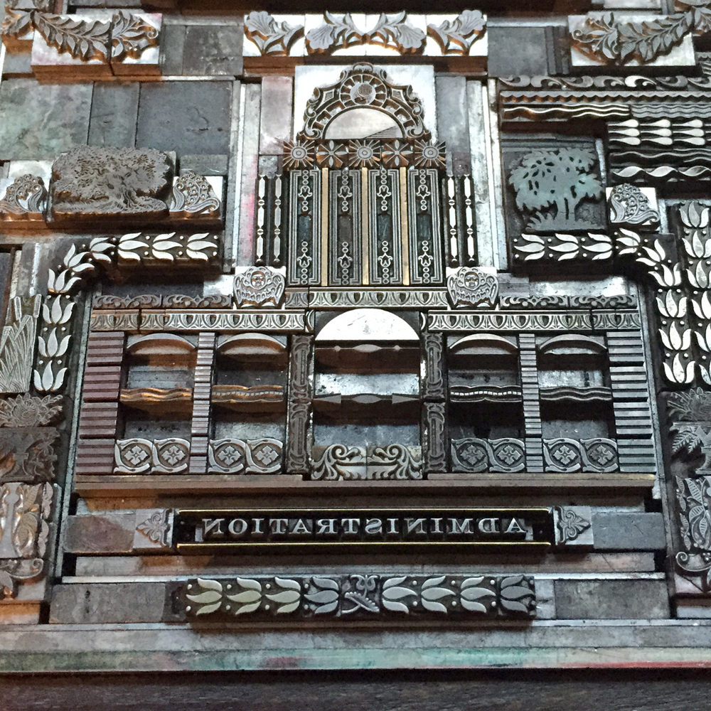
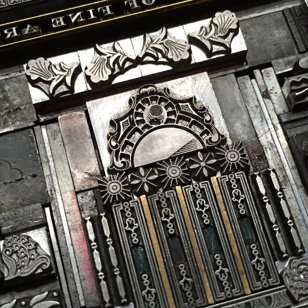
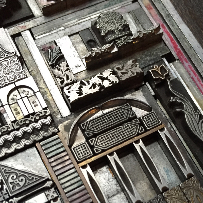
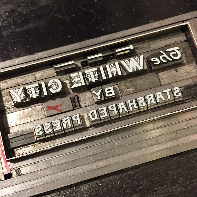
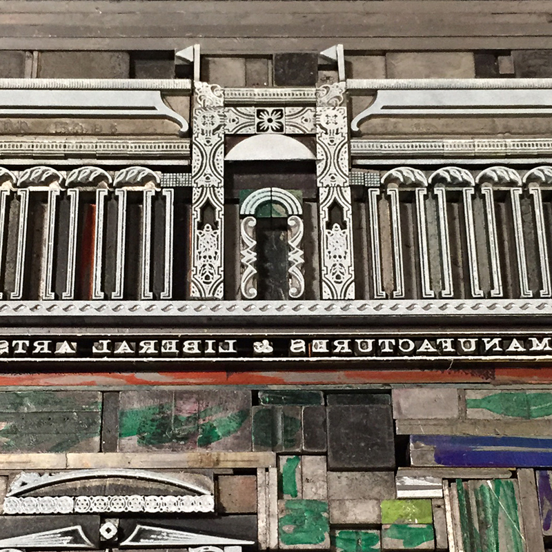
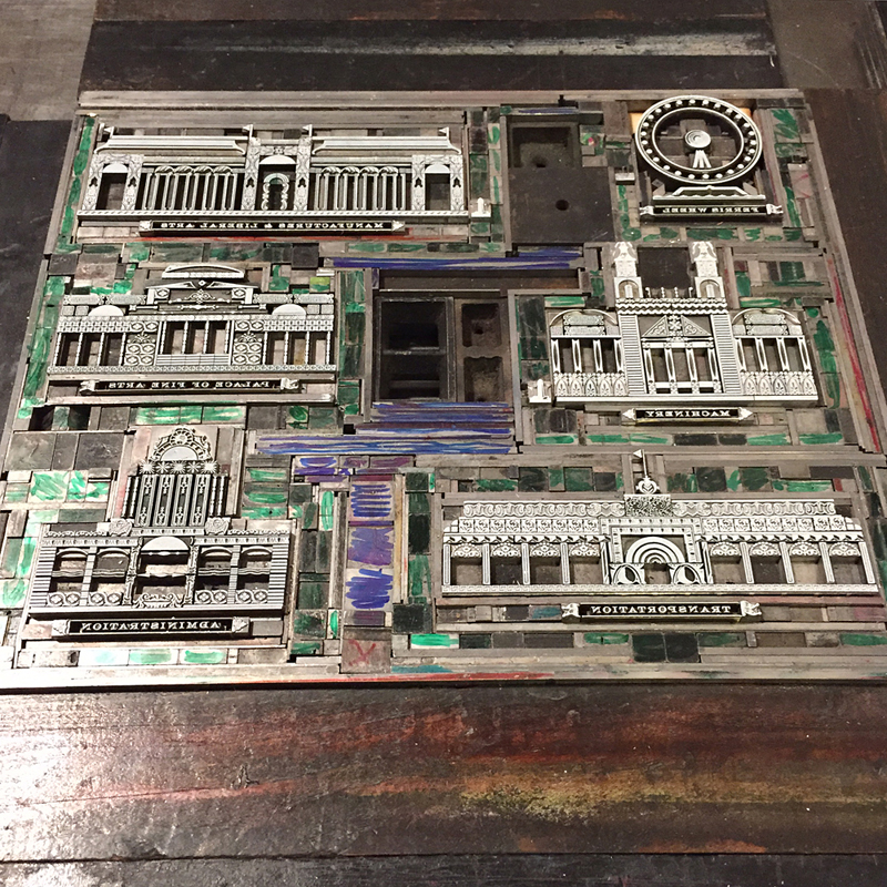
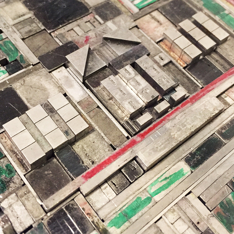
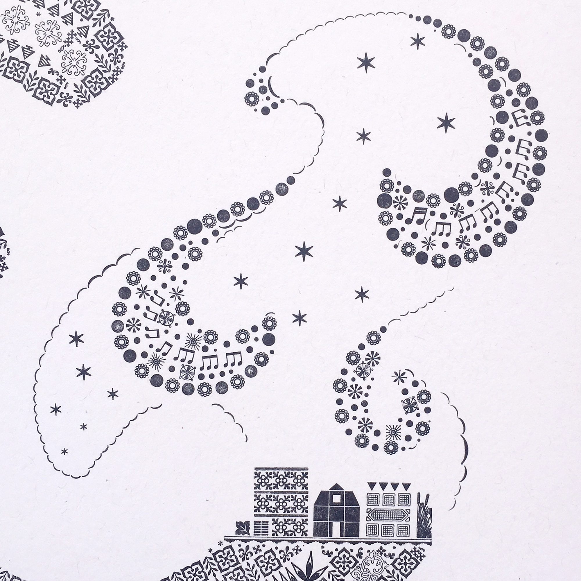
The third print is near to my heart. Before even casually mentioning what typeface would be used to represent Chicago, folks said 'it has to be Cooper, right?' Indeed. Cooper Black is the only typeface meaty enough to carry a substantial skyline of the city I love.

I had an epiphany the night I embarked on this one, realizing that there has to be a way to represent wind for The Windy City. This involved a lot of lead curving and some tricky setting to retain the shape but hint at the sky. It's almost ridiculous how much is going on in this design.

The fourth ampersand representing the London Underground is fresh off the press!

This form for printing the prospectus will also appear on the final sleeve that houses all of the prints. I arranged the ampersands in order of size to make it look like the tiny airplane was pulling them in banner form.

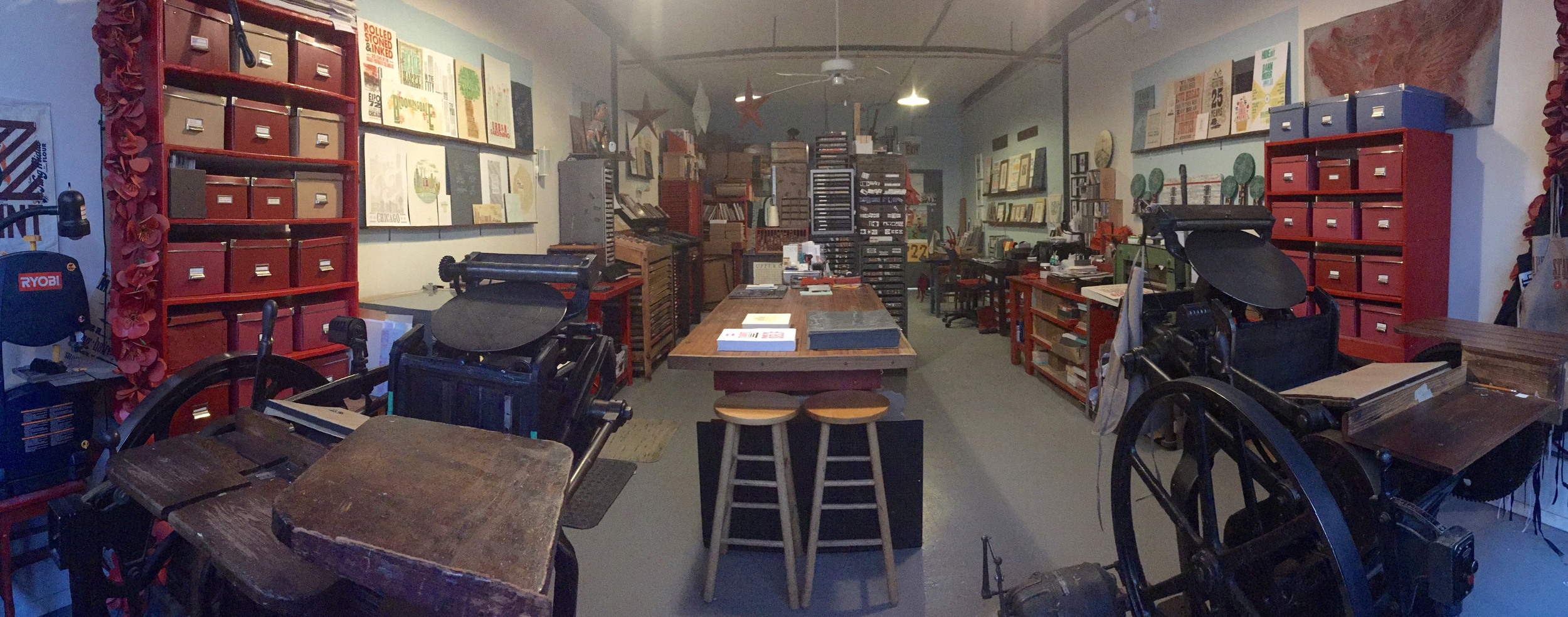
Here are the details! While each print will be available individually, 50 sets will be packaged in an LP-style sleeve and include a digitally printed colophon showing photos of all of the type forms used to create the ampersands.

The series is available for sale here and individual prints will be listed on our etsy site as they come off the press.

Made to Love Magic

I can probably trace my fascination with magic hour, the first hour of sunrise and last before sunset, back to George Lucas' commentary about the urgency of shooting scenes of American Graffiti at these times of day. Living in the city doesn't prevent one from experiencing the soft and radiant light that occurs at this time, whether you're on the beach of Lake Michigan or in the alley behind Starshaped, as I often am. This Spring, magic hour has come at the conclusion of a 12 hour day, at the break before starting a second shift, or at the end of an all-nighter. In all cases I am physically and most likely emotionally exhausted, pondering how to cope with what follows this stretch of work (usually parenting or housekeeping and seldom sleep). Standing in my alley and seeing the baby blues mixed with copper golds, reflecting on the buildings surrounding mine gives me a momentary sense of calm and clarity. This moment is something I've wanted to capture in print. magic1cropWith type and ornament, not imagery, my strong suit, I stalled, as no single typeface in the studio seemed right for the two words making an appearance on an otherwise graphic print. Maybe creating some type of geometric blackletter would provide me with the next challenging set of letterforms. This seemed like it might be appropriate for capturing... something, in the print that I couldn't quite nail down. So I started with the type and settled on lowercase as it was more appropriate for the size and, well, easier. I found a digital version that was relatively straightforward and started drawing over it, making changes to suit the geometry of metal type.

firstsketchThen I narrowed down the sizes of potential ornaments to something I could find in the studio. The 'i' does not have a dot here as I planned to reflect the shape of it off of the 'h'. You'll see why.

graphpapersketchI compiled ornaments and rules that felt like a good fit, knowing that I would need to miter the edges off of many sorts to make it happen.

firstsketch2I was concerned that my hand drawing wasn't true to ornament dimensions (can someone please make graph paper that's measured in picas!?), so I drew it on the computer, with each box and triangle representing the true size of the ornaments. This allowed me to put together an accurate cut list of rules, including the correct miters and quantities.

magichourschematicRR

cutlistAfter collecting everything necessary I printed out a wrong reading guide on which to build. Slowly. But surely.

layout1

layout2

layout3And then, there it was. Kerning issues waiting to be corrected.

layoutfinalThis is a large portion of the shavings I mitered off of the rules and triangle ornaments to make them fit together. These scraps go back to the Platen Press Museum to be melted down and saved for future typecasting.

metalshavingsAnd then... how will the type play with the rest of the print? I pulled series of ornaments that fit my ideas of sky and started to build arcs. My handy rule bender saw a lot of action, creating leads and slugs that would shapes these curves.

layingoutskyThe final form is attractive, mixing standard square and rectangular furniture alongside custom made angled pieces. This photo was taken after pulling a hand inked proof in copper gold on navy paper.

fullgoldproof

Tsky1

Thour2

typecloseupThe first black and white proof looked great but I felt strongly that something was missing. I walked away from it for three weeks to stew. But I was still stuck, so I did what I do every time this happens. I ran to 'my' Sarah, former Starshaped Girl Friday, for another opinion and a life line. Together we brainstormed a linoleum cut with subtle nods to the ornaments in play but in a more abstract way. How I miss her in the studio.

printedproofThis drawing, done on top of the black and white proof, was the final inked version I did before transferring it to linoleum. linodrawling

linocutI first printed the brightest colors as a split fountain that began with copper gold and faded up to pale blue.

fullcoloronpressFollowing that I printed a slightly tinted transparent white for the linoleum, which has a varnish-like look. It's just enough to give depth to the print while not competing with the more delicate ornamentation. You can see in the detail the mirroring of larger, linoleum versions of the tinier elements.

magic4I have stared at this blackletter. Probably for hours. Assembling this has been the hardest typographic work I've ever done and it's still so far from perfect. The miters aren't all spot on. Some rules are very beaten but were all I had. Printing was a challenge and it's not the finest I've ever done. None of these things bother me; if anything I'm glad that I used very geometric border pieces to give a bit of rigidity to what has somehow still retained a sense of 'hand' to it. I don't design type so my insecurities did what they always do and sought Rich for help. 'The C and O are taller by a pica... should I trim the tops down?' No... it's perfectly imperfect this way. 'Should I add a shadow to the type, printed in the transparent run, as I initially intended?' No, don't mess with the type; it stands alone. He's always right.

magic5

magic6The easiest part was setting the bottom credit. Just a simple, straight up line of type. And you can see here how the first row of curved ornaments balance between the dot of the 'i' and the top of the 'h'. Not perfect, but close.

magic7As I write this, I'm still uncertain about the final print. Sure, it provided me with all of the challenges I enjoy within my craft. The colors did exactly what I wanted them to do. The final piece is attractive to look at. But did it capture the sense of time I wanted to freeze? I don't know, but I am weepy when looking at it and think this reaction is a gut one stemming from the subconscious feelings I encounter at actual magic hour. The understanding that despite whatever lengthy shift has just concluded, I spent it doing something that feeds my drive and is chased with a moment of comfort, knowing this sky is there to guide me through the next 12 hours, whatever they bring.

magic3

Print is available for purchase here. And thanks.

Metal Type Presses On

Fortune has always favored me in the form of friends that are true go-getters. From the family I found at Fireproof Press, to the Chicago Printer's Guild and Chicago Printmakers Collaborative, to the talented stream of interns at Starshaped and the new friends I discover at the Hamilton Wood Type and Printing Museum Wayzgoose every year, there's never been a dearth of inspiring artisans and designers in my life. Not the least of these is Erin Beckloff, who reached out years ago looking for a proof of one of our wood typefaces so that her father, Scott Moore, could create a set of patterns to pantograph cut a few replacement characters. We hit it off immediately and I have always been impressed with her enthusiasm for all things design and letterpress. She has never faltered in her quest to understand the craft and the people behind it, so when she mentioned this past Fall that she felt a documentary was in order to showcase the stalwarts of the print community, I knew immediately she was the person to make it happen.A long while ago, I heard an interview with an actor talking about working with the Coen Brothers on a film and he said, 'Some people just don't suck. And when they call you to work on a project, you say YES.' This is how I've always felt about Erin and her projects because she thoughtfully sees them through to a fully realized end. She asked if I could contribute in two ways to help get this off the ground. The first is in the form of a print to be offered as a reward for supporting her Kickstarter campaign.

llmtgray1I have always felt that promoting metal type has been an uphill battle as wood type, in all of its textured, meaty glory takes center stage. Metal type requires more patience and a solid understanding of the medium in order to get stellar results. Starshaped creates most projects with metal type and given our past of printing propaganda, it seemed like time to mix the two. I began by sketching out what would look like a mass of protest posters with slogans altered to be typographic in nature.

firstsketchThen each 'poster' started to take form in various sizes with a mash up of different typefaces.

typeformstartI added rules to give dimension to the edges as well as those that would look to be supporting the posters. This is the first good carbon paper proof of the form.

carbonproof

formwithink

solidarity

figuresWhen all looked good, I removed the rules as they would be printed in a different color. Here they are sitting on a proof so that I remember what went where.

rulesAfter printing the red I replaced the rules and took the type out.

rules2It never fails that I sense a third color would really 'bring a print home'. So I took a misprint and labeled the dimensions of each poster so that I could cut linoleum blocks to print over them in a transparent-based ink. This helped them pop from the paper quite a bit, despite the subtle effect.

misprintmeasurements

llmtgray2The prints, offered as part of the fundraising effort, measure 8x10" and are printed on paper generously provided by Appleton. I also ran a short edition on 11x14" paper to give the type a bit more breathing room. These will be available eventually; invest in the documentary first!

llmtgreen1The second way I am contributing to this project is in the form of teaching one lucky (or unlucky?) person as much as I possibly can in one day about metal type. In this 12+ hours of grueling type setting, proofing and printing, we'll discuss the history of metal type, look at how issues were dealt with by previous generations of printers and how to best work in the medium now. Plus, that person will have access to the Starshaped collection and the opportunity to create something special. Are you up for it? Check out the entire campaign and get updates on the facebook page.

35studio1

Erin is in the middle of this photo, surrounded by students that she has inspired both in design and letterpress. It is incredible to see her grow and overlap both fields while taking the time to teach everything she knows to the next generation of aspiring printers. The fact that Jo and I will both be a part of the final documentary is such an afterthought to the bigger picture of how the craft is recorded and passed on. And pulling in Mark from the Mayfair Workshop, a longtime close friend of both Fireproof and Starshaped, to create the perfect background score brings this project full circle for me. Everything about it feels right. Will Erin be the Alan Lomax of the letterpress world? It's early to speak to that, but she is well on her way, supported by those of us who understand the importance of retaining and collecting history before it vanishes. Go get 'em, lady.

lecture2